Thank you for checking in to see what we have been making in art!
Students in the Fall 2017 2-D Art Elective began by choosing a masterwork to replicate.
Modeled after apprenticeship practices, their goal was to get inside the head of a successful artist and learn through emulation of methods, materials, and techniques. Alongside this goal, students were to create one or two independent works of art depending on if they were in 7th or 8th grade. Lastly, a course conclusion paper reflecting on what was accomplished, created, and learned.
🎨 Enjoy
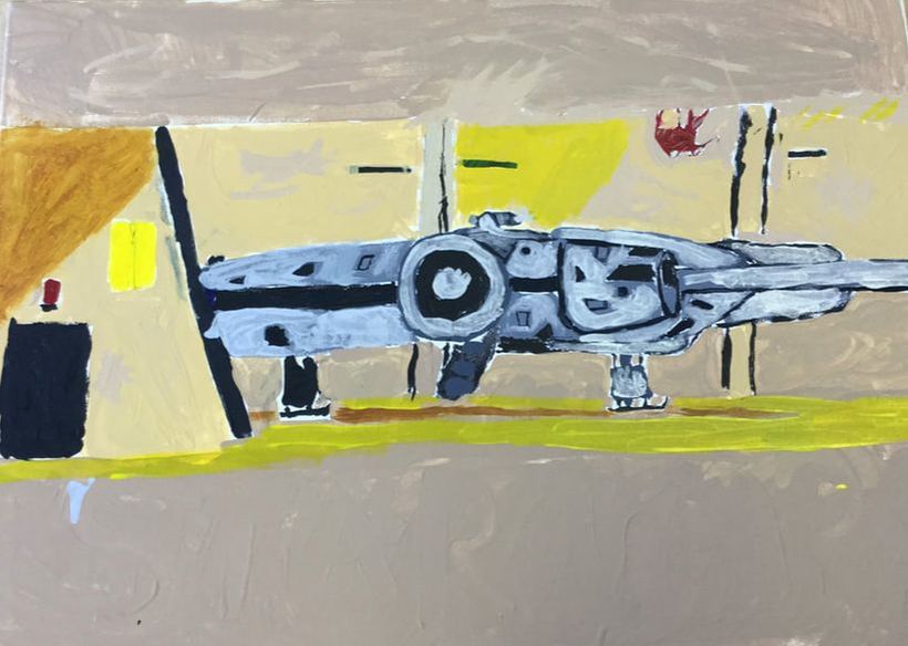
Kate
Quentin
|
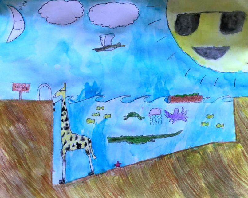
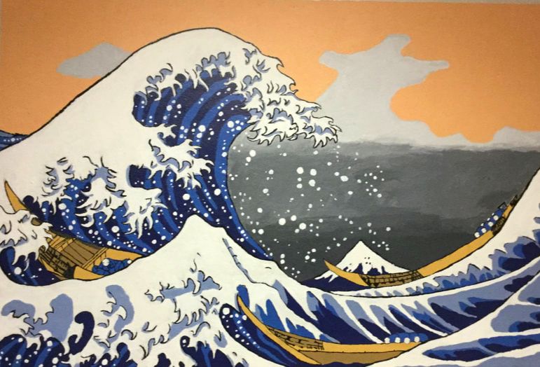
During this 9 week course of art, our teacher Deb had us do a Masterwork recreation, and 1-2 Independent (Wow,) pieces to show what we as an individual could do. For the Masterwork recreation, Me and two other classmates (Ava L, and Duncan P) recreated Under the Wave of Kanagawa, also known as the Great Wave of Kanagawa, or The Great Wave. For my Individual piece, I drew a line art of Aang from the anime Avatar the Last Airbender digitally.
|
|
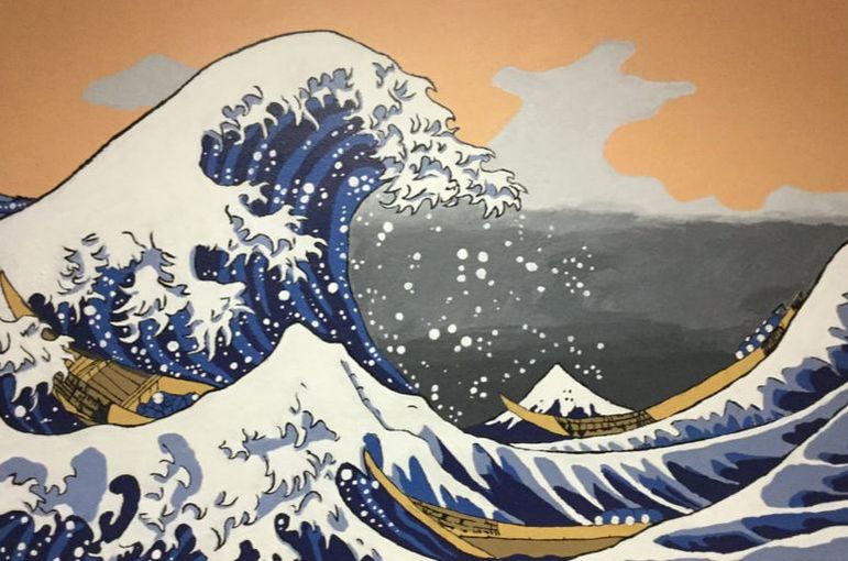
Under the Wave of Kanagawa, also known as the Great Wave of Kanagawa, or The Great Wave is a print that is apart of Hokusai’s Thirty-Six Views of Mt. Fuji. It was published between 1829-1833. Under the Wave of Kanagawa, and South Wind, Clear Sky are some of the prints Hokusai is most known for. I, Ava, and Duncan decided to make the print into a mural so that everyone who walks through can experience this overbearing wave about to crash down on some fishing boats, with Mt. Fuji off in the distance. I wanted to paint this piece because it brought about a sense of nostalgia, from all the times the image of The Great Wave has popped up in my life. I also wanted to do it for its level of difficulty. It’s been a pretty big challenge getting all the colors up, painting on a wall above lockers, time management, and painting in small crevices. All the said and done though, it’s been a great ride to an amazing end product.
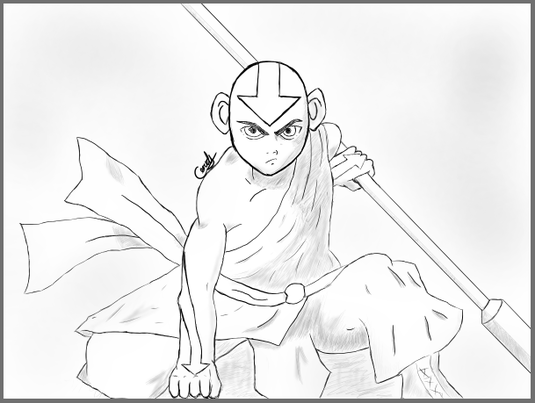
For my Individual piece, I drew a line art of Aang from the anime Avatar the Last Airbender digitally. Which means that I drew it using a pen and tablet hooked up to a computer and drew on an art program. The art program I used is a free program called Fire Alpaca. I drew line art of Aang because it was a good difficulty for me being new to digital art and drawing with a pen and tablet. And also because Aang was the main character of my favorite TV series/anime when I was younger. I was pleasantly surprised with the outcome of the drawing, and to see how far I had come in terms of digital art, from not knowing anything, to know quite a bit. In the end, the most difficult thing for me was getting the body parts proportioned, and shaped correctly.
Ian
|
|
Paloma
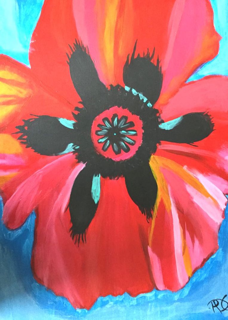
For my masterwork piece, I recreated Red Poppy VI by Georgia O’Keeffe. It has many vibrant colors (mostly different shades of blues and reds) that I painted on a white canvas. I painted this piece because I have always had a joy of painting flowers and this piece “spoke” to me. I wanted to blend colors and make it seem more 3D with shadows from darker colors but since I didn't paint all of it at the same time, the paint dried and couldn't blend very well. I think I did very well on my piece but there is always room for improvement, I think if I did it all in one session rather than doing it in multiple shorter sessions I would have been more pleased with the outcome. I got more and more upset with my piece then got happier- that it was done.
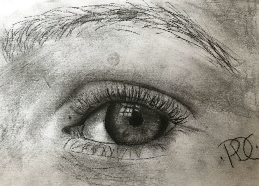
Madeleines Eye
For my first individual piece, I took a picture of my friend Madeleine’s eye and drew it with charcoal, which is a very nice utensil to use for smearing. The big idea for this piece was to practice making nice shadows and smudging. I ended up not so happy with the actual eye part, as in the colored area around the pupil, but was more happy with the eyebrow and the shadows I made.
|
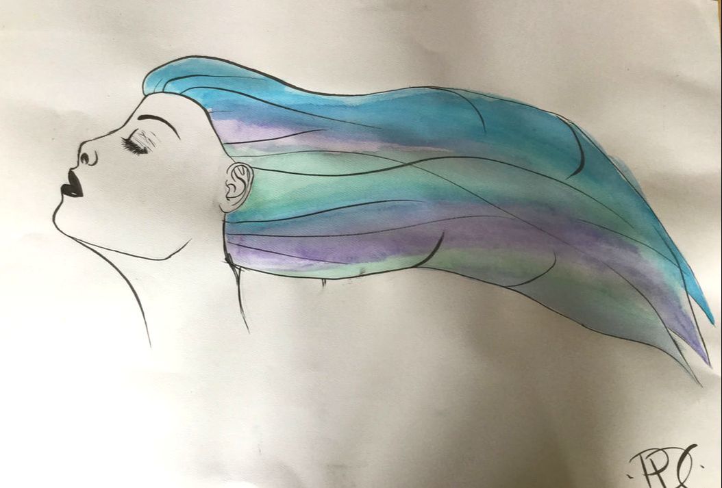
For my second individual piece, I used a picture do a face I got from the internet and then added hair and watercolored it . To draw the face and outline of the hair I used a brush tip black marker. After I outlined, I water colored the hair with green blue and purple colors. I was never very upset or even upset with this piece, and thought it turned out very nicely. Drawing hair was probably the biggest challenge I came up against, but ended up semi-happy with the result.
|
Evan
|
|
Nali
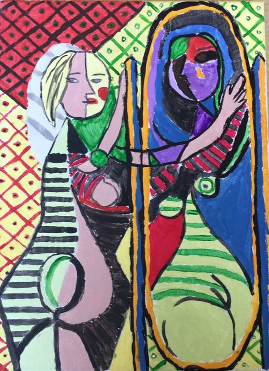
In the three-day-a-week first quarter art class I did a lot of fun and cool things. I drew, wrote, painted, developed ideas, and most importantly learned about art. Each student in the class was given a masterwork to recreate, and depending on if the student was a seventh or eighth grader, was given the task to complete one or two independent works respectively. The class focused on 2D art, so everyone was drawing or painting things. I had a lot of fun creating and recreating pieces like “Girl Before A Mirror”, my original piece “The Barrier Between Magic”, and an untitled piece I didn't have enough time to start, but an idea for.
My masterwork was Pablo Picasso’s “Girl Before A Mirror”. Pablo Picasso was born on October 25, 1881, in Málga, Spain. He painted “Girl Before A Mirror” in March, 1932, at 51 years old. The painting—of a youthful girl standing before a mirror and looking at her old, contorted reflection—represents the girl looking at her future self, where she's old and no longer beautiful. The subject is Picasso’s young mistress Marie-Thérèse Walter. Picasso died on April 8, 1973, in Mougins, France at 92 years old.
At the beginning of the class, when I had just started “Girl Before A Mirror”, I spent at least a quarter of the entire span of the class just drawing everything out and making sure the drawing was as perfect as I could get it. It was hard to get some of the shapes completely correct, but I figured since some of the shapes were kind of abnormal, it was okay if they weren't completely identical. Then I moved on to painting, using acrylic paints, which was actually a lot easier and more relaxing than drawing everything out. All I had to do was mix the right colors, and because they were such strange shades with such interesting undertones it was hard to match them correctly. I admit that sometimes I gave up on the mixing because it was close enough to the original color to not be completely obvious that it was different. The painting was pretty tedious, and took a long time to do, but wasn’t extremely hard.
If I could change anything about my version of “Girl Before A Mirror” I would want to make the color-matching a lot better, and I would make the paint strokes cleaner. I learned a lot of things that are kind of hard to explain, but I think the most important thing I learned was that experience helps. It doesn’t matter if you aren’t very good at doing something, because you can get better with time. If I had to do the piece again, I would feel better about it than I had before I did “Girl Before A Mirror” because I’d know that I’d done something like it before. Overall, I’m really proud of “Girl Before A Mirror” and I had fun recreating it.
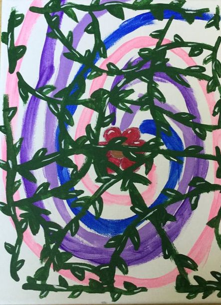
My first independent work is called “The Barrier Between Magic”, and is a painting of a flower with swirls of color emanating from it, and in front of that is a tangled net of vines. I made the piece from the idea that nature is almost like magic; some of the things that happen in nature is truly magical. I also really like things to have a magical or fantasy-like twist, which is why I made the piece. The idea was that nature was suppressing the magic--which was coming from the flower--because humans aren’t deserving of it, and would only destroy it, like we’re currently doing with nature.
The one most important thing I learned while creating “The Barrier Between Magic” was actually how to do highlights and shadows, which I had never done before. I still don’t think I did it one-hundred-percent right, because the figurative lighting was off in the painting, but I think for a first attempt it was pretty good. If I could do the piece over again, I would add a mysterious shiny metallic color like gold or bronze for a background, so that there wouldn’t be so much white. I also would have added more shadows and details to the flower and the vines, because that’s really the only thing being observed.
Unfortunately, I ran out of time and couldn’t flesh out my second independent piece. I did have an idea for it, though. I wanted the piece for be more cartoony and fun, and I also wanted to incorporate another idea I had of drawing a cow, because cows are one of my favorite animals. I wanted to draw a realy cute cartoon cow, sitting in the left-hand side of the page with a barn and a barbed-wire fence in the background. I wanted to draw the idea on a piece of paper and color it using colored pencils or Prisma colors. It reminded my of a few years ago when my parents were on sabbatical, and we all went to live in Bozeman, Montana for nine months. Where we lived, there was a pasture of cows next to us. The thing I learned the most from not doing this piece was time management, even though the time was used working on other pieces that were important as well.
Overall, the things I learned the most from taking art this quarter is that experience can only make you better, and that time can slip away from you when you really want to perfect something. I also learned about highlights and shadows, which I’ve never really understood or been good at. If I could do the whole quarter over again, I would have worked on a second independent piece at home so that I would’ve had enough time, but that’s it. I had a lot of fun in art this quarter, and I enjoyed growing more accustomed to painting and drawing.
Eliahna
Billie
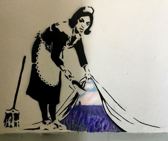
The anonymous graffiti artist Banksy, is the original creator of “Maid in London.” This England-based artist depicts cynical and satirical scenes to make viewers think, laugh, and become angry. His original intent for the 2006 “Maid in London” was a comment on the government’s proclivity to “sweep things under the curtain” and keep information from the public, as well as partially covering the topic of “democratizing subjects in art.” He created “Maid in London” with a stencil and spray paint, the same media as most of his works. I attempted to replicate his process as best I could with the materials available. Banksy is an extraordinarily talented artist and one can only imagine the time it has taken him to get to this pivotal point. He is able to create these distinctive works of art in an extremely limited time frame as well as under the pressure of evading the police. To recreate “Maid in London” took me weeks of hard work in class, and was tremendously challenging.
I chose the “under the curtain” scene for my independent project. In the original version of “Maid in London,” the maid exposes a wall of brick behind the curtain. I decided to differ from this, and give it new--and personal--meaning. In my adaptation, the drapery lifts to reveal a vibrant field of lavender below a pastel sunset. The lavender’s shade fades and brightens as it becomes nearer to the onlooker. I experimented with mixing the paints on the project itself and using a wide range of colors and pigments. As someone who’s primary media of art is pencil and marker, I enjoyed, as well as labored through, the process of learning different painting techniques. In the spirit of Banksy I tried to paint it on a wall that one may not stop to look at originally, and I will not be signing the work.
I chose the “under the curtain” scene for my independent project. In the original version of “Maid in London,” the maid exposes a wall of brick behind the curtain. I decided to differ from this, and give it new--and personal--meaning. In my adaptation, the drapery lifts to reveal a vibrant field of lavender below a pastel sunset. The lavender’s shade fades and brightens as it becomes nearer to the onlooker. I experimented with mixing the paints on the project itself and using a wide range of colors and pigments. As someone who’s primary media of art is pencil and marker, I enjoyed, as well as labored through, the process of learning different painting techniques. In the spirit of Banksy I tried to paint it on a wall that one may not stop to look at originally, and I will not be signing the work.
Julia
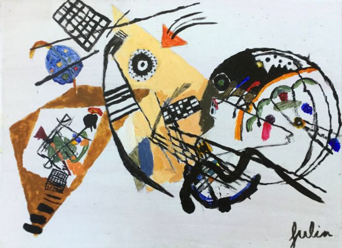
My Masterwork piece was the Transverse Line by Wassily Kandinsky. Kandinsky related his artwork to music, he would match certain shades of colours to certain notes in musical pieces. In 1923, Kandinsky painted the Transverse Line on a canvas with oil paints, in Kunstsammlung Nordrhein-Westfalen, before it was a famous art institute in Germany. When I re-created the piece, the big idea behind the project was to mimic the original as much as possible. For my piece, I used a canvas with acrylic paints. The biggest challenge for me was spacing out where everything was going to go.
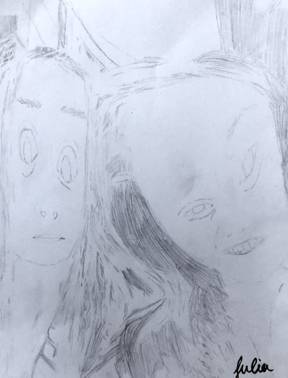
My first independent piece is a sketched photo of Madeline and I. My main goal for this piece was to show the little intricate details and fine lines that the camera caught. I learned that it was easier to see the paper when I was in a dark space so I could trace out the lines easier. My overall thoughts on the work I did are that I did very well, but for next time I will probably color in the piece I did.
|
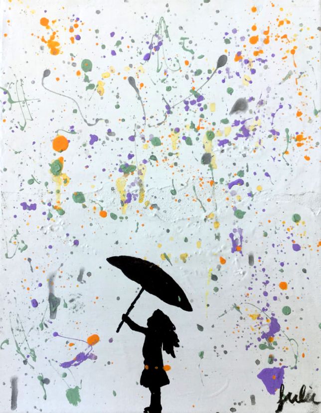
My second piece is called toxic, it’s a splatter painting with a girl holding up an umbrella to sheild her from the rain. The hardest part in making this piece for me was spraying the splatter paint. It wouldn’t come off of the brush that I was using so I had to put a couple drops of water in the paint. My original idea for this piece was to make it seem like the rain was holding her down (metaphorically) but with the colors I used it turned out more happy than I had originally planned. This piece helped me reach my goals as an artist because I envisioned it the way that it ended up.
|
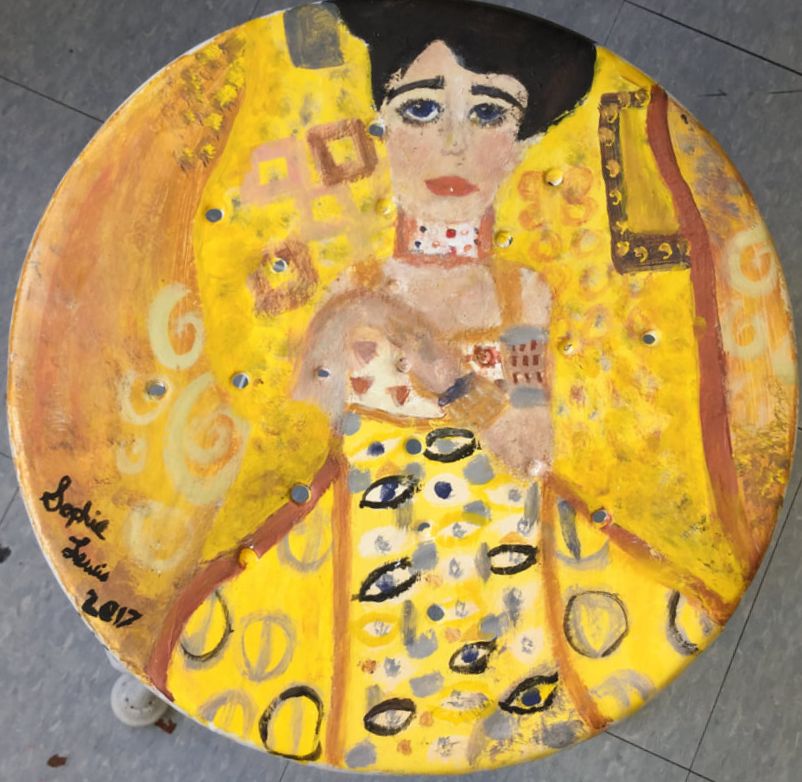
Sophie
For quarter one I took the 3 day 2D art class. I was really excited to learn about all the masterworks and excited to make art.
|
For the Masterwork segment in this class I did The Portrait of Adele Bloch Bauer by Gustav Klimt. I recreated this piece as best as I could on one of the art room stools. It was definitely a challenge but it was lots of fun. The original artwork was made between 1903 and 1907 and part of the reason it was so famous is because it was stolen by the nazis because it is a portrait of a Jewish woman. I used mostly acrylic paint but I also used watercolor in a few cases to highlight some areas. Overall I am happy with my work and glad I had the experience. I learned a lot about how much work and effort goes into making a painting like that.
|
Independent
For my Independent piece I did an eye study but I added some extra little designs around the edges to make the piece a little more interesting. The eye was made with colored pencil. I spent a long time trying to make the pupil. In the detailing around the edges I used a small sharpie. I definitely learned a lot about how the eye is built and what it takes to draw it. I had a really great time trying to draw the eye because I have tried to draw an eye before but never really spent a lot of time and effort on every detail and such.
For my Independent piece I did an eye study but I added some extra little designs around the edges to make the piece a little more interesting. The eye was made with colored pencil. I spent a long time trying to make the pupil. In the detailing around the edges I used a small sharpie. I definitely learned a lot about how the eye is built and what it takes to draw it. I had a really great time trying to draw the eye because I have tried to draw an eye before but never really spent a lot of time and effort on every detail and such.
Ilana
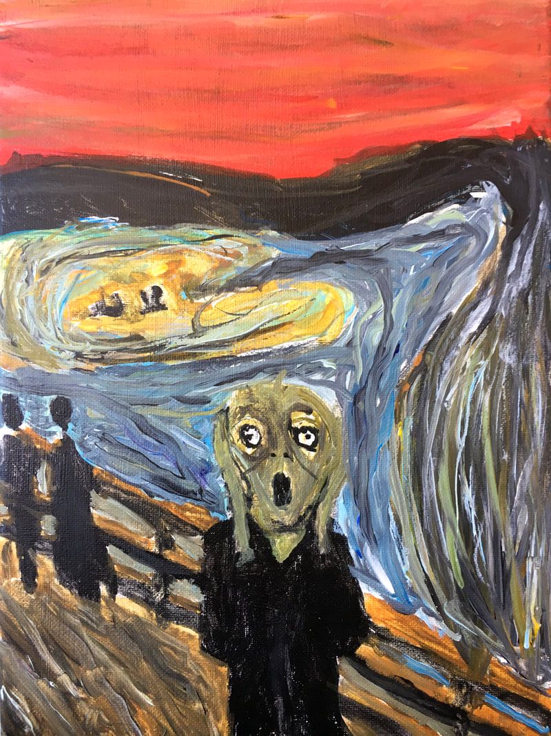
For the first quarter I had 2D art 3 days a week. I’ve made one master work, and 2 independent works in which for the most part are pretty much finished.
For my master work, I made a painting called ‘The Scream’ by Edvard Munch. His original is painted in very thin strokes with lots of browns, greens, blacks, faint oranges and reds, even some yellows and blues. But all the colors in his painting look very bland and drained of saturation. It is what looks like a distorted human, cupping their hands on their face, screaming. There are also two silhouettes of people walking far behind this person or whatever it is.
For my first independent work I was inspired by something online that said to draw yourself surrounded by your fears. What I did was a did draw a girl, and I tried to blend in the fears that I was able to draw (some I couldn’t figure out how to draw it) into the picture and the girl in the middle. At first glance you probably wouldn’t be able to figure out what most of the fears actually are.
For my second independent work [not pictured] I looked up pictures of my three favorite celebrities/actors/people/my idols on an ipad, I found a picture with all three of their faces, but only half the face was showing for each of them. I traced the basic outlines of their face shape, lip shape, etc, and then filled it all in while looking at the picture.
I made my masterwork using acrylic paints on a canvas, I made my first independent piece with pencil, a little charcoal, and paper, and I made my second independent piece with just pencil and paper, I also traced the outlines of the faces and then filled them in and blended on my own.
I don’t know what Edvard Munch intended the big idea of this painting to be, but when I first saw it I thought something along the lines of how sometimes life just makes you want to scream, and sometimes it’s hard not to. When I first saw it, that’s what it represents/ed to me.
My indy #1 was representing my fears, (or some of them). That’s the big idea.
My indy #2 I just wanted to draw them because I love those people, and the characters they play on TV very much and they have been a big part of my life, etc. So I just wanted to draw them cause I love them, that’s the big idea.
My goal for this was to make it look like the original but in my own way I guess, like with slightly different colors, etc. I think I did alright. My goal for my independent pieces was just to do a good job and make them look how I wanted them to look.
My overall thoughts are that I had fun making this, and I had trouble making the strokes like Edvard Munch’s, but eventually I gave up on that and did it as best I could, and it still turned out okay. I also found some parts were easier than other paintings because it’s supposed to look sort of messy-ish.
For my independent pieces, I had more fun making the portraits than the fear piece, but they were both okay to do. My overall thoughts are that I did decently okay I guess.
Ava
I had so much fun in art this quarter. I was always so excited to work on these projects, and I’m so glad I got the chance to make the things that I did. Deb is totally awesome, and I loved the assignments that we had. I’m very happy that I was in art this quarter, and hope that I will have art again.
For my masterwork, I worked in a group with my two very good friends; Duncan and Quentin. Together we replicated the Great Wave Off Kanagawa. The Great Wave off Kanagawa is a Japanese print, and was published between 1829 and 1833. It was printed by Hokusai, who was a Japanese artist, known for his wonderful woodblock prints. The Great Wave is in a series of prints titled: “The Thirty Six Views of Mount Fuji.” Because The Great Wave is a print, there are thousands around the world. It is estimated that Hokusai printed 5,000-8,000 Great Waves. Nowadays, they usually sell for more than $60,000, based on condition, release date, and what colors were used.
For my masterwork, I worked in a group with my two very good friends; Duncan and Quentin. Together we replicated the Great Wave Off Kanagawa. The Great Wave off Kanagawa is a Japanese print, and was published between 1829 and 1833. It was printed by Hokusai, who was a Japanese artist, known for his wonderful woodblock prints. The Great Wave is in a series of prints titled: “The Thirty Six Views of Mount Fuji.” Because The Great Wave is a print, there are thousands around the world. It is estimated that Hokusai printed 5,000-8,000 Great Waves. Nowadays, they usually sell for more than $60,000, based on condition, release date, and what colors were used.
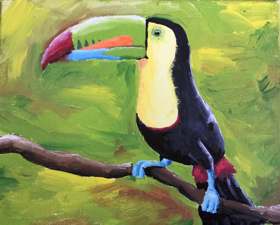
For my first independent piece, I painted a picture of a keel-billed toucan. It is painted on a canvas, and I used acrylic paint for this. I drew the toucan right on the canvas first, then I filled it in with the paint. I used a reference picture of the bird the whole time that I was working.
I’ve always wanted to paint a bird, because I have always found them very difficult to draw. I wanted to pick something that would challenge myself. I went for a toucan just because of how much color they have. I chose a keel-billed toucan, because I thought the colors were especially vibrant. My goals were to paint something that I found challenging, and I think I picked something with just the right level of challenge to it. Overall, I’m not thrilled with the background, but I don’t hate the actual toucan. If I were to recreate this piece, I would definitely change the background, and maybe add some more detail to the feathers.
I’ve always wanted to paint a bird, because I have always found them very difficult to draw. I wanted to pick something that would challenge myself. I went for a toucan just because of how much color they have. I chose a keel-billed toucan, because I thought the colors were especially vibrant. My goals were to paint something that I found challenging, and I think I picked something with just the right level of challenge to it. Overall, I’m not thrilled with the background, but I don’t hate the actual toucan. If I were to recreate this piece, I would definitely change the background, and maybe add some more detail to the feathers.
|
|
|
|
|
|
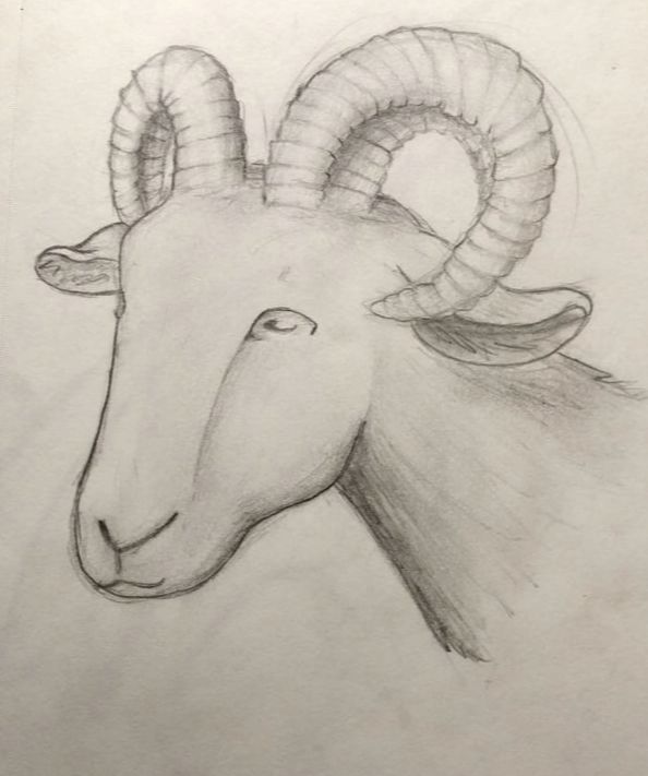
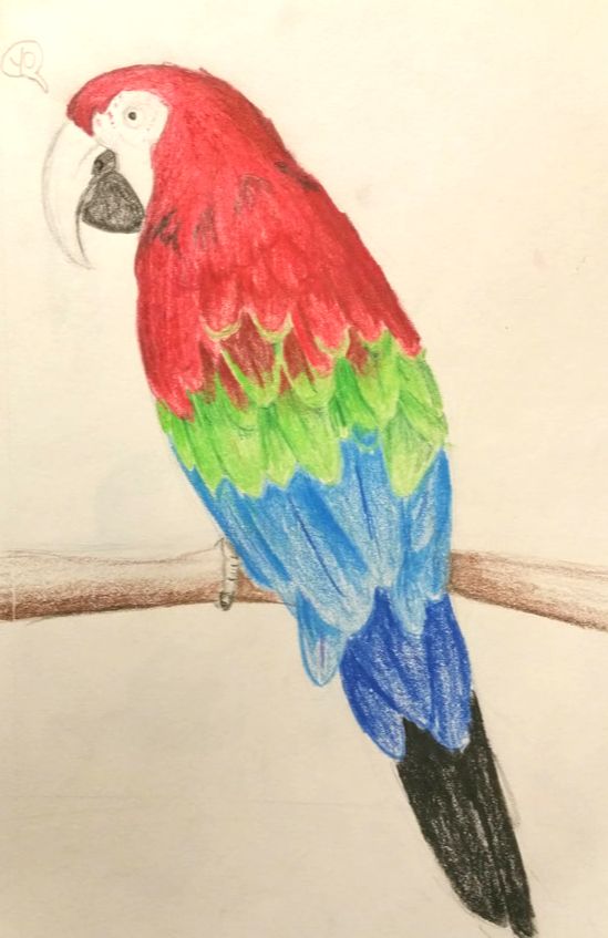
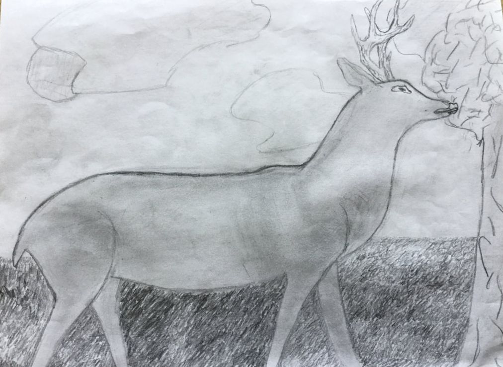
For my second independent piece, I was allowed to keep drawing in my sketchbook, and have those count as an independent piece. I do love to draw animals, so that’s mainly what I drew over the course of the quarter. I have lots of drawings involving deer and goats, because they are some of my favorite things to draw. I guess I was on a bit of a bird streak, because I also drew and colored a Green-Winged macaw. I’m trying to get better at drawing things and actually using color, and I think my birdie turned out pretty well.
Overall, I thought this quarter was super fun! I have always wanted to create a mural, and being able to do it with friends made it 100 times more fun. I thought the whole experience of mural making was super fun, and maybe I’ll get a chance to do another one sometime. I hope Quentin and Duncan had as much fun making it as I did, because this was one of my favorite projects I’ve ever done. I think Deb is a wonderful teacher, and I’m sad that I have to leave this year, and won’t ha ve her for very long. She is so kind, and always supportive. Thank you Deb! |
Charlotte
|
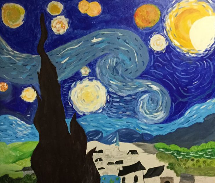
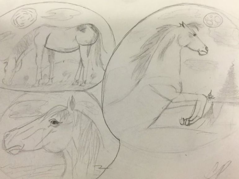
I was placed into first quarter 2D art class elective where you have to do TWO pieces of art, MASTER WORK and 1 or 2 independent pieces.My master workpiece was Vincent Van Gogh’s “Starry Night” and my Independent piece Is called “bubble eyed” why bubble eyed I have no idea.
Starry Night was painted in 1889 and one year later Vincent Van Gogh DIED of a gunshot wound. Starry night is being kept Museum of Modern Art NYC. My Independant piece “Bubble eyed” I named it that because the art has been put into little “bubbles” and I felt like that name fit. I drew 3 different Portraits of horses. I love horses A LOT and it kinda jumped out at me for a random reason. I did the piece with a normal pencil and a tiny bit of charcoal. ENJOY! |
Duncan
This quarter, I mostly worked with paints, which were very new to me, because it was the first time I really worked with paints a lot. I learned so much this quarter, from mixing colors to choosing brushes, and the colors and textures of the different paints. I had so much fun this quarter, and it really brought me back to art, after not doing much of it for a while.
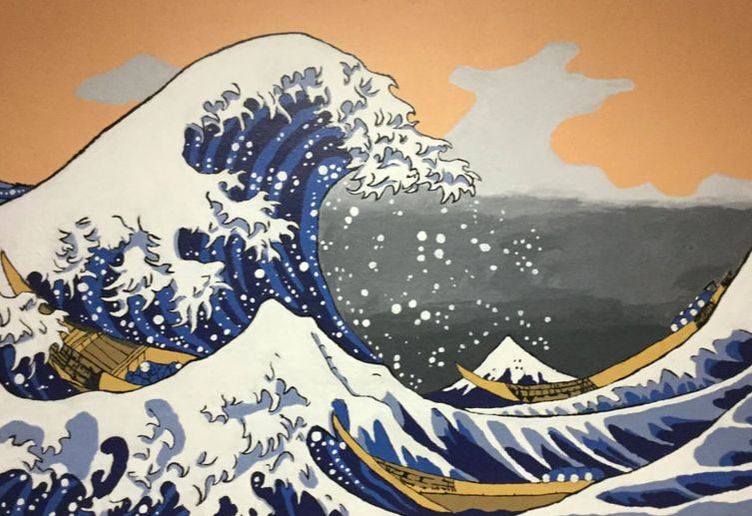
Masterwork: The Great Wave Off Kanagawa
The Great Wave Off Kanagawa, or Under a Wave Off Kanagawa is a print by the Japanese artist Hokusai. It was a print that was a part of a series titled 36 views of Mt. Fuji, and was made using the ukiyo-e printing style. The print was extremely popular, and the original woodblocks likely produced around 5,000-8,000 prints. The piece was admired by the artists Vincent Van Gogh and Claude Monet, along with many other Europeans after the Meiji Restoration, which ended Japan’s isolation, allowed the print to spread to the rest of the world. The Great wave also inspired Claude Debussy's piece of music, La Mer, along with a sculpture by Camille Claudele, an emoji, and the art for two Magic: the Gathering cards.
Hokusai’s birthday is unclear, but is often said to be on Oct. 31, 1760. His childhood name was Tokitarō, and started painting at the age of 6. At 14, he worked for a printmaker for 4 years until he entered the studio of Katsukawa Shunshō, who was an artist of ukiyo-e, and the master of the Katsukawa school . After working with Shunshō for a year, he was dubbed Shunrō by the master. He changed his name over 30 times during his career, often giving the old names to his apprentices. Art historians often use the name changes to break up his life and work, because the name changes often accompanied changes in his style and type of art.
For this piece, I worked with two friends, Ava and Quentin on creating a mural outside of the art room. We did it above some lockers, so we had to use a ladder at the start, and when that disappeared, we ended up standing on chairs. The size of the mural was tough, but with three people painting, it ended up working out. Even working with this piece as a painting, and on such a large scale, I cannot begin to comprehend how Hokusai managed to do this as a small woodblock print.
Independent:
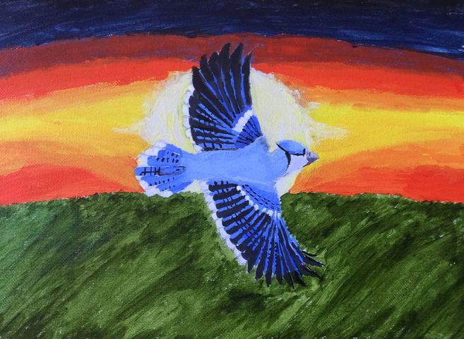
For my independent piece, I painted a small picture of a blue jay flying over a field at sunset on canvas. I really enjoyed making this, although mixing the paints could get a bit frustrating at times. I feel the least satisfied about the colors on this piece, especially in the sky. The blue jay has always been one of my favorite birds, along with the black-capped chickadee, which I was going to do for this project before I changed my mind at the last moment. We have a bird feeder in my backyard, and I frequently see both of these birds at it, which was a source of inspiration for this piece.
I had a wonderful time in art this semester, and am looking forward to continuing to paint and draw. I learned so much, and I also want to work on other kinds of 2-D art such as watercolors and colored pencil. I wish classes were longer, because I always felt like I had just gotten my materials out when it was time to start cleaning up, and I believe that was part of what made the mural so tough.
Nola
|
|
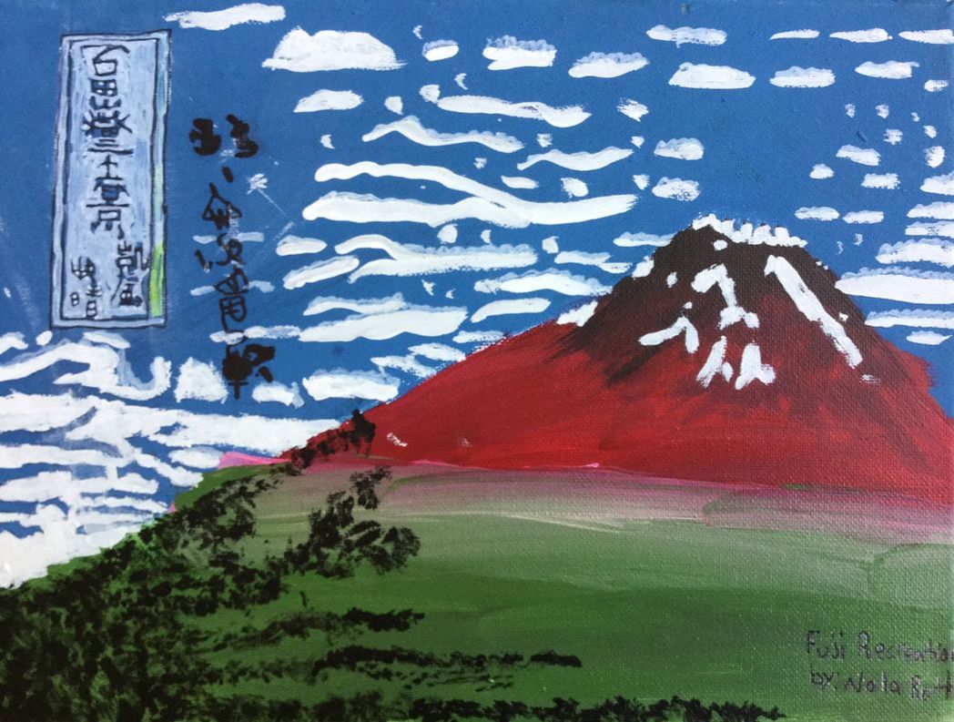
My name is Nola. I took a nine-week 2D art elective. I walked out having made a recreation of the Fuji piece, and a painting that came out of my own head.
My masterwork painting is called Fuji. This piece was printed. That means to carve into wood, add paint, and stamp onto a flat surface. I painted it instead. This was done by Katsushika Hokusai, and created in 1831. When recreating this artwork, I ran into problems such as shading, and making the Japanese writing. Shading is a good thing to do when your paint is wet.(I learned this the hard way). The Japanese writing looks much bigger on my recreation than on the real print. I used pencil, sharpie, and acrylic paint for making the recreation. I got most of my facts off of Wikipedia.
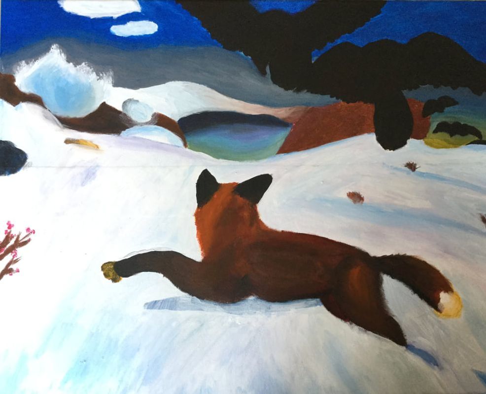
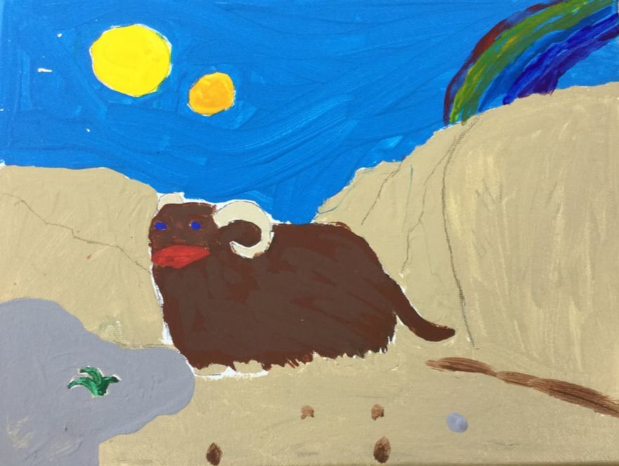
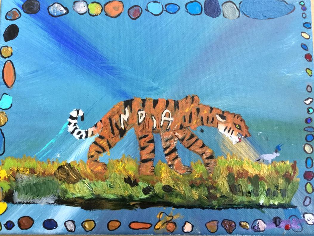
The independent drawing I made was of a tiger stalking a small field mouse. Around the edges of the canvas I put dots of paint outlined in sharpie. The dots are of every color I used to make the tiger and the background. The blobs of paint get bigger as I go around. I got inspired to make my piece by my love of tigers. I named the piece Diego and Poppy for the names of the tiger and the mouse. I had two goals for the piece.
My masterwork painting is called Fuji. This piece was printed. That means to carve into wood, add paint, and stamp onto a flat surface. I painted it instead. This was done by Katsushika Hokusai, and created in 1831. When recreating this artwork, I ran into problems such as shading, and making the Japanese writing. Shading is a good thing to do when your paint is wet.(I learned this the hard way). The Japanese writing looks much bigger on my recreation than on the real print. I used pencil, sharpie, and acrylic paint for making the recreation. I got most of my facts off of Wikipedia.
The independent drawing I made was of a tiger stalking a small field mouse. Around the edges of the canvas I put dots of paint outlined in sharpie. The dots are of every color I used to make the tiger and the background. The blobs of paint get bigger as I go around. I got inspired to make my piece by my love of tigers. I named the piece Diego and Poppy for the names of the tiger and the mouse. I had two goals for the piece.
- To make the grass lots of colors. I did make the grass a lot of colors, but it doesn’t really look like grass.
- To make the tiger look realistic. I did this by not having a black outline, so it looked fluffy, and having different colors in the tiger.
Overall I think I have learned quite a bit about artists, and good art techniques, and I owe it all to Deb.
Chloe
|
Course Conclusion
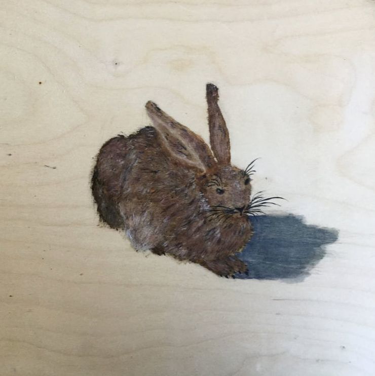
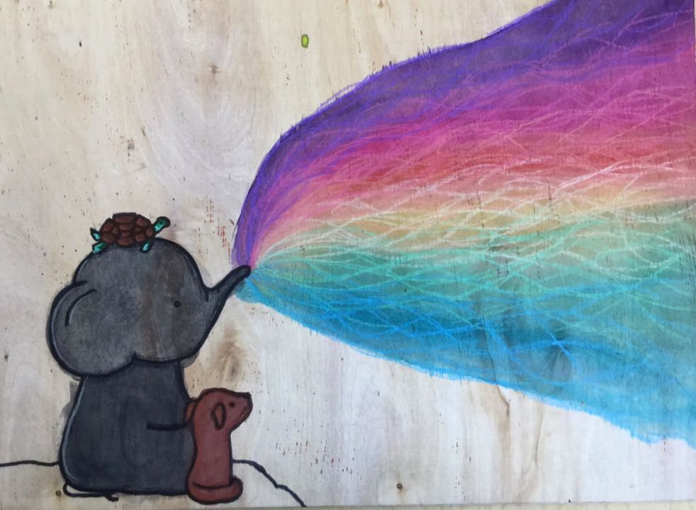
While working on my art pieces I realized a few interesting things. The first thing I realized was that while doing my masterwork I hadn’t ever painted on wood and I thought it would be fun to experiment with, so I did my first indepent piece on wood to try it out some more. I also don’t do paintings that often because I like to be in control of my art and paint seems to be so sloppy and want to go everywhere, unlike a pencil or marker. I found out though that I like watercoloring because it goes everywhere but that's what it is supposed to do and it is not really supposed to have a particular shape. For my masterwork I did the “Young Hare” by Albrecht Dürer. The painting is of a hare lying down. I used wood for my background. The materials I used for this piece were watercolor paint, a pencil, black ink and a little bit of white acrylic paint. I used paint brushes, a paint palette, a pencil and eraser to create my painting.To begin I sketched the image onto the wood using just a pencil, then I painted a watercolor outline of my hare on the background. Next I adding the fur texture using the tip of a paint brush and using light, quick stokes. After, I cleaned it up and added some more details like the eyes, whiskers and claws. For my first independent piece called “Friends Forever” I made a watercolor painting. I used wood again for my background. I used watercolor paint, a sharpie, a pencil and prismacolor colored pencils. I sketched a baby elephant in the lower left hand corner sitting down on the cliff of a mountain blowing a rainbow into the sky with a tiny turtle on its head and a dog by its side. I sketched out the elephant, turtle and the dog then used watercolor to make their shapes.Then I outlined the shapes with sharpie to make them more cartoon like. I also used watercolor to create the rainbow, then used prismacolor colored pencils to create designs in the rainbow. For my second independent piece called “Alone Forever” I did a silhouette of a sitting fox a with a galaxy, forest background. I used watercolor paper for my background. I used watercolor, a white crayon and a pencil for my piece. I used paint brushes, eraser and a pencil. First I sketched the fox out by basing it off an image I found online, then I outlined the sketch with a thicker pencil. After I added some white dots using a white crayon. Next I used watercolor to make a sky like background. To finish I added a silhouette of some trees and a ground to make a starry night atmosphere. |
This quarter’s art class has been interesting and fun. I’ve enjoyed working with different materials and styles for my pieces. I’ve gotten more comfortable with working with paint during this quarter. I think I will enjoy next quarter’s classes just as much as this quarter’s.
Margaret
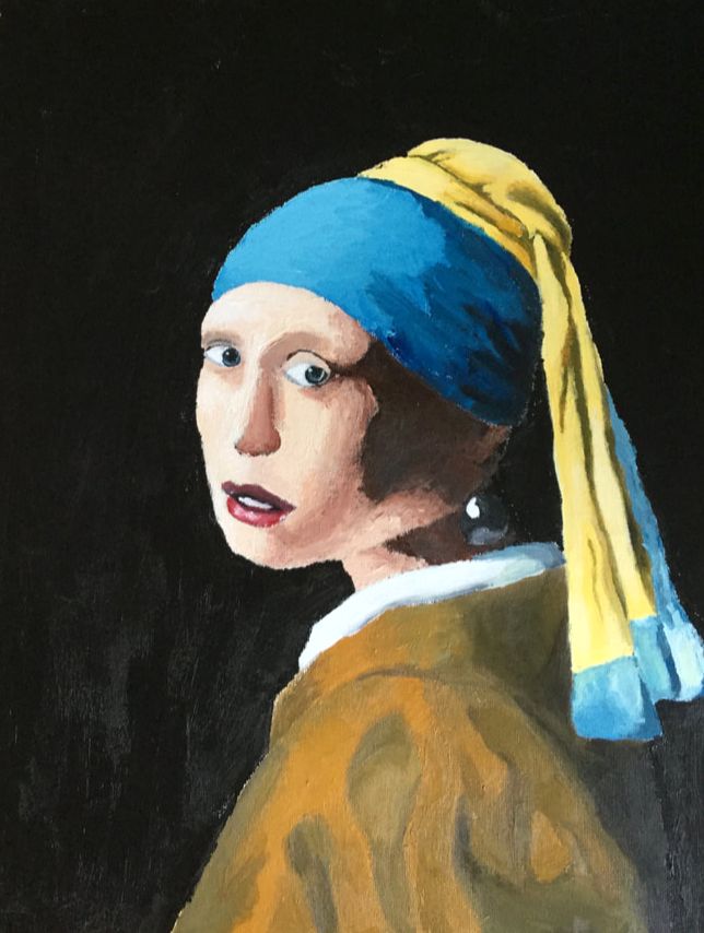
Girl With a Pearl Earring is a masterpiece painted by Johannesburg Vermeer in 1665. It depicts a girl wearing a headscarf and a large pearl earring, looking sideways over her shoulder at the viewer. I used acrylic paint on canvas board to recreate this masterpiece. It is incredibly captivating--the girl’s gaze, looking directly at the viewer, her slightly open mouth, the deep shadows and rich highlights. This painting has a huge variety in tone, which I tried to capture in my recreation. The attention to detail is incredible too, down to the little white highlight on the pearl.
|
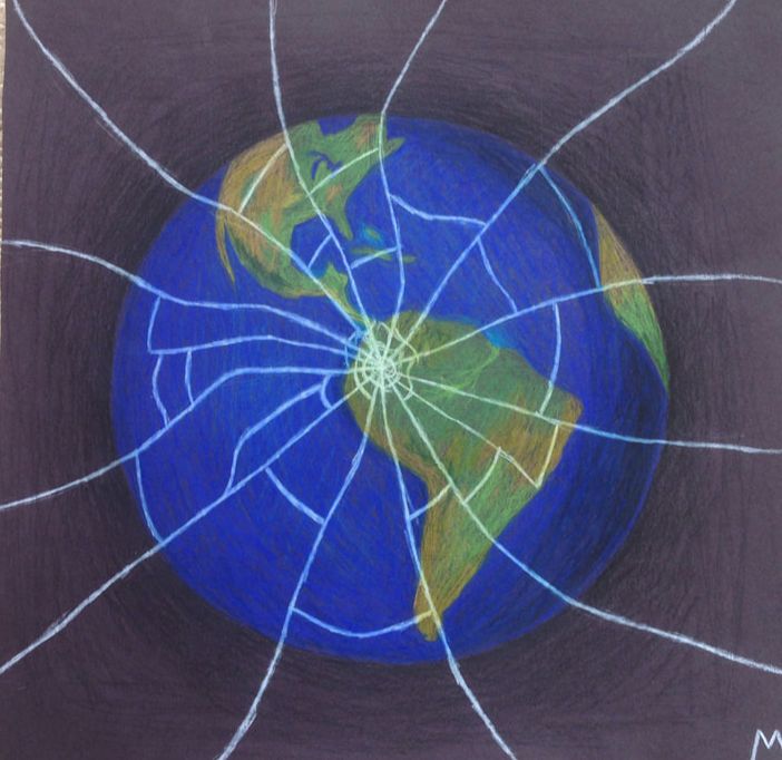
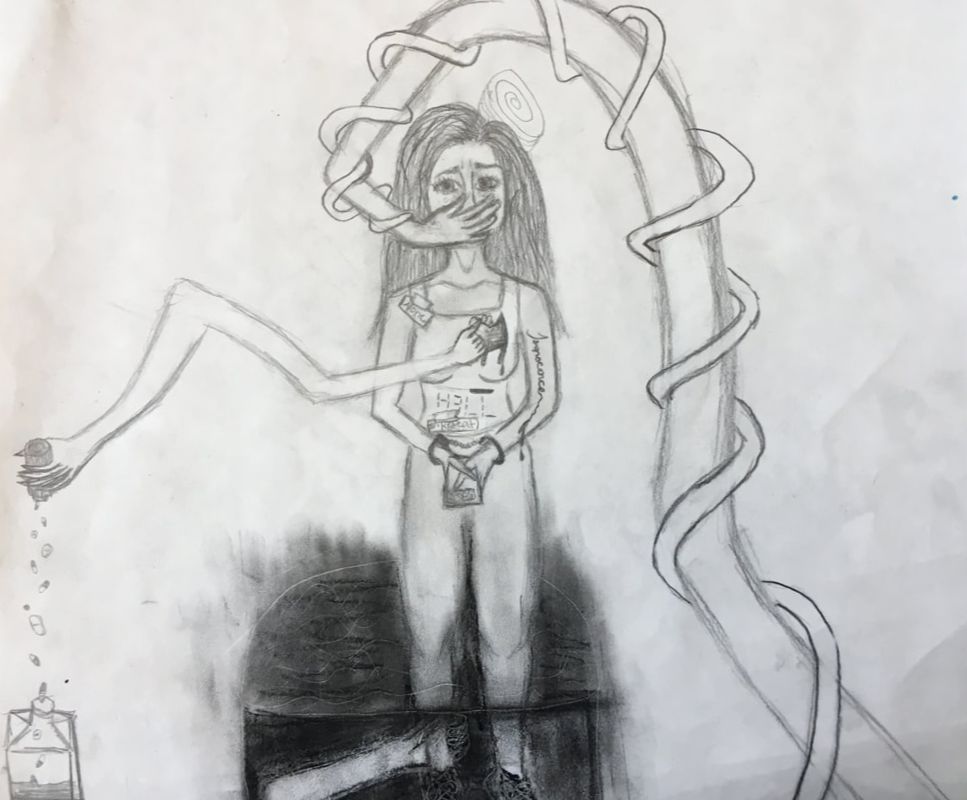
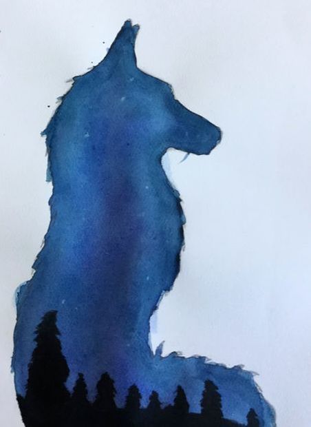
My first independent piece shows the earth as if from space, with cracks like broken glass spreading from the center. I drew it with Prismacolor colored pencils on black construction paper. There are so many things that are broken about the world. Politics, the environment--it can be very disheartening at times, and that is what this piece represents to me. I try to be hopeful, but sometimes it can be hard to remain optimistic in the face of all the bad news we are pummeled with every day. We have to overcome our fears and doubts and work together, hard as it may seem, to fix things before it is too late.
|
|
|
|
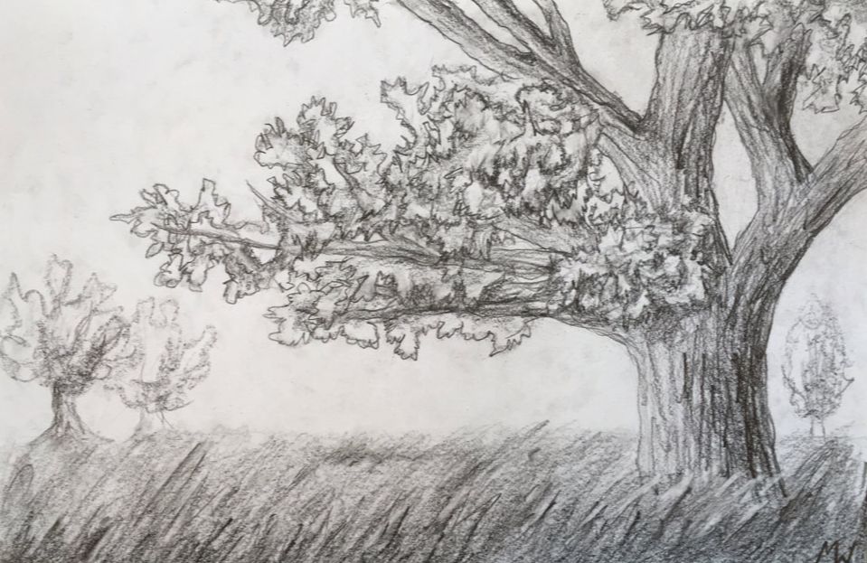
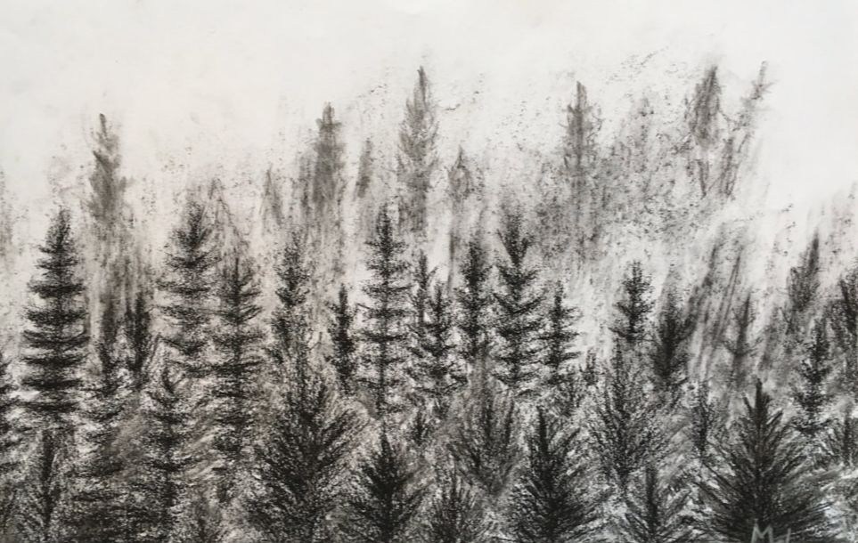
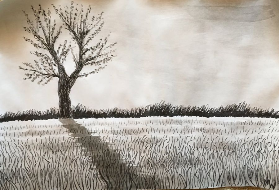
My second independent piece(s) are a triptych of drawings, each depicting a different tree or trees. The first, in graphite, shows a large tree in a field of long grass. I tried to capture the texture of the bark and leaves with loose and quick strokes. The second, made with charcoal, shows a forest of pine trees fading into the fog. The fog was the most interesting part to create, smudging the charcoal with gum erasers and fingertips. The third, for which I used ink, mirrors the first, a single budding tree in a field, casting a long shadow over the grass. I used both pens and brushes for this piece, outlining the grass and tree branches with dark pen lines and using ink was with a soft brush to shade the sky, grass, and buds on the tree. These three works were an exercise in different media, and I learned a lot from creating them.
Madeleine
|
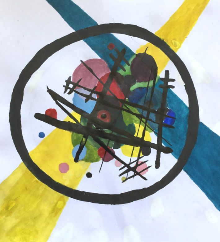
For my Masterwork, I replicated Circles in a Circle by Wassily Kandinsky. I first started it doing watercolor on wood, but I started over because I thought I could do better and did it instead on paper. I learned from my first draft of the artwork that you need to find the right balance between the watercolor and the water, because if it's too watery, it will bleed everywhere.
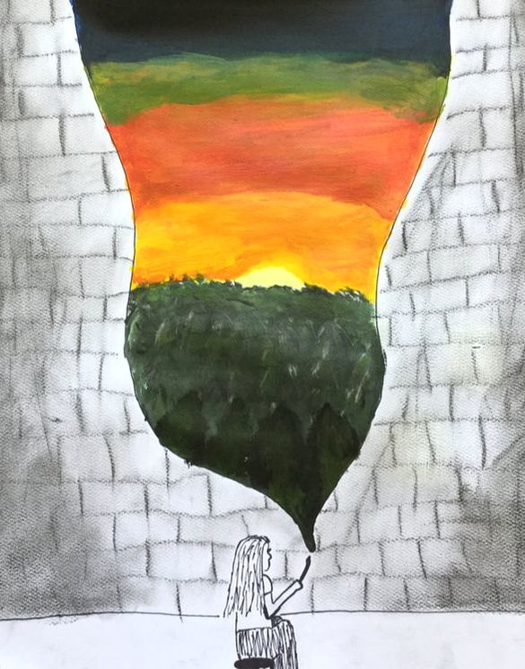
For my first independent, I made A Girl Painting. Its acrylic, charcoal and sharpie on paper. It's of a girl painting a dark, brick, wall with a bright sunset. The light in the painting is coming from the sunset. I learned while making this piece that multiple thin layers of paint are better than one thick layer. I learned that you shouldn’t stop before you are completely happy with your art, because you can always make it better. I'm really happy with the way this project turned out. For my second independent, I drew Albert on the Beach. It’s a drawing of a turtle (Albert) sitting on the beach. It’s marker on paper. I drew him on the beach because it seemed so ridiculous, and it just kind of fit the picture. I learned while making this that in a lake, the farther out you get, the rougher you should draw the waves. I also learned how to make “cute eyes”. 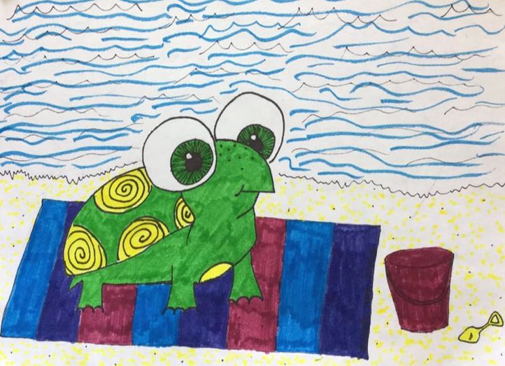
|
Chase
I am only in 2D art, and the thing I found most challenging was actually finding something that interested me. I am very picky about my art, especially when I use a reference. Another thing I found difficult was keeping myself from painting the tiny details first on my mural. I usually focus on the tiniest details first, and then go on to the larger details, especially when I draw.
I decided to make something that might have meaning when you think about it (I'm not sure if it will here, but I feel like it will to some people). I used pencil, marker, and sharpie to make this. I made it because I found a picture on the internet that I wanted to try and replicate, but also add my own twist to it, because copying art completely is boring and also possibly illegal (unless you don't publish it and claim it as your own). I also cut the original drawing out and glued it to the paper.
|
Once again, I chose something from the internet. I added my own twist, changing the hair, skin color, clothing, and color scheme. I used pencil, thick sharpie, and colored pencils to create this artwork. I struggled a bit with the bottom two colors because I accidentally used the same type of purple, so I had to color over the middle one with blue. It looks alright, but I still think that it looks at little strange.
|
Michael
|
|
Elizabeth
This quarter, when I got my schedule, I was excited to see that I got an Art class. I wasn’t very good, but I enjoyed it and thought it would be fun to do. There were a lot of problems and mess-ups, but I’m overall glad I got this class and excited I got this experience.
Masterwork Recreation
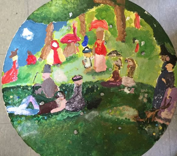
For my Masterwork, I chose the Painting A Sunday Afternoon on the Isle of La Grande Jatte, by Georges Seurat. It shows a scene of many people sitting, standing, and playing on a waterfront. I chose to paint this on an Art Room stool, that had been painted on a couple years prior. The paint was chipping, and it had been there for years. I repainted it, with some very thin Acrylic Paint. I did some research on A Sunday Afternoon, and it was painted in 1884-1886. La Grande Jatte is in France, where Seurat lived and worked for most of his life. This piece was EXTREMELY hard to recreate. It took tons of effort, time, and paint. I was constantly repainting. I am not 100% pleased with how mine turned out, but at least I can be glad that I’m done, and that I learned something for next time.
For my Masterwork, I chose the Painting A Sunday Afternoon on the Isle of La Grande Jatte, by Georges Seurat. It shows a scene of many people sitting, standing, and playing on a waterfront. I chose to paint this on an Art Room stool, that had been painted on a couple years prior. The paint was chipping, and it had been there for years. I repainted it, with some very thin Acrylic Paint. I did some research on A Sunday Afternoon, and it was painted in 1884-1886. La Grande Jatte is in France, where Seurat lived and worked for most of his life. This piece was EXTREMELY hard to recreate. It took tons of effort, time, and paint. I was constantly repainting. I am not 100% pleased with how mine turned out, but at least I can be glad that I’m done, and that I learned something for next time.
Independent Piece
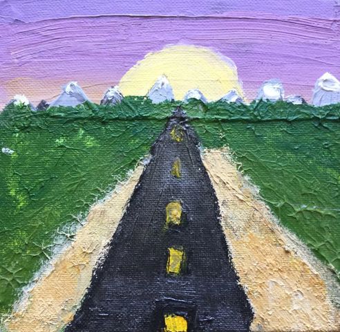
For my Independance piece, it didn’t take long to find inspiration. I knew I wanted to do something with a vanishing point, so I ended up drawing a road, with mountains, and a sunset. It has a very beautiful background, and everything leads to one spot. To make this piece, I used Artist quality Acrylic paint to really capture the texture I was looking for. It required a lot of mixing paint, but I think in the end it was an excellent choice that took the art to the next level. Some goals I had for this art was to really pay attention to detail, while at the same time, I wanted to let it flow free and be slightly abstract, especially the sunset. I feel like my piece really did exceed what I had in mind and when I was first sketching it out. I think that it was also good practice for other pieces I make in the future.
For my Independance piece, it didn’t take long to find inspiration. I knew I wanted to do something with a vanishing point, so I ended up drawing a road, with mountains, and a sunset. It has a very beautiful background, and everything leads to one spot. To make this piece, I used Artist quality Acrylic paint to really capture the texture I was looking for. It required a lot of mixing paint, but I think in the end it was an excellent choice that took the art to the next level. Some goals I had for this art was to really pay attention to detail, while at the same time, I wanted to let it flow free and be slightly abstract, especially the sunset. I feel like my piece really did exceed what I had in mind and when I was first sketching it out. I think that it was also good practice for other pieces I make in the future.
Conclusion
In the end, I am so glad that I took this course and got to learn so much, there were many problems, but I worked them out and learned new techniques along with new skills.
In the end, I am so glad that I took this course and got to learn so much, there were many problems, but I worked them out and learned new techniques along with new skills.
Tate
This 9-week quarter, we were required to do two pieces of art; a recreation of famous paintings, and an independent piece. The pieces were very hard to complete in only 9 weeks, especially my masterwork recreation.
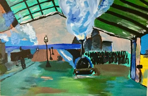
I did my masterwork recreation on Arrival of the Normandy Train, Gare Saint-Lazare by Claude Monet. It was painted in 1877 with oil paint on a canvas. I did my recreation with acrylic paint on the wall. It is an impressionist painting of Gare Saint-Lazare Station in France. This piece was very hard to recreate, and took about 25 days to paint. I learned how to blend the paints on the wall using a special technique.
I did my masterwork recreation on Arrival of the Normandy Train, Gare Saint-Lazare by Claude Monet. It was painted in 1877 with oil paint on a canvas. I did my recreation with acrylic paint on the wall. It is an impressionist painting of Gare Saint-Lazare Station in France. This piece was very hard to recreate, and took about 25 days to paint. I learned how to blend the paints on the wall using a special technique.
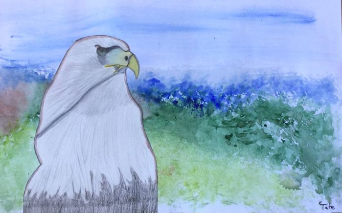
My independent piece is of an eagle with a background of an aerial view of trees. The title of my piece is “Eye of the Eagle”. I used colored pencil for the eagle, and watercolor for the background. I learned how to blend colored pencil from making this piece. I also learned a technique for making a light layer of watercolor.
Overall, I think that art was very fun this quarter. I learned a lot of blending techniques. I learned more in depth about how to use the 3 mediums that I used in my artwork. Acrylic paint was the hardest to get what you wanted out of it. I liked working with colored pencil the best because it is semi-erasable, so I can start over in some parts if I need to.
