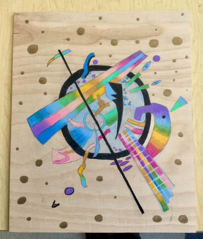
Students in the Fall 2017 3-D Art Elective began by either choosing a masterwork to replicate or a 3-D media to explore.
Modeled after apprenticeship practices, their goal was to get inside the head of a successful artist and learn through emulation of methods, materials, and techniques. Alongside this goal, most students were to create one or two independent works of art depending on the complexity of their project and if they were in 7th or 8th grade. Lastly, a course conclusion paper reflecting on what was accomplished, created, and learned.
Modeled after apprenticeship practices, their goal was to get inside the head of a successful artist and learn through emulation of methods, materials, and techniques. Alongside this goal, most students were to create one or two independent works of art depending on the complexity of their project and if they were in 7th or 8th grade. Lastly, a course conclusion paper reflecting on what was accomplished, created, and learned.
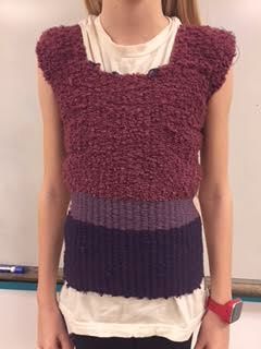
Felicity
|
Over the last 9 weeks, I’ve dedicated each art class to something that I’ve had little to no experience with before: Weaving and hand stitching. I chose to make a wearable shirt with a handmade loom using 3 different types of yarn, something that proved to be much more time-consuming than I initially thought. I began by making the loom, making a rectangle of posterboard and cutting about 30 slits in the top and bottom of it. I then strung yarn through the slits vertically and tied it off at the end. The weaving pattern I used was simple: over, under, over, under. I probably wove a couple hundred rows in total. When I was done, I took it off the loom by cutting the vertical strings of yarn and tying them off at both ends.
For the stitching I chose to use the blanket stitch. I haven’t done very much hand stitching in the past but I think this was a pretty successful first attempt. Overall I’m quite happy with the final result. Throughout this process there were many points where I was unsure of how well it was going to turn out. There are a lot of little imperfections in this piece, but I think it turned out pretty well. |
|
Wade
My only piece for 3D is what is known as a ‘Soundsuit,’ inspired by soundsuits made by Nick Cave, who has made dozens of the large colorful costumes. The soundsuits are called soundsuits because when they are being worn they make interesting swooshing, clicking, ringing, clanking, or thudding sounds. My soundsuit has two pieces, the head and the shouldery bit, the head is a head-shaped wire frame covered in marker caps, which dangle and click around when I move. The shouldery bit is also a wire frame, but it only has three marker caps dangling off it, it does, however have six square plates dangling down over the chest that clank around, and three long strings of marker caps on the back, which swing and tangle. I’m not completely done with the Soundsuit, so I’m going to work on it during lunch next quarter.
Mark
|
Nola
|
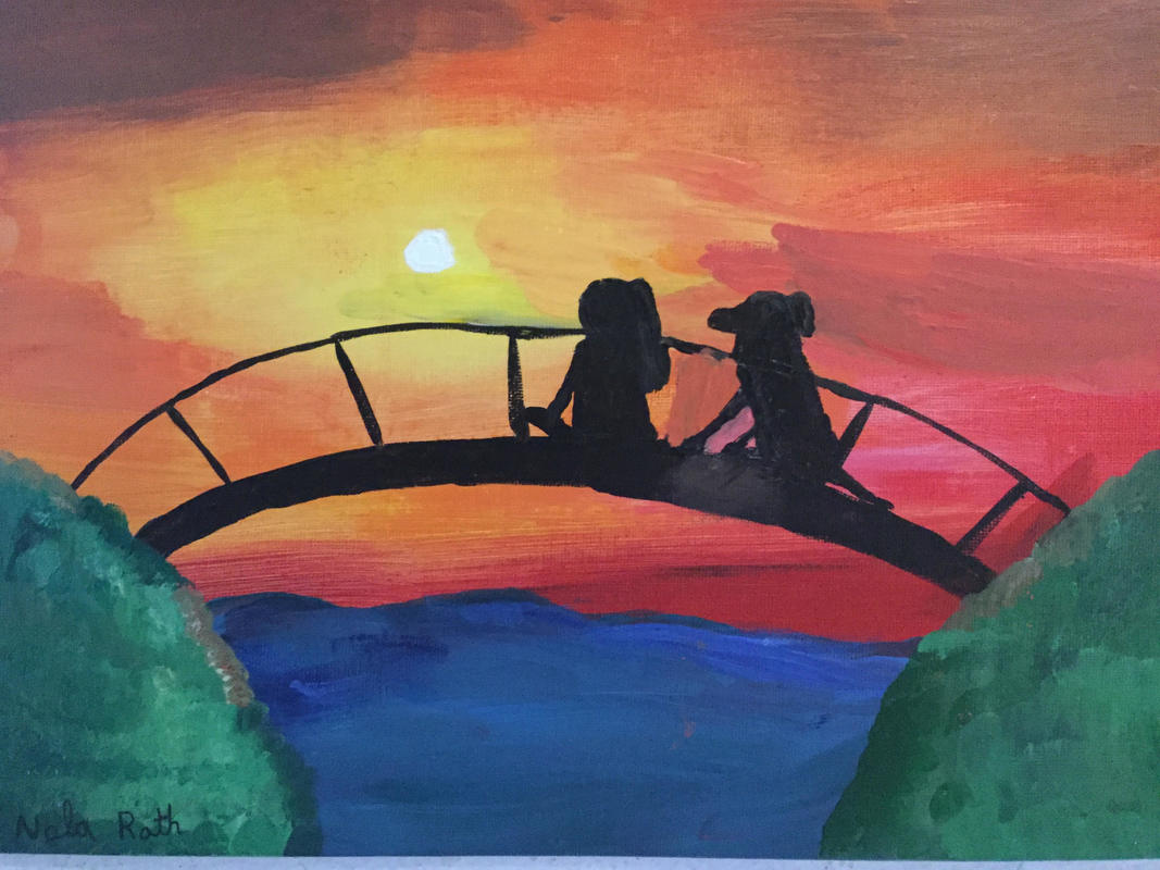
I have two independent pieces of art that I created. The first isn't a 3D piece. It is a painting of a girl and her dog sitting on a bridge, watching the sunset. I painted this at home for Deb, and it was counted, because I made it during the quarter. I named my piece “A Perfect Sunset”. Almost all my paintings have grass in them, and I really like to paint grass.(I’m a weirdo). I have always been a dog person, so I wanted to paint the relationship between a girl and her dog. I didn't have many goals for this art, I just started painting. One problem I ran into, was the dogs legs, and you can see it in the paint. I learned that dog legs need to be thicker, and then get smaller, so they don't look like horse legs. The second piece is a mix between embroidery, and paint. At first I started to make the piece Sloth, by Danielle Clough. It was beyond my skill level by a mile, so I went with something more simple. It is a pink sheep made of the FRENCH KNOT stitch. Note that this is something I learned how to do. I put orange paint around an embroidered sun. Thank you for reading! |
|
Gillian
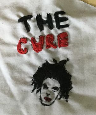
My artwork is an embroidery piece done in black in red thread on white fabric. I embroidered Robert Smith’s face and the words “The Cure” on it.
It's made from red and black embroidery floss and white scrap fabric. I used embroidery stitches as my techniques.
My art was inspired by my favorite singer, Robert Smith. His face and band are the focus of my art. I tried to show a slightly bleak emotion by only using black and red thread.
My goals for this artwork were to finish it, and to have his hair look nice. I reached both of those goals, but I think I could have set higher ones. My goals as an artist are to improve, and for this quarter, learn to embroider. I met those goals too.
I learned quite a lot from making this art project. I learned to embroider, use color wisely, and how to be neater and more responsible in my art classes. The final piece actually looks a lot like my subject and how I imagined my art to turn out in the end. This piece will influence my future artworks when I do more embroidery and further develop my techniques.
Julia
Clay Bowl
For my first independent project I made a pretty standard clay bowl. I started my bowl by making a pinch pot, when I started my bowl I was originally going to make a plate, but soon enough I realized that I hadn’t grabbed enough clay. Deb showed me a bowl she made where she had melted glass into the bottom of the bowl so I tried to use that as an inspiration when I used clear and light blue pieces of glass. I glazed my bowl with the color redwood, it is a dark red with tints of pink and purple. With this project my goal was to try and make the glaze as even as possible, so I used thicker layers of glaze and it seemed to work. 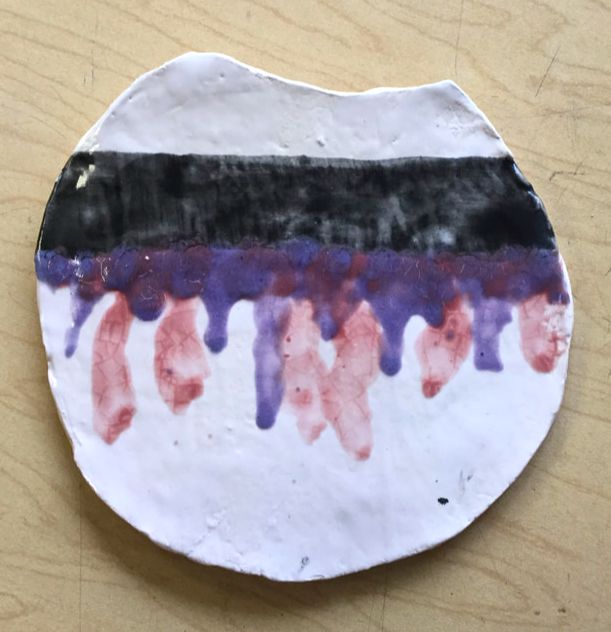
|
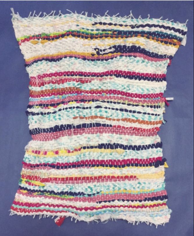
Rug weaving
Madeleine, Avani, Elie, and I worked together on a rug that we weaved using a wooden loom. For our rug we first started off cutting out many pieces of fabric into about two inch fabric strips, then we strung the fabrics through the loom with a repeating pattern of over, under, and when the fabric ran out we would knot the current fabric with a new fabric. We used a lot of different colored fabrics that also had different textures. My goals for this project were to make a rug that could function, and actually be used as a rug in a home. Overall, I think we did a good job with the time limit that we had, the piece resembles what my original vision was of the rug. 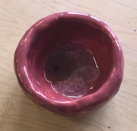
Flat dripping project
My inspiration for this project came from a piece of artwork that an elementary student made that I somehow fell upon. They had made a cup with a white base, and the inner part of the cup had melted glaze falling down the sides in a swirl pattern. I tried to mimic that by having my glaze dripping down, but for mine it didn’t turn out looking like the cup. This whole project was just an experiment to see how closely I could make my piece resemble the cup, and now I know for next time what I can do to make it better. For this piece the glaze’s I used were snowy white (for the base), black (stripe), redwood, and a blue color for the dripping pattern. |
Madeline
My first piece is a masterwork replication of Elizabeth Catlett’s “A Negro Woman”. It depicts a small bird sitting on a rock. I used cutting tools, and carved
the simple drawing. Then, I carved in texture like wavy lines in the rock, and the accent lines around the bird. I liked the way the bird was poised, and also the texture lines all around it. My goals for this piece were to accurately represent the original, and to have it print well on the first try, and I did the first one, but I had some slight changes to make with the carving on the outside.
The second piece I did is a carving of a Beatles album with the song “Nowhere Man” on it. It is carved on a rubber block. I used carving tools and first, I carved a border around the drawing of the record, then I carved the record and needle. After that, I carved a line pattern on the background. My big idea with this piece was to embody my love for Beatles music. (It’s amazing)! My goal was to get a good print out of it, and to have it look professional. Overall I thought that it turned out exactly as I planned, and I like it a lot.
Madeleine W.
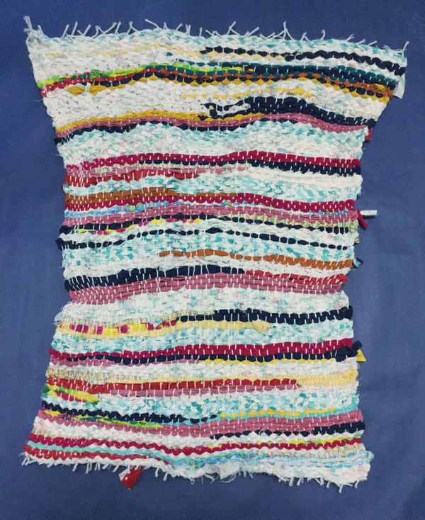
For my first project, I wove a rag rug with Julia, Avani, and Elie. It's made of fabric and yarn. During the process of making the rug I learned that if you have a long strand of fabric you just put the tip through while you're weaving and then at the end you pull it all through. I also learned that you shouldn't pull it tight at the ends because then it gets too tight. We accidentally pulled it really tight at the start so our rug is kind of in an hourglass shape, and the strings got way too close and made it harder to weave. To make that easier, you can weave it up higher where the strings are farther apart and then push it down. Also, when finishing it, we learned that you should tie all the yarn knots at the same tightness, so it's not uneven. I liked how this turned out.
|
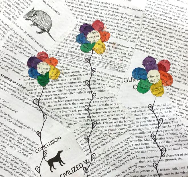
For my first independent, I made a collage made out of pages of old books. There are three flowers in the middle of it, and I painted the petals with watercolors to add color. I got this idea when I saw Anna carving a book. I used the circles that she carved for the flowers. I drew the stems for the flowers in sharpie. I like how it came out.
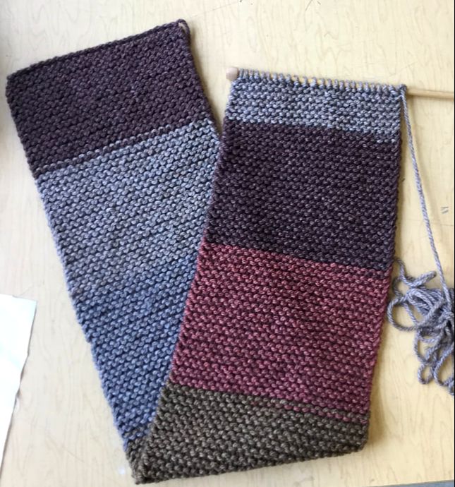
For my second independent, I’m knitting an infinity scarf. I'm making it using multicolored yarn. It's brown, grey, blue, light brown and pink. I'm knitting both ways. I'm not done with it yet, but I learned while making that if you're using thicker yarn, then it will go a lot faster, and that if you're using thick yarn then you should probably use thicker needles too. |
|
Keera
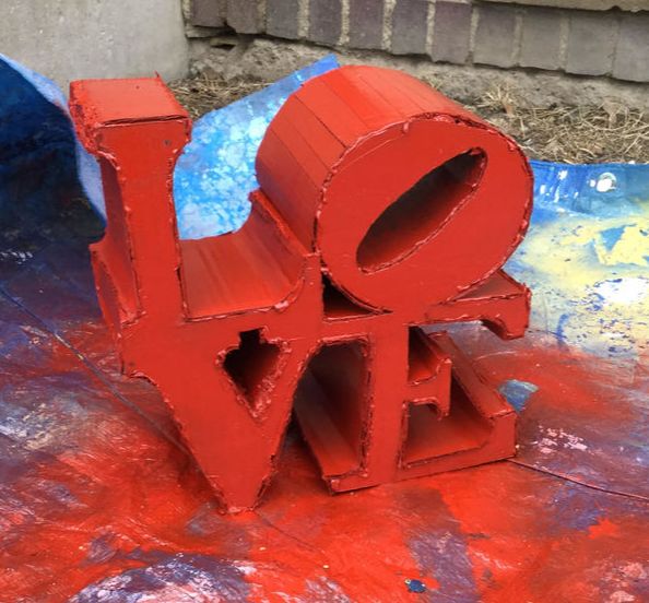
My piece of art is a replication of “Love” by Robert Indiana, a pop artist. Robert was born on Sep. 13th 1928, he lived in 21 different homes until he relocated to Indianapolis. My piece is the word “Love” six inches wide, six inches high and three inches deep. It is bright red and the “O” is tilted to make up for space. To create my piece I used hot glue to glue pieces of cardboard together into letters. To make the rounded parts I made slits in the cardboard to bend it without breaking it completely. Cutting the cardboard to the rounded parts was something I had never done before and it was surprisingly effective. I then spray-painted it red.
The idea revolving around my piece was to replicate the original “Love” by Robert Indiana. The original piece is 12 ft tall,12 ft wide and 6ft deep. My goal for this work of art was to create a scaled down replica of “Love”. I picked this piece because I thought is was really eye catching and cool to look at.
I think that the final product came out pretty well. Though I wish I had planned my time out better. I barely finished in time and ended up spray painting it one day before it was due. When I was making this I learned to manage time better and will probably end up using this skill in future projects.
Willow
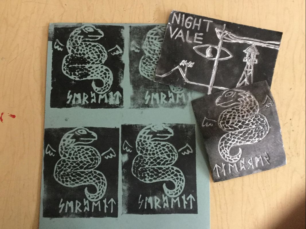
My artwork is two foam stamps I made. One Is the theme picture for Night Vale, and the other has a picture of a serpent and it says “serpent” on it in Nordic Runes. I mostly just did it because even though I was in 3-D art, I really like drawing. I drew the picture on, then wrote the letters. I also found out, that you if you write something on the stamp, it has to be backwards so l kinda messed up on the Night Vale one.
I still think it came out cool.
My inspiration was just that I like Night Vale, so I thought I would be fun to do a print of it, and I recently learned how to write in Runes, and I wanted to do something with that. And when I think of Nordic things I think of folktales and medieval beasts, so I did a serpent. I also originally was going to do a dragon, but it was two complicated and I didn’t to know how well it would print.
Overall I think I like how it came out, but I need to work on the actual printing part. For supplies I just used paper, styrofoam paper, a roller and board for printing, and screen printing ink.
Ava T
|
I used an improvised running stitch to create my artwork. Titled “Anchor”, which depicts a broken anchor lying in the sand. Several stitches had snapped as a result of the string getting tangled in a zipper. Once I had cut the thread free, my artwork had fallen apart. Hence the “broken”.
I like drawing sketches depicting abstract faces and items. I enjoyed the idea of creating an embroidered version of my art, and I set to work. |
|
My second piece is called “Anise”. Inspired by the warm, snowflake appearance, I immortalized it in fabric. I also included a short list of other possible interpretations. Again, I used an improvised stitch. I actually started this piece last quarter, but failed to acknowledge its existence. I take pride in this piece as I managed to write words! Next to the Ant Finger Carpet (featured last quarter), Anise is my favorite piece.
Ava L.
This quarter, I was in both 3D and 2D art classes. I think this quarter really just proved that 3D art isn’t necessarily one of my strong suits. Although the art I produced wasn’t great, I still had a very fun time in art, and am looking forward to trying more 3-D art in the future.
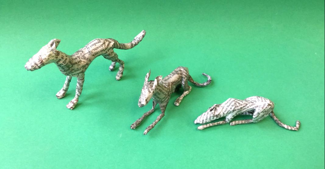
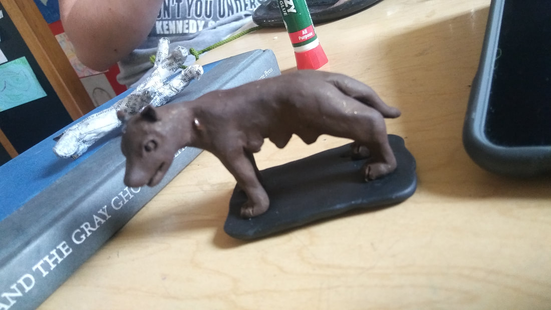
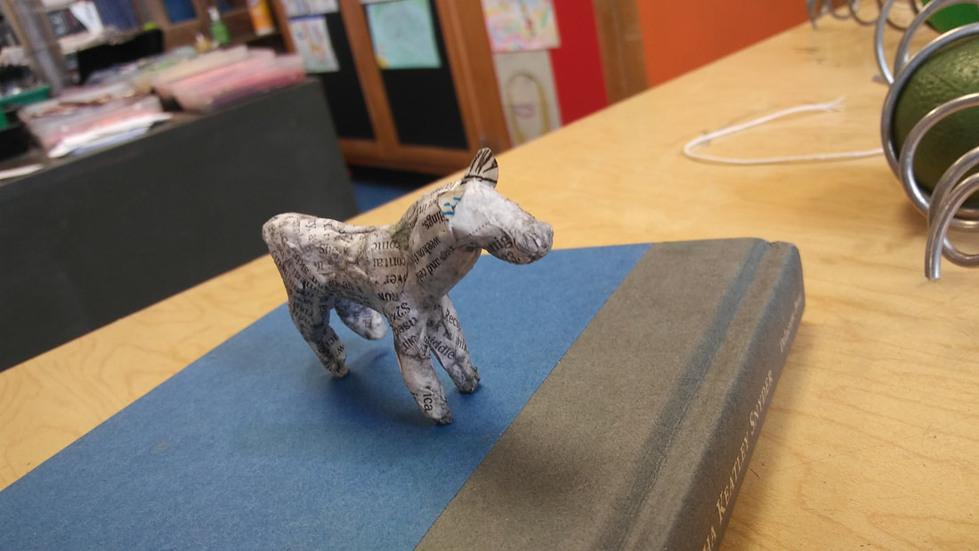
Instead of doing one masterwork piece and two independent pieces, I was allowed to continue adding to my masterwork for this quarter. The works that I chose to replicate were Lorraine Corrigan’s papier-mâché dog sculptures. I stumbled upon Lorraine Corrigan as I was helplessly searching the internet for art ideas. She is based out of RhydLewis, Wales, and she primarily creates sighthounds out of papier-mâché. All of the paper that she uses comes from recycled or vintage books. She starts out with a wire frame, and then build up the body with the paper, and finally seals it with a glaze to protect them from aging or yellowing.
Sighthounds are a category of dog breeds, which are bred to be very quick, nimble, and agile for hunting very fast animals. They have been bred to have deep chests, long legs, and a very thin build. Some examples of sighthounds include greyhounds, borzois, whippets, Irish wolfhounds, and salukis.
The bodies of my dogs related closely to a greyhound’s, but the head shapes are much closer to a borzoi’s. I created three different doggos, one standing upright, one laying down, and one sleeping. I started out by making the spine of the dogs with wire, and then adding feature like the legs and tail. I built this frame up with aluminum foil, then added layers of newspaper to the outside. I used newspaper instead of books pages, because the newspaper was thinner and easier to sculpt around the frame.
I had a couple issues about halfway through the project. I made the standing dog first, and I guess I had lost that particular piece of newspaper. When I tried to make my second dog, I found that the text bled a lot more than the first. After it dried, it ended up looking pretty gross and grey. I also entirely forgot what a dog looks like for the last one. I really have no clue what I was thinking, and I made the frame of the dog (that was supposed to be sleeping) with the body raised off the ground. Although often times these dogs do have their body off the ground when laying down, it would never be to the extent that i made. Also his head looks like a donkey.
Although my dogs really aren’t the prettiest, I did have fun making them, and glad that I chose this as my project. I think practicing 3D art really helped me to understand shape and anatomy a lot more than 2D art. Instead of just a flat drawing, you need to understand what the actual animal would look like from every angle. I think that this was a great way to help learn how to turn what you see into art, and I think I learned a lot this quarter.
Duncan

For my masterwork I chose to make a sculpture in the style of Louise Nevelson. Nevelson’s sculptures are always monochromatic found objects often arranged in boxes. Most of her works are black but some are other colors, such as white or yellow. For my sculpture, most of the elements were small wooden things found around my house which were cut to fit inside the box and spray painted. At the start of the quarter, I had chosen to make a piece of book art, but that was not a great choice because it was such slow work, and wasn’t really showing any signs of progress.
|
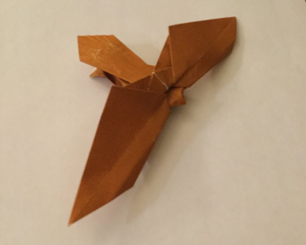
For my individual piece, I designed my own origami bird of prey. Since I didn’t have any instructions for it, it was kind of hard to recreate the piece, but it often worked out. The hardest part of making this piece was getting the tail to look good. Since the folds are so small, it was hard to get the lines straight without ripping the paper.
For my second individual piece, I collaborated with Ian Taylor to make a mobile. The mobile is made up of several spirals of wire with a round object in the middle. Ian made the first spiral, and the effect of it spinning made the object in it look like it was rolling up or down in midair. After that, we made more of the spirals and attached them all to a piece of wire so that they could spin.
|
Anabelle
|
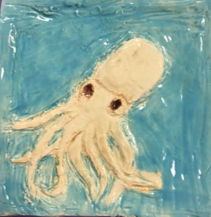
In 3d art I made a sculpture relief title, I was originally going to make a ocean scene with multiple people but that didn't work out. Sculpture relief title is a sculptural technique where the sculpted elements stay connected to a solid background of the same material. Instead I made a brownish octopus swimming in light blue water. It took me awhile to get the right shape of the title, I made a 6in by 6in square. Before I craved the octopus into the clay I sketched it out on a piece of paper with a pencil, and then craved the octopus onto it.
|
|
Anna
|
|
|
Ilana
|
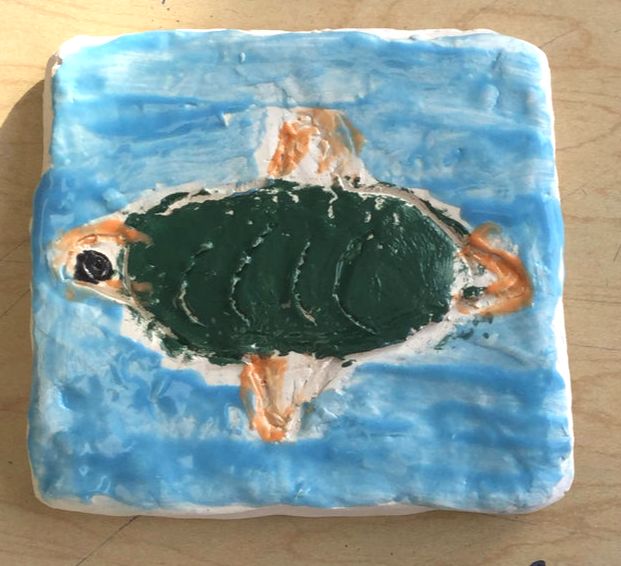
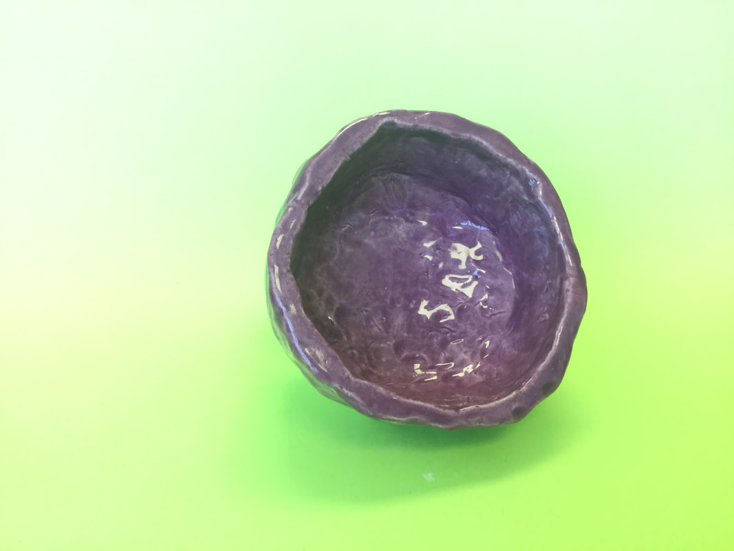
My piece is a tile made out of clay, in which I carved a butterfly into, and then glazed. To create this piece I made a tile out of clay, and then I carved a butterfly into it with a metal tool. Then, I glazed it in light blue, dark blue, and pink. I left part of it white. The big idea was to make a tile with something on it, eventually I gave up and decided to just make an easy butterfly. My goal was to make a tile with something more complex than what I ended up doing, but I still finished at least. Overall thoughts are that I could have probably done better, but at least I finished it in time! |
Andreas
I made a sculptural relief tile. I called my tile Dead Squid. I used clay and flattened it out with the ribbon. As it was in the green dry stage, I set my tile a little too hard and it broke. I out the two pieces on a wooden slab, and painted the rest. I was originally working with a group, but it turned out that it didn't work out so well, so we stopped and split off into our own tiles. This piece turned out a lot different then I imagined, mostly due to the fact that it broke in half, but overall I am happy with the result.
Daniel
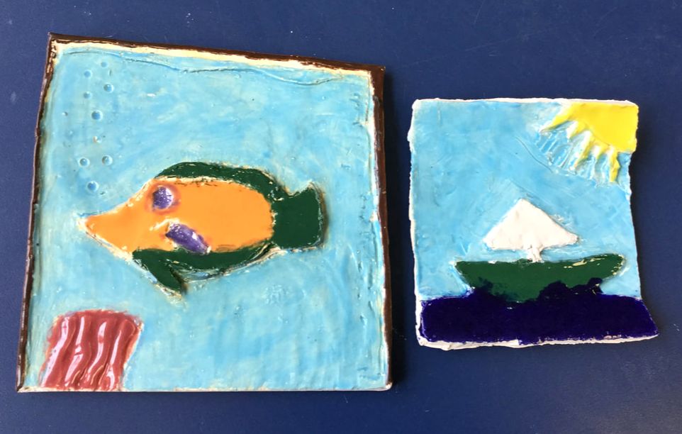
I made two tiles, both with a theme of an Ocean. One of my tiles was of a fish and the other was a scene of a boat and the sun. I made both out of clay and then glazed both of them. I carved my tile with a ribbon tool and it took about three classes for my first tile and one class for my second. I based my first tile on a picture of a fish from the ocean. With these tile is wanted to learn more about clay and create something vibrant and nice. I think that these two pieces turned out better than I expected and I learn quite a bit about how to carve and glaze clay.
Mitch
Avani
Madeleine, Julia, Elie, and I weaved a rug (pictured above). Originally we were going to make bowls by weaving and crocheting with strips of fabric that we cut but it turned out to take a very long time so we decided to use the fabric to make a rug instead. After we cut the fabric we restrung the loom with white yarn. Then, we weaved various strips of fabric and when the fabric got short we would tie on another piece. When we finished weaving we cut the yarn and tied it in groups of two or three. We decided to put all the knots from where we tied the fabric on the same side. We also tried to not use the same color fabric next to each other. I think it turned out pretty good but since we pulled it too tight it got an hourglass shape.
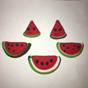
For my independent I used polymer clay to make slices of watermelon. I tried various methods of making the rind. I tried adding a texture on some. I used white, light green, and dark green in thin layers to try to get the effect of color changing. I used red clay to make the inside of the melon. I added seeds and faces on some with black clay. I also tried making the slices different sizes. Then I baked them in the oven. I like how it turned out.
For my independent I used polymer clay to make slices of watermelon. I tried various methods of making the rind. I tried adding a texture on some. I used white, light green, and dark green in thin layers to try to get the effect of color changing. I used red clay to make the inside of the melon. I added seeds and faces on some with black clay. I also tried making the slices different sizes. Then I baked them in the oven. I like how it turned out.
Alice
For my master work I made a recreation of the statue Lupa Capitolina. My wolf is made from polymer clay and has an armature made of wire. The actual statue is located in the Capitoline Museum in Rome, Italy and is made out of bronze. The statue is also referred to as the Capitoline Wolf. Lupa Capitolina was made in the 11th or 12th century and the twins were added later in the 15th century. The stature is based off of the Roman wolf goddess Lupa and the two founders of Rome: Romulus and Remus. In my artwork I only made Lupa and did not make the twins because the wolf was made first and also I just didn't want to ruin the art with two screaming babies. The story of Romulus and Remus comes from the Roman legend about how Rome was founded. We do know that the twins did exist but no one can be sure whether they were actually descendants of the king or just two ambitious young men
The myth of Romulus and Remus began in a town near what is now Rome. The king of the town was murdered by his brother making him the new king. The new king was so scared of being overthrown he forced his dead brothers daughter to become a Vestal Virgin so she could not have children. But Mars the god of war took notice of her and soon enough she gave birth to two twin boys; Romulus and Remus. The king was furious and decided to do the most reasonable thing possible; to put the two babies into a basket and throw them into the river. This plan failed because a wolf ( Lupa who was later considered a Roman goddess) found the two abandoned babies and nurtured them until a farmer found twin boys and decided to raise them as his own. The twins grew up and founded the legendary city of Rome.
The myth of Romulus and Remus began in a town near what is now Rome. The king of the town was murdered by his brother making him the new king. The new king was so scared of being overthrown he forced his dead brothers daughter to become a Vestal Virgin so she could not have children. But Mars the god of war took notice of her and soon enough she gave birth to two twin boys; Romulus and Remus. The king was furious and decided to do the most reasonable thing possible; to put the two babies into a basket and throw them into the river. This plan failed because a wolf ( Lupa who was later considered a Roman goddess) found the two abandoned babies and nurtured them until a farmer found twin boys and decided to raise them as his own. The twins grew up and founded the legendary city of Rome.
For my second independent I made a fox out of paper mache with an armature from wire and foil. The fox is inspired by artist Lorraine Corrigan who mostly makes paper mache greyhounds. I got the idea from my friend who recreated her greyhounds. I decided to make a fox because they are one of my favorite animals and I like making them from polymer clay so I decided to make one from paper mache. The fox was a bit tricky to make because the mod podge and the paper where hard to work with because it would not stick. I also had some trouble because foxes have strange body proportions and giant tails. I think working with paper mache is an interesting material because you turn something more 2 dimensional into a 3-D piece.
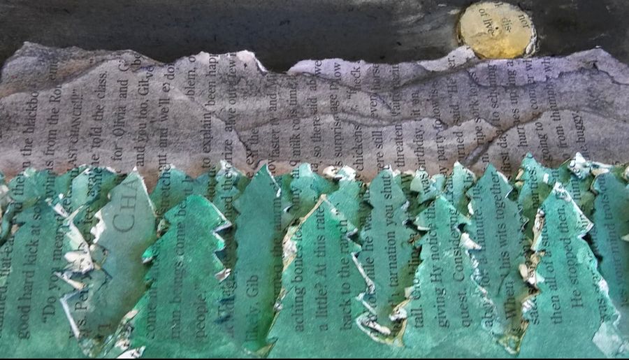
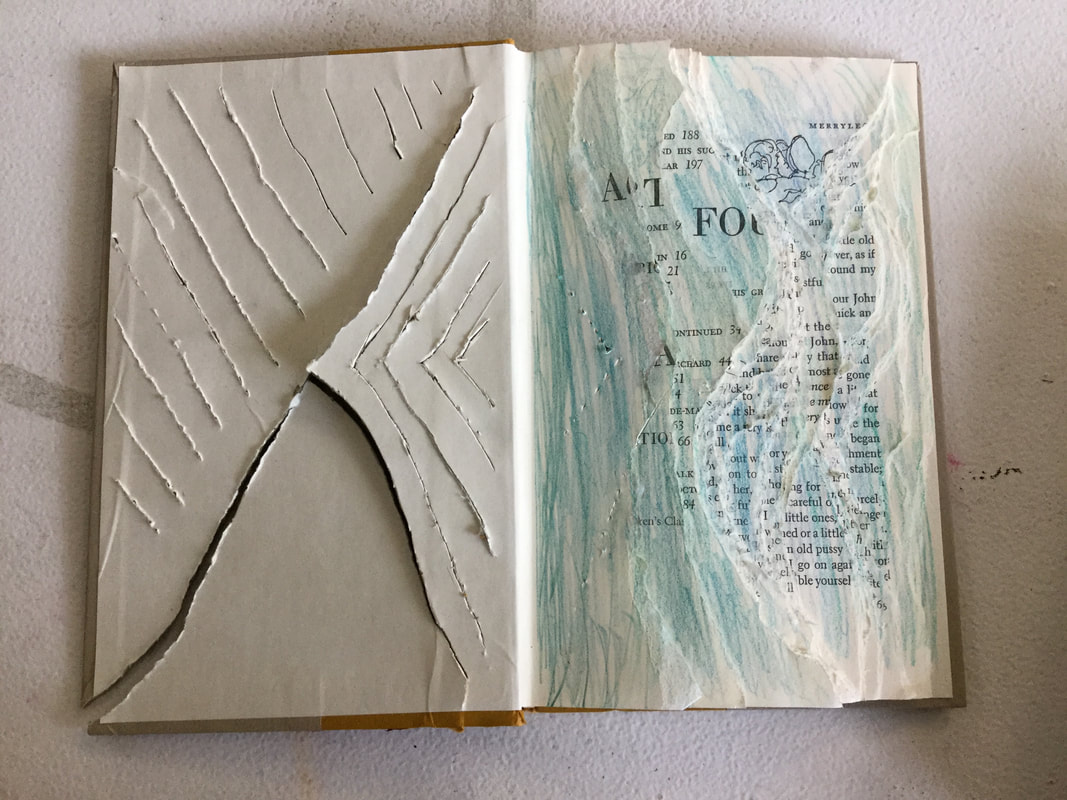
For my first independent I made a book carving out of an old book and an exacto knife. I got this idea from other students and artworks I have seen. When you open the book you see a landscape of a forest behind which are some mountain. I added a moon onto the night sky of the scene by drowning a stack of paper circles in some mod podge. I then painted the papers with watercolor so you could still see the words. Im am not very happy with how this turned out. It was messy,kinda boring and I did not use the volume of the book well. Overall book carving was something completely new to me and I do think that with practice and effort I could create something better and more creative.
Ian
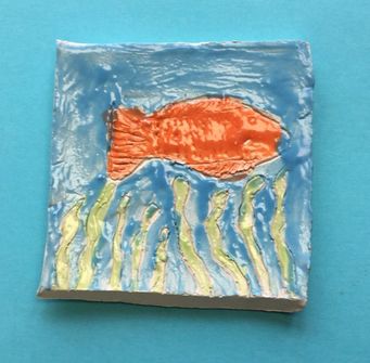
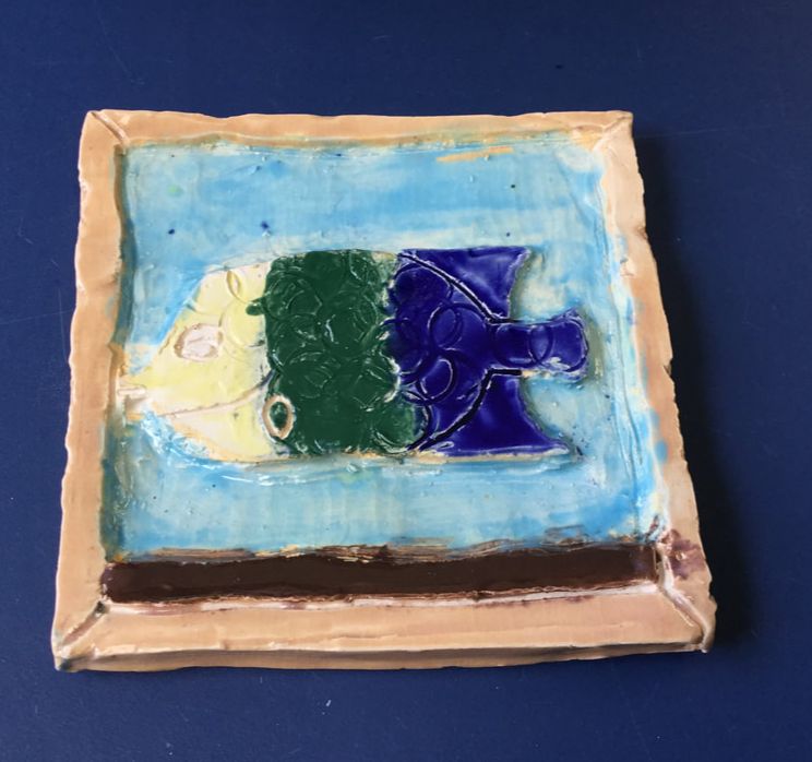
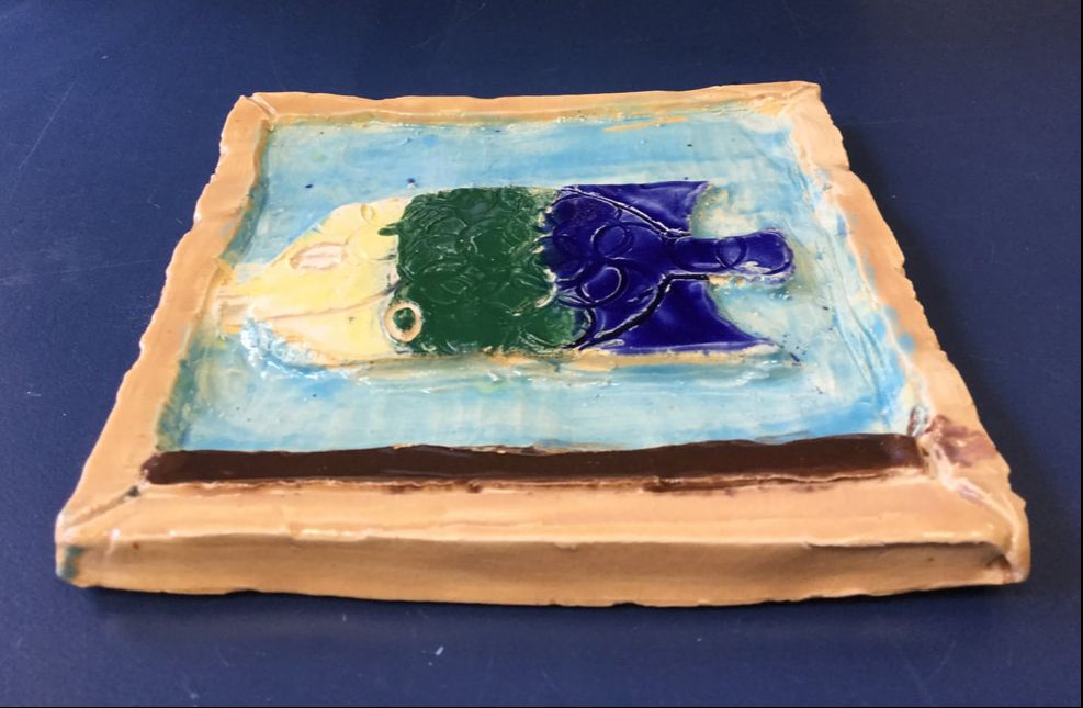
My first piece was a yellow, green and blue fish in some water with a frame. I made it by rolling out a piece of clay and cutting out a square. Then I traced out a fish and used a ribbon tool where the water was to shrink it down. I was inspired because originally everyone doing a stress relief tile were doing a water animal theme and then we split up and I stuck with the idea. My goals for this piece were to create something out of clay that I hadn’t done before. The original piece was a seahorse but I didn’t think it looked good so I decided to go with a fish instead
|
|
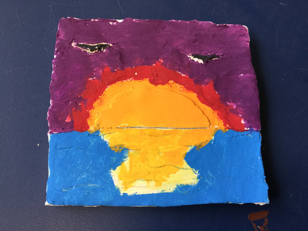
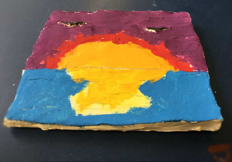
My second piece is a sunset with some birds flying overhead. I created it by making a square just like my first piece, and tracing the sun and birds. Then I used the ribbon tool again on the sky. I got the idea because for multicultural fair we made a big mural that was a sunset so I wanted to do one too. My goals were to make a nice looking sunset with some birds flying overhead. I liked how it ended up except I wish I had more time so I could’ve used glaze.
|
|
Jack
Fiona
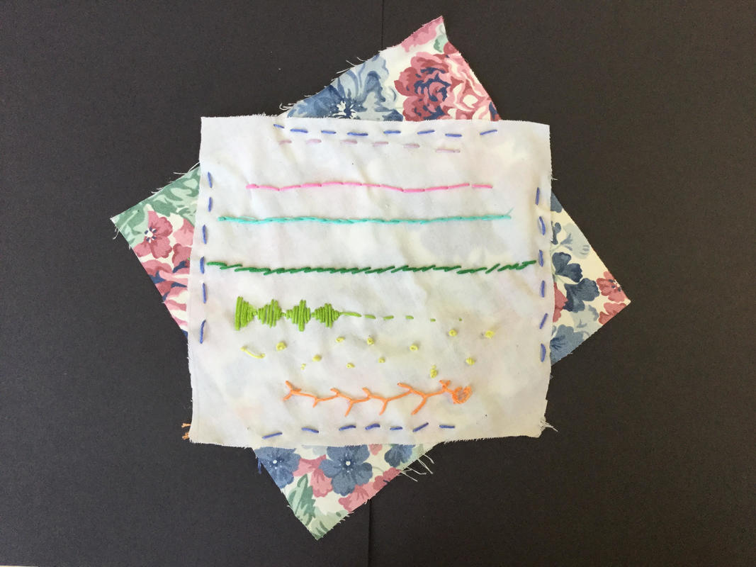
For this quarter, my focus in three dimensional art was embroidery. In place of a masterwork, I did a sort of “study” which was seven basic embroidery stitches in different colors. My intent was only to learn the basic stitches. It was kind of simple but later I stitched the cloth with the stitches onto another patterned cloth to create a sort of asymmetrical border. Although this was more practice then actual art, it still looks ok and I did learn a lot of useful stitches from it. Overall, I enjoyed making it and I like the result.
|
|
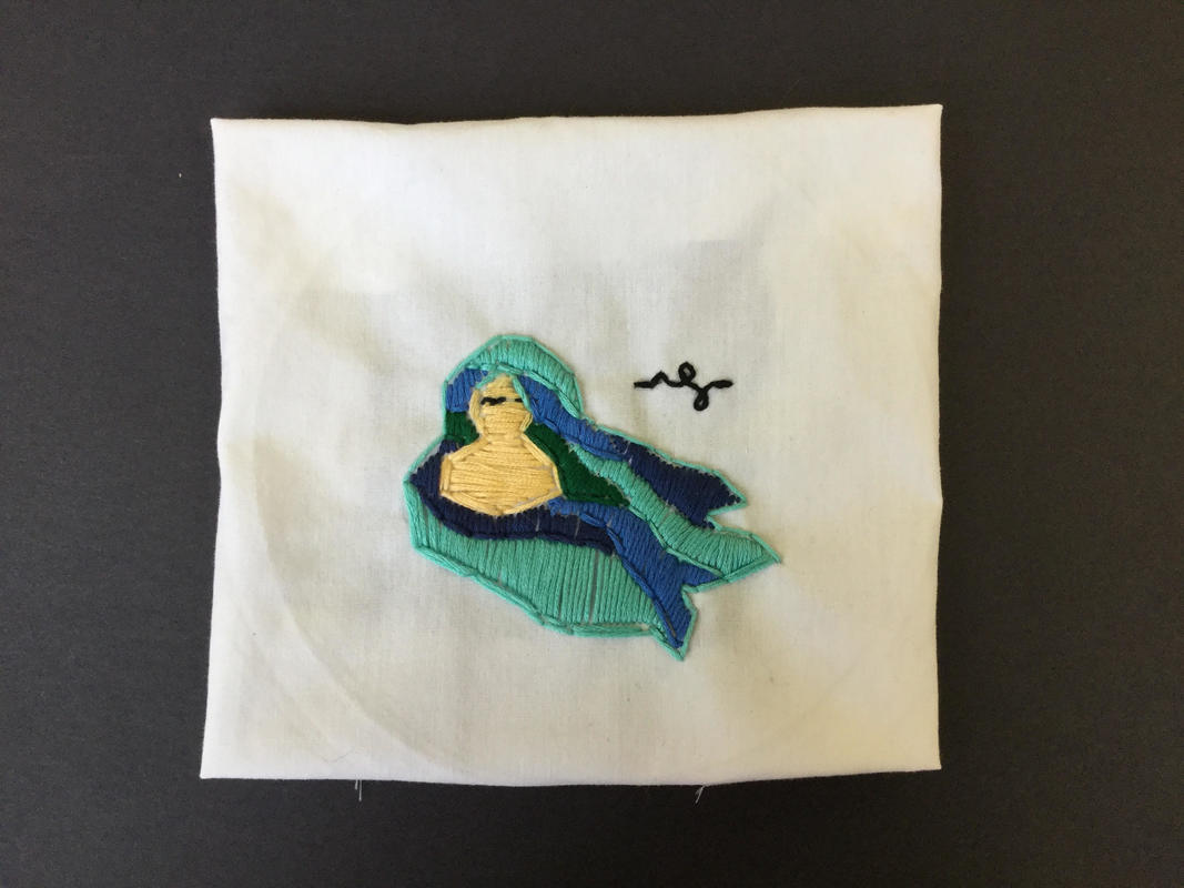
My independent piece was a embroidery of a girl with blue hair. It was fairly simple, with a plain design, and I feel like it could have been more interesting and creative. However, I had to do a lot of satin stitching for almost the entire piece, and I definitely improved at that type of stitch. Though this one doesn't look as good, I did learn from it and I know I could do much better if I tried again.
