Students new to this program began by choosing a masterwork to replicate.
Modeled after apprenticeship practices, their goal was to get inside the head of a successful artist and learn through emulation of methods, materials, and techniques. Alongside this goal, students were to create an independent work of art and six observational drawings. Students returning from previous semesters were to create two independent works inspired by successful artists they found on their own, along with six observational drawings.
Lastly, a course conclusion paper reflecting on what was accomplished, created, and learned.
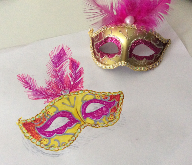
Kai
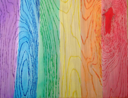
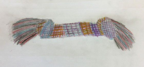
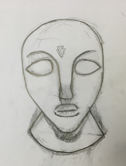
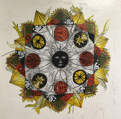
For my independent art I traced the grains of wood in my canvas in the different colors of the pride flag. To make my independent work I used acrylic paint and watercolors. I made this to celebrate me coming out to my parents and to remind myself of that experience. My goals as an artist is to be able to express myself and my emotions in my art. I think that my independent art turned out how I wanted it to.
|
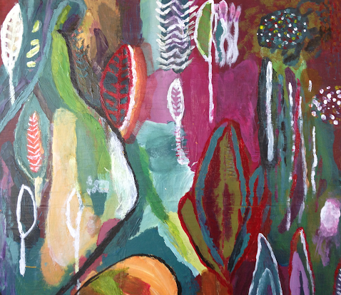
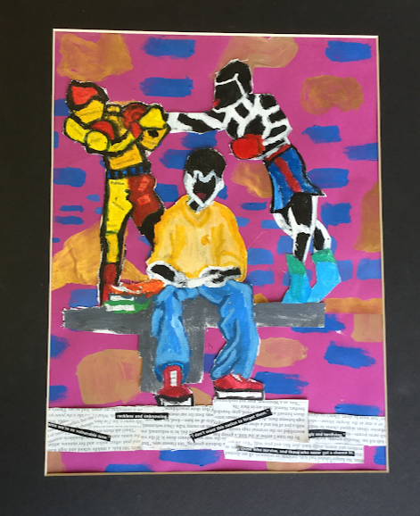
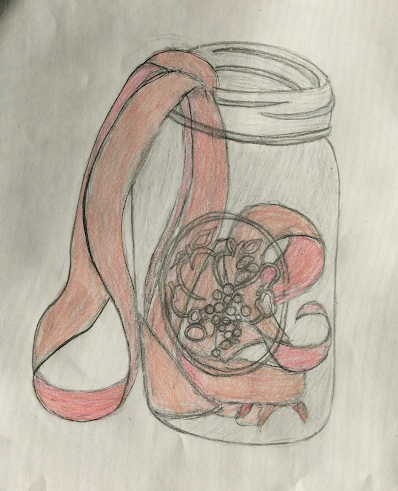
This piece is a recreation of "Held and Healed" by Flora Bowley. I used paint to recreate Held and Healed. When recreating Held and Healed I tried to represent the emotions I see when I look at Held and Healed which I think represents saddening confusion. My goal as an artist is to be able to express my emotion in my art. It was interesting to try to convey emotions that I'm not necessarily feeling at the moment. I learned along about mixing colors from this painting. I also tried a new technique where I mixed my paint with water to try and mix the color on my brush with a color on the canvas.
|
|
|
|
|
OBSERVATIONAL DRAWING CONCLUSION MISSING
Alex
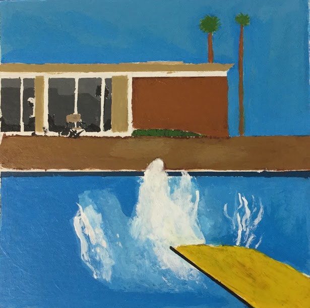
I recreated “A Bigger Splash” by David Hockney. I got a medium sized, square piece of cardboard and sketched out the shapes and details by measuring the original work that I’d printed out, and scaling that up to fit my board. I then began painting over the pencil marks, one section at a time with different shades of blue, brown, grey, green and yellow. Hockney originally had used these colors to represent a typical day in California, where he was living at the time. The painting was made after two others of very similar nature, entitled “A Little Splash” and “The Splash”. All three depict a diving board, which is angled towards a pool within which, there is a splash of water. Behind that, a house sits, but the viewer can only see the right edge of it. They also share a similar color palette.
|
|
|
|
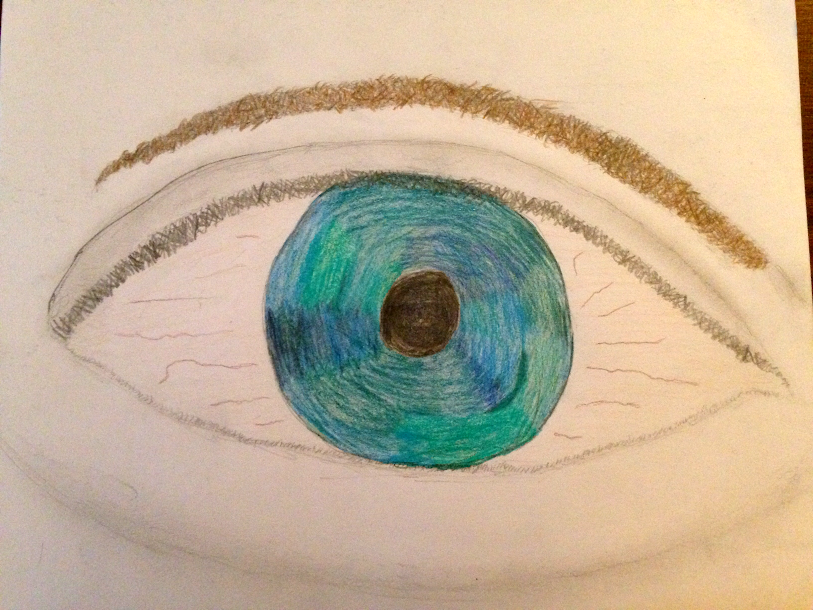
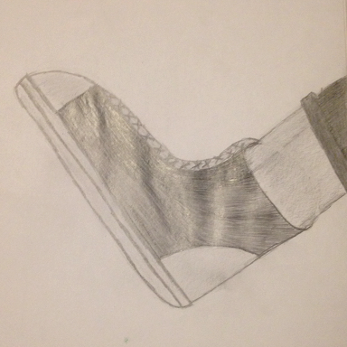
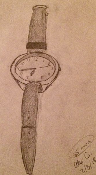
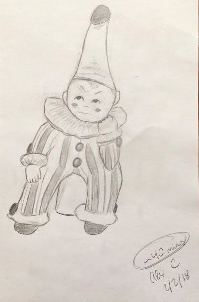
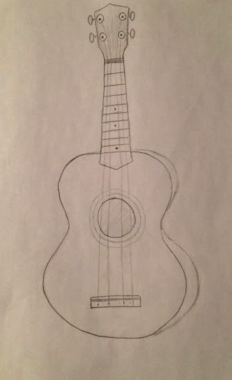
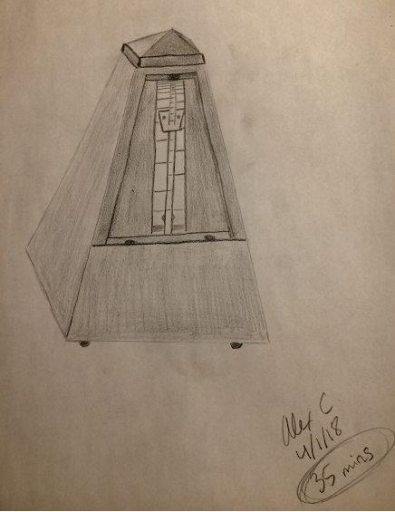
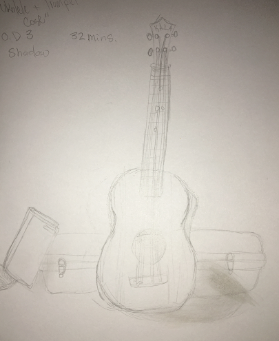
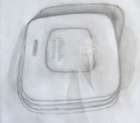
For my observational drawings, I drew any moderately interesting or difficult object that I could find; my dad’s watch, an odd clown knicknack, a television remote, a ukulele, a small plant and an old metronome. I only used a pencil and an eraser, so I tried to create contrast using value as opposed to color, which I found difficult.
Overall, I think that I got quite a bit better at both drawing and painting. I learned a lot more about the technical aspect of 2-D art, and hopefully I can build from here.
Overall, I think that I got quite a bit better at both drawing and painting. I learned a lot more about the technical aspect of 2-D art, and hopefully I can build from here.
Suri
|
|
This quarter in 2D art, we tried something different than before. The pieces assigned to us in the past two quarters were; a masterwork piece, or a copy of an already existing masterpiece in the world for the purpose of learning and mastering painting, printing, drawing and, inking techniques, and an independent piece, a work showcasing an original idea expressed with the new techniques we learned in the masterwork process. This quarter, those who had done one or more masterwork in a past class had the option of doing an independent piece inspired by an artist or particular style instead of an exact copy.
|
Since I had done a sufficient number of masterworks in the past, I got to choose two artists I like and make two pieces inspired by their works. The first artist I picked is a wonderful woman named Mab Graves. Her style is very surreal and one of her newest projects she calls “Mab’s Miniature Museum” in this project, she either makes or finds small versions of things one would expect to find in a museum. The thing that inspired me about this project is the small fish she has. These fish were found as little fish figurines, roughly factory painted and not realistic at all, but Mab took them and repainted them to make them much more lifelike. To achieve the same effect, I went rummaging through my basement and came up with a medium sized cat figurine, painted a flat and boring orange. I primed the cat with a light blue and then went crazy, basically letting my subconscious flow free onto the plastic. I covered the cat in scales and the crazy just developed from there. Currently, he has a third eye, sculpted from resin, but many more silly appendages are sure to be added in the future.
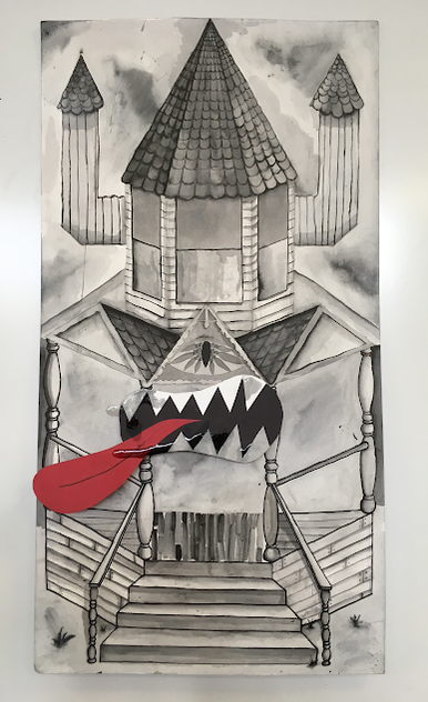
This quarter in 2D art, we tried something different than before. The pieces assigned to us in the past two quarters were; a masterwork piece, or a copy of an already existing masterpiece in the world for the purpose of learning and mastering painting, printing, drawing and, inking techniques, and an independent piece, a work showcasing an original idea expressed with the new techniques we learned in the masterwork process. This quarter, those who had done one or more masterwork in a past class had the option of doing an independent piece inspired by an artist or particular style instead of an exact copy. The second artist I chose was recommended to me by Deb, Brian Spolans. Spolans’ art is a fun, surreal, amalgamation of otherwise unrelated objects placed together on an occasionally 3D canvas. In his art, everything is something it’s not, and some inanimate objects have faces. Themes I extracted from his art included the use of heavy black line, ink, and flat, but 3D elements. I decided to draw a slightly spooky house, a piece that would usually be considered sullen, dark, or creepy, and I added a 2D mouth, created by gluing construction paper elements to each other, on little 3D paper stilts to protrude it from the house. Directly in the middle of the house is a decorative bit on part of the house. In this decoration is an eye seemingly melting into the patterns around it. Without the cartoon style mouth, the eye would have looked like a wood carving in the house but somehow, the human mind will still connect one half pattern eye and a large goofy mouth with a tongue lolling out together as a face.
|
|
|
|
|
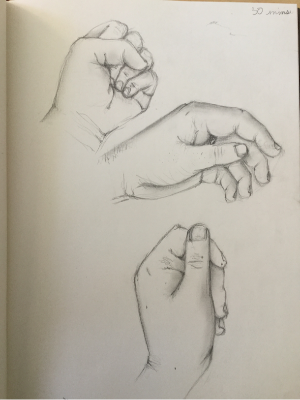
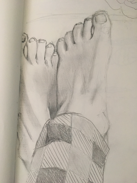
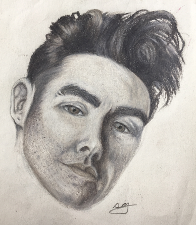
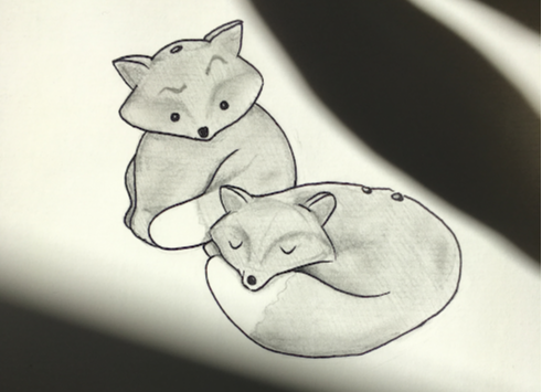
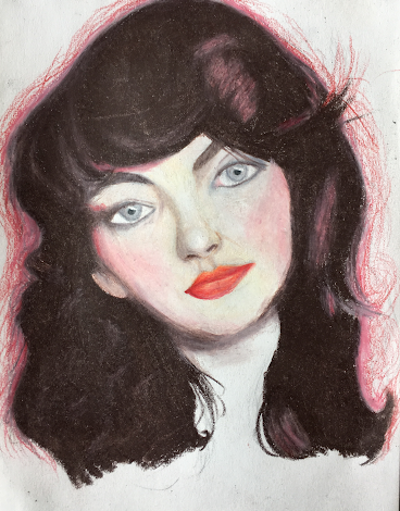
For our last assignment in this class, we had to create six separate mini independent pieces of things we have observed. These are called “observational drawings” For the first one, I drew three separate views of my hand, creatively titled “Hands (Multiple)” In this work, I focused on realistic graphite shading. For the second piece, I focused on the same thing, this time drawing my feet while I was wearing pajamas, this one titled “feet?” My third observational drawing is titled “foxes and the addition of eyebrows” and I was still focusing on realistic graphite shading, though I did add a slightly cartoony solid sharpie outline. The fourth, the pot (that I made. wow) with the air plant titled “slightly furry plant. potted”, again followed the graphite shading route, this time sans outline. For my fifth drawing, I strayed from the graphite shading and focused on realistic colored pencil shading. This one is titled “Morrissey Man” as it is of the singer known as Morrissey. Lastly, for the sixth drawing, what I drew follows the same path as the fifth, a realistic colored pencil portrait of a singer named Kate Bush, creatively titled “Kate Bush.”
|
|
Willow
|
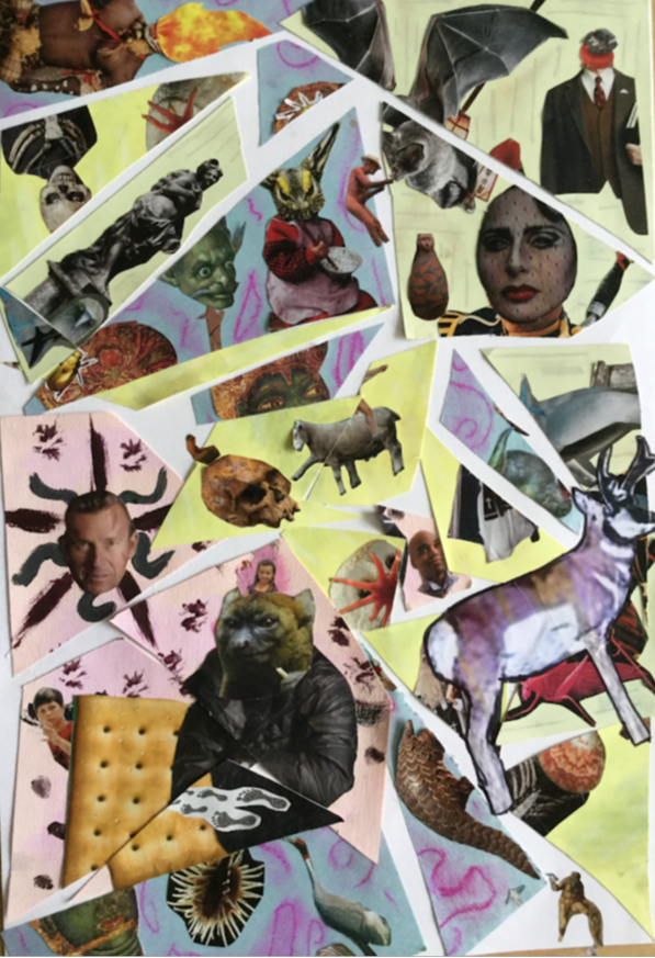
This is my independent piece called the Forlorn Pronghorn Album Cover Collage.
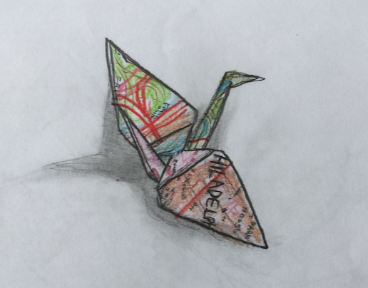
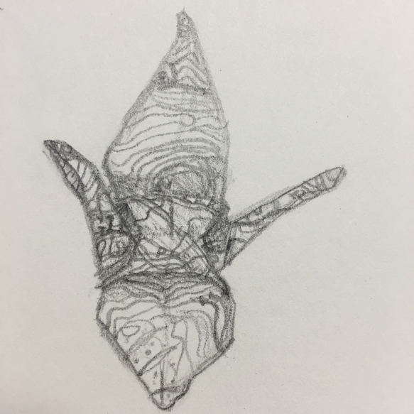
It looks like a college, but it actually a collage in a collage in a collage! How we made it: we took for pieces of paper, and made them into collages, then we cut up the collages and collaged them onto a big piece of paper. We wanted it to look like shattered glass, and it came out really cool. There are four little men in the picture, hidden! Try to find them. These are my observational drawings. They are of pretty much random objects, but I tried to use various styles. My favorite one is probably the crane, because I think I did a really good job on it. But I also like the gerbil, because I don’t really use that style.
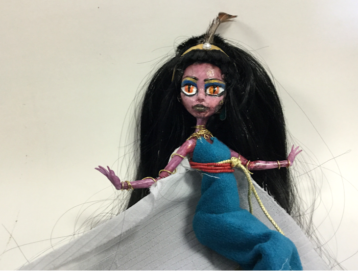
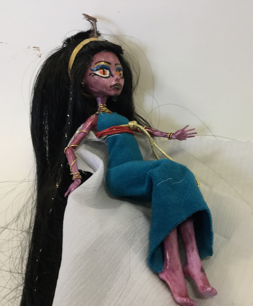
This is my secound indepent piece, wich is a callabortive art project I did with my friends, Ava and Gillian. The piece of art is a repaint of a monster high doll. It is supposed to look like a Egyptian Snake Godess. We took off the orignal paint with nail polish remover, and made our own clothing. We repanted the face. At every base stage we sprayed the head with sealint. We took off the orignal hair, and got new hair. We amde all the jewlery and did the hair. For this being the first time ive done this, I am think it came out very good.
|
Ava L
|
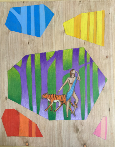
For my first independent piece, I worked on a piece inspired by J.A.W. Cooper. My piece depicts a woman in the forest. She is surrounded in purple trees, and is next to a bengal tiger. I used J.A.W.’s elements of line and style, and also picked subject matter that was similar to hers. A lot of J.A.W. Cooper’s artwork involves lots of contrast, layers, and naked women in forests. I made this piece using Prismacolor colored pencils layered on top of a piece of wood. I thought this piece turned out mediocre. The more you look at it though, the more things you find wrong with it. (Like the fact that a naked woman just so happens to be floating in the woods).
|
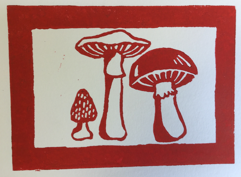
For my second independent piece, I wanted to challenge myself and try something new. I made a linocut block print of three mushrooms. One mushroom is a common mushroom, one is a morel, and the last is a deathcap. First, I drew out my design on the block of linoleum, and then carved away the linoleum in the negative space for the design to turn out correctly. It took about three total hours to complete this piece.
|
|
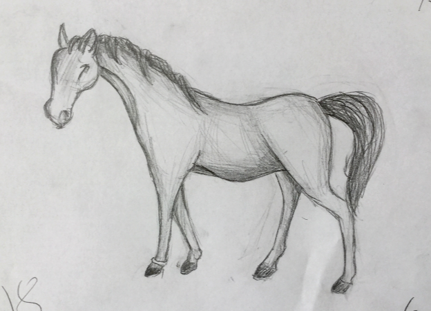
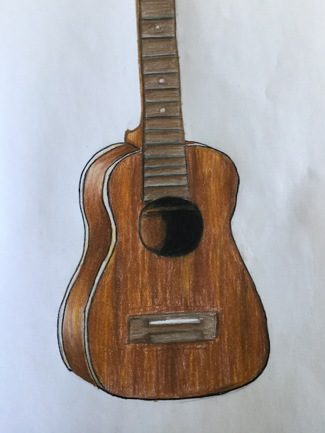
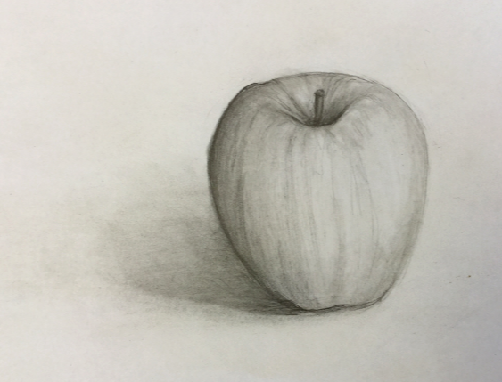
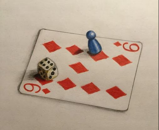
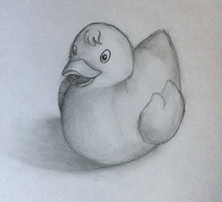
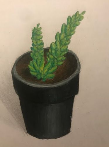
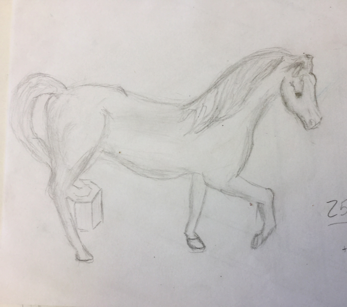
My observational drawings consisted of six pencil drawings. Half were done in regular graphite, and the other three were done in colored pencil. Over the course of this quarter, I drew my horse son Richard, a baritone ukulele, an apple, a couple of board games pieces, a rubber ducky, and a plant. I liked the rubber ducky or the plant the least. I thought the plants had lots of issues with shadows and highlights, and rubber ducky just looked really bad and creepy. I think I hated the ukulele the least, because I like the way the wood grain turned out. The lines aren’t very smooth though.
Overall, I definitely think I learned quite a bit. I tried out a completely different type of art for the first time, and and tried to stay away from subject matter and styles I had used in the past. I really tried to challenge myself and try lots of new styles and mediums of art. |
|
Naomi K
|
|
|
Maddie
|
WHERE IS YOUR WRITEUP
|
|
|
|
|
|
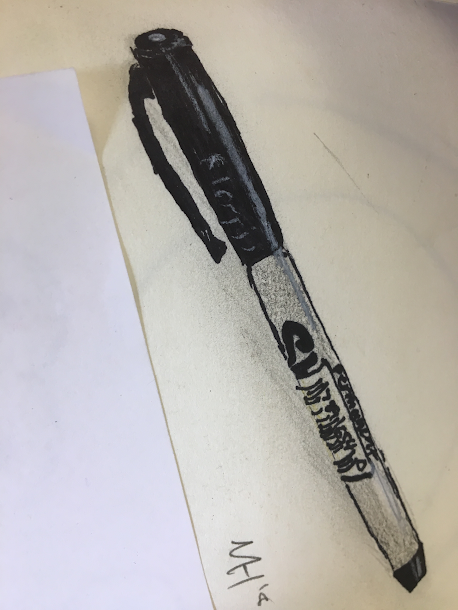
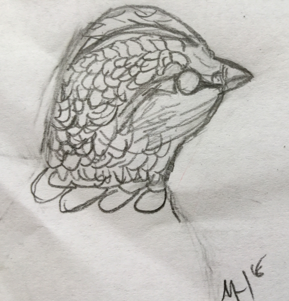
My observational drawings consist of an array of things. The first one is a vase with flowers painted on it, the second one is two eyes (mine and my mothers), the third one is of a ukulele, the fourth is a sharpie marker, and the fifth is a chicken head from a tub of pencil shavings. All of them were made of graphite, and all I did was shade with my fingers. The big idea was to basically get perspective and shadow nailed, and to especially focus on realism. The goal was just like the big idea and I think I did that well, especially in my fourth piece, where I used white colored pencil for highlights. Overall I think that I did well, I achieved my goal, and created some good art.
|
|
Billie
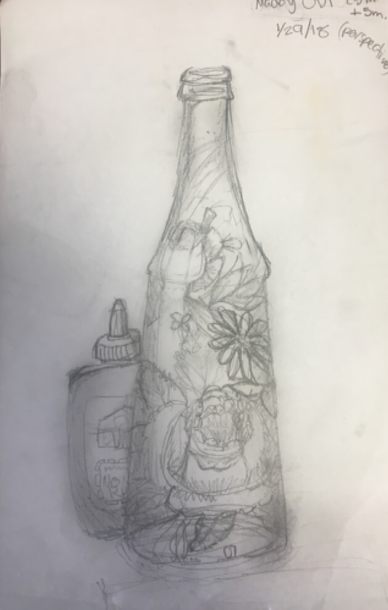
For my first independent piece I sought inspiration from post-impressionist surrealism, specifically the artwork of René Magritte. I decided that wood would be the ideal surface for this type of work, something that already evoked interest and contained a feeling of it’s own.
My final piece consists of a bottle tipped at a 45º upwards angle in the upper-left hand corner. It is slightly more than half-filled of water, stems of many assorted flowers submerged in the water. The tips of the flower petals end near the middle of the top of the wood and from the largest rose, botanical drips fall downwards until they form a tall, round mushroom. This mushroom is one of a wide variety that are sprouting from the mouth of a black and gray inked boot. Caps detach from three tall, triangular mushrooms on the right side of the bunch and float towards the upper-right hand corner of the wood piece, slowly morphing into a singular, lilac cloud. Shelf mushrooms grow from the left side of the shoe and four continue on into the space below the bottle while no longer attached to the boot. The boot is the center focal point of the piece.
Lines following the natural waves of the wood radiate outwards from the boot. As the lines move farther from the boot they begin to drip, slowly becoming more liquid. On the lower right side of the wood there is another bottle. It, as well, is more than half-filled with water. A single daisy drops towards the round from the opening of the bottle. The water spills upwards from the bottle, it’s cap caught in the stream, until it forms a puddle in the top right corner.
To create this piece I used watercolor paints, colored pencil, and ink. I mostly used the colored pencil over top some bits of watercolor to bring out the vibrancy of the colors. While working with the ink I primarily used a thin brush, diluting the ink with water to get the desired shade of gray. I drew the outline of the boot and most of the lines surrounding it with a dip pen.
The final version of this project was not completely what I had envisioned from the start. Originally the flowers in the bottle and the mushroom-filled boot were two separate ideas and the second bottle and boot-puddle were not included at all. It ended up being much more complicated and time consuming than expected and I was unable to complete it. If I had had a longer time period in which to complete this I would have thought more carefully about the composition, taken more care in using the watercolors, and evaluated different techniques to find the one most closely fitting my standards before beginning the final work.
This piece is a very loose play on the fluidity of all things and the idea that much of what we see can become something else if we think about it in enough depth. The lines and boxes that society conforms us to are not quite as rigid as we seem to think. The glass ceiling is often left ignorantly untouched.
My second independent artwork is a drawing of one of my favorite musicians, Sweater Beats (Antonio Cuna). I took a photo that he had posted of himself and adapted it to my style.
In the picture, the Filipino digital musician holds a cup of boba tea up to his mouth and is sipping it through a straw. He is wearing a black and white striped t-shirt and the strap of a bag is slung across his chest. Sweater Beats has thick, black hair, styled into a wave. His big eyebrows rest above slightly rounded, black-rimmed glasses. He has a patchy chevron mustache.
I drew the first sketches in pencil, then outlined it in felt tip pen. For shading, 3D effect, and texture I used black and gray colored pencils. This proved to be a mostly successful project, aside from the fact that the head was too small and the shoulders too wide in comparison to the photo. This piece was good practice in drawing people and it helped me in learning to provide texture in a 2d work of art. I was excited to be able to draw someone I greatly admire for a school assignment.
|
|
|
|
|
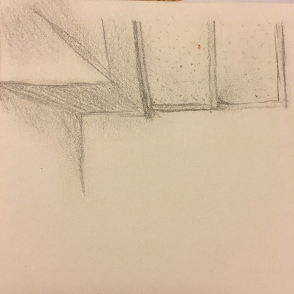
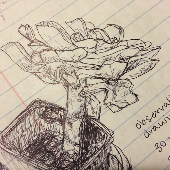
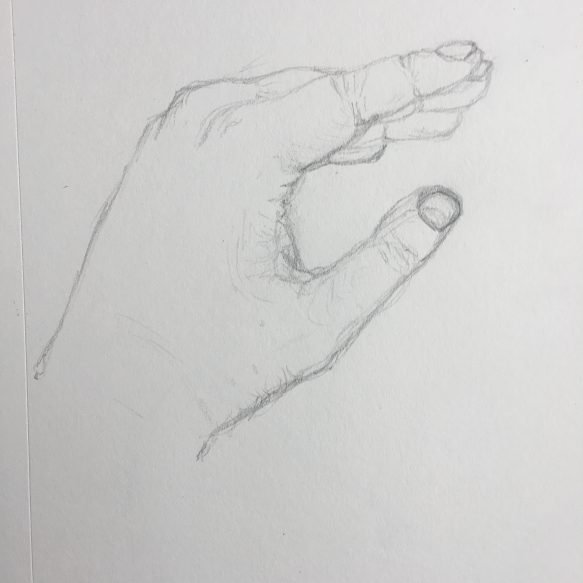
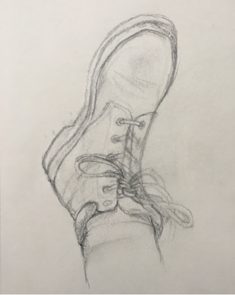
I successfully completed 6/6 observational drawings for this quarter. Each drawing took from 30 to 60 minutes to complete. For five out of the six drawings I worked with pencil, and the last I drew in ballpoint pen. I improved in the areas of shading and texture. Over the course of the nine weeks in which we had to finish these, I focused most heavily on the elements of line, value, texture, and shape. I incorporated the principles of contrast, emphasis, scale, unity, and rhythm. I drew a paper crane, the ceiling of our art classroom, my classmate Suri, my succulent plant, my left hand, and my right boot. This was great practice for me in drawing more realistic objects. I am hoping to continue this practice into the future.
|
|
Ven (Chase)
|
NEED WRITE-UP FOR MASTERWORK
|
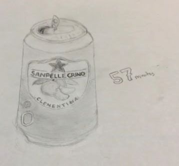
My observational drawings mainly focused on household objects that I never really payed much attention to. Drawing these objects was difficult because I really had to focus on the object, and I ended up straining my eyes because of how hard I was focusing on them. Each took 30 minutes to an hour and 25 minutes.
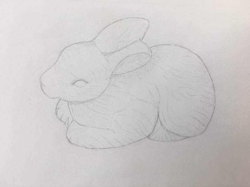
The Ceramic Bunny
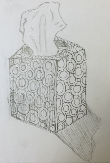
The Tissue Box
Slightly damaged styrofoam head
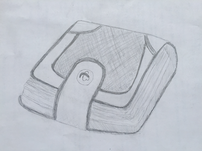
Music box
|
This was the first observational drawing I made, and I managed to get most of it done within 25 minutes. I added 5 more minutes of work to the details and outline. This isn’t my best piece (and it shouldn’t be) but I continued to improve throughout the other 5. This drawings time in total is 30 minutes.
The tissue box was one of the harder ones to do because of the repeating circle pattern on the box. It also changed directed slightly around the corners approaching the top. My favorite part of that drawing is the tissue. I think that it has accurate shading and very nice shape. This drawing took 30 minutes.
|
Elsa
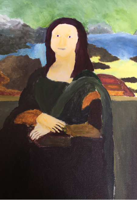
I painted the Mona Lisa for my masterwork recreation. I used paint for the whole thing. It is unknown who the Mona Lisa actually is so I can't say what inspired Leonardo da Vinci to paint the painting. Honestly my goal was just try to make it look kinda like the Mona Lisa, so I think I succeeded. I found out that the Mona Lisa had been stolen multiple times, once the dude just walked right out with the painting under his coat. Also the Mona Lisa has no eyebrows which bugs me.
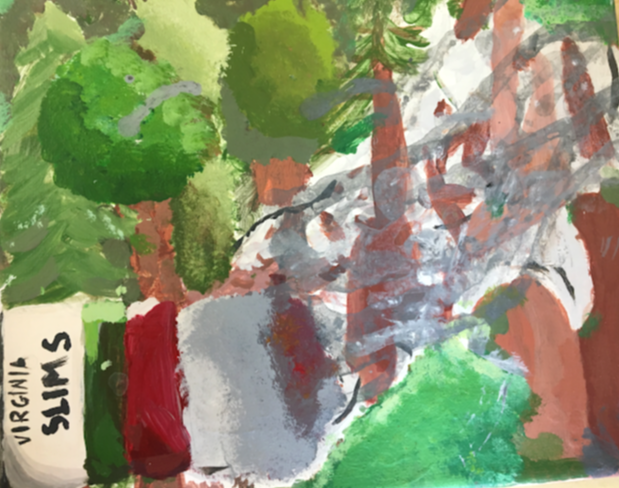
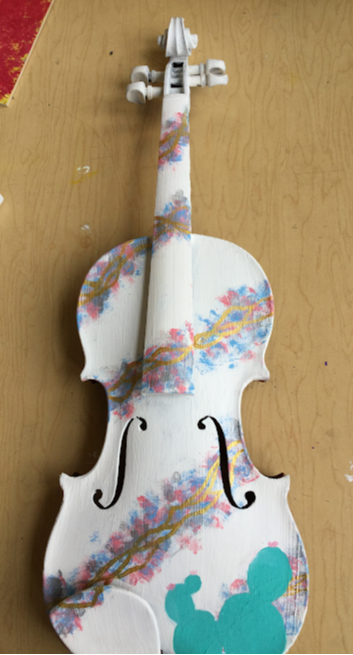
For my independent piece I painted a violin. I used paint, paint brushes and a sponge. I had wanted to paint a violin for a long time and I got the idea for using a sponge from a piece of art I saw at Kerrytown concert house. I later went to Arizona and decided to put a cactus on it. My goal with this was just to let loose and I didn't do that as much as I wanted. I wish I had a bit more time to add more details. |
|
|
|
|
|
|
I drew multiple things for my observational drawings. Mostly I used pencil for them, but sometimes I used marker. My inspiration was things I like. My goals were drawing things more realistic-like. I learned a lot about shading and drawing things as they are. |
|
MW
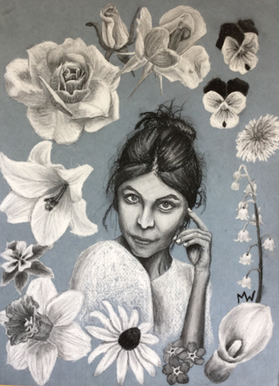
For my first independent piece, I wanted to channel the style of artist Oksana Leadbitter. She created portraits of women with oil paint and charcoal, but it was her charcoal pieces which interested me the most, in particular one called Elizabeth. The portrait used black and white charcoal blended together to effortlessly capture the woman's tipped-back face. When I tried both colors of charcoal together, I was instantly intrigued by the smooth way they blended. I chose light blue pastel paper to set off the black and white. But even when I was done drawing the girl I'd chosen as my reference, I felt like my piece wasn't finished. After considering for several days, I decided to fill the space around her with flowers. The piece feels much more complete and I decided to call it Flower Girl.
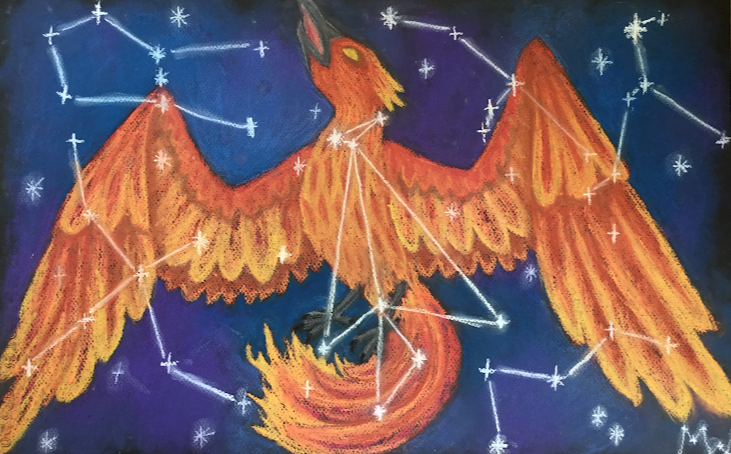
As an inspiration for my second independent piece, I chose artist Chloe O’Shea, whose stunningly realistic drawings of crystals and beetles are created with colored pencil and soft pastel. I was especially impressed with her pastel starscapes, and decided to attempt a drawing of the northern lights, maybe including another figure. However, despite having multiple different ideas for the composition, none of them seemed to work. So I scrapped my former plans and decided to draw a phoenix, inspired by the constellation Phoenix the firebird and my love for mythological creatures. This immediately felt much more natural to me, and I dove into the drawing with enthusiasm. I colored the bird in shades of flame and, as a finishing touch, decided to spangle it with constellations, including Phoenix in the center of the bird’s chest. While I strayed from my original idea, I still managed to use soft pastels to capture a starry scene, and learn how to draw flame and feathers along the way.
|
|
|
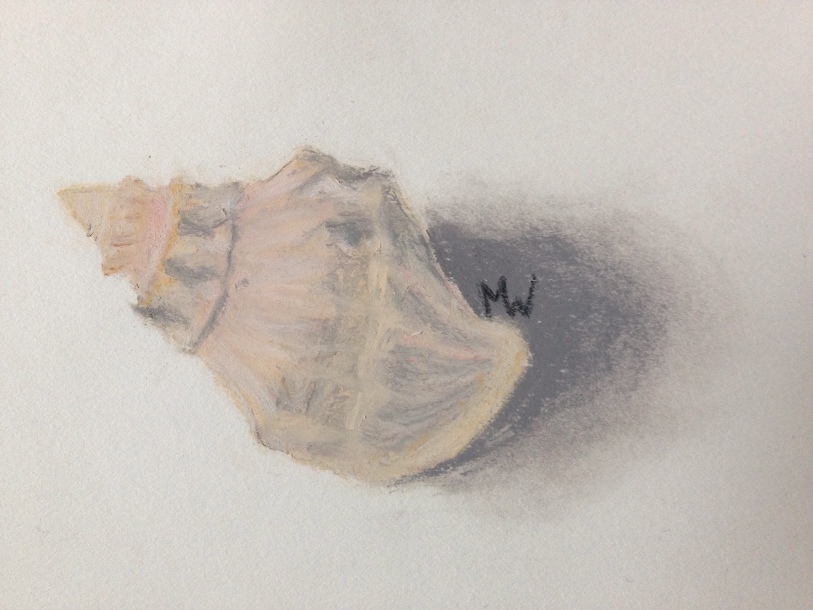
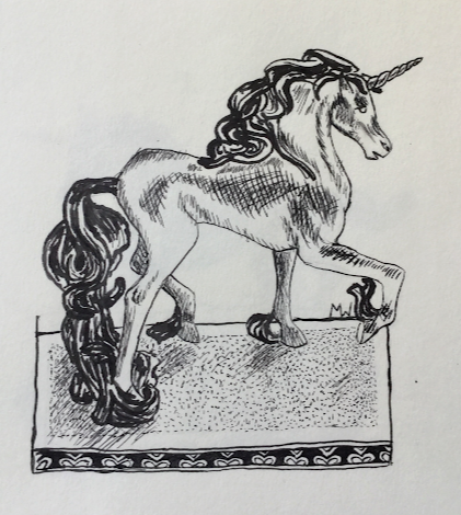
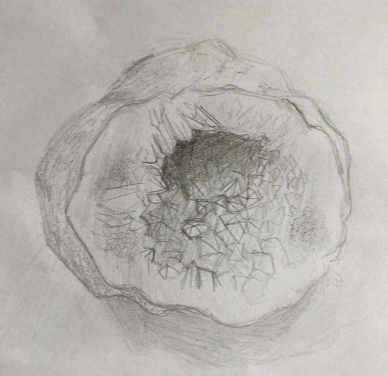
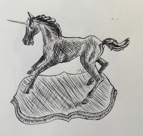
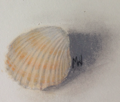
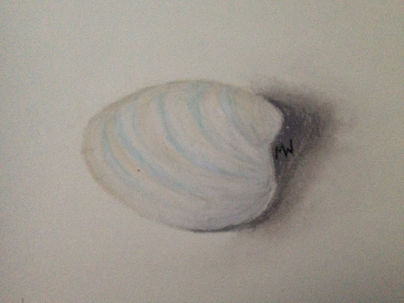
My first observational drawing was a pencil sketch of a geode I found in the classroom. I was so busy trying to capture the shape and texture of the crystals that I forgot to do much shading, so the drawing is mostly light values. For my next two observational drawings I wanted to try a new pen and ink set. I chose to draw two of the many small unicorn statues my mom has from when she was little. I used crosshatching to create the shadows in the metal. My last three observational drawings were made over spring break, and I used soft pastel to practice for my final independent piece. I drew three different shells, all soft shades of white, cream and brown, and focused on capturing the shadows formed by the shells’ irregular shapes.
|
|
Fiona
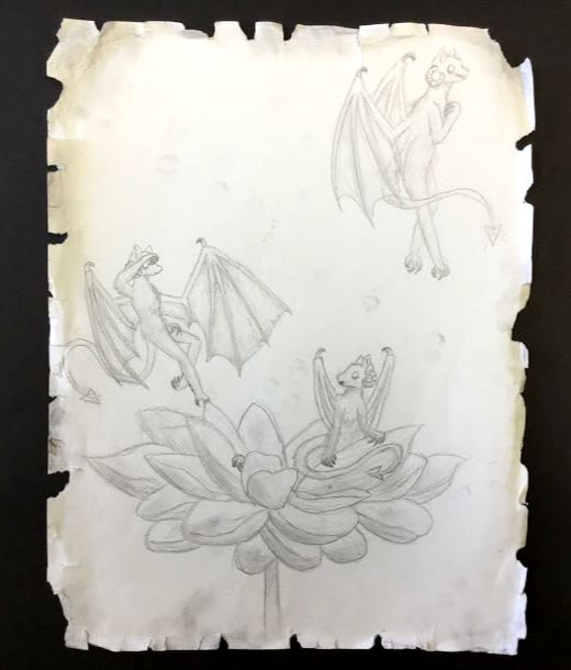
My second independent piece is a random idea I thought of. I at first wanted to make miniature dragons coming out of a flower, but somehow it changed to demon like creatures, so my piece
is demons coming out of a flower. This was a challenge in terms of anatomy, since they were so human like. I just sketched it with pencil and shaded it a lot, without adding any color. I tried to make it look worn by ripping and shading the edges, which I think turned out pretty well. This piece was closer to my comfort zone, since I usually draw in pencil, and I like how it turned out but I don’t think I learned much from it. Still, it was fun to make. |
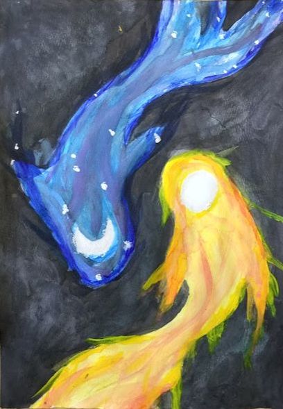
My first piece this year was a watercolor painting of two koi fish. I made this because I like koi fish and I wanted to experiment with watercolor. It’s a painting of two koi on a black background, one orange and yellow with a sun on its head and one blue, purple, and black one with a moon on its head. Although it didn’t turn out like I hoped, I learned how to use solid watercolors and some new techniques for watercolor in general. Overall, I think I learned a lot from this piece.
|
|
|
|
Nadya
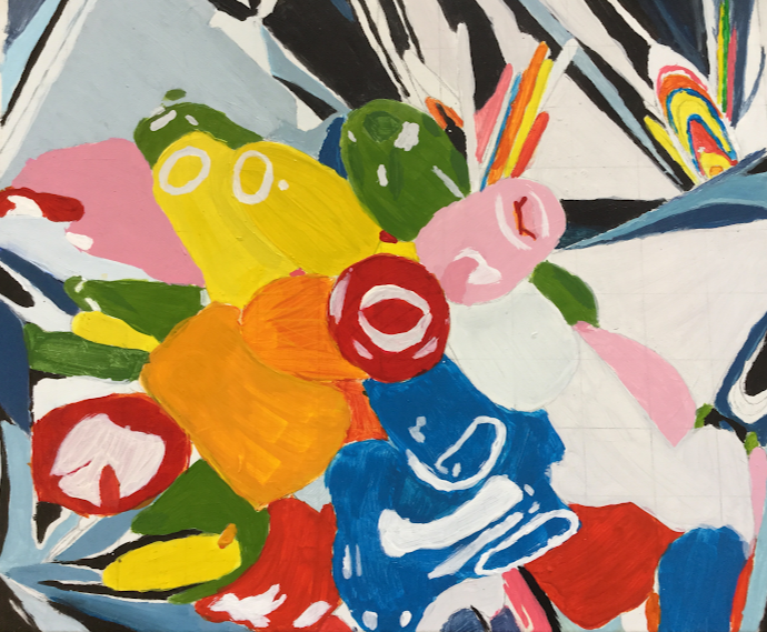
I chose to re-create Tulips by Jeff Koons. This is a colorful piece depicting a bouquet of balloons. The painting has an abstract background colored with blues, whites grays and blacks. Jeff Koons used paint to create Tulips. Jeff Koons has made many other pieces depicting balloons: Balloon Dog, Balloon Flower, and many others.
One of my goals while working on this piece was to correctly mimic the reflections of light on the balloons. I also tried to make the colors as close as possible to the real thing. When I first started this piece, I drew all of the lines perfectly, and I added all of the details. Then, I realized that I was never going to get anything done if I didn’t start painting. Once I started painting, it all came together, and I saw that I didn’t need so many lines. It just estimated and worked on the painting as a whole.
One of my goals while working on this piece was to correctly mimic the reflections of light on the balloons. I also tried to make the colors as close as possible to the real thing. When I first started this piece, I drew all of the lines perfectly, and I added all of the details. Then, I realized that I was never going to get anything done if I didn’t start painting. Once I started painting, it all came together, and I saw that I didn’t need so many lines. It just estimated and worked on the painting as a whole.
|
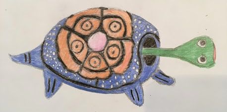
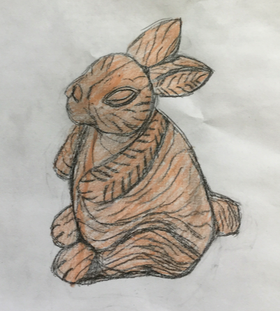
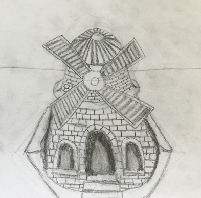
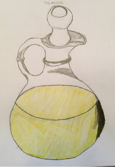
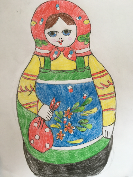
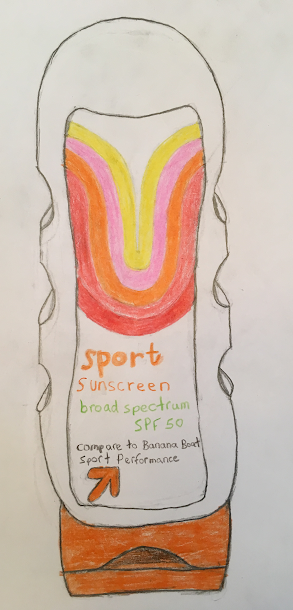
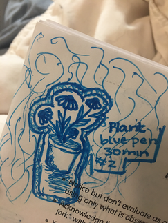
The objects I observed and drew were: a ceramic rabbit, a metal windmill bell, a wooden turtle, a glass pitcher, a matryoshka and a sunscreen bottle. All of the objects I drew were somewhat round, so I learned a lot about realistically drawing round things this quarter. I used pencil on all of the drawings, and I used colored pencil on all except for the windmill one. Some of my goals were: making the shape and proportions very accurate, shading the edges to make them dark and contrasting the different parts of the object. I also worked a lot with color, though I was limited to the original colored pencil colors. I think that I spent a fair amount of time on these drawings, and I like the way they turned out.
|
|
Louis
This artwork and by extension my recreation of it are are work done in grey scale in the style of
some African and Asian art styles. In these styles there is an emphasis on distorted features
that give it a kind of off putting and somewhat comic look. But make no mistake the subject
matter of this piece is as dark as you can get. During the second world war the army of the Third
Reich attacked the spanish town of Guernica, the artwork in question depicts the aftermath of
the attack. In the piece you can see the severed arm of a soldier holding a broken sword, a
mans cut off head, a woman cradling her dead child and many other things that seem almost
funny if you don’t look closely into it. The main thing that this artwork was trying to do was show
the horrors of the aftermath of war an what it does to human lives. Over all I think my replication
of Guernica when fairly good, most of the details where put on at the last minute, and all od the
shading was done in one night, but other than that it was pretty good.
My Independent piece was a kind of abstract work I guess. I mean it’s not just a bunch of
shapes put together (well I mean technically it is) but its not like Jackson Pollock abstract. I
made this piece by drawing the lines of the different layers and then putting the color on after
the fact. For the layer designs I drew straight lines so that I could impose the design over top so
as to keep them straight. There is no big Idea behind this artwork I just thought it would look
cool and I was write for the most part. As for the goals of this artwork once again I really just
wanted to make a cool drawing. Overall I think that this piece went pretty good and I enjoyed
making it.
Observational drawing one:
This was my first observational drawing of the class so I just picked up the first thing I saw. The thing I picked up was a cup with water and paint brushes in it. I created my artwork with a graphite pencil, an eraser and a blending stick. I used the blending stick to make the layers and the shades of the piece and I used the pencil to put the lines and the general tones on. I wanted to draw something that would give me some practice on shading and blending. Overall I thought this drawing was pretty good but I could have done better, if I had more time.
Observational drawing two:
For this observational drawing I decided to draw my cell phone. I used only a graphite pencil for this, as there was not that much blending that needed to be done. This artwork was a good practice in making texture in artworks, and also shadowing. My over all goal in doing this piece was to get good at drawing three dimensional objects with things like line placement and shadows. Overall I think that working with what I had at the time this piece was pretty good, and I think it accomplished its goals.
Observational drawing three:
Timewise this observational drawing was a bit of a challenge seeing as I could only work on it in the art room. This was because I decided to draw the board in the back of the art room. For this drawing I used graphite pencil, a blending stick and colored pencils. I mainly used to blending stick to give the board in my drawing the same kind of gradient effect. I also used the white colored pencil to make it seem more like the lamp ball things were one thing instead of a bunch of lines. The goal of this artwork was to improve how I used colored pencils. Overall I think this piece was good I guess, I think would have look better if I had, had a little bit more time to perfect and blend.
Observational drawing four:
This drawing had to be done over spring break so I could pretty much only used the things that I had in my bedroom. So I also used the two mediums I had on hand a pencil and an eraser (see observational drawing six) I used the shading on the plant to show depth and distance. Also as one can see I made a bit of a miscalculation and ran out of space on the page. I also wanted to draw it because I thought it looked cool. My intention for this piece was to practice drawing things from the natural world, and also to work with depth and foreground. I thought this artwork went generally well it was fun to draw and I think I carried out the goals fairly well.
Observational drawing five:
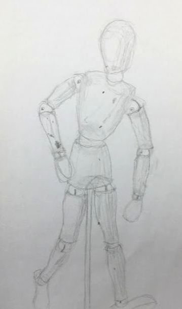
This drawing was done in the art room, I had finished my master work and my individual pieces so I spent my time making this drawing of a model thing. This drawing was fairly straight forward I did no have to do any blending of shading all I had to do was just make lines on paper. To be honest at this point I already had my last drawing done but not submitted so I just wanted to get it done. My main goal for this work was to practice drawing the human form. Overall I thought that it went pretty good mostly because of the simplicity of the peace.
Observational drawing six:
This one was kinda weird because I completed it before the fifth observational drawing it just sat in room for a minute and in that time I did the fifth one so technically it’s the sixth because I submitted it the day I am typing this. To make this drawing I used a pencil (I could not use an eraser seeing as it was the subject of the drawing) and my finger to do things like layering and shading. I drew this thing because it was just laying around and I had to draw somthing for class so I drew this eraser. I guess a goal that I saw after the fact was that it was practice for incorporating words into a drawing. Overall I thought I it went good but not as good as some of the other drawings because (altho it does not show it the way I submitted it to google classroom) it ending up being a fair bit smaller than I think I should have made it.
This was my first observational drawing of the class so I just picked up the first thing I saw. The thing I picked up was a cup with water and paint brushes in it. I created my artwork with a graphite pencil, an eraser and a blending stick. I used the blending stick to make the layers and the shades of the piece and I used the pencil to put the lines and the general tones on. I wanted to draw something that would give me some practice on shading and blending. Overall I thought this drawing was pretty good but I could have done better, if I had more time.
Observational drawing two:
For this observational drawing I decided to draw my cell phone. I used only a graphite pencil for this, as there was not that much blending that needed to be done. This artwork was a good practice in making texture in artworks, and also shadowing. My over all goal in doing this piece was to get good at drawing three dimensional objects with things like line placement and shadows. Overall I think that working with what I had at the time this piece was pretty good, and I think it accomplished its goals.
Observational drawing three:
Timewise this observational drawing was a bit of a challenge seeing as I could only work on it in the art room. This was because I decided to draw the board in the back of the art room. For this drawing I used graphite pencil, a blending stick and colored pencils. I mainly used to blending stick to give the board in my drawing the same kind of gradient effect. I also used the white colored pencil to make it seem more like the lamp ball things were one thing instead of a bunch of lines. The goal of this artwork was to improve how I used colored pencils. Overall I think this piece was good I guess, I think would have look better if I had, had a little bit more time to perfect and blend.
Observational drawing four:
This drawing had to be done over spring break so I could pretty much only used the things that I had in my bedroom. So I also used the two mediums I had on hand a pencil and an eraser (see observational drawing six) I used the shading on the plant to show depth and distance. Also as one can see I made a bit of a miscalculation and ran out of space on the page. I also wanted to draw it because I thought it looked cool. My intention for this piece was to practice drawing things from the natural world, and also to work with depth and foreground. I thought this artwork went generally well it was fun to draw and I think I carried out the goals fairly well.
Observational drawing five:
This drawing was done in the art room, I had finished my master work and my individual pieces so I spent my time making this drawing of a model thing. This drawing was fairly straight forward I did no have to do any blending of shading all I had to do was just make lines on paper. To be honest at this point I already had my last drawing done but not submitted so I just wanted to get it done. My main goal for this work was to practice drawing the human form. Overall I thought that it went pretty good mostly because of the simplicity of the peace.
Observational drawing six:
This one was kinda weird because I completed it before the fifth observational drawing it just sat in room for a minute and in that time I did the fifth one so technically it’s the sixth because I submitted it the day I am typing this. To make this drawing I used a pencil (I could not use an eraser seeing as it was the subject of the drawing) and my finger to do things like layering and shading. I drew this thing because it was just laying around and I had to draw somthing for class so I drew this eraser. I guess a goal that I saw after the fact was that it was practice for incorporating words into a drawing. Overall I thought I it went good but not as good as some of the other drawings because (altho it does not show it the way I submitted it to google classroom) it ending up being a fair bit smaller than I think I should have made it.
Gillian
My observational drawings that I turned in were all inanimate objects and relatively simple ones. A few times I attempted to draw things like people and animals, but they ended up looking hideously cartoonish and disproportionate, so I had to draw other, more simple things, to save myself from embarrassment. I used just pencil, pen and red colored pencil as my materials, as drawing sans color kind of creates a cool, bleak feeling in my opinion. I applied some of the elements of art and principles of design in all six of these. I used mostly all of them, I think, but I probably could have done it better. My main goal as an artist is to make one thing that’s really interesting and surreal and means something and represents my emotions, which is hard to do with these observational drawings, but I did learn about the elements of art and principles of design in the process which could definitely help in the future. So, this assignment helped in ways that will influence my future works.
Ivy
Observational Drawings
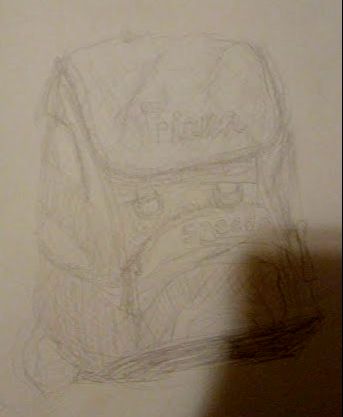
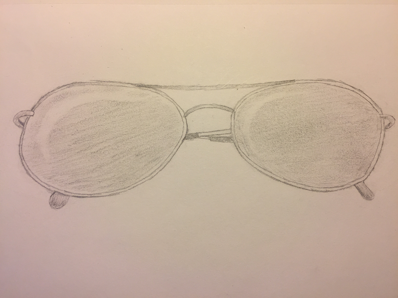
For this quarter of art, for my observational drawings i used pencil to create all of them and i really tried to work on lines in my drawings and how to draw someone into a certain part of my work. I did not have any specific reason for choosing the objects that i drew. I just found some things lying around my house and decided to draw it. some of the things i drew thought were pretty old. The leather purse is my mom's from the 80s, and so is the Koh-i-noor pen, and the pair of glasses are my moms grandmas glasses from the 60s. These pieces helped my goals as an artist because i really focused on getting the lines and angles right. One of my goals as an artist is to be more patient when i'm drawing and i think that these drawings helped me with that because i went back to them multiple times to see how i could improve them.i think that doing these drawings have helped me with my art so when i go and draw something i will remember to shade and to make some lines thicker and some thinner.
For this quarter of art, for my observational drawings i used pencil to create all of them and i really tried to work on lines in my drawings and how to draw someone into a certain part of my work. I did not have any specific reason for choosing the objects that i drew. I just found some things lying around my house and decided to draw it. some of the things i drew thought were pretty old. The leather purse is my mom's from the 80s, and so is the Koh-i-noor pen, and the pair of glasses are my moms grandmas glasses from the 60s. These pieces helped my goals as an artist because i really focused on getting the lines and angles right. One of my goals as an artist is to be more patient when i'm drawing and i think that these drawings helped me with that because i went back to them multiple times to see how i could improve them.i think that doing these drawings have helped me with my art so when i go and draw something i will remember to shade and to make some lines thicker and some thinner.
Elliot
Our master work assignment was to recreate a famous-ish work of art using similar methods as the original artist and possibly turn it into a mural in the school. I chose the piece "Edline" by Swoon. Edline is a very cool mural that comes in many different versions. It is a sketch of a girl standing in front of a geometric design. I had limited time so I focused on the background. I tried to make it similarly to how Swoon makes hers, she draws the outline on a big piece of paper with charcoal and the paints it, then she takes it to a spot on the street and wheatpastes it up. Wheatpaste is super super sticky and nearly impossible to get off a wall. I made mine on a giant piece of white paper, I sketched it with willow charcoal which is super fine and dusty, like a light pencil, then I painted it with acrylic paint and added the details with compressed charcoal. This project was super, super hard and slightly stressful but it was pretty fun and I learned a lot about the artist and about paint and charcoal. I think I spent the last couple months completely covered in charcoal dust and paint. This was a super cool project and I am pretty proud of how it turned out.
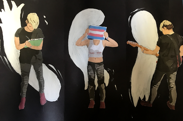
For our individual project we basically got to choose something to make that would take about 3 hours to make. Honestly when I started I has no idea what to make but after considering 700 things I decided to draw 3 pictures of me with a ghost background of some sort. The finished product is 3 digital drawings of me made with Adobe photoshop on a Wacom drawing tablet glued onto a piece of black paper with 3 white ghosts painted behind them. The first drawing is of me playing guitar, the second is me standing with the trans flag over my face and the third is of me drawing. As for making it, my dad took pictures of me outside and then I sketched the pictures in Adobe photoshop. I have used both Adobe photoshop and Adobe illustrator but I have found that photoshop works better for drawing which makes absolutely no sense. Then i printed out the drawing, glued them to the black paper and used some white acrylic paint to make ghosts behind the figures. This project was super fun and i learned a lot about photoshop and my Wacom tablet. I highly recommend digital drawing, it takes a long time but its super fun and the final products look super cool. Plus, photoshop has a ton of different brushes and its cool to mess around with them and get different textures.
|
|
|
|
For one of our assignments in this 2D art class we had to make 6 observational drawings. I made 5 of mine with pencil and one digitally. Drawing these was very interesting and fun. I realized that I could actually draw realistically and I learned a lot about shading. It was weird to learn that when you are drawing you have to draw what you see, not what you think you see.
|
|
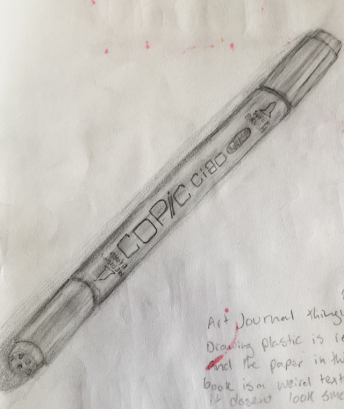
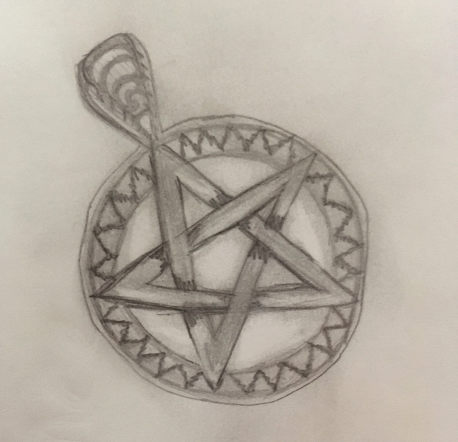
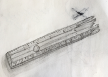
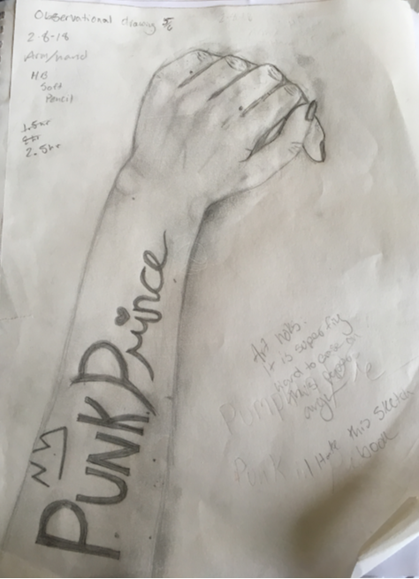
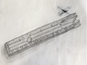
My first drawing in this series is a sketch of a Copic marker, I made it with a #2 mechanical pencil. The second drawing is a sketch of half a ruler I broke during math. The ruler is my favorite pencil sketch in the series. The third drawing is of a microphone receiver on the ceiling. I also drew a pentacle necklace and my arm with writing on it. The arm drawing took about 2.5 hours. The last drawing I made was a recreation of the cover of a comic called The True Lives of the Fabulous Killjoys illustrated by Becky Cloonan. This drawing took the longest, 3.5 hours. I made it on a Wacom drawing tablet with Adobe Photoshop.
Felicity
|
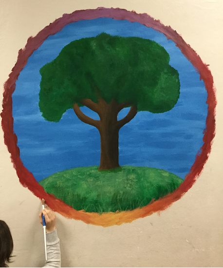
During this 9 week course of 2D art, we had to complete one masterwork recreation, one individual piece and 6 observational sketches. Instead of doing a masterwork recreation, our teacher Deb gave some of us the option to be inspired by a certain artist’s work. I chose to paint a mural on one of the walls of my school which was inspired by Lori Roberts, an amazing artist who is the name and face behind Little Truths Studio. Her pieces are all extremely beautiful and very calming to look at, which is the main feature I wanted to incorporate into my mural. I wanted the end product to look very balanced, precise and pretty-- something which I definitely think I accomplished. Overall I’m incredibly proud of how it turned out! 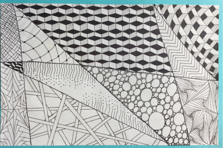
|
For my individual piece, I focused on zentangles. The zentangle method is an art form which uses many different patterns and shapes to create a beautiful and intricate design. I used 11 different zentangle patterns in my piece. My main source of these designs came from a zentangle book (courtesy of Deb) which guided me through drawing and creating each pattern. The most difficult and time-consuming pattern was the one with the 3-D blocks, one of my favorites in my piece. I really love the end product and how it looks!
|
|
|
|
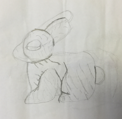
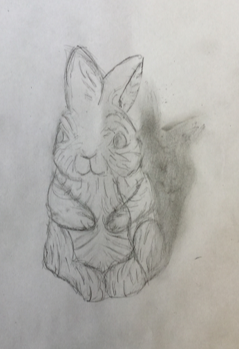
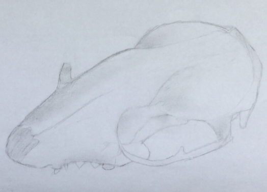
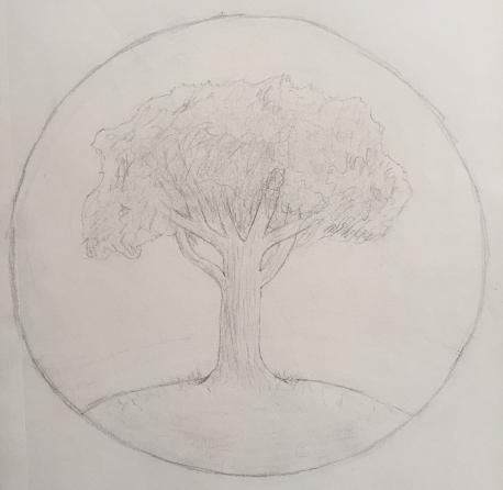
For my six sketches, I intentionally focused on drawing objects I thought would be challenging for me. All of them had different highlights and shadows that were really fun to draw, and I’m quite happy with all of them. I based my mural off of my second drawing (the tree), which was something that worked out very well. My favorite drawing of mine was the ceramic rabbit which taught me to focus on the finer details in order to enhance the overall image.
|
|
|
Ava T
As a required project, we were supposed to draw six observational drawings (still life). My drawings are of a paper crane, a mannequin, a mimic octopus, an axolotl, a tree full of birds, and a stained glass window. The animals (excluding paper crane) were depicted in a book about strange creatures. I enjoyed their amazing looks and decided to draw them. I found the tree of birds and the glass window at a restaurant in Detroit. The paper crane is my favorite, and the mannequin was my final piece.
Eliana
Observational Drawing
My observational drawings are all animal related (if I'm remembering correctly). My artwork was all made from pencil, a few were colored pencil, and/or sharpie. I tried to bring some of my observational drawings pop out, as if it were alive. These drawings helped me work on shading, and bringing objects to life. My final pieces were what I imagined. I'm proud of all the work I've gotten done this quarter.
My observational drawings are all animal related (if I'm remembering correctly). My artwork was all made from pencil, a few were colored pencil, and/or sharpie. I tried to bring some of my observational drawings pop out, as if it were alive. These drawings helped me work on shading, and bringing objects to life. My final pieces were what I imagined. I'm proud of all the work I've gotten done this quarter.
Tommy
|
My recreation was of M.C. Escher’s “The Waterfall.” It's a greyscale painting showcasing at least 2 people living in a small house that appears to be thriving off a water wheel powered by a geometrically impossible waterfall. First, I sketched the painting on a blank sheet of paper to get a feel of the painting itself. Next, I drew the painting in pencil. After that I painted it with black and white acrylic paints. I couldn't find much about Escher's thoughts on the painting, but to me it means that you really don't
have to care what other people think. My goal was to finish a mural this quarter, which I did not achieve. What I did do, however, turned out better than I thought it would. I also liked the idea of the Penrose Triangle. I think I learned to next time go a little faster and spend less time in class doing observational drawings and sketching the painting on paper. Overall I enjoyed working on recreating this. |
|
|
|
|
|
|
Chloe
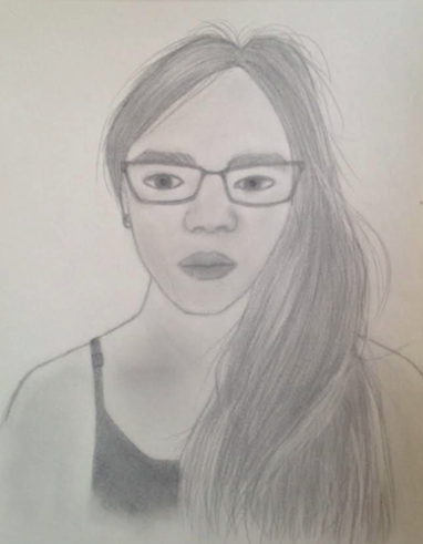
This quarter for my independent piece I did a realistic self portrait. In the picture I’m wearing a black tank top, with my glasses on and my hair over my left shoulder. My title is “Self Portrait”. The most obvious elements in my piece are line, shape, value, form, texture and space. The most obvious principles of design are contrast, movement and rhythm. The material in my drawing is made with a pencil and of course paper, I also used an eraser. I started my drawing by making an oval head shape in the upper middle part of the page. From there I drew the neck and shoulders. Then I drew in the hair, ear and
shirt. After that I drew the glasses, then the eyes and eyebrows. Finally I drew the nose and lips. I finished up by shading it and adding highlights. I was told to do this for my independent piece over spring break. My goals as an artist is to become better at drawing and painting. My piece helped me practice shading and texture. It also taught me another style of drawing. I learned that drawing noses and lips are very difficult. I liked how my piece turned out especially the hair, but I think the lips could have been drawn differently along with the shading which I could have done more of if I had more time.
shirt. After that I drew the glasses, then the eyes and eyebrows. Finally I drew the nose and lips. I finished up by shading it and adding highlights. I was told to do this for my independent piece over spring break. My goals as an artist is to become better at drawing and painting. My piece helped me practice shading and texture. It also taught me another style of drawing. I learned that drawing noses and lips are very difficult. I liked how my piece turned out especially the hair, but I think the lips could have been drawn differently along with the shading which I could have done more of if I had more time.
|
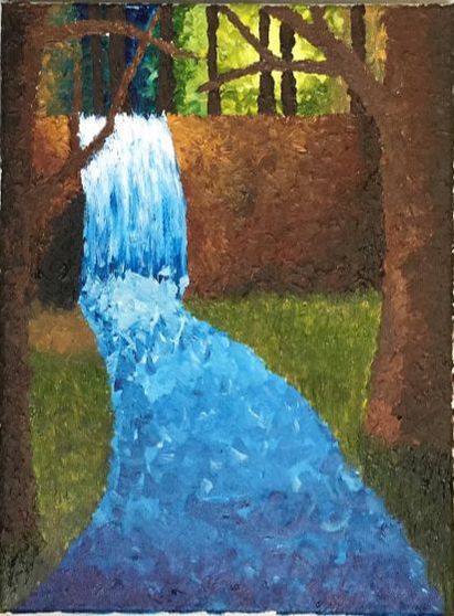
For my other independent piece I did a palette painting. In the painting there is a waterfall with bare trees on either side of it and bare trees in the background. The elements and principles of designs used in my piece are shape, color, value, form, texture space, emphasis, movement and rhythm. I used acrylic paint and a stubby brush to make my painting. I sketched out my painting then painted it in and finished up by adding shadows and highlights. I was inspired to become more familiar with palette painting because last quarter I did a masterwork by leonid afremov and I liked the technique he used. I learned that my acrylic paint always dries out unless there was a lot of paper towel and/or there was a lot of paint left. I also learned that it’s really hard to open the paint tubes. I liked how my piece turned out, but I didn’t really know the exact colors I was going to use so it was interesting to watch the colors come together.
|
Observational Drawings
I did six observational drawing for this quarter. The time spent on them was 30 minutes for five of the pieces and 45 minutes for one of them. The objects I picked were random ones found in my house and in the art room. The most prominent elements and principles of design in my pieces were line, shape form and rhythm. I think I improved on the elements and principles of design of space, texture, shape and form. For all of my observational drawing I used a pencil and paper (and eraser). I also included a felt-tip pen for one of my drawings. I wasn’t trying to show any emotion in particular in my pieces. I learned that it’s not as easy to draw everyday objects you find, some of them have a weird shape or the lighting is odd and the shading is difficult. Something that I noticed, but already knew about is that it’s hard to shade something sometimes because the shading gets smeared with your hand. That leads to either the different tones being blended and making them all look like the same tone or it makes the background of the white paper start to look a bit darker like grey and then in that case I have to spend time erasing it so it doesn’t look smudged.
I did six observational drawing for this quarter. The time spent on them was 30 minutes for five of the pieces and 45 minutes for one of them. The objects I picked were random ones found in my house and in the art room. The most prominent elements and principles of design in my pieces were line, shape form and rhythm. I think I improved on the elements and principles of design of space, texture, shape and form. For all of my observational drawing I used a pencil and paper (and eraser). I also included a felt-tip pen for one of my drawings. I wasn’t trying to show any emotion in particular in my pieces. I learned that it’s not as easy to draw everyday objects you find, some of them have a weird shape or the lighting is odd and the shading is difficult. Something that I noticed, but already knew about is that it’s hard to shade something sometimes because the shading gets smeared with your hand. That leads to either the different tones being blended and making them all look like the same tone or it makes the background of the white paper start to look a bit darker like grey and then in that case I have to spend time erasing it so it doesn’t look smudged.
Madeleine W
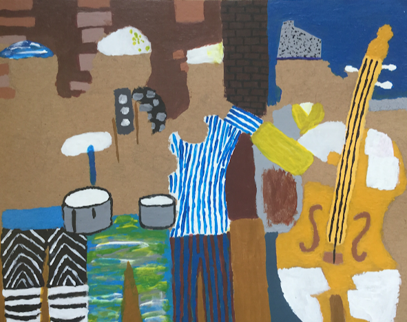
For my masterwork, I replicated Jazz Village by Romare Bearden. I did it in paint. I liked doing this piece because I haven’t really done anything in this style before and I liked that it was something different. This project was hard for me because I had to mix a lot of paint colors to get the right shades,and I'm not very good at that. I didn't finish this piece because I procrastinated. I was going to collage it and paint it at first, but then I ended up just painting it. I think if I had more time I would've used collage though because there were some things in it that I wasn't able to paint (like the trumpet and saxophone). I liked how it turned out, but I wish I had started earlier so I could've actually finished it. I think something I needed to do better was have a mo detailed sketch before actually starting painting, because the sketch was kind of vague and it made it harder to paint. If I had had a more detailed sketch I would've been able to know where everything was before I painted it.
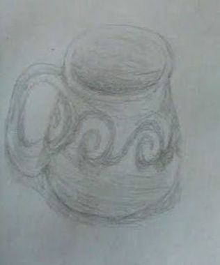
In my observational drawings, I drew a coffee cup, a book, a wooden block thing, a pair of glasses, a mug, and a little toy thing. I tried to focus on making my drawings as accurate as I could. I didn't turn in 2-5 on time because I did them at home and I forgot to bring them in to submit them. The main elements of art I tried to focus on were shape, form, and balance. I did all of my observational drawings in pencil, of random objects.
Duncan
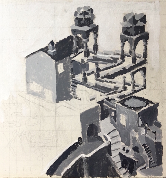
|
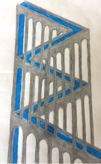
For my masterwork, I decided to create a piece in the style of M.C. Escher. The piece I made is loosely based of his piece “Waterfall”. I think the piece turned out pretty well, but there are a few things I would have liked to have added, like more contrast between the sides of the pillars, and a background. The materials I used for this piece was pencil and colored pencil. 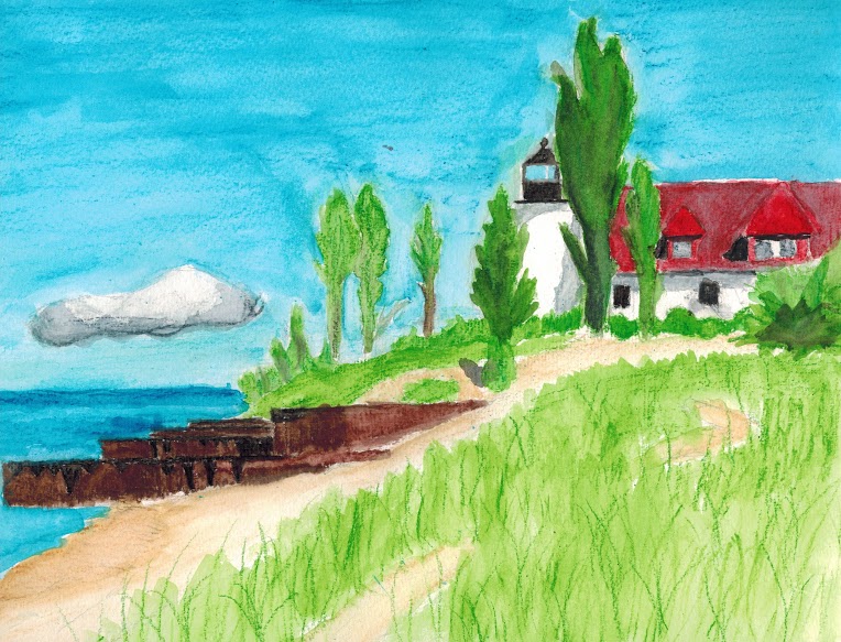
|
|
For my individual piece I did a watercolor of a picture I took while on vacation a couple years ago. This was my first time using watercolors, and I learned a lot while making the first draft and final piece. There are some things I would like to fix if I ever did this again, such as working on getting colors closer to what they actually are. Overall, I think I learned a lot this quarter, and had a lot of fun too.
|
|
Kate
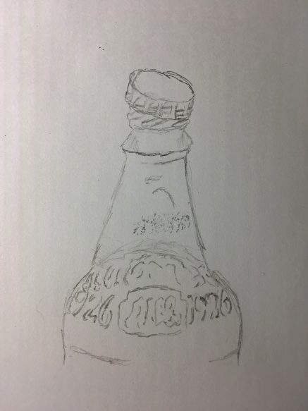
I am in making of an art piece called Inume In Kai Province. It was originally made by Katsushika Hokusai in 1832. I am painting this mural by the window on the stairs by Joe’s room. I am using paint to paint this mural. The blending of the paint does take a lot of time and effort to make it the right colors. I am working by myself on it and it’s taking a while. I am going to extend my work into next quarter, hoping that I will finally finish it.
The main struggle I’m currently having is getting the proportions at least decent. A helpful technique I should have used sooner was to paint the background first before I painted the part in front of the background. If you don’t do the background first, but after you paint the thing in front, the background can get on that front layer.
I didn’t express exactly any kind of mood in this except possibly putting Mount Fuji in the background, and how far the people have to travel to get to their destination.
I didn’t reach the goal I hoped to this quarter, but I hope to next quarter. That goal was to finish the mural.
I feel that I didn’t get too far this quarter. I feel this piece taught me not to work on a giant mural alone. It also taught me to prepare colors on my pallet, such as looking how it may look before I put it on the wall. It also taught me not to shade too much and sort’ve express the different colors.
Anabelle
|
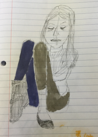
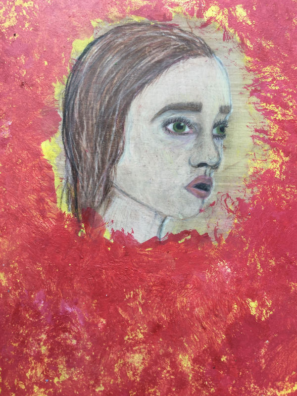
For my master work I made a drawing of a girl looking to the side. All around it has yellow and red paint. I restarted this piece two times before I came up with this. I wish I had more time to work on it I don't love how it turned out. I can't really think of a meaning behind it maybe it shows anger or confusion. At first the background was only yellow but then I spilled red paint on it and so I just painted the rest red.
|
