Quinn
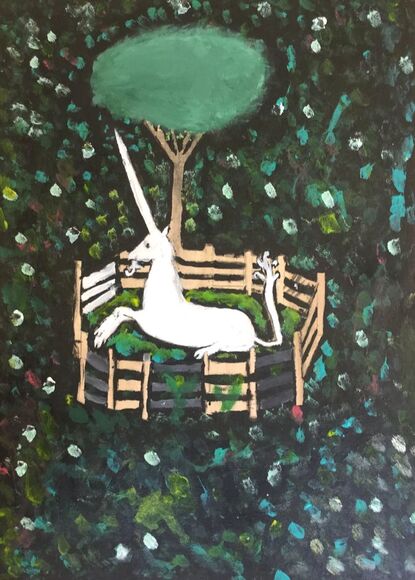
My Masterwork piece is black with a lot of little flowers and unicorn fenced in with a tree. The most prominent Elements of Art are the perspective, organic shapes, and visual texture. The original piece is a tapestry made with wool, silk, silver, and gilt so the original piece has a lot of texture because it’s woven. The most prominent Principles of Design are pattern, emphasis, and contrast. The title of this piece is The Unicorn in Captivity. This piece was made in 1495-1505.
I learn techniques like dipping my brush in water with black paint on the tip to make the black paint cover more space. I had to problem-solve because I painted the fence gray when in the tapestry it was a wooden-like color. However, I already had painted it gray so I decided to make a patterned gray and wood fence.
I think the inspiration for this piece was if unicorns were a real thing and the artist might have thought that they would be hunted. Humans would fight with unicorns, because they could be a threat. I feel sad for the unicorn, because it’s in a cage and has three gashes.
My goals as an artist are to be able to make art in a lot of different ways. This piece helped me get faster, and a better painter. This piece turned out as I expected. I think this piece will influence me to do more wood and paint pieces.

My independent piece looks hectic there is a lot going on. The most prominent Elements of Art and Principles of Design would probably be geometry shape, color, balance, and variety. The title of this piece is called Hectic people.
I used a palette knife to carve out more detailed parts. I had to turn words on the cardboard into a part of my piece.
This piece was inspired by Jean-Michel Basquiat he never went to art school and he just liked to express himself. I want viewers see that art is a form of whatever you think and/or that you are the only person who can choose what and how you choose it to be.
This piece helped me express myself I think I want to do more realistic art, but I think changing it up may make viewers questioning if I am a different artist. I think this piece helped me reach my goal of different styles of art. I don’t know if I want to continue this style of art.
Tess
Masterwork
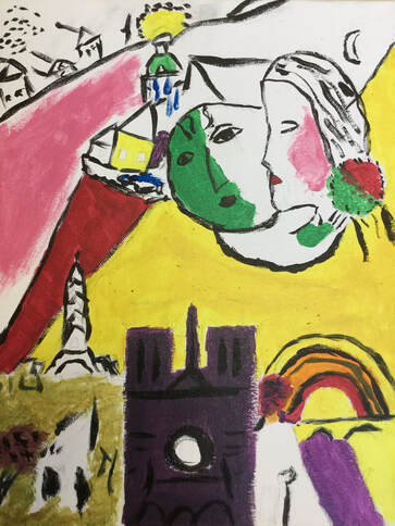
My masterwork was called Le Dimanche by Marc Chagall, and it was created in 1954. It has what looks like a mother holding her baby as they look over Paris. In the painting, you can see lots of famous French architecture. The most prominent Elements of Art are probably line and shape, and the most prominent Principles of Design are probably contrast and balance. This piece was created on canvas with acrylic paint, although I noticed later on that just from looking at it closer it was made with oil pastel and colored pencil. I didn’t have many issues or times that I needed to problem solve, because acrylic paint is actually very easy to work with! Probably the most important important and useful tool I used during all of this process was a grid. It was really helpful because I could see where some of the more intricate details were and I think it definitely made my recreation look a lot more like the original piece. When I see the painting, it makes me feel happy and portrays France as a desirable place and makes me think that the artist was very proud of this place and wanted other people to be interested. My goal as an artist was nothing in particular, I just think I wanted to improve in general. This piece definitely made me get better, part in skill but mainly in the mental barrier. This was my first quarter doing Masterwork, and I loved it. I had been very reluctant to join this elective because I didn’t think I was good at art, but just trying and seeing how well I did was really fun and interesting.
My masterwork was called Le Dimanche by Marc Chagall, and it was created in 1954. It has what looks like a mother holding her baby as they look over Paris. In the painting, you can see lots of famous French architecture. The most prominent Elements of Art are probably line and shape, and the most prominent Principles of Design are probably contrast and balance. This piece was created on canvas with acrylic paint, although I noticed later on that just from looking at it closer it was made with oil pastel and colored pencil. I didn’t have many issues or times that I needed to problem solve, because acrylic paint is actually very easy to work with! Probably the most important important and useful tool I used during all of this process was a grid. It was really helpful because I could see where some of the more intricate details were and I think it definitely made my recreation look a lot more like the original piece. When I see the painting, it makes me feel happy and portrays France as a desirable place and makes me think that the artist was very proud of this place and wanted other people to be interested. My goal as an artist was nothing in particular, I just think I wanted to improve in general. This piece definitely made me get better, part in skill but mainly in the mental barrier. This was my first quarter doing Masterwork, and I loved it. I had been very reluctant to join this elective because I didn’t think I was good at art, but just trying and seeing how well I did was really fun and interesting.

Independent
My piece is a guitar, two records, and drum sticks that have been hydro-dipped (something dipped in water with paint or nail polish on top). The most prominent Elements of Art are probably color and space, and the most prominent Principles of Design are probably harmony and movement. This piece showed many challenges, including timing, materials and size of materials. For example, it took me a long time to find a bin that would fit a guitar, and using nail polish didn’t last that long because they’re in such small bottles. But working through these helped me figure out how to work through any problems. I didn’t get my inspiration from any specific thing, but I knew that I could use a guitar and I wanted to use a creative time of style with the guitar. I hope people can see that even though it might be busy, looking closer you can see how it all ties together and how visually interesting it is. Again, I don’t have any specific goals, but I knew I wanted to try something new and push myself out of my comfort zone. Dipping things into paint is totally up to chance how it will turn out, which is not something I particularly like or I am used to. Doing this and experimenting with it was really fun to play with and really did push me out of my comfort zone.
My piece is a guitar, two records, and drum sticks that have been hydro-dipped (something dipped in water with paint or nail polish on top). The most prominent Elements of Art are probably color and space, and the most prominent Principles of Design are probably harmony and movement. This piece showed many challenges, including timing, materials and size of materials. For example, it took me a long time to find a bin that would fit a guitar, and using nail polish didn’t last that long because they’re in such small bottles. But working through these helped me figure out how to work through any problems. I didn’t get my inspiration from any specific thing, but I knew that I could use a guitar and I wanted to use a creative time of style with the guitar. I hope people can see that even though it might be busy, looking closer you can see how it all ties together and how visually interesting it is. Again, I don’t have any specific goals, but I knew I wanted to try something new and push myself out of my comfort zone. Dipping things into paint is totally up to chance how it will turn out, which is not something I particularly like or I am used to. Doing this and experimenting with it was really fun to play with and really did push me out of my comfort zone.
Conor
|
My masterwork was a piece of art by M.C Escher. It is a piece that has birds and when you get further down the piece, those birds turned into fish. It took around 5 classes to finish. It was pretty hard around the middle of the piece because that's where the two parts fused together. After I got a pretty good idea where everything went I outlined the pencil with sharpie. I colored everything in.
My independent was painting shoes. I bought the shoes which were Nike Air Force 1’s high tops. I decided I wanted to hydro dip them. Hydro dipping is where you get spray paint and spray the water with the paint. You dip the shoes into the water and it puts the paint on the shoe. So I did that and it looked so good I was happy with what happened. Next, I peeled off the tape which was put on the places I didn't want to get paint, after I did that I was still happy with the shoe. I waited two days for the shoe to dry and I went to check up on them, it looked like some of the paint was chipping off. Then I realized that that guy at the shoe store sprayed something on them to make the stay shiny, that's what caused the chipping. So what I am going to do is dip them again. |


|
Claire L
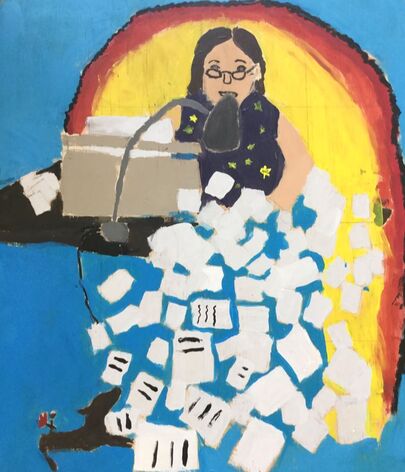
For my Masterwork, I recreated Margeret F. Stewart: Our Lady of Guadalupe by Yolanda Stewart. Our Lady of Gaudalupe was painted in 1978. Yolanda painted it of her mother Margeret sewing a big blue blanket with yellow stars, she’s working on a messy desk and at one of the leges of the desk there is a little angel with a couple roses. Margeret painted a yellow and orange light around her mother to represent the iconic painting Our Lady of Guadalupe. In the painting Our Women of Guadalupe, the Virgin Mary is the main part of the painting and she is the ideal woman in Mexico. By painting her mother in this setting she’s saying that there are all different types of ideal women. I recreated this painting except instead of painting Yolanda’s mother using a sewing machine I painted my mom using a typewriter. I decided to recreate this painting because I loved the meaning of it, that all women are the ideal woman. Yolanda used Harmony and Value in her painting, she made all the very different colors, shapes, sizes, and made it all work together to make a beautiful painting. To recreate this painting I used acrylic paint, and I worked on a piece of plywood. I learned to work through my problems, and what colors I should mix to get the best shade that I need.

For my independent piece I drew a picture with three buildings at the bottom of the paper with smoke coming out of the chimneys. There is the Earth across from a big clock with the writing “Time is running out” where the numbers would usually be. The background of my piece is just a bunch of little things, some of which are: fish, plastic bags, cans, plants, animals, etc. I used lots of color to make certain things stand out more than others. I also tried to make things that I wanted to stand out more bigger or over-exaggerate on the size of something compared to something else to make it seem more important. In my piece I used colored pencils on a sheet of paper. I tried to make sure that it looked like light was hitting from one side by making one side of the paper lighter than the other. On the circular things in my drawing I learned to curve the lines a bit when coloring it in to make it look more round. My artwork is about climate change and how it's affecting us and how it's going to affect us. This past September the seventh and eighth graders went to the climate march. Going to the climate march and learning about how it’s affecting us made me make some changes in my lifestyle. I really wanted to draw this because I am hoping that through my art I can inspire other people to make some changes themselves.
Overall my goals as an artist is to challenge myself. I want to be able to push myself to the next level, but I also want to make sure that I can do that and still be happy with my work. In my masterwork I think I challenged myself by changing the painting to something that’s in my life, and using acrylic paint which I’ve never used for that kind of more detailed painting. In my independent piece I feel like I could have challenged myself a bit more. I really like why I did my independent and what the message is, but I feel like I could have made the things in the drawing a little more detailed, and maybe used some different materials to challenge me more.
Overall my goals as an artist is to challenge myself. I want to be able to push myself to the next level, but I also want to make sure that I can do that and still be happy with my work. In my masterwork I think I challenged myself by changing the painting to something that’s in my life, and using acrylic paint which I’ve never used for that kind of more detailed painting. In my independent piece I feel like I could have challenged myself a bit more. I really like why I did my independent and what the message is, but I feel like I could have made the things in the drawing a little more detailed, and maybe used some different materials to challenge me more.
Sophia
In this art class, we make at least two art pieces. The first one we call a masterwork piece. A masterwork is when you recreate a famous piece of art. If you have already taken this class before then you are supposed to expand or interpret the piece to make it more original. Some examples of doing this are either putting yourself in the piece, changing colors, or adding something to the piece. After you are finished with the masterwork part, you make what we call an independent piece. This is a work of art that you created. Sometimes you can even do a mural of either of the pieces, as I did.

Master Work - George Lake Reflection, By Georgia O'Keeffe
George Lake Reflection is an abstract piece with bright and bold colors that range from cool to warm. The variety in the color helps different parts of the piece pop out. The piece was made in 1921-1922. Even though the piece is old it doesn't take away from how beautiful the piece is.
Georgia O’Keeffe was born in 1887 and died in 1986. She was 99 years old. During her art career, she went through different periods of art. Abstract art, American modernism, abstract expressionism, Precisionism, and modernism. Georgia O'Keeffe was inspired to create this piece by her regular visits to her family home in Alfred Stieglitz. She painted what she saw, and she wanted people to take the time to look at the piece and interpret it. The message she is sending in this piece is a meditation, that captures the beauty, and unspoiled landscapes. She built upon the tradition in the 19th century “Hudson River School artists.” I think the cool and warm tones together convey this message.
It is interesting because how one person might interpret the piece, another person could interpret a whole different way. I see the piece a lake scene, the black and white lines represent the point where the sun meets the water. And the different colored “round things” represent mountains. The little circles represent flowers. So together it makes a lake scene. When I look at this piece I feel calm.
I have taken this class before, so instead of interpreting the piece, I worked with some of my friends on a mural on the third floor of our school. We started by figuring out the right proportion of the piece to be able to put it on the wall. Then we sketched the mural out and started painting. We used rulers, erasers, pencils, tape, and acrylic paint to create this painting. While we were working we realized we were not working fast enough to meet the deadline. So our art teacher Deb gave us the idea to each work on separate parts of the piece. We learned that this strategy worked very well and using it we were able to complete the mural in time. I also learned that proportion is everything, and without proportion the piece will end up looking a lot different from the original. I have blended colors before, but I work on this piece really taught me how to blend correctly with paint. When you are blending, it is easiest to just keep going over the same place until you are satisfied for instance painting lighting and then slowly mixing in darker or light colors helps make the piece look better done. I think the most pronimate elements of art in this piece are color, space, and value. I think the more prominent principles of design are contrast and proportion.
My goals as an artist are to keep improving my painting skills and work more on my shading while using paint. This piece helped me work on these goals because I was working with paint and in the piece, there are some areas that have to shadow so I was able to improve those skills. The piece turned out basically like I expected. I just wish we had more time to work on it. This piece of art could influence my future art by working more with abstract pieces for inspiration

Independent Piece- Trees Through the Eye, By Sophia Szentkiralyi
This piece is a pencil drawing on wood. This is a piece of my eye looking at winter trees. You can see the reflection of the trees in my iris. On the spot the spotlight would be I made it into a moon. The background behind the trees is the wood. I left it just wood because I liked the texture and I think it adds to the piece. I started by sketching, using the iris as a guideline on how big the eye was going to be. Then I drew the trees and finally the moon spotlight. After the sketch was done, I started shading the trees with Prisma colored pencils. After I was done with the trees, I started the iris, and finally, I ended with the white part of the eye and eyelashes. While making this piece I used pencils, erasers, rulers, wood, and Prisma colored pencils. I think the value, color, and line are the most important element of art in this piece. Throughout the piece you can see the light coming through the piece and what areas the light hits, the value of consists throughout the piece. The value of the piece is essential to the message. The color is important to the way the trees are black and white and with the simple wood background, the blue of the iris really pops out. I think that contrast and proportion are the main properties of design in this piece.
I made this piece in October of 2019. The subject matter of my piece is to convey a message to take in our surroundings and appreciate what is going on in the moment. While working on the piece I learned how to shade trees and just working on shading in general. My main idea was to make my iris the background of my piece, but as I continued to work I realized that the piece would convey my eye more if my iris was blue instead of the background. I found my inspiration for my piece by looking at Magritte's painting of the eye. I also found some inspiration because I love winter and I want people to truly see the beauty in winter not just that it's the coldest season. The message I am trying to convey with this piece is to appreciate your surroundings and to live in the moment. I hope people who see this piece feel the same way and get a positive message from this piece. I tried to communicate this message by using the calm shading in the trees and then the bold iris.
My goals as an artist are to keep experimenting with Prisma colored pencils and wood. I would also like to learn how to draw other parts of the face and maybe even portraits. This piece definitely helped me with these goals. While making the piece my shading skills definitely got better. My piece turned out way better than I thought it would. I think this piece could influence my future artwork. I am thinking of doing a series with different parts of the face and nature backgrounds. I am really pleased with my work.
Johana

|

|
Describe your Artwork
Masterwork: The piece that I helped work on was Lake George Reflection. This piece was painted by Georgia O’Keefe in 1921 through 1922. My work is a big mural that resembles a lake. The main elements of design that I used were proportions and value.
Independent: For my independent, I chose to do a painting of a mermaid. I painted a mermaid with her back to us sitting on a rock in the ocean. The elements of design that I used most were color or value. The principle of design that I used most was emphasis. I guess I would say the title of my piece is Ocean's Mysteries.
How was this Work Created?
Masterwork: Our mural was created with acrylic paint and tape. My group really had to learn how to problem solve blending, space and the rhythm of our painting styles. The main thing I learned was how to blend. I learned it’s not just a layer of paint but smooth layers where you can't tell it changes color, but it gradually does.
Independent: My independent was created with acrylic paint and water. I mixed the paint with water so it was more like watercolors than acrylic paint. I really had to problem solve shadows and which way the light was supposed to be coming from. I learned to pick a point where the light starts and follow that gaze through the painting.
What is the Big Idea Behind this Artwork?
Masterwork: The big idea behind Georgia O'Keeffe's artwork is the actual Lake George. She had gone there as a young adult and fell in love with it. I believe the message behind this painting is to be happy in the moment. I also think there's something symbolic about this piece but I can’t quite figure out what it is. I think this is conveyed nicely in the piece with all the different colors.
Independence: I found my inspiration to do this piece because I love mermaids and the ocean. I hope viewers get the special feeling of being at the beach on a windy cloudy day. I feel like I communicated this by doing cool colors throughout the piece and of course painting the ocean.
Goals as an Artist & Overall Thoughts
Masterwork: Some of my goals as an artist are to learn a new skill and become better at looking at proportion. I really want to learn how to draw more graphic characters instead of realistic things. This piece really helped me because it was all about proportions and the lake was not like a typical painting of a lake.
Independence: My goals as an artist are also to use different types of materials and do more 3D art. I really want to use everyday tools to put together a piece of artwork. This piece helped me out because I mixed different materials that I would have never thought of using. The piece kind of turned out how I wanted it too. I had originally thought the mermaid was going to be in a different position. I am really happy with how it turned out.
Trey

|
For my masterwork I remade Le Chat Aux Poissons Rouges (which means the goldfish cat in english) by Henri Matisse. In the art work there is a yellow cat dipping its paw in a fish bowl on a blue table in front of a window.
To make Le Chat Aux Poissons Rouges I used a guitar and paint. I used the hole in the middle of the guitar as the top of the fish bowl, made a cardboard cutout of the cat, and hot glued it to the guitar. Henri Matisse had gotten his inspiration from artists such as Gauguin, Cézanne, and Van Gogh and cubism. I’m not sure if there's a hidden meaning behind Le Chat Aux Poissons Rouges, although there probably is. This art piece turned out better than I thought and over all I am proud of it. |
Independent
For my Independent piece I wrote a story about a chicken named Ralph. Ralph is an Invasive species known as the “Saber Tooth Chicken”. The piece starts out by Ralph spotting an egg and then eating it in a horrifying close up shot, followed by him turning around and seeing a little chick. Ralph gets a lust for blood, gets close to the chick and the story ends.
To make this I used 6 small pieces of wood planks and sketched the story, then I went over it and outlined everything with black colored pencil. After that, I colored everything in Prisma colored pencils.
My inspiration for this art piece was from Peppa pig. I thought of her eating bacon and then I thought of a cannibalistic Chicken. The only message in this art is never trust chickens.
Cecelia

My Masterwork
For my masterwork re-creation, I painted a piece called Bridge To Charing Cross. It was painted by Andre Derain in 1906. It is a beautiful landscape painting of trees, a bridge, a city, and a road. The shapes in the painting are not strictly defined because Andre Derain’s style was sort of abstract brush strokes and dots. I think the most prominent elements of art in the piece are color, texture, and value. The painting has unique colors that were hard to recreate. One of the hardest parts of painting the piece was mixing paints and trying to find the right colors. The most prominent principles of design were unity, movement, and proportion. Movement was shown in some specific parts, like the cars on the road. They were sort of blurry and non-defined to show the movement. When I first looked at the painting, I thought it looked pretty simple. When I started trying to recreate it, I realized it was actually very complicated. There were so many little details that I wouldn’t have noticed if I hadn’t painted it myself. I used acrylic paints for my masterwork. My surface was wood. I haven’t had much experience in painting so I definitely learned a lot of techniques. I learned how dipping my paintbrush in water helps the paint smoothly spread across the surface. I learned about how different paint brushes should be used for different parts of the painting, like when you have to go into greater detail, or when you have to paint a large area one color. I learned how to mix paints. By the end, I learned that it does not have to be perfect. When I first started painting my masterwork, It took me so long to finish one part because it didn’t seem good enough. Then, by the end when I was rushing to get it done, I realized I had to keep moving and it didn’t have to look exactly like the original piece. That it is my own version of it. Bridge to Charing Cross was inspired by the actual Charing Cross bridge in London. Derain made a painting of the bridge because he was sent on a paid visit to London by an artist and art dealer named Ambroise Vollard, and was told to bring back a series of painted landscapes for him. When I look at the piece of artwork, It makes me think of a peaceful city. I think the colors help convey that message. When I look at it I also think about some piece of wilderness that’s being turned into a big city, which makes it seem kind of sad. So I guess it gives a sad and happy feel.
This piece pretty much turned out how I had hoped! The only thing I wish is that I had more time to work on it, or at least that I had worked faster in the beginning. One of my goals as an artist is to become more comfortable with painting and mixing paints. Painting this piece did help me get closer to reaching that goal because I got to use paint. I can think about the way I painted this masterwork when I make my own future pieces. I can think about the ways I mixed paints and the techniques I used.

My Independent Piece
For my independent piece, I drew a mouse holding a bouquet of wildflowers in the rain. I call it “The Gift.” The mouse is gray with pink feet, pink hands, and a pink tail. The mouse is standing on a mossy log in a field. There are leaves falling. The background is gray rain. The mouse is holding a bunch of colorful flowers. I think the most prominent elements of art in my drawing are color, line, and texture. I used bright colors for the flowers to make them stand out. I used lines and curves to draw the mouse. I also used texture by spreading the oil pastel. The most prominent principles of design in my independent piece are emphasis, movement, and balance. In my drawing, I tried to emphasize the mouse and the flowers and make that a focal point. I tried to draw movement in the rain and place the different drawings in different places to balance out the piece as a whole.
I used oil pastels to draw my independent piece and my surface for drawing was wood. I hadn’t used oil pastels in a long time so it was fun to get to use them again. I kind of surprisingly learned a lot making this drawing. I learned how to transfer a drawing using a charcoal print by rubbing charcoal on the back of the original drawing on paper, and then flipping it onto the final surface and tracing the drawing with more force. It was really cool to learn how to do that because I had never done it before. I was surprised when it actually worked! I also learned that I love drawing and painting on wood because it is very smooth and forgiving.
I got the idea to draw this because I thought it would be cute and I love to draw mice. I feel like mice are a symbol of peacefulness. I liked adding the flowers in because it made it symbolic like the mouse is giving somebody a hopeful message in the bouquet. I would hope that people who saw it would think it was cute and peaceful.
The piece pretty much turned out how I wanted it to. I do wish I had more time to add more and be able to go into greater detail, but for now it’s just a simple drawing.
Jayden
|

|
Independent Flatland Piece
My independent piece has a lot of blue and green and white. The most prominent elements are value, line and shape. It actually looks as if it was a painting. At the top right you will see a line, that line is Lineland. It has A Sphere, A Square and Frau A Square in it. My work is about Flatland.
I made this art piece with Prismacolor pencils. First I put a sphere in with regular pencil. Then I colored it with neon green for the outline, and then grey for the eye. Green, red and pink for the insides. Then I used pencil for Frau A Square, used brown for the insides and blue for the eye. For A Square I used pink for the brain, red for the heart, green for the stomach, blue for the lungs and eye and black for the back area inside him. Then I wrote FLATLAND at the bottom, made the background with blue and white, and drew lineland with pencil. I also wrote a._square at the bottom too.
I didn’t have a big idea, I just made it without thinking.
I want my goal as an artist to be to have really nice looking clay Figures and to have published a really good book. To have a really good movie in theaters.
Rio
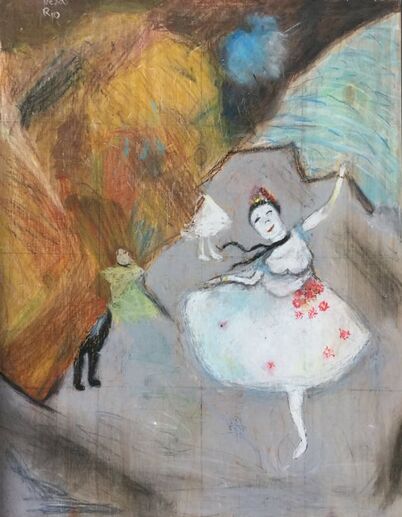
My masterwork piece is called "The Star" By Edgar Degas, and made in 1878. When I describe this piece, I think of it as a very graceful calming piece of art to look at, especially because of the balance and movement in this art piece, and the way the lights and dark go together perfectly and how she is performing in a very majestic pose.
This piece of art was created originally with paint, but I decided I wanted to use oil pastels instead of paint like Edgar Degas, because I wanted it to be more original, I thought that it would be a better idea because of all the blends and textures in this piece, and with pastels you can really blend and get lots of texture. One of the techniques that helped me along the way that I found was helpful is to use a paper towels to blend the colors together. Some of the things I learned when I was working on my piece is to keep trying and you will get it, there are a lot of the different curves and shapes in this piece which made it harder, but what I learned is that it is very helpful to make a grid and make sure that you look at the grid more that you look at the piece.
The big idea behind my masterwork is that Edgar Degas wanted something eye catching and something fun to look at, which is why he made this painting of a leaping figure, something that would make you gasp.
My goals as an artist is to be a cosmetologist, because I feel like your face is a blank canvas and you can do what you want with it. My overall thoughts about this is to do what makes you happy because why do something that you don't enjoy.

My Independent Piece
My independent piece is of a sunrise which is inspired from when I saw a sunrise when I was on my way to school one morning. I decided to make a painting of this because I thought it would be very pretty to look at, mostly because I think a lot of sunrises have a lot of variety, color and form. I created this by blending a lot of different colors with white to make lighter colors and not as much white for darker colors. Some of the techniques I used for the trees in the background when I made the leaves using my fingers to give them texture and variety. I had a hard time making the trunk look realistic, but I solved the problem by using various shades of brown.
I got my idea by looking at nature and what's around me, I thought I should put the nature I see in my artwork. My piece turned out exactly how I imagined, because I was really ready to start and had everything planned out in my head already. This helped influence me to create when I'm inspired.
Stephanie
Masterwork
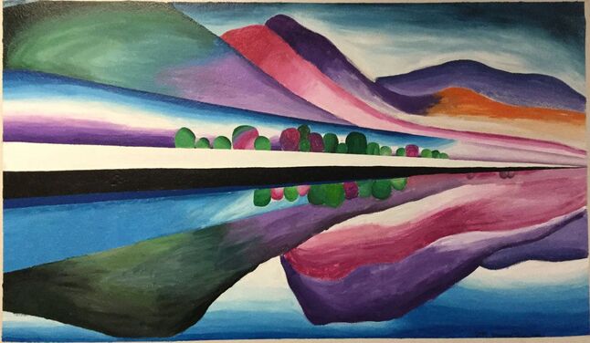
This piece was made by Johana, Sophia, and I, as a mural on a wall on the upstairs of or school. Our piece was a recreation of the piece of artwork “Lake George Reflection” by Georgia O’Keeffe. It was created in 1922. It is a very colorful, bright and vibrant oil on canvas painting. The canvas was measuring 5-feet by 3-feet long.
The main three elements of art in this piece are, color, value, and space. We had to work a lot with colors in this piece trying to match up the colors we mixed to the colors in the actual oil painting. We were also working a lot with values and blending trying to get all the different tones of each color and fading them dark to light. And lastly, we worked with space trying to recreate this piece. Making it look like some of the mountains are closer and some father away.
The most prominent principle of design in this piece was probably contrast. You can see the contrast between the different colors of mountains, with some really popping out more than others. There was also some balance between the top and bottom piece of the painting. Both halves were almost symmetrical, which really gave balance in the painting.
This recreation was done on one of our school walls with acrylic paints. We worked with trying to do a lot of blending in this piece, problem-solving through the difficulties of trying to blend the acrylic paint on the wall. We were all struggling with our own difficulties at the beginning with this piece. But for me what really came together more at the end was my bad tendency to just paint different layers of each shade of the color I was working with instead of actually blending the colors to make them come together more. I learned a lot of different techniques while blending such as using water or different sizes and shapes of paintbrushes. I also learned a lot about space and perspective when sketching the piece out. We also used the technique of taping some of the mountains while painting it because it was on such a large surface.
Georgia O’Keeffe’s paintings were often inspired by her surroundings and what she could see around her. Georgia O’Keeffe was said to have been inspired by the visits she took to her family home of Alfred Stieglitz's, which was on the upstate New York lake.
When I look at this piece it just fills me with joy. It’s such a colorful, bright, and vibrant piece you just can’t stop looking at it. All of the different bright colors and spacing and proportions of where each mountain sits just make the whole piece fit together really well.
I have recently been working on making more realistic pieces and paintings but have wanted to try and make just a little more abstract paintings trying to work with different colors and exploring the color theory. Doing this mural really gave me a chance to work bigger with a piece and be able to focus on getting to work a lot more with colors trying to make just the right tone with the acrylic paints, instead of working with a lot smaller surface focusing on each little detail.
I do think this piece turned out very well considering we had to try to combine all our different techniques and skill levels into one big painting. It was sort of a struggle at first trying to make all of your own personal styles blend together but we were able to communicate better and make everything come together.
This piece did inspire me to in the future to work making more abstract art and using more creativity to figure out my own style of art instead of just every time painting off of a picture from the internet or my camera roll. I really enjoyed recreating this piece as a mural.
|

|
Independent
This was a piece of art I created myself called “A Single Rose”. It is a colored pencil drawing that was done on wood. It is of a floating hand holding a single rose, with a light blue watercolor background and with the quote “You make me laugh even when I don’t want to smile”
The most prominent elements of art in this piece are probably form and shape. They both really played a role in trying to make a realistic hand trying to get the actual shape of the hand and the form to make it look more three dimensional. And for the principles of design, the most prominent was mostly just emphasis, trying to really make the hand and rose stand out with the blue background.
To create this piece I used color pencil on wood with a watercolor background. I learned a lot about trying to use a lot of different shades of color pencils to get the ‘just right’ skin tone color, which was harder than I thought it would be and after many tries still didn’t turn out perfect. But I was learning about trying to just keep layering different shades to get the shade that worked for me. And also I was learning about trying to make the hand pop out more from the background even before I added the watercolor by trying to create different thicknesses and shades of lines around the hand trying to make it not blend in with the wood so much. I did also find that using your hand as an example to sketch the hand really made a difference.
In 6th grade, we had done a project of trying to draw your hand drawing something. And that was one of my favorite projects we had done and had really inspired me to practice drawing more hands. And I have been practicing sketching hands but this gave me the opportunity to draw one that I could actually turn into a project. And I had decided to make it holding to rose because I really enjoy drawing flowers and roses are my personal favorite flowers. After finishing the piece I then had decided to add a quote to fill in the blank space. And I added this specific quote to try to communicate the fact that you will always have someone by your side, no matter if it's a family member, friend, or classmate. I hope people feel inspired by my piece and that it makes them happy.
This piece helped me meet my goal of drawing more hands and turning one into an art piece that people will enjoy and this really gave me a chance to do that. I really like how this piece turned out in the end. I wasn't too sure I like the watercolor background. But after I was finished I was glad I did it because it really helped to make the hand pop out more. Creating this piece inspired me to keep drawing hands and draw some other ones that are in different positions or that are holding other things.
Julia
For my masterwork, I recreated Claude Monet’s “Woman With a Parasol”. He finished the painting in 1875 in the style of impressionism. In the painting, Madame Monet is standing in a field, holding a parasol with her son on a sunny day. Claude Monet was not rich at the time, but he painted the parasol and veil as a symbol of status. The parasol also symbolises protection, Madame Monet protecting her son. Monet painted it outside to convey the feeling of a casual outing, rather than a formal portrait. I wanted to recreate this painting, because I thought it was beautiful in the way that it symbolises a mother protecting her son but, also, I loved the way the colors make you feel like you are there with them. Instead of using oil paints on canvas, like Monet, I chose to use oil pastels on wood. This was one of my first pieces with oil pastels, so it was a little challenging at first, but I soon learned how to blend them together, and add layers and textures. I think that the main elements in this painting are color and space. Monet used both vibrant colors and pastels to make certain things stand out. He also used space to indicate closeness between Madame Monet and her son. Working on this piece, I learned how to blend colors to create a textured look, and how to work through my problems. I had a lot of fun trying this out. It was a fun challenge.
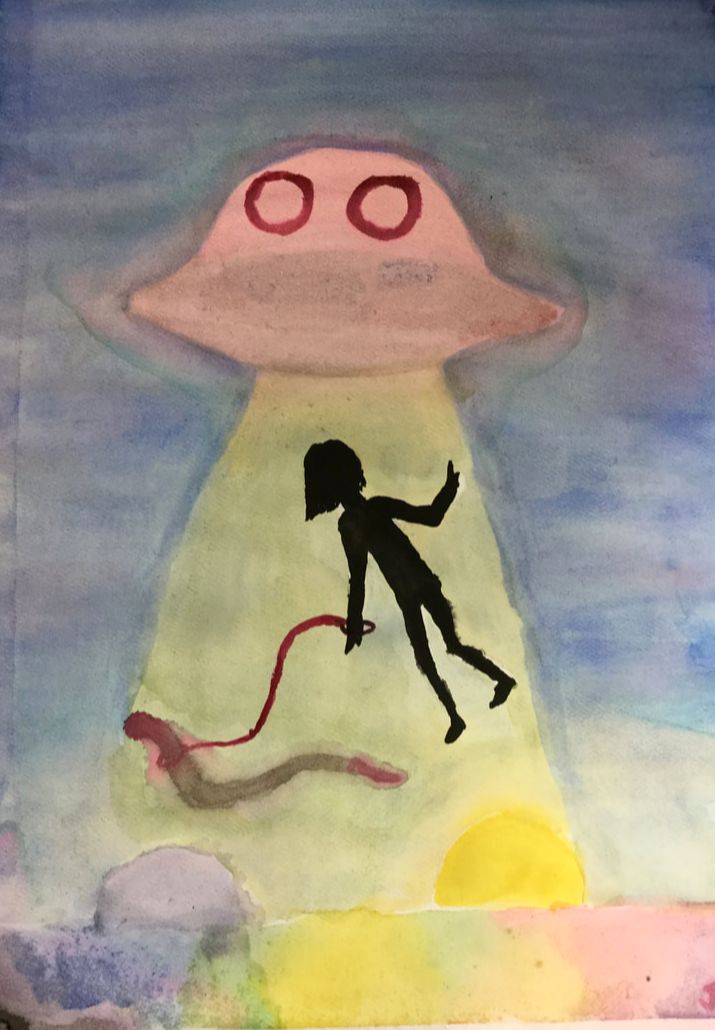
For my independent piece, called “Tied Down“ I used watercolors to create a surrealism style painting with a spaceship beaming up a human, holding a worm. I tried to use Color and Value in my painting. I couldn't decide what color to make the grass at the bottom of the paper, so I decided to make it a rainbow explosion of color. I also used value to make things stand out in the foreground. In the back, I used mostly watered-down colors, and pastels, but for the human and worm, I made the colors darker and more potent. I exaggerated the size of some things, like the worm, to make them seem more important. I wanted to try something new when I made this piece so when I was painting this I think I really stepped out of my comfort zone, working with watercolors. While making it, I learned how to blend colors, add layers, and create contrast.
Over all, my goal as an artist, is to challenge myself, and to try new things. I also want to spend my time wisely and work on my pieces whenever I can. I want to focus on detail, but still pay attention to the big image. I challenged myself working with the mediums I chose on both my independent piece and my masterwork. Both of them, oil pastels, and watercolors, were mostly new to me, so I am happy I tried them. I am excited to work with them again in the future.
Over all, my goal as an artist, is to challenge myself, and to try new things. I also want to spend my time wisely and work on my pieces whenever I can. I want to focus on detail, but still pay attention to the big image. I challenged myself working with the mediums I chose on both my independent piece and my masterwork. Both of them, oil pastels, and watercolors, were mostly new to me, so I am happy I tried them. I am excited to work with them again in the future.
Sam
Masterwork
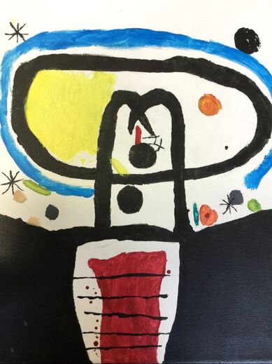
The art looks like a “Space Tree with a face”. I think the most prominent elements of art, and principles of design are, color, contrast, and shape. This piece is supposed to illustrate the earth's equator passing under the sun, the piece is called “Equinoxe”, and was made by Joan Miro in 1967.
This art was originally made by Joan Miro, and was an etching, although I used paint, one way I had to problem solve while making this was to use a sponge instead of paintbrush in the top right corner.
He got lots of inspiration from his teacher at his art school, Francisco Galí. The art is about the earth's equator passing under the sun, and I'm sure it has other meanings, when I look at this artwork, I see a tree with a face, and it is happy. This piece helped me become better at painting, which is something that I feel I struggle with.

Independent
My independent piece looks like an airpod with zentangles around it. The most prominent elements of art and principles of design are, pattern, line, and color. The piece is supposed to illustrate how good airpods are. The piece is called “I Should Get Airpods” and it was completed on October 26th 2019.
For this piece, I used pencil, sharpie, and Prisma colored pencils. I made the zentangles in pencil, then i went over them with a sharpie, and the colored pencils were for the rainbow coming out of the airpods speakers.
My inspiration for this piece was mainly how much I want to get airpods, but my parents will not let me buy them for myself, when I look at it, I see a rainbow coming out of the speaker, and it demonstrates how good the sound quality is. The piece turned out better than I imagined, and helped me with being more creative, because many times I had to come up with new zentangle designs.
Rex
|
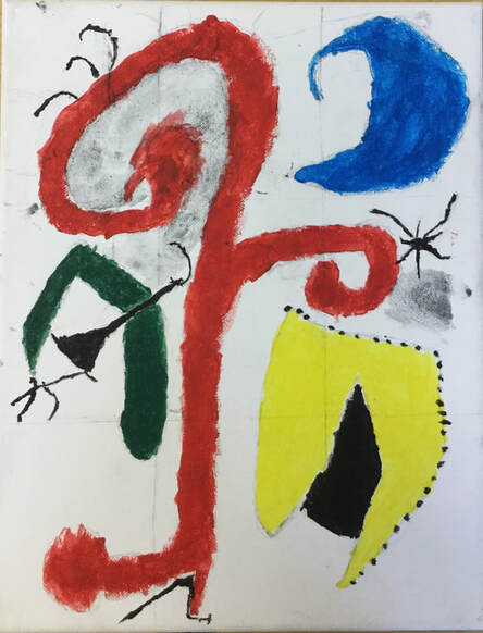
My piece has a white and grey background and has four main organic shapes. One of the main principles of design is variety. The name of the piece is "Jardin au Clair de Lune" and it was made by Joan Miró. To recreate the piece I was assigned to I made a sketch of the painting then used acrylic paints to finish it off. For the small part of the background I did, I used black acrylic paint and water and spread it around the canvas. I’m not completely sure where Miró got his inspiration for this piece, or his ideas for it. When you look at the piece from a distance you might think it is abstract but when you get closer to it you see that those shapes are part of the garden.
For my independent I did a concept for an album cover for a band I’m part of. The main principle of design is unity. The name of my piece is "Game Together." To create my piece, I sketched using pencil. I got my inspiration for my piece from the name of a song that I wanted to make. Since the piece has all of the major platforms for gaming on it, it has the message of people doing things together no matter what they play on. I was trying to show the unity of this hobby where your background doesn’t matter, and you can just be a person. I don’t really have any goals as an artist currently. Art isn’t something I can see myself pursuing or taking seriously in the future. Because of this I don’t really have any hopes/plans for myself as an artist.
|

|
Nakoa

My master work
It is light and dark it has a lot of variety and it has a lot of proportion and texture. The piece has no white anywhere on it it is colored in with little lines of blue and other colors like red and yellow for the sun and brown for the buildings in the distance and the dock on the left of the canvas.
How was the piece made
The first material I used was pencil, I copied the bridge and the building with the pencil. Then I used paint to fill it in while I was looking at the real painting. I think I learned a different way to paint, it was nice.
What was the big idea behind the piece
I could not really find what the reason they made the piece, but there was a little bit. The info said he was inspired by the Kensington gardens.

My goal
I would say my goal is to be a better artist but that is a really broad term. So then my goal would be to get better at painting and drawing straight and just lines and other shapes that look like the real one without needing a stencil or a ruler.
My independent
The elements that are in my piece are variety, proportion and repetition. The materials I used for my independent where pencil and only pencil. It looks like a genie lantern with a bunch of faces coming out of it there is one big face in the middle and there are many little faces surrounding the big face.
Why I made my independent
I thought it would be fun because it had so many different emotions. Some of the faces are mad, some are happy, and some are sad. I did it because of all the different things I could put in it. And I kind of felt like I could really be open and put all of my thoughts in to it.
Claire

Purple Leaves by Georgia O’Keeffe
The masterpiece that I recreated was called Purple Leaves by Georgia O’Keeffe, created in 1922. It was designed to make something simple like leaves look beautiful in its own way, making the whole thing all about leaves. It was inspired by her love of nature.
I used acrylic paint to make it. I learned that adding more water to the paint, and putting on more coats really helped with getting the color that I wanted. With adding more thick paint I found that it was harder to find what color would look the most like how I wanted it to look.
Georgia O’Keeffe’s inspiration from nature made her want to capture the little beauties and isolate the leaves from their natural setting. Adding a different and un-natural color to the simplicity of the leaves really makes them pop from the canvas. This piece spoke to me because I have a love for nature and making something so simple look so amazing really inspires me.
Some goals I have as an artist are to bend the rules of reality and not always create things that are realistic. Recreating this piece really helped me understand that art isn’t always realistic and it can go different ways than what we can see.

My Independent Piece
My independent piece is called Run Away. Some of the most important elements of this art piece are value and space. I created this piece to portray what is happening in the world and hopefully open other people's eyes. The painting is of a deer running from a factory to its natural habitat. I used oil pastels on a wood canvas to make my independent piece. I learned that it is easier to blend with oil pastels if there are more coats than a thin coat on wood. It was my first time working with oil pastels. One issue I had was oil paint didn’t cover some wood areas well so more coats were needed.
The idea of this piece is to portray what is happening in the world, and how I think it should be. It is meant to portray how we as people are ruining the earth and hopefully open their eyes to what is actually happening. I have been a vegetarian for my whole life because it is not fair to the animals being killed and I feel that this piece really expresses that about me. Climate change and fossil fuel factories are also portrayed in this piece.
My goals are to try to work with more and different materials in my art. This piece helped me with that because I had never worked with oil pastels before and I will definitely be working with them in the future.
Grace

|

|
Stella

|

|
Fauti
While making this piece, it seemed a bit hard at first but it slowly became easier and easier. I noticed how she made the movement and slight curves in the art. I noticed the blending and how hard it was to make the curves that looked so smooth and simple, I noticed how hard it was to make the white stay in one spot and how hard it was to make the texture look nice and smooth.
The original piece of art was made with oil paint. The paint that I used was acrylic. The biggest challenge in making this piece of art was probably the curve in at the top of the piece. The big idea of the art is to understand the bigger picture. Georgia O'Keeffe's art is mostly of a close up of a flower or a rose and she does this to help you understand the bigger picture. My main goal as an artist is to focus more on my blending. I feel as if my blending in my artwork is nowhere near as good as Georgia O'Keeffe. |
My art teacher asked me to describe this piece of art that I had made. At first I didn’t understand what she meant so I stared at the art work while trying to figure out what this woman Georgia O'Keeffe had made and it finally came across my mind on what she meant.
This piece of artwork was originally made my the artist Georgia O'Keefe. 
|
Devi
Masterwork
For my masterwork, I recreated a painting by Franz Marc called “Sleeping Cat”. I worked with a variety of different colors and blending techniques. In the painting, a white cat is sleeping on a yellow pillow, with a reddish orange blanket under it. There are light gray highlights in some parts of the cat, and it was very hard to recreate because it was tough to try to blend the white and gray paints together.
Franz Marc is known for painting cats in his artwork, so I’m sure he had a few cats at home. My goal for this painting was to experiment with different colors to try to find the right ones, and learning how to blend colors together. When I was re-creating this painting, I learned that it’s OK if it’s not the exact same as the real thing, and that it’s OK to have your own style.

|
|
Independent
For my independent, I wanted to do something with flowers, so I decided to do a painting of flowers on wood. I originally had the flowers light pink, but I repainted both to a dark purple shade. On the left side of the painting, there’s a big flower, and on the right there’s a smaller matching one. When I was blending the paints, I dipped the tip of the paintbrush in water, and that helped smooth the paint. I was excited to be able to do a flower painting, because I have been drawing flowers for a long time. My goal with this painting was to learn more about contrast and blending. When I was painting this, I learned that it’s ok if you make mistakes, because they can make the piece better sometimes.
For my independent, I wanted to do something with flowers, so I decided to do a painting of flowers on wood. I originally had the flowers light pink, but I repainted both to a dark purple shade. On the left side of the painting, there’s a big flower, and on the right there’s a smaller matching one. When I was blending the paints, I dipped the tip of the paintbrush in water, and that helped smooth the paint. I was excited to be able to do a flower painting, because I have been drawing flowers for a long time. My goal with this painting was to learn more about contrast and blending. When I was painting this, I learned that it’s ok if you make mistakes, because they can make the piece better sometimes.
