Gillian Perry
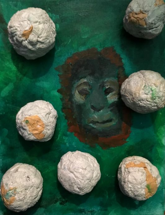
My artwork is a painting of green and yellow dense foliage, accompanied by an orangutan head peering out of the bushes. Glued to the canvas, there are balls of white and orange paper. The title of the piece has not been chosen yet. The elements of art most obvious in the work are value, texture, shape, and color. The principles of design most obvious are emphasis, rhythm, and unity.
My artwork is oil and watercolor on canvas. I made the balls of paper by tearing old pieces of paper up into tiny little bits, soaking the scraps in water, molding that into balls, and waiting for them to dry. When they dried, I hot glued them onto the finished painting.
My artwork is inspired by the modern art section of the DIA, and music I’ve heard. My artwork is about personal issues, specifically feeling out of place. To show that feeling I used things that “stuck out” of the canvas. I used a background of jungle and an animal to convey the feeling of not fitting in with the natural order of things. The orangutan face was chosen because orangutans look like especially wise creatures to me, and they are awfully close to humans in DNA, which I think is good for my purposes. The reason I didn’t use, say, the face of a chimpanzee, or gorilla, is because I like the orange fur of the orangutan. Orange feels like a chaotic and attention grabbing color. The balls of paper are made from crumpled up pages of old drawings and writing I made. These old papers represent confusion.
I don’t really have any set, defined art goals. I mostly just would like to make art that I’m proud of that also means something important. I like to make art to express myself and get my ideas out there, and I think that the creation of my independent piece gets that across and meets that “goal.”
I’ve never used oil paints before, so I have a better idea of how those work now, and will maybe use them again. The final version of the piece didn’t go with my original idea, since the first plan was to paint in machinery instead of the ape, but after looking at pictures of machines I could draw inspiration from, I wasn’t all too excited about that plan any longer. I don’t like my piece that much though, I think the balls of paper look a bit off, and I have more balls on there than I need, and the foliage didn’t go as well as I wanted it to because the oil paints were foreign. The orangutan is also lacking because I have no prior experience with painting apes. I think I’ll probably work more with textures after creating this, and will probably paint more natural things, since I liked painting the primate.
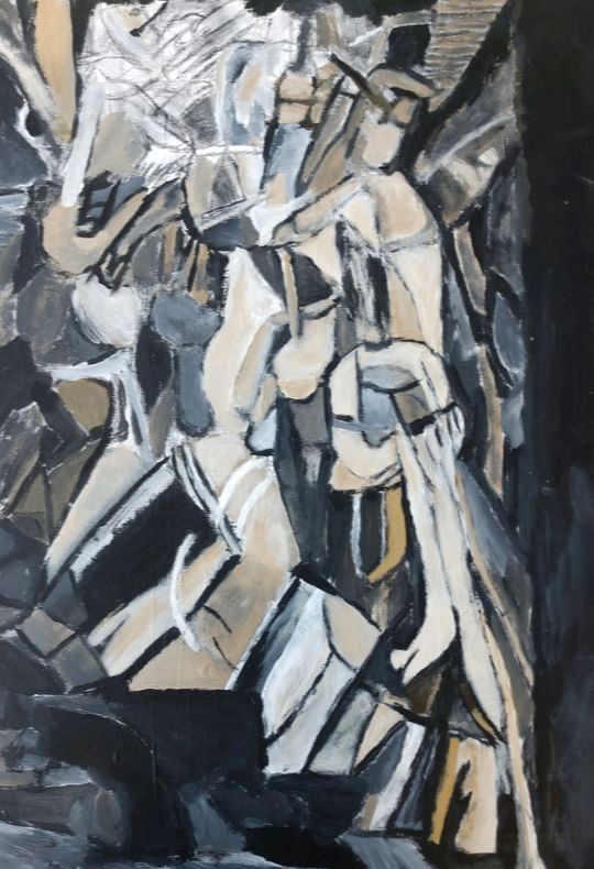
The artwork I recreated is a cubist painting done in grays, golds, browns, and tans. The subject is a splintered form in the stages of going down the stairs. The title is “Nude Descending a Staircase, No. 2,” and in the bottom left corner of the piece there is a caption in French reading “Nu Descendant un Escalier.” The elements of art most obvious are line, shape, value, and color. The principles of design that are most obvious are movement, rhythm, and emphasis.
My recreation is acrylic on canvas. I used a grid transfer to try and be as precise as possible, and also used charcoal to map out where the paint should go.
Marcel Duchamp, the original artist, was inspired by time-lapse photography, specifically a photo series titled “Woman Walking Downstairs.” The painting is a depiction of movement and energy. It’s a futurist body passing through space.
A few of the things I’m fixated on in terms of developing a style based on are abstract expressionism, cubism, surrealism, pop art, and so on, along those lines of modern art. Recreating the painting was a good experience in trying out working in these styles, which was definitely beneficial and will be useful later. In the course of recreating, I learned many more things about acrylic paints, which is a medium I don’t really use often. I learned how to blend paints to create a fade effect, and learned to layer the paint to build up more of a texture. I will certainly be using many of the techniques I learned in future works along with drawing inspiration from the painting itself.
I didn’t actually finish the whole painting yet, because it’s a very detailed piece and I used quite a large canvas, and admittedly kind of took a bit more time than needed. I specifically took too much time with the charcoal, trying to get every single detail exact when that wasn’t very necessary. I do plan to finish it soon though.
Sophia
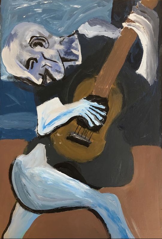
Master Work (The Old Guitarist By Pablo Picasso)
This piece is a painting of an old man playing a guitar. It was made in Picasso’s “blue period” so most of the colors in this piece are a shade of blue. My recreation of the piece is on a canvas. As I was working, I noticed the texture with the man’s clothing and how the shapes and lines sometimes were pointy. I also noticed the more detail I had the more it looked like the original piece.
I used pencil, paint and a canvas to make this piece. I started by drawing the basic outline of the legs and working my way up. After I was done with the outline, I started painting the background first, and after that, painted everything but the skin. I did the skin last. The skin was probably the most difficult part, because you had the get all the shades in his skin right.
I was inspired to do this piece because I have seen this piece in real life and I thought it would be neat to try to recreate it and then go back and see the real thing. I tried to show an unhappy feeling in this piece, because to me this pieces shows a sad time in someone’s life. I think this piece expresses sadness and a sad time. I think some people can relate to this piece because they could be going through a sad time.
My goal was to learn how to paint and use paint. I also wanted to learn how to show shadow and light. I think for the most part I accomplished my goals. I think this because I now know how to paint and use paint. I had a little trouble with the texture of the clothes and skin. I think I have shadowing and light down now. I learned how to use paint and how to mix paint and how to paint realistic pieces. I also learned how to use lights and darks in certain areas. The final piece was better than I thought I could do. I am happy with the final piece.
Independent Piece (Tropical)
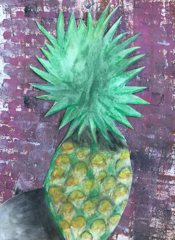
This is a piece of a pineapple in the sunlight. The background is mainly purple, I chose this because it is the complementary color of yellow which is the main color in the body of the pineapple. As I was working on the piece I noticed the individual parts in the body of the pineapple.The piece is done on a thick piece of paper. I used pencil, oil pastel, and a painted background to make this piece.
I started by drawing the basic outline of the oval of the pineapples body and then I worked on the leaves. After I was done with the outline, I started adding the color with the oil pastel. I started with the green in the leaves and then worked on the body. With the body I started by putting green in between the gaps. Then I started on the yellow and orange. I made it lighter on the right side and darker on the left with a shadow on the left side. This gave the illusion that it was in the sunlight.
The most difficult part was working with the oil pastels, because I have not used them very much and I did not realize how much they smeared. It was also hard doing the body of the pineapple because there was so much detail in it and the oil pastels smeared so much.
Ian
Dark Rider Again By Eric Joyner
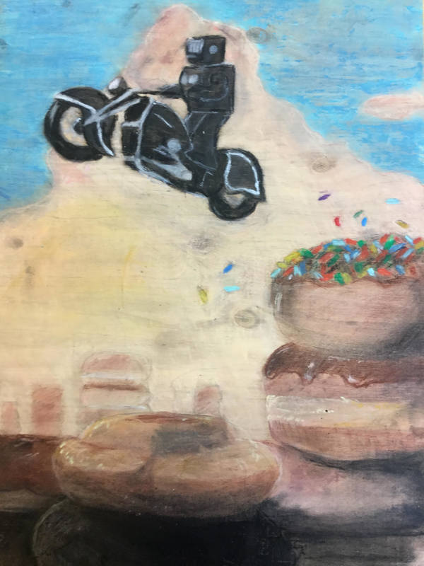
The original was done on a canvas with paint and bright tones, my recreation was limited in the sense that I was using oil pastel on a wooden board, the tones ended up being a little more dull than the original. The sky changed from a bright and vibrant blue to a more dull blue with a little of green tones, and the sprinkles on the doughnut in the original were slightly neater than the recreation. In 1999, he chose to focus only on topics that he likes. He started painting with four different elements: Mexican masks, San Francisco city life, old newspaper cartoons and Japanese robots. He found that the robots were the most popular feature with his friends.He had been collecting toy robots for about 20 years and wanted to bring them to life. In 2002, he felt that he needed another element to work off of. I started with the motorcycle and then the doughnuts, however first I laid out the shape of each with some measurements of the printout copy and the wooden board and lowered it down to a small portion of the board, but I made a grave mistake, I did the foreground first instead of the background, then from there I filled in the out each outline with color. My big Idea behind my artwork was to copy the essence of the one that came before and to make it a wonderful piece the would bring people to a warm feeling inside.
My goals for this piece were to copy the original in a way that was original in its own way. My overall thoughts about the artwork were that I finished the minute details and I am very proud of what I have done and what I was making. The art piece can now let the viewer see the original but in a new light.
Light Amidst Darkness
By Ian Schleick
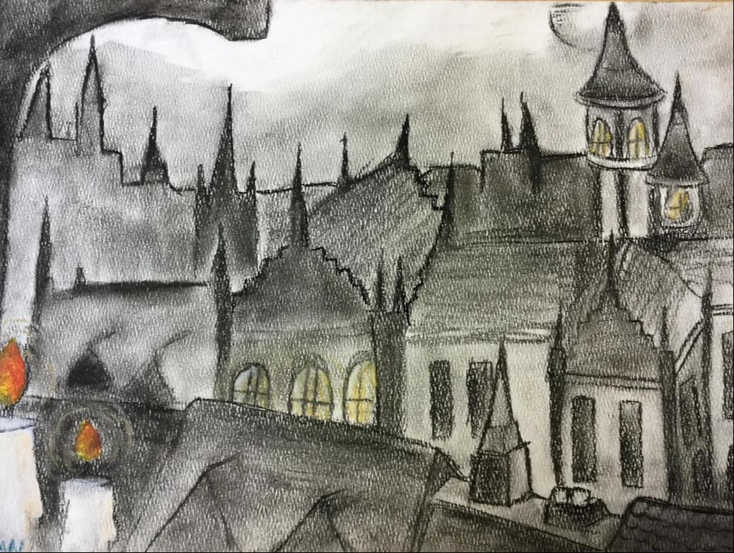
In the bottom left there sit two candles each one with a light wax dripping down on either side, 21 different spires reach to the sky and two towers sit on a top of a dark road of broken dreams. There is a lot of space and depth which brings out the rooftops of the old city. When I started with the original idea I wanted the piece to sit ion the paper, portrait, not landscape, but ideas change and so did the orientation of the paper. I came to the resulting idea of the arch with the candles under it, that's where I started, beyond that is when I let my imagination take the wheel. In the end, I had an old and dead city with the sliver of light on a sheet of paper. The idea behind my artwork is to lead the viewer’s gaze to the bright points of light value and let them slowly see the darkness creep in, in every direction and soon it will make the viewer glance across the paper to see all the little details in the darkness in the midnight gaze.
My goals were to intrigue the viewer to see all the depth and texture of each and every brick of the long lost town. My goals were to practice with a new medium and to give a new look to an old style. My overall thoughts were to accomplish something I haven't done before, and that is to use charcoal as my medium. This was a new experience for me and a new look on my style of drawing, I wasn't expecting for it to be this good, and I wasn't expecting to enjoy the work as much as I did.
By Ian Schleick
In the bottom left there sit two candles each one with a light wax dripping down on either side, 21 different spires reach to the sky and two towers sit on a top of a dark road of broken dreams. There is a lot of space and depth which brings out the rooftops of the old city. When I started with the original idea I wanted the piece to sit ion the paper, portrait, not landscape, but ideas change and so did the orientation of the paper. I came to the resulting idea of the arch with the candles under it, that's where I started, beyond that is when I let my imagination take the wheel. In the end, I had an old and dead city with the sliver of light on a sheet of paper. The idea behind my artwork is to lead the viewer’s gaze to the bright points of light value and let them slowly see the darkness creep in, in every direction and soon it will make the viewer glance across the paper to see all the little details in the darkness in the midnight gaze.
My goals were to intrigue the viewer to see all the depth and texture of each and every brick of the long lost town. My goals were to practice with a new medium and to give a new look to an old style. My overall thoughts were to accomplish something I haven't done before, and that is to use charcoal as my medium. This was a new experience for me and a new look on my style of drawing, I wasn't expecting for it to be this good, and I wasn't expecting to enjoy the work as much as I did.
Elliot
Anjali
My Masterwork Piece: A Recreation of the Official Portrait of Michelle Obama
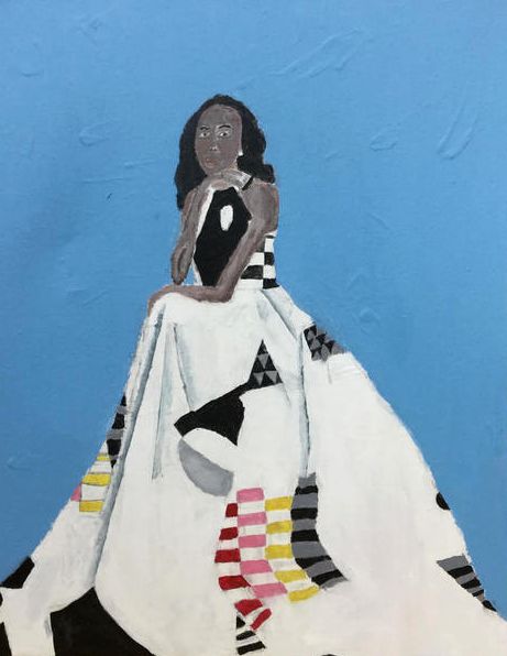
For my masterwork piece I did the Official Portrait of Michelle Obama by Amy Sherald. The piece is a painting of Michelle Obama sitting down in a white dress with some colorful designs on it. The background is a light blue. Amy Sherald is known for using gray tones in her art for the skin African-American people. For my piece I did not change the background or her position or the coloring. A thing that did differ a little from the original piece is where the ruffles and shadows were. I started by drawing out the body and dress of Michelle Obama on a canvas with pencil, I only laid out the outline and where things would go. I then painted the background light blue. After that I made the body and dress a little more realistic, I drew the hands with fingers, and I drew her hair. After that I drew all the details on the dress. For the details on the dress I focused on looking at the shapes, and looking a the space and distance between each shape. After that I drew the face. Capturing the exact features of her face was kind of hard for me. I had to zoom in on the ipads and study her features. After I had drawn everything out how I wanted it to look, I painted the shapes on the dress. I had to mix a lot of different colors such as red, black, pink, gray, yellow, and white. Once I was satisfied with how the shapes on the dress looked, I moved on to doing the ruffles and shadows in the dress. For the ruffles I used a palette with colors ranging from blue gray, to black and white. I used a ruler to make the shadows and ruffles straight. I had to first draw a dark blue gray line next to the ruler, then I had to quickly blend it with some lighter colors before it dried. After that all that was left was painting the face, one of the harder parts in my opinion. Finding the exact color was hard, because all the colors looked a little darker on the canvas than they did on the palette. The goal behind this piece for me was to make sure that if someone saw it next to the original painting, they could tell I had tried to replicate it. I created my piece with pencil and paint on canvas. The idea of my artwork was to replicate the original piece by Amy Sherald. Overall I’m pretty satisfied and I feel like I have gotten a lot better a t looking back and forth between things and spotting the difference.
For my masterwork piece I did the Official Portrait of Michelle Obama by Amy Sherald. The piece is a painting of Michelle Obama sitting down in a white dress with some colorful designs on it. The background is a light blue. Amy Sherald is known for using gray tones in her art for the skin African-American people. For my piece I did not change the background or her position or the coloring. A thing that did differ a little from the original piece is where the ruffles and shadows were. I started by drawing out the body and dress of Michelle Obama on a canvas with pencil, I only laid out the outline and where things would go. I then painted the background light blue. After that I made the body and dress a little more realistic, I drew the hands with fingers, and I drew her hair. After that I drew all the details on the dress. For the details on the dress I focused on looking at the shapes, and looking a the space and distance between each shape. After that I drew the face. Capturing the exact features of her face was kind of hard for me. I had to zoom in on the ipads and study her features. After I had drawn everything out how I wanted it to look, I painted the shapes on the dress. I had to mix a lot of different colors such as red, black, pink, gray, yellow, and white. Once I was satisfied with how the shapes on the dress looked, I moved on to doing the ruffles and shadows in the dress. For the ruffles I used a palette with colors ranging from blue gray, to black and white. I used a ruler to make the shadows and ruffles straight. I had to first draw a dark blue gray line next to the ruler, then I had to quickly blend it with some lighter colors before it dried. After that all that was left was painting the face, one of the harder parts in my opinion. Finding the exact color was hard, because all the colors looked a little darker on the canvas than they did on the palette. The goal behind this piece for me was to make sure that if someone saw it next to the original painting, they could tell I had tried to replicate it. I created my piece with pencil and paint on canvas. The idea of my artwork was to replicate the original piece by Amy Sherald. Overall I’m pretty satisfied and I feel like I have gotten a lot better a t looking back and forth between things and spotting the difference.
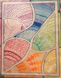
My Independent Piece: Zentangle Rainbow
After trying to recreate Amy Sherald’s masterpiece I wanted to do something a little more original and creative, something that didn’t have to resemble anything in the real world. So, for my independent piece I decided to do a piece that was more abstract. I remembered something Deb had taught my class in 6th grade, Zentangles. I wanted to implement Zentangles in my piece as well as have an original creative aspect of my own in there. So here’s what I came up with in the beginning (I changed some things as I moved through different stages of my art. I decided to mark off different sections on a piece of wood and use a different analogous colors in each little compartment. I decided it would look good with color pencil. I sanded a medium size piece of wood and taped off a border. Then I made seven different sections. One for each of the colors I was going to use: red, orange, yellow, green, blue, purple and pink. I wanted to make each section monochromatic. After I had finished all the sections and taken the tape off. I realized they all looked a little compartmentalized. So to make them a little more communal, I drew a small black border around it. But it still looked a little too much like 7 different pieces. So after talking to some people I realized that if I did a rainbow border around the black border it would make the piece look a lot more communal. I liked it so much better after that, and I was so much more satisfied. I didn’t really think I had a goal for my piece when I started it., but in looking back it was to make all these different designs, aspects and colors come together in a special way. In the end I like my independent piece a little more than my masterwork because it’s more me and it’s more my style. Overall I really like both of my pieces and wish I had more time to make them more complete.
After trying to recreate Amy Sherald’s masterpiece I wanted to do something a little more original and creative, something that didn’t have to resemble anything in the real world. So, for my independent piece I decided to do a piece that was more abstract. I remembered something Deb had taught my class in 6th grade, Zentangles. I wanted to implement Zentangles in my piece as well as have an original creative aspect of my own in there. So here’s what I came up with in the beginning (I changed some things as I moved through different stages of my art. I decided to mark off different sections on a piece of wood and use a different analogous colors in each little compartment. I decided it would look good with color pencil. I sanded a medium size piece of wood and taped off a border. Then I made seven different sections. One for each of the colors I was going to use: red, orange, yellow, green, blue, purple and pink. I wanted to make each section monochromatic. After I had finished all the sections and taken the tape off. I realized they all looked a little compartmentalized. So to make them a little more communal, I drew a small black border around it. But it still looked a little too much like 7 different pieces. So after talking to some people I realized that if I did a rainbow border around the black border it would make the piece look a lot more communal. I liked it so much better after that, and I was so much more satisfied. I didn’t really think I had a goal for my piece when I started it., but in looking back it was to make all these different designs, aspects and colors come together in a special way. In the end I like my independent piece a little more than my masterwork because it’s more me and it’s more my style. Overall I really like both of my pieces and wish I had more time to make them more complete.
Phi
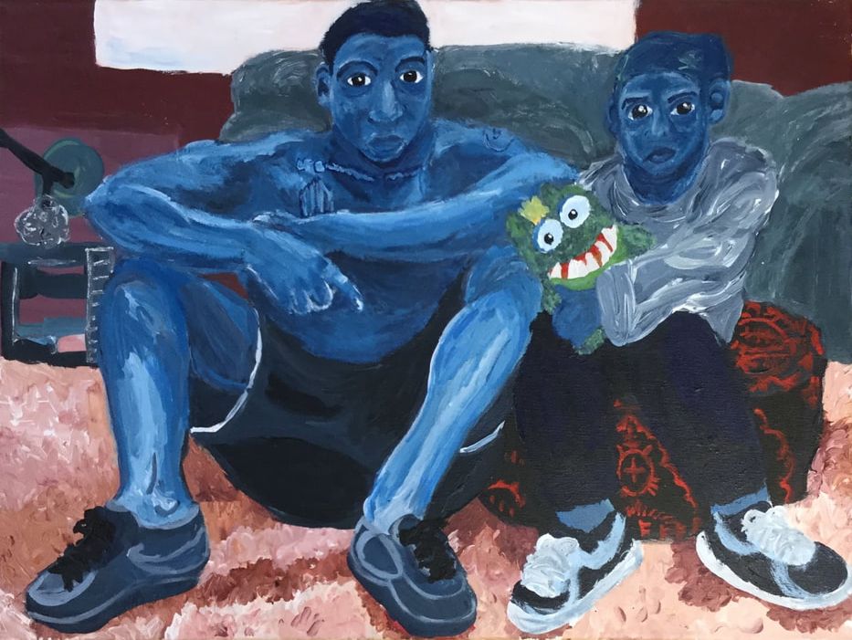
I recreated the mastwork Miles and Jojo by Jordan Casteel. The subjects of the painting are two people, who are painted blue. They are sitting in front of a couch, one sitting on the floor, and the other on a cushion. The younger person is holding a stuffed animal. The stuffed animal is green and since it’s the only thing in the painting that is green it’s really easy to see.
I painted the walls first, and then the carpet. The carpet was really hard to paint because I had to mix the paint while I was painting to get the right color for the specific part of the carpet. When I painted the people, I painted the main colors and then painted over it with lighter and darker values to create shadows and highlights. The original piece is 54in x 72in and I was painting on a much smaller canvas, so I had to use a really small brush if I wanted to go into more detail.
When Jordan Casteel painted Miles and Jojo she wanted to express their everyday emotions and their personalities. She didn’t want people to think differently of her painting because of the people’s skin color so she painted them blue. She often uses similar color choices in her other paintings. I chose to recreate this painting because when I first saw it I noticed the emotions of the people before anything else.
I wanted to learn how to shade things better and I thought painting this would help with it because the people are all blue so I only had to worry about the value.
I learned a lot when painting this. I used some of the things I learned about shading when painting this in my individual piece, like how to shade hands and the underneath of people's eyes. When painting this piece, I learned that it’s important to use minimal paint on your brush, otherwise it’s hard to paint specific parts of the painting. Painting this helped me grow as an artist. Now I feel more confident when using paint and when shading things. I will definitely be painting more in the future.
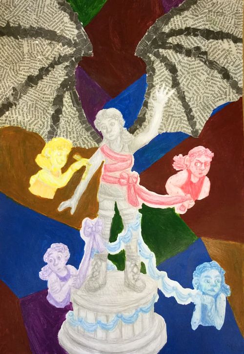
For my individual art project I drew myself as a statue. I drew myself again four times around the statue expressing different emotions. Each “emotion” is a different color and is tying a piece of glowing fabric onto the statue. In the background, there are multi colored pieces of color that the “emotions” pop out of. There are also bat wings in the background that look like they’re attached to the statue. The statue stands out from the rest of the piece because it is grey so it contrasts with the bright colors.
I drew the statue and “emotions” with colored pencil and painted the background with acrylic paint. The bat wings are made out of ripped up pieces of newspaper.
The statue represents how I feel when I’m not feeling emotions. The people tying pieces of fabric onto the statue represent how it feels to have emotions. All of the emotions are tying their fabric on the statue at once and “competing for space” in the situation. The bat wings are there incase the statue needs a place for the extra “emotion fabric” to go. The bat wings are made of newspaper because everyone is always talking about every dramatic thing that happens. The statue could use the wings to fly away from all the emotions if they wanted to but they would have to get tangled in the mess of drama so they choose not to. The multicolored background symbolizes the rest of the world and how it seems like everyone is feeling big emotions, about everything, all the time, even when I’m not feeling emotions and just being a statue.
When I used newspaper to make the wings, one of my concerns was that people would look at the newspaper and try to read it, instead of looking at everything else, but I think I used small enough pieces of newspaper that that won’t happen. I probably will use newspaper in the background like this on art I make in the future.
When I decided to create this piece I knew exactly what It would look like and had a very solid plan for how I was going to make it happen. This is one of the only pieces I’ve created that turned out almost exactly how I wanted it to. I’m very happy with this piece.
Devi
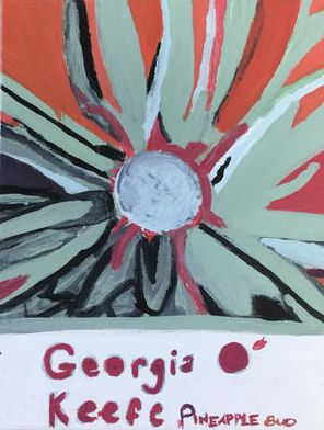
My Masterwork is a recreation of Georgia O'Keeffe “Pineapple Bud.” It’s a flower, with pink, black, and green. The color was really hard to recreate, because the piece had a lot of texture, and lights/darks. The shape was also very hard, because the petals were all different. I used paint for this project. I had to blend a lot, because the colors in her paintings were all a little bit different from the colors I got. This piece helped me reach my goals, because it was very hard to make. I think hard is good, because it means you can get better. I learned how to make paint have shadow, and I also learned about texture in the middle of the flower. It got darker when you got towards the middle too, and that was very hard. At the bottom of the piece, I wrote her name, and the name of the piece.
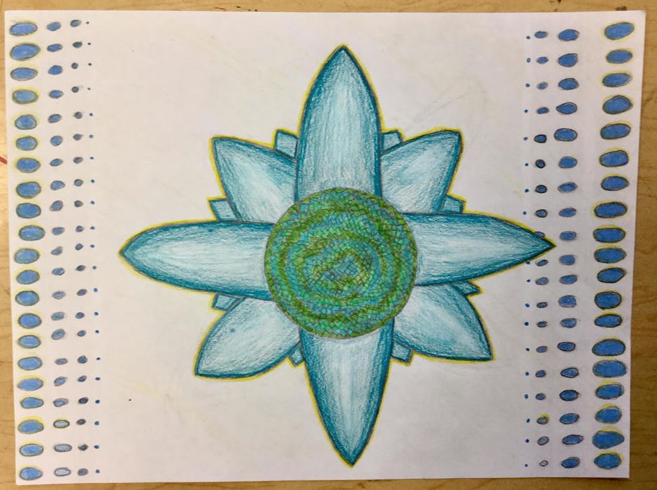
My Independent is a blue/green flower with dots on the sides, making the piece look like it has depth. It is on a thick piece of paper and the center has a lot of squares and shapes. I made the center a perfect circle, and I traced a roll of tape to make it perfectly round. My piece is made with two blue and green colored pencils, and outlined it in yellow. The person who inspired my piece is Georgia O'Keeffe, and I did my masterwork piece of one of her paintings called “Pineapple Bud.” I wanted to show happiness in my piece, because I think all of her pieces were happy, because all of them included flowers. This piece helped me get better at shading, because I wanted to shade a lot in my drawing. I learned how to make better lines and curves also.
Samantha

|
The Happy Donor The Happy Donor is a piece of surrealism. It has a man standing in front of a wall. He is only a silhouette. Inside of this man is a home in the middle of the forest with a sunset in the background . The house is brightly lit on the inside with an orangey glow. All of this scene is covered with an ominous mist and clouds out most details, but the moon still shines bright with beautiful stars around it. It was painted on the wall and it was made using acrylic paints. The Church Hill Sunset
The Church Hill Sunset is an image of a church with a mountain in the background. In front there is a river and on the sides there is a barren dessert. It was made using charcoal, paint, pastels and colored pencils. This piece is supposed to express how there is always a bright side and a dark side. My goals for this artwork where to get better at all of the aforementioned mediums and be a cause for inspiration and learning through the beauty of art. |
Alexander
A trippy MC Escher (Maurits Cornelius Escher) fading piece, bending your mind and vision with careful pen and pencil work. Using polar opposite colors to create outlines for designs and having precise angled lines to create shading using the exact distance between them to make a variety of shadows. MC maintained a solid art career beginning when he was forty and relationships between his first wife and eventually divorcing and marrying a second
I created my art using pencil pens and markers, creating shading values and details from the mismatch between them. Rulers were a key part of creating perfect lines for the level of professionalism in this piece. The line style being mainly straight and keeping the line from line to line. Also helping using a base guideline, creating the major details and then copying it on to my final piece. The shapes in this piece were merging and small details could change the whole look of my piece.
The big idea behind my piece, was the merging. Done flawlessly this could give this piece sort of three dimensional feel. The patterns are what Escher is known for and feel like this was the concept of this piece originally as well. Then the line work really gives the piece the feel of farm lands and fields, making the pattern an interesting piece too.
My goals wasn’t to learn intense patterns, but more to practice value and shape with pencil. Trying to expand my pencil style from more of sketchy work to defined lines creating a more finished look and obtaining what most artists aspire to grasp. This definitely helped me at least practice 25% of what I’m looking for and will be able to draw this style with more ease. I know I’ll never be as amazing Escher or even remotely close and to his mastery. The style may well be integrated into my possible next pieces and even maybe patterns. The eventual learning will always help with pattern recognition and shape finding, not directly recreating such works as Escher’s
Independent Idea
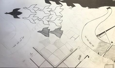
The style of my piece is a contrast between light and vibrant colors and grays and blacks colder than blizzards mixed with another contrast between abstract background observations and very detailed foreground with a centerpiece. The foreground will have a tree placed in middle spraying the colors from its branches, sucking the aforementioned tree lifeless. The texture will be smooth and soft on the background bringing out the shriveled texture of the tree with charcoal and pencil.
The message will be clear but with no overarching ideal or direct message, leaving plenty of room for interpretation such as most art. The watercolors and the charcoal and pencil shall mix with inspiring differences such as branches and the leaves, and I’m assuming leaving an odd texture and design. You will not be able to tell a leaf apart and the edge keeps going merging into each other with divine differences, forming more colors on the way.
My goals were to complete the piece, obviously this did not appear to happen, although I wish it did. But besides that, my goal was to envision a interesting piece having many art elements, that I may dive into using things I’m not very used too. I learned to have a great imagination in the art world and finding ideas. I’m not a particularly creative person and often use many references, and other such reminders to not rack my brain too much. This may be finished someday possibly coming back to this idea further into the near future.
Elizabeth
Masterwork Piece: A Recreation of Christina’s World
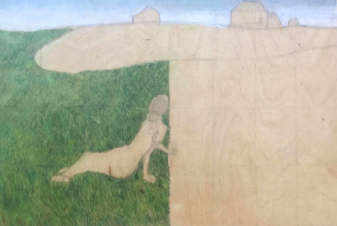
I did a recreation of Christina’s World by Andrew Wyeth. Christina’s World is a painting of Christina Ann Olsen, a fifteen year old girl who suffered from arthritis. The picture was taken outside her house. Wyeth did a series of paintings surrounding the Olsens, but this one is considered to be the most famous. I used Prismacolor colored colored pencils on wood to create this piece. Some things I had to focus on were texture, color, form, and space. This piece really challenged my art ability, because I’ve never really thought that I’m very good at color, shading, or texture. I learned a lot about all of those things and more, and I’m proud of how it turned out.
I did a recreation of Christina’s World by Andrew Wyeth. Christina’s World is a painting of Christina Ann Olsen, a fifteen year old girl who suffered from arthritis. The picture was taken outside her house. Wyeth did a series of paintings surrounding the Olsens, but this one is considered to be the most famous. I used Prismacolor colored colored pencils on wood to create this piece. Some things I had to focus on were texture, color, form, and space. This piece really challenged my art ability, because I’ve never really thought that I’m very good at color, shading, or texture. I learned a lot about all of those things and more, and I’m proud of how it turned out.
|

|
For my independent piece, I used a method of painting where you first arrange tape on a canvas, paint over the tape, then peel the tape off to reveal clean white lines that appear to be over the paint. I got inspiration from photos I’ve seen on the internet, and over the summer I have played around with this style a little bit. For my piece, I taped over the spots I liked, then did an ombre rainbow across the canvas. The goals I had for this piece were to make a good ombre while keeping the lines clean. Some elements of art that you can see in my piece include; line, color, shape, and form.
Stephanie
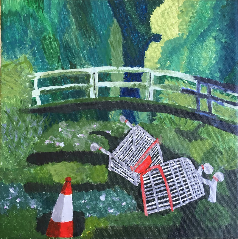
My recreation of a masterpiece is called “Show Me The Monet” and was originally made by Banksy. It is trash (a street cone and shopping carts) in a beautiful swap area, with a bridge. Too me the main elements I used in this piece are value and space. I had to use value on some areas, especially the cone, because I had to make it look like it was round by showing the shadow. Then I had to use space to make it look like the bridge was farther back than the cones and the trees behind the bridge were farther back than the bridge and so on. I painted this piece on a canvas and I used acrylic paints. I had to use a lot of texture in this artwork because I had to do all the swap area and the trees in the background. To me this piece is suppose to be a political or social statement. It's trying to prove a point that we are trashing and destroying are earth. I had never done much actual painting before except for when I was really little. I think I did an ok job, but I feel like if I had more time and I wasn’t rushing myself I could have done a little better. I really think I was able to figure out the value on the street cone but now so much on the bridge. After I finished this piece I had felt like I never wanted to paint again, but now that I look back at it I think I learned a lot from it and want to try painting more.
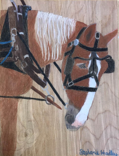
My independent piece does not have a name. But the main idea of it is a horse pulling a carriage. It’s a photo I took on Mackinac Island. The photo is only of the horse's head which is tucked in and has all the equipment on its head that makes it able to pull the carriage.
For this piece I used the technique where you divide up the area you're using into equal squares and the reference your using into equal squares. And draw the piece square by square. But after a while of trying to draw it, I realized my squares weren’t the same size on my board I was using and my reference. That was why the head of the horse looked really long. So I just decided to erase the lines and just draw it free hand.
I did my piece on a wooden board and used colored pencils. But I was worried the white on the horses face would not show up bright enough with colored pencil. But after testing it out on wood it was fine.
On this piece you can tell I used a lot of texture because I had to try to make the fur look like actual horse fur. I felt connect to this artwork and the main reason I chose to do do this piece is because I love horses. I am around them a lot and I ride them. I wanted to do a picture that I took for my independent piece and I thought doing this artwork showed my love for horses. I think this piece taught me a lot. I had never really drawn a face or an animal face at that angle and that was a bit of a challenge for me at first. I had wanted to get better at drawing animals and I had never drawn on wood before. And doing this piece showed me how to do that. For the most part this piece turned out how I imagined it to be. I had wanted to do a background but I didn’t really get around to that. Over all at the end, I thought this piece turned out pretty well.
Aidan
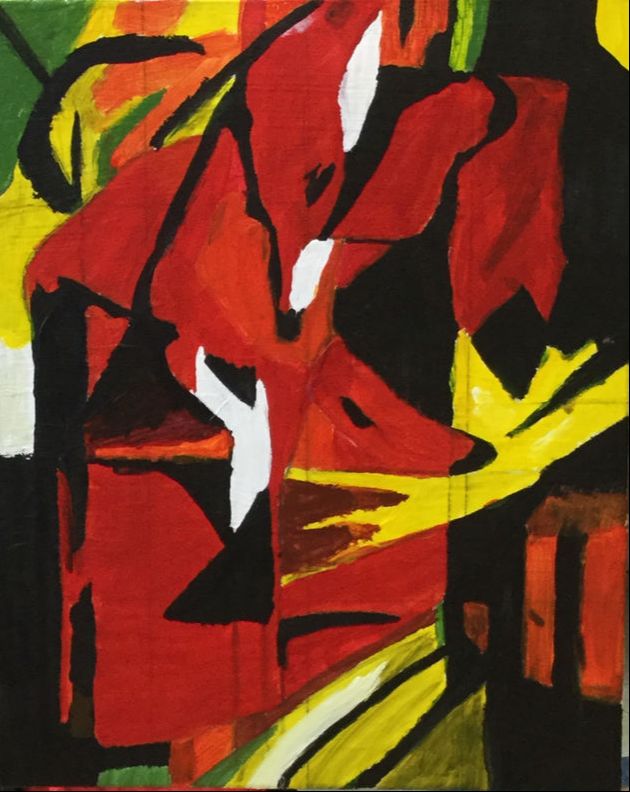
The Fox by Franz Marc
On the surface the fox looks mostly like it will be orange, but if you look closely, there are a lot of colors. The one you will notice the most is probably is the orange, then yellow, and the black. There are a lot a shapes that intertwine, and the shapes really work with each other. The colors also work with each other.
I started with drawing out most of the lines. The artwork type is cubism, which means the shapes are important. Then I started the painting part with the orange. What I noticed about the piece is that the strokes are all moving in one direction. I painted all the orange parts first, then moved onto painting the less prominent colors like the yellows and greens. I have only used paint and pencil. I have used mostly primary colors except for the orange and green.
I feel like the painting is happy, but the colors are darker versions of the color, the orange is a dark orange, and the yellows are not as bright. Even the white looks gray. It was painted a year before WW1 began.
My goals were to be able to get all the right colors, and to be able to get the vibe that worked for the original. I have never really painted an art piece, so this was a good first painting
My thought on my painting was that is was pretty good for my first recreation. I have never painted much, so it was good. One thing I learned was that you just have to paint. You worry about it while you’re painting.
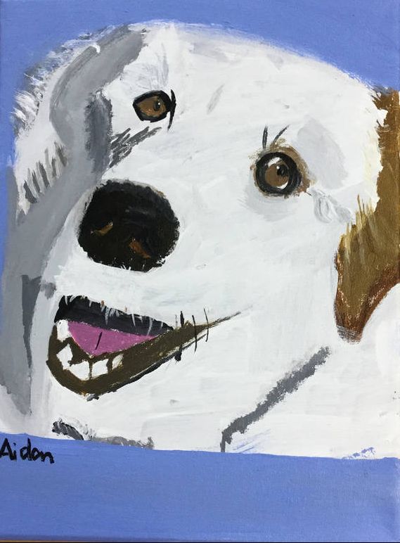
My Dog Luna
My artwork is a little weird, but that’s ok. It was only my second full piece I have ever painted.
I started to draw my dog at home, and I thought it looked good. On Sunday, during the four hour work time it started painting. I mostly use gray white for the fur, and for the rest I mostly used light brown, and dark gray. The last thing I did was the blue background
The idea of my painting was just to paint my dog. I wanted to paint an animal for my independent, and I have a good picture of her.
My goal for this painting was for it to look like my dog, and I think I mostly succeeded. It is pretty good.
My thoughts of the painting is that is is pretty good. I am happy with it right now. I think if a painted more, in two or three years it would be a lot better.
Griffin
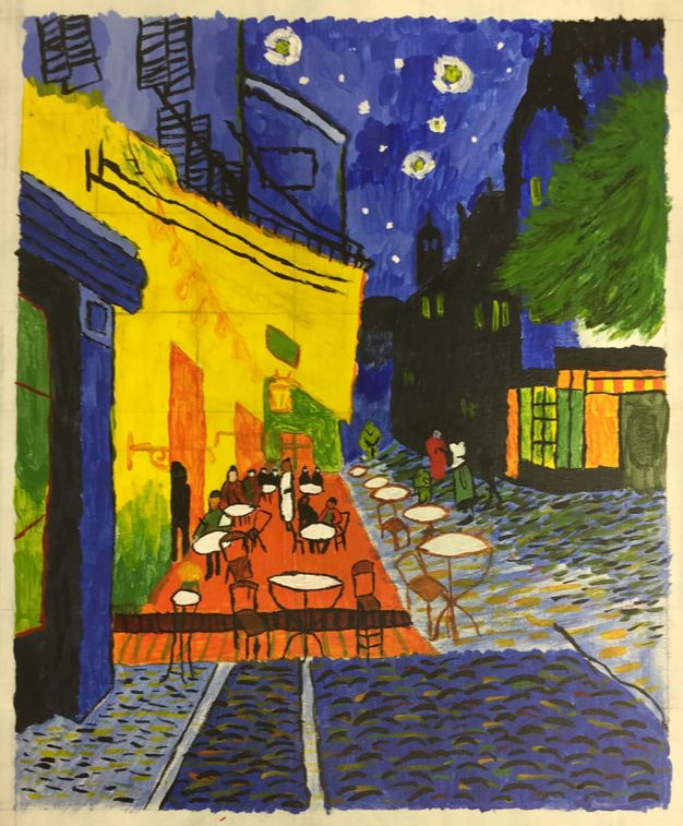
Café Terrace at Night by Vincent Van Gogh
The color that stands out the most would probably be the yellow terrace or all the blue in the sky. It is acrylic on canvas. The technique I used to make it was that I would put a lot of paint on the brush to make the kind of strokes. Van Gogh is my favorite artist, so I tried to get the brush strokes similar to his original work. My goal was to get it as close as possible to the one by Van Gogh. My overall thoughts are that I think I did much better than I thought I would do. I did the brush strokes well.
If I did an independent piece, it would definitely be in Andy Warhol's style. I really like his style, so that’s why I would want do it like that. It would probably be four baseballs with different contrasting colors on each panel. I would choose baseballs because I love baseball.
Sheridan
My work is a recreation of Alma Thomas’ “Splashdown” of Apollo 12. It is the image of a mountain and a sunset. It is in vibrant colors and instead of being solid color, is made up of separate rectangular brushstrokes. My piece is acrylic paint on wood. I first sketched out the general shapes, than I started painting. I started with the background, and then I did the foreground. Sometimes I had to repaint a part because it was the wrong color or shape. I tried to convey the brightness of the original piece by Alma Thomas. I think I learned a fair amount in doing this piece. I learned how to use ratios to make sure everything was to scale and I learned how to mix paint. I learned that and sometimes a color looks different on the pallet then it does on the wood. I also learned about different brushes and which one works best for each thing. I like how my piece turned out, especially the look of it on wood opposed to canvas like the original. I tried to use bright colors to convey happiness. I used to be afraid of paint because it seemed so permanent, but now I know that you can fix mistakes. In doing this piece I have become more confident in using acrylic paint and I may use it again in the future.
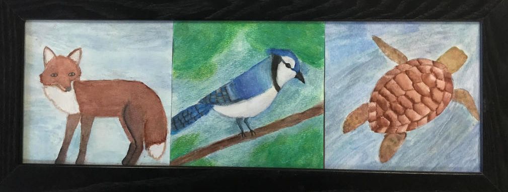
My work is 3 separate pieces of paper, each with a different animal on it in watercolor and colored pencil. It is in a realistic style and I tried to convey texture with my brush. It is on watercolor paper, and I used a pencil to sketch out each animal before hand. After doing the animal, I did the backgrounds, and lastly, I did details, touch ups and highlights with colored pencil. I was inspired to do realistic animals because of a previous piece I made of a wolf.
In the piece I tried to capture each of the animal’s traits and temperament. I wanted to try using watercolor, which is mostly new to me and see what I could do with it. I also wanted to get better at drawing animals. I really enjoyed working with watercolor, but at first I had challenges such as getting the watery paint to go where I wanted it to. I like how my piece turned out overall, but I think I could have made it more vibrant. I think the watercolor works to convey what I wanted it to, especially with the texture. I think in the future I would like to do a similar piece, but I will give myself more time to do them.
In the piece I tried to capture each of the animal’s traits and temperament. I wanted to try using watercolor, which is mostly new to me and see what I could do with it. I also wanted to get better at drawing animals. I really enjoyed working with watercolor, but at first I had challenges such as getting the watery paint to go where I wanted it to. I like how my piece turned out overall, but I think I could have made it more vibrant. I think the watercolor works to convey what I wanted it to, especially with the texture. I think in the future I would like to do a similar piece, but I will give myself more time to do them.
Naomi
My Independent piece: Perfect Imperfection
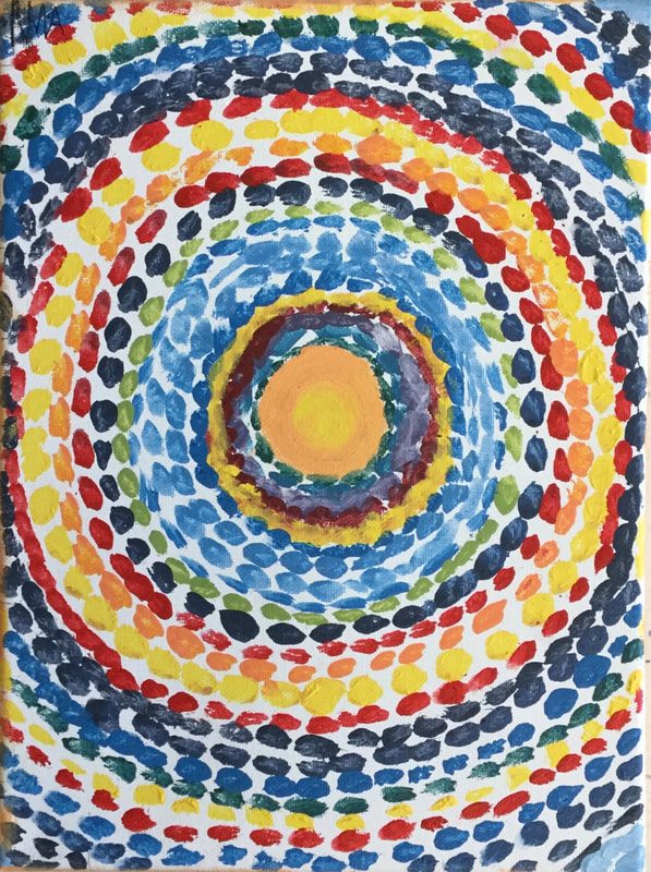
It is an abstract piece of art made with acrylic paint and color pencil. My experience with my piece: I put tape on the blank canvas and painted around the tape. I first painted the border purple then painted each rectangle. I had to make so touch ups and color the very edge of the canvas with colored pencil. I enjoyed making my piece. You Can’t Have One Without The Other,
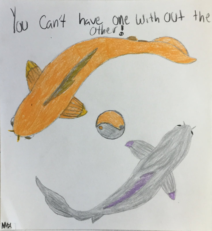
also known as Koi fish, Yin and Yang |
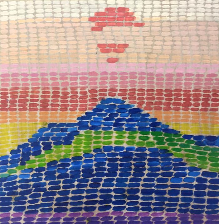
The Splashdown of Apollo 13 by Alma Thomas
Alma Thomas made this piece in 1970 in was made with acrylic paint on a 61 7/8 × 52 on canvas. She was born in 1891 and died in 1978 8 years after the piece was made She died in D.C. of cancer. My experience with this piece: I enjoyed working on this piece but it was a little difficult in using the certain brush stroke and it took me longer than I expected. 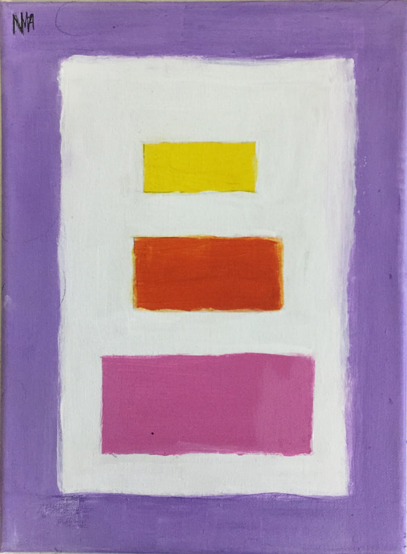
|
|
|
My piece is inspired by Avatar the Last Airbender. I love that show I own all of them on DVD. I loved them when I was little and I still love it now. I drew my piece on paper, drew it in pencil, transfered it to a nicer piece of paper using a light box, then colored it in with colored pencil. What I learned: I definitely learned something. I learned how to use a light box and how to use muscle memory. I think my draft is much better than my final. I enjoyed this piece the most.
Ziv
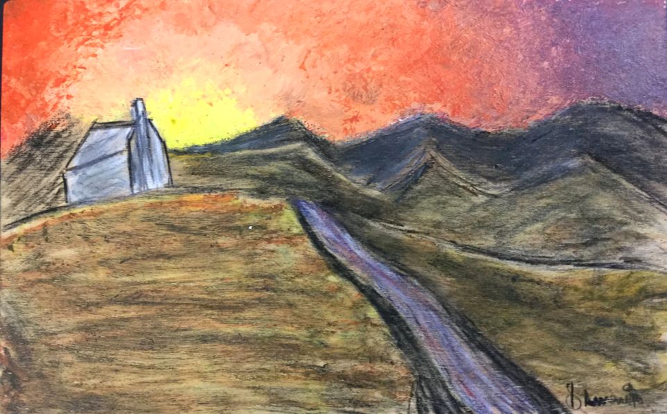
Description My Artwork is the recreation of “The Oxbow” by Thomas Cole. It is a landscape piece. It portrays a view from Mount Holyoke after a thunderstorm. When I made my artwork I used a lot of acrylic paint. I mixed and I matched and I sobbed from despair. Then I used my tears, and water to make the paint more smooth and blended. Knowing the original size of the piece, I had to cut some detail from it.
My Artwork was a recreation of “The Oxbow” by Thomas Cole. It was inspired by a view from Mount Holyoke after a thunderstorm. I chose the piece because I wanted to try a landscape piece, and I thought it looked really nice.
For my goals as an artist, I started art with the goal of not wanting my stuff to look like crap. I also wanted to get better at painting, as what I do normally amounts to colored pencils. Doing this piece has helped me achieve that, by showing me new techniques with painting paint and mixing paint. Because of this, I have started to enjoy art.
Thoughts I do not believe I am going to landscape pieces anymore. The amount of detail required for them I find to be too much and it takes the fun out of them. I did not really enjoy doing it, and if not for Deb I would have called it good enough. I did enjoy repainting the clouds though.
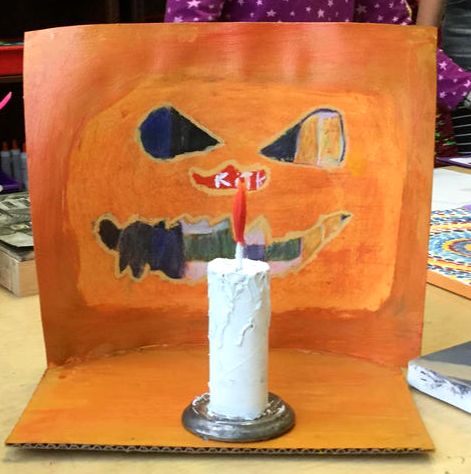
My piece is supposed to be a view from the inside of a pumpkin. It is called “Night on Hallows Eve”. I chose this name because of what my piece is. I tried to give it a barely 3D look. I need everything to seem as if it was only inches away from the mouth/nose/eyes.
I created my artwork by use of various techniques. I used watercolor paper and painted it all the orange yellow the inside of a pumpkin looks. Then I used colored pencil to draw the outside. I also put it on a stand to make it look 3D. I made a candle to help people get that it is the inside of a pumpkin. My artwork was inspired that by the time I started making it we were 2 weeks away from Halloween. Carving jack o'lanterns is one of my favorite things to do, and I sometimes make stuff from the guts which I am looking forward to eating. I tried to make the inside look warm and comforting from the candlelight and the outside dark and scary (whisper). My goals as an artist were to do something with Halloween. I also wanted to get better with doing light on the inside of the pumpkin, and I figured it would be interesting to try to get some of the texture within a pumpkin. Thoughts In this peace I learned how to do lighting better. I also got a lot of experience with colored pencils and how to make them look like a hard line. One of the biggest challenges was that the watercolor paper was bumpy. The final piece is not what I imagined, I put it up on a stand and made a fake candle. I was expecting it to be just an ordinary 2D piece. I think I really like how it turned out, and I am planning on making a piece where the holes are cut out. Then I will put another sheet behind it and color it all in, so you can actually get different views. I think that it is a brilliant idea, so thanks Deb. I also want to experiment more with putting bases and frames on pieces.
I created my artwork by use of various techniques. I used watercolor paper and painted it all the orange yellow the inside of a pumpkin looks. Then I used colored pencil to draw the outside. I also put it on a stand to make it look 3D. I made a candle to help people get that it is the inside of a pumpkin. My artwork was inspired that by the time I started making it we were 2 weeks away from Halloween. Carving jack o'lanterns is one of my favorite things to do, and I sometimes make stuff from the guts which I am looking forward to eating. I tried to make the inside look warm and comforting from the candlelight and the outside dark and scary (whisper). My goals as an artist were to do something with Halloween. I also wanted to get better with doing light on the inside of the pumpkin, and I figured it would be interesting to try to get some of the texture within a pumpkin. Thoughts In this peace I learned how to do lighting better. I also got a lot of experience with colored pencils and how to make them look like a hard line. One of the biggest challenges was that the watercolor paper was bumpy. The final piece is not what I imagined, I put it up on a stand and made a fake candle. I was expecting it to be just an ordinary 2D piece. I think I really like how it turned out, and I am planning on making a piece where the holes are cut out. Then I will put another sheet behind it and color it all in, so you can actually get different views. I think that it is a brilliant idea, so thanks Deb. I also want to experiment more with putting bases and frames on pieces.
James
Garrowby Hill by David Hockney
My piece has a lot of different colors and shapes, I am proud of my piece I did a pretty good job. There are a lot of colors that stand out in my piece, my piece has bright colors that stand out to your eyes at the bottom of the piece. At the top it has a different tone of colors, it has more blue and green in it. When I look at my piece I can see that it’s a hill, and how the road goes down the hill and behind the mountain. I’m proud of the trees in the piece especially the top of the trees, they stand out better than the bottom.
When I look at my piece I see the road and then my eyes start to follow the road, then they shift off to the top part with all the blue. When David Hockney made this piece It looks like he was looking down a hill and noticing what was on the hill and at the bottom.
One of my goals for this piece was to make the roads look good and all the shapes the right size and color. I’m almost done with my piece and the last few things I need to do are the designs and details in the shapes. Over all I think my piece is pretty good, in some spots I think that I could have used a smaller brush to get better details, I tried to match a lot of the colors but some of them aren’t so good. For my piece I started with the big shapes and the bold shapes and then slowly did the rest of the piece.
|
Independent piece
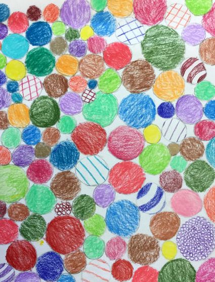
I decided that I want to do a easier piece for my independent partly because there's not a lot of time, and second because the piece I just did was really hard. My plan is to do a whole bunch of circles and triangles on either side of each other with a line through the middle with colored pencils. I decided to do colored pencils because it doesn't take as long and I really like colored pencils a lot more than paint. For my independent piece I would like to do a variety of colors for the circles and triangles. I will have to make my independent piece very tedious and my arms will get tired while coloring. I might do stripes of color through some of them and not fill in the whole circle and make sure that when I color I stay in one direction and not every which way. |
Sam
|
Masterwork
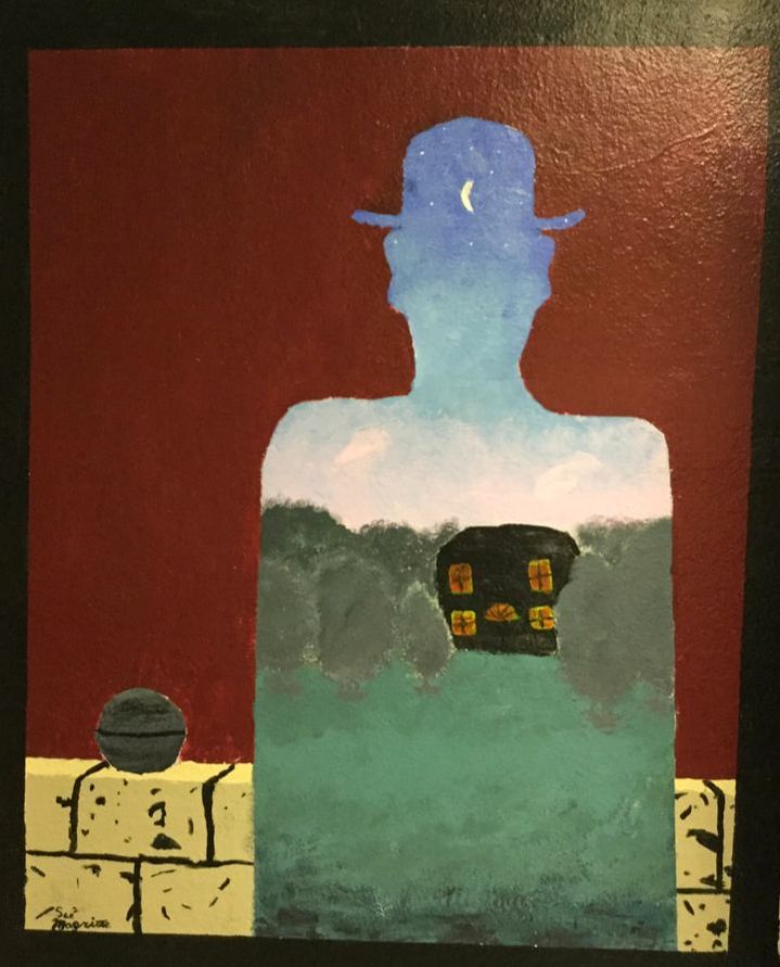
My masterwork to me looks like a portal to another world, it is also kind of spooky in my opinion. I like it a lot and chose to paint a mural of it on the wall upstairs. It is a cool painting and I like how Rene Magritte does surrealism. I think it is a cool style and looks like a fantasy world. The painting looks like a brick wall with the silhouette of a guy in a bowler hat, and through the silhouette, you can see a house in a forest. Independent My independent reminds me of yin and yang because the light colors on half of it meet the dark colors on the other half. I don’t really know why I made a tree but I do like the way that it looks. |
|
Trey
Master work
My art piece was based off Parc Pres de Lu by Paul Klee. I made it by tracing the black lines and then painting over them with black paint. I then made the background colors, then the colors around the black, then thin white paint around the black but not enough to cover the other colors. No one encouraged me to do this piece. Goals stated in the independent piece part. I learned that things that look easy can be really hard.
Independent piece
I created my independent piece by thinking of a comic idea that sounded fun and soon thought of one and drew what I thought of. When I see my independent piece I think of an old 80s or 90s cartoon. I used a pencil, sharpie, ruler and a lightbox. No one really inspired me to make a comic or anything. I just like to doodle. I feel that my goal as an artist is to be able to draw better and I feel that this piece really helped me as there were things that would usually be hard for me to draw. I learned that you can do what you think you couldn't before if you really try.
