Wow! What a productive quarter!
7th/8th grade students in three-day art were to identify a famous work of art to emulate, as apprentices have for centuries. They were also to create a unique and original work of art, and write a reflective artist's statement about both.
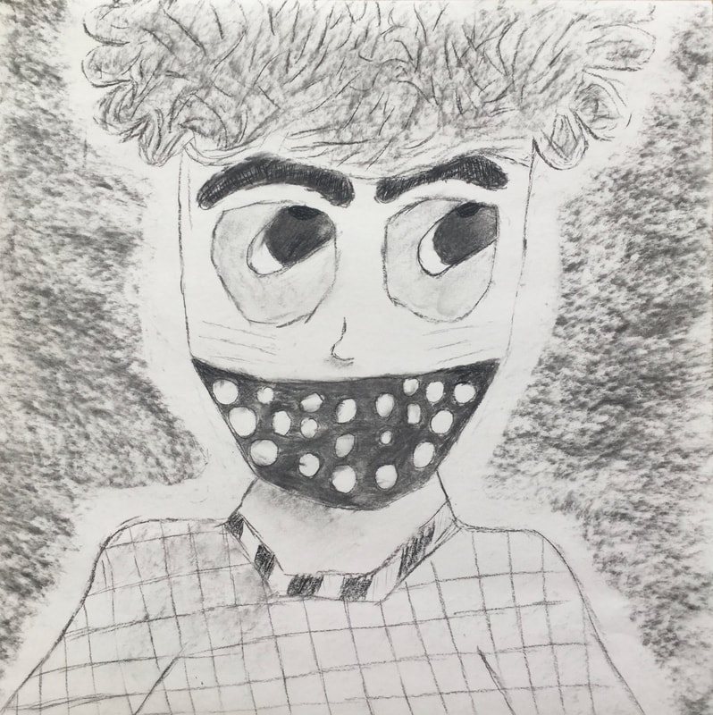
At the bottom of this page, you will find their achromatic (greyscale) self portraits from the beginning of the quarter.
7th/8th grade students in three-day art were to identify a famous work of art to emulate, as apprentices have for centuries. They were also to create a unique and original work of art, and write a reflective artist's statement about both.
At the bottom of this page, you will find their achromatic (greyscale) self portraits from the beginning of the quarter.
Quinn

Masterwork
The most prominent Elements of Art in my Mastwork are space, texture, and value. The most prominent Principles of Design in my creation are proportion, contrast, emphasis, rhythm. My artwork has no light in the foreground and is pitch black. In the midground is Lisa del Giocondo, and the background is a combination of three different colors. To make this piece, I used Prisma colored pencils and tempera paint for my artwork. I went through a lot of trial and error, I improved on shading and toning, and crises on sleeves. The Mona Lisa is painting of an Italian model named Lisa del Giocondo it was painted by Leonardo da Vinci during the Italian Renaissance in 1503. I feel proud because of how well I did, and I like how it's darker in the front, but it has lighter and more vibrant colors in the back to have the contrast that balance between light and dark. The message is to always keep a balance. My goals are to get faster and more realistic art and to spend equal time on all parts of the artwork. This helped me make more realistic art for the future.
The most prominent Elements of Art in my Mastwork are space, texture, and value. The most prominent Principles of Design in my creation are proportion, contrast, emphasis, rhythm. My artwork has no light in the foreground and is pitch black. In the midground is Lisa del Giocondo, and the background is a combination of three different colors. To make this piece, I used Prisma colored pencils and tempera paint for my artwork. I went through a lot of trial and error, I improved on shading and toning, and crises on sleeves. The Mona Lisa is painting of an Italian model named Lisa del Giocondo it was painted by Leonardo da Vinci during the Italian Renaissance in 1503. I feel proud because of how well I did, and I like how it's darker in the front, but it has lighter and more vibrant colors in the back to have the contrast that balance between light and dark. The message is to always keep a balance. My goals are to get faster and more realistic art and to spend equal time on all parts of the artwork. This helped me make more realistic art for the future.

Independent
In my independent piece, the most prominent Elements of Art are space, color, and shape. The notable Principles of Design are variety, emphasis, and movement. My piece is someone falling (except they have different characteristics compared to a regular human) into a white circle with black all around them. Like the Masterwork, I used tempera paint and Prisma colored pencils. I had to do this piece in two hours, which was a sliver compared to how long it took me to do my Masterwork. I wanted to do someone falling because when people fall, they don't just put their arms and legs out; they more complicated things (to draw), and I wanted to illustrate that. This helped me get better at drawing something and leave it and not try to make it perfect and not get anywhere. The piece turned out how I imagined it.
In my independent piece, the most prominent Elements of Art are space, color, and shape. The notable Principles of Design are variety, emphasis, and movement. My piece is someone falling (except they have different characteristics compared to a regular human) into a white circle with black all around them. Like the Masterwork, I used tempera paint and Prisma colored pencils. I had to do this piece in two hours, which was a sliver compared to how long it took me to do my Masterwork. I wanted to do someone falling because when people fall, they don't just put their arms and legs out; they more complicated things (to draw), and I wanted to illustrate that. This helped me get better at drawing something and leave it and not try to make it perfect and not get anywhere. The piece turned out how I imagined it.
Stephanie

Masterwork
This piece was my interpretation of “The Starry Night” 1889 by Vincent van Gogh and “Temple Gardens” 1920 by Paul Klee. I am calling my piece “Starry Garden”. The top half of the painting is based on The Starry Night painting, but I used the colors from Temple Gardens to make it have more of a warm feeling to it. Then the bottom half is is a recreation of the bottom half of Temple Gardens but using bright oranges and reds instead. In this piece, one of the most prominent elements of art are mostly shape, texture, and space. The bottom part really using the shape element then the blue centerpiece in the front using space to try to make it look like it’s in front of everything else. The principles of design I tried to make the most prominent are a little bit of rhythm through the bottom half of the piece and also contrast with the blue centerpiece really standing out.
Starry Night was an oil on canvas piece and Temple Gardens was gouache and ink on paper. My piece was made on wood using acrylic paints. The main technique I used throughout this piece was really trying to get the texture throughout the piece. Working on getting the colors to work together without blending together too much and really trying to get the brush strokes to stand out was a challenge. I also learned how to get the contrast throughout the piece to work too. Another challenge was trying to get the dark reds to look like they were going behind the yellow stars and moon.
“This morning I saw the countryside from my window a long time before sunrise, with nothing but the morning star, which looked very big” was how Vincent van Gogh described his inspiration for his painting to his brother. Other than what he had observed he also put his imagination, memories, and emotions into this piece. When I look at this painting I picture looking out of a tall story building at night seeing the bright stars and moon standing out in the dark sky with the small town below. Paul Klee’s abstract forms and symbols had a very unique style that showed in a lot of his later work and he also had a big love for colors, putting those things together creating Temple Gardens. When I first saw temple gardens I wasn’t exactly sure what it was or what his inspiration for this painting was. But after looking at it a little I sort of saw the inside of a house having stairways leading to different doors and rooms using space to pull it all together, but that’s just what I see looking at it.
Looking through the pieces trying to decide which one of the pieces I had wanted to recreate, the main goal I had was trying to make more of an abstract piece because I had been focusing more on realism. Making this piece combining The Starry Night and Temple Gardens really did help me meet my goals. Both pieces being more abstract and also really trying to get the texture of The Starry Night Piece was a challenge but really also helped me meet some of my goals and move forward. In the end, this piece really didn’t turn out how I had imagined it being, but I was really happy about how it turned out. Making this piece really inspired me to try making more abstract pieces. I really enjoyed doing the masterwork recreation.

Independent-
For my independent piece, I created a piece I titled “A Self-Portrait in Grey”. This piece is a portrait of myself in greyscale. With basic shapes in colored pencils in the background. The most prominent elements of art in my piece are value and shape. I tried to use a lot of value in the face and hair making the shadows darker and really trying to add in the highlights. And then the shape element in the background making the face try and pop out more. The main principles of designs I used in this piece are balance and contrast. Using balance to try and balance each side of not just the portrait but the background too. And using contrast and a little bit of emphasis to try and make the greyscale head stand out from the colored background.
I made this piece on stiff paper working with charcoal for the face and Prisma colors for the background. To make this piece I started out by doing my best, sketching my face on a piece of newsprint. Then when I was finished with my sketch, I used the charcoal transfer technique, where I covered the entire back of my sketch in charcoal then put the sketch face up on a piece of firm paper and then I just traced all the lines on my sketch and when I picked up the paper the portrait was transferred in charcoal. After I used a lightly rolled up piece of paper and more charcoal to add light and dark values to the face. Then finally I added the color shapes in the background.
When trying to add the background I did end up making the color lines outlining the shapes too dark taking away from the emphasis on the face, but after trying to erase the lines and darkening the face I was able to fix it. And I also did have a couple of issues trying to get the mouth where I wanted it but after looking more at my reference and some of Deb’s help I was able to figure it out.
Eli

My master work art piece is recreation of the Sleeping Gypsy by Henri Rousseau. The most noticeable element is the emphasis on the gypsy and the pillow they’re resting on. The majority of the art piece is is occupied by a brightening night sky and a beige and rusty desert. Standing over the only colorful thing, the gypsy, there is a lion, caught in the act of curiously sniffing the gypsy. The gypsy’s eyes are slightly opened giving the impression that they know that the lion is there and doesn’t want to move lest the lion gets startled and strikes. The inspiration for this painting, like most of Rousseau’s, is a dream. An analysis of this artwork says that Rousseau never had an interest in learning the details of art, like perspective or scale, instead he preferred to draw detailed semi-realistic paintings. For instance the gypsy is resting at an extremely uncomfortable angle and the lion suspiciously has the shape of a sheep.
To make this master work I first made a grid and scaled the original down to the size of the canvas. Using the grid I sketched the outline of all the features. Afterwards I used acrylic paints to color in the painting. I started with the sky and continued to the mountains and water followed by the foreground. The last thing I colored in was the lion and the gypsy.
The inspiration for this painting like most of Rousseau’s is a dream. The reason I chose this art piece for my master work was that I liked how the lion is the perfect combination of strength, tenderness and curiosity. My goals for this art piece was to practice the art of drawing on canvas and painting with paint. This is the first successful time I have done that. The painting look like the original but with my style and brush strokes add to it. The original sleeping gypsy was three times larger so making the thin lines like on the gypsy’s dress or the lion's mane was easier.
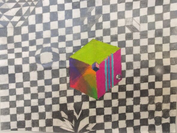
My independent piece which I’m titling Orderly Chaos and the Beauty of Small Distortions, has a checkered grid as the background and as a main feature. The checkered background has multiple distortions scattered around. Some look like the white squares are holes going down, and others look like something is pushing on the other side of the grid so it's stretching. In the center there is a colorful cube with slots running down the side and a hole in the right corner among other illusions.
The way I made this piece is: First I drew the outline of the central cube and drew the hole in the bottom right. In the center of the hole I drew a cross that divided the hole in to quarters. The upper right and bottom left quarters are shaded black while the other two are left blank. Each dividing line is extended to the edge of the page. Then each line is replicated with an offset till the end of the page. This makes the basic grid and cube, remember not to draw the grid on the cube. The entire piece other than the cube is done only with a standard writing pencil. The cube is drawn with colored pencil. The inspiration for this piece comes from the various art works of M.C Escher. I find the use of simple geometric shapes to make an interesting piece something strange and beautiful. A single note has no meaning and conveys no emotion, but the same note play over and over again can yield rhythm and song. There are two messages I intended to convey in my artwork. One is that life is full of distortions, but one has to ride the ripples out and not fall off the page. The other message is that true brilliance lays within the ripples, the majority of people never find their wave, and when people find the ripple for them it is not always the greatest one, but once in a while someone finds the right one then they become our heros that bring color into art and the world. A cube when all is said and done is just a fancy square. My goal for this art piece was to improve my ability to draw three dimensional shapes and shade evenly. If you look closely the distortion in the upper right corner is supposed to be as if a white square is sticking up it does a good job of portraying this locally, but if you look at the entire piece the perspective is all wrong. This shows that attention is vital. It also shows how locally on a small scale something can seem great but when looking at the big picture it just doesn’t work. A small accidental third meaning.
The way I made this piece is: First I drew the outline of the central cube and drew the hole in the bottom right. In the center of the hole I drew a cross that divided the hole in to quarters. The upper right and bottom left quarters are shaded black while the other two are left blank. Each dividing line is extended to the edge of the page. Then each line is replicated with an offset till the end of the page. This makes the basic grid and cube, remember not to draw the grid on the cube. The entire piece other than the cube is done only with a standard writing pencil. The cube is drawn with colored pencil. The inspiration for this piece comes from the various art works of M.C Escher. I find the use of simple geometric shapes to make an interesting piece something strange and beautiful. A single note has no meaning and conveys no emotion, but the same note play over and over again can yield rhythm and song. There are two messages I intended to convey in my artwork. One is that life is full of distortions, but one has to ride the ripples out and not fall off the page. The other message is that true brilliance lays within the ripples, the majority of people never find their wave, and when people find the ripple for them it is not always the greatest one, but once in a while someone finds the right one then they become our heros that bring color into art and the world. A cube when all is said and done is just a fancy square. My goal for this art piece was to improve my ability to draw three dimensional shapes and shade evenly. If you look closely the distortion in the upper right corner is supposed to be as if a white square is sticking up it does a good job of portraying this locally, but if you look at the entire piece the perspective is all wrong. This shows that attention is vital. It also shows how locally on a small scale something can seem great but when looking at the big picture it just doesn’t work. A small accidental third meaning.
Sophia

We Will Stand, inspired by the New Republic by Kehinde Wiley
For my masterwork piece, I decided to do an interpretation of the piece the New Republic by Kehinde Wiley. You can see that the flowers are the same, but the person is different. I decided to change the person in the piece to a black woman. The women you see in this piece is fighting. I feel like I got inspired to interpret this into the piece because there are lots of political protests going on around the world about equality. I thought I would protest in my artwork against conservative men who don’t believe in equality, against rapists, against racism, and against everything wrong in this country. Because people need to start standing up for their rights and start speaking out.
I feel like I went along with the original artist of this piece, Kehinde Wiley. He uses his artwork to make political statements. Kehinde Wiley got inspired by the absence of black people in historical and cultural events in history. He does the background of the piece like an old European painting and then he puts a black person in the pieces. When I look at the original piece and my own, I see a political statement against racism and lots of other events. In my piece, I feel like the arm raised conveys the message and I think in the New Republic the star conveys the message. I think the main principles of design in this piece are contrast, harmony, and balance. I feel like all three of these are needed in this piece, especially in the skin of the woman. I also think there is an emphasis on the yellow fingernail. I feel like it draws people's attention to the fist, which is the main part of the piece. For the elements of art, I think that the most prominent are value, color, and texture. I created this piece using Prisma colored pencils, wood, and white paint. I learned so much while creating this piece. Before this piece, I had never done any realistic skin or hair and while working on this piece I really think I have a good understanding of how to do skin and hair. I feel like my skills in realism have really developed. The only problem I had while working on this piece is the eyelashes. When I first did the eyelashes I made them way too long and almost ruined the piece. I was able to fix them and I learned a good technique on how to do them.
My main goal as an artist to really work on realism using Prima colored pencils. I think this piece really helped me with this goal. I learned how to make realistic hair and skin with Prisma colored pencils. I also learned how to draw and shade a fist. My piece turned out beyond what I expected. This piece will definitely influence my future artwork. I am hoping to do another piece with a realistic person and a political message behind it. I am incredibly happy with my artwork.
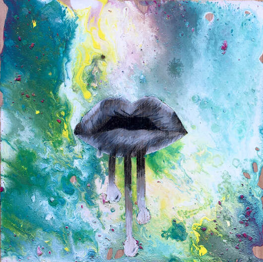
Lips Don’t Lie, By Sophia
I created my piece using acrylic paint, wood, glue, rubbing alcohol, Prisma colored pencils, and water. While working on this piece I ran into not having enough time to work on it outside of school and since I started this piece a little later than most people I had to really learn how to manage my time. While working on this piece I also learned how to do a paint pour and how to draw and shade lips only using the colors black and white.
I got my inspiration for this piece by the cover of the rolling stone album. One day I was looking at my family's CDs and I saw it and got the idea. Last year I made a paint dripping piece and so I decided to combine the ideas. The message I would like viewers to take away from it is to let your true colors show rather than hiding them away.
The way I conveyed the true colors by doing the marble background, which is colorful but not perfect. I conveyed the hiding it away from doing the lips on black and white. My piece is done on a wood surface, with a marble background. In the middle of the piece, there are black and white open lips with paint drops coming out of them. I think the most prominent elements of art are color, value, and form. I think the most prominent principles of design are rhythm and variety. I created this piece in January 2020. My goals as an artist are to master realism. I think this piece helped me with this goal because of the lips and shadowing of them. I think this piece turned out just like how I pictured it and maybe even a little better. This piece could influence my future artwork because of the realism. Also, I drew an eye last quarter and since I did a piece on lips I am hoping to do one on the ear or maybe nose. I am very pleased with my piece.
Stella
History of the Piece
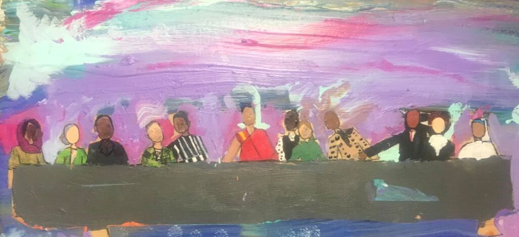
My piece was an interpretation of Leonardo da Vinci’s ‘The Last Supper’. It was created from 1495 to 1498. Da Vinci used an oil/tempera mix and applied it to a dry wall to create the piece. The piece depicts the shock and horror of the twelve disciples upon learning that one amongst themselves was going to betray Jesus Christ. The work was commissioned in 1494 by Ludovico Sforza, who was the Duke of Milan
My piece was an interpretation of Leonardo da Vinci’s ‘The Last Supper’. It was created from 1495 to 1498. Da Vinci used an oil/tempera mix and applied it to a dry wall to create the piece. The piece depicts the shock and horror of the twelve disciples upon learning that one amongst themselves was going to betray Jesus Christ. The work was commissioned in 1494 by Ludovico Sforza, who was the Duke of Milan
My Piece
My interpretation was of this piece but everyone was replaced with people who are activists or have bettered the world community as a whole with their work. My inspiration for this was the fact that many people in the world see the people in the original as important people, and so I made mine as my view of people who are important in today's community. I used paint, sharpie, and colored pencils on wood for my piece. My main challenge for this piece was accepting that no matter how hard I tried, it was never going to look perfectly realistic and that my colors don't always have to be 100% perfect and accurate.
My interpretation was of this piece but everyone was replaced with people who are activists or have bettered the world community as a whole with their work. My inspiration for this was the fact that many people in the world see the people in the original as important people, and so I made mine as my view of people who are important in today's community. I used paint, sharpie, and colored pencils on wood for my piece. My main challenge for this piece was accepting that no matter how hard I tried, it was never going to look perfectly realistic and that my colors don't always have to be 100% perfect and accurate.

Independent
For my independent, it started out as a landscape of a beach, I used my Ipad for it, and then I proceeded to lose my iPad :). After a short period of panic, I started a new piece on my phone on the same program. My independent on my phone started out as a prompt I found on Tik Tok, but as I started to use the prompt, it started to look more and more familiarly, until I realized I was essentially just drawing Lizzo. My main challenges for this piece were using the blur effect on the program because it was very hard to control, using colors that looked realistic, and adding small details like hair, wrinkles in clothing, and shadows.
For my independent, it started out as a landscape of a beach, I used my Ipad for it, and then I proceeded to lose my iPad :). After a short period of panic, I started a new piece on my phone on the same program. My independent on my phone started out as a prompt I found on Tik Tok, but as I started to use the prompt, it started to look more and more familiarly, until I realized I was essentially just drawing Lizzo. My main challenges for this piece were using the blur effect on the program because it was very hard to control, using colors that looked realistic, and adding small details like hair, wrinkles in clothing, and shadows.
Claire C

Starry Dawn
For this piece, I took the original design of the famous work of art “Starry Night” by Vincent Van Gogh. I changed up the colors to make it look like a sunrise, with warmer colors leading out from the sun into darker colors. I called this piece “Starry Dawn” because of the warm colors added to it, making it look like morning. I think that the most important element of art for this piece is line because of the clearly visible unblended lines I added in order to mimic the the most important principle of design in the work, which I believe to be movement. The original “Starry Night” was made June, 1889. I used paint for this piece just like the original one. I learned that I have to wait for the paint to dry before I put in the different streaks, otherwise the paint would blend together and it would not give the effect of the original one.
My inspiration for this piece was having a new start to the year and having the sun finally come up, making things lighter for the new start. Vincent van Gogh was in an asylum when he painted “Starry Night” after cutting off a part of his left ear. He painted this piece to express the hard times he was going through using the cooler colors as element to represent his sadness.
My goal for this piece was to paint something different. For this piece, that meant using the more abstract part of the piece, as opposed to blending all of the colors together. Making this work helped me to realize that paintings don't always have to look realistic, but sometimes they can look just like paintings as opposed to photographs. It helped me to see the value in not always trying to make things look realistic.

Reaching Out
I called this piece “Reaching Out.” It is a silhouette of a little girl reaching out to the magical colors in the sunset, with a blue background. I worked on this piece from December 2019 to January 2020. I think that the most important element of this work was color because I used colors in such a way as to make them pop out.
I made this piece with paint and duct tape. I used the duck tape to sharpen the lines of the sun and the ground. One of the problems that I ran into along the way was the paint seeping through the duct tape, making some of the lines less sharp. One way that I found to fix this was going over the rough parts with a little paint brush and filling in some of the parts freehand. One of the problems I ran into with this was putting the yellow on top of the darker colors because the yellow was less thick and would not fully go over the darker colors for the sun. The message that I want people to take away from this piece is to appreciate the colors of the world. I was inspired by seeing a video on using duct tape to paint straight lines and I wanted to try it out. One of my goals as an artist is to use different materials to make new pieces. This piece helped me with this because I used duct tape to get the lines straight. This piece pretty much turned out how I wanted it to, except that I ended up adding more bright colors than I first thought I would, but I think that overall it benefitted from the addition of more colors.
Julia

Master Work
For my master work I recreated “The Kiss” by Gustav Klimt. I chose this piece because I liked how there is both simplistic, geometric shapes and complex, organic shapes. I love the variety in The Kiss because there are both vivid and muted colors. I think when Gustav Klimt was painting The Kiss, the elements of art and principles of design he had in mind when painting this are shape, value, color and unity, emphasis and balance.
In the past, the paintings I have done with acrylics have mostly been abstract, or non-realistic so trying to capture a realistic image was a new thing for me. While painting with acrylics I learned how to control the brush, how to layer and blend paints and how precision and time pays off.
When Gustav Klimt was painting The Kiss, his color palette was inspired by the beautiful landscapes of Italy. I love this piece because it symbolises joy, delicacy and love. What I interpret the flowers to mean is that nature is full of beautiful and delicate things that can symbolise hope or joy.
I loved making this piece because it helped me learn and practise precision and detail. I am very proud of my piece and I would love to do another like it.

Independent Piece “Running”
For my independent piece, I used colored pencils on wood and tried to create a realistic image. In my piece, I have a dog by a pond made of pencil shavings with trees in the background. I focused on having a mid-ground, a foreground and a background to show depth and value. I focused on form and color when I was drawing the dog (and everywhere else). I call my piece Running because I wanted to emphasize the fact that there may be clean water and green grass now, but we are running towards a climate crisis.
When I was making this piece, I learned a lot about adding value and drawing proportionally. I loved practicing getting in as much detail into my drawing as possible. My favorite thing about my piece is the pencil shavings instead of water. I love the color it adds.
When I was still thinking of subjects for my independent piece, I knew I wanted to tackle drawing fur and texture so I started with that. I came up with a similar sketch to the drawing I have now and I saw a bunch of pencil shavings on the table I was working on and I knew I could do something cool with that. My goals when I was working on Running were using my time wisely, and paying attention to detail. I wish I would have given myself a little more time, but I love how it turned out. Working with Prismacolor pencils was really fun for me and I would love to do it again.
Rio
San Giorgio Maggiore at Dusk
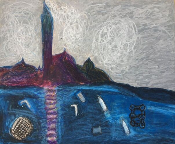
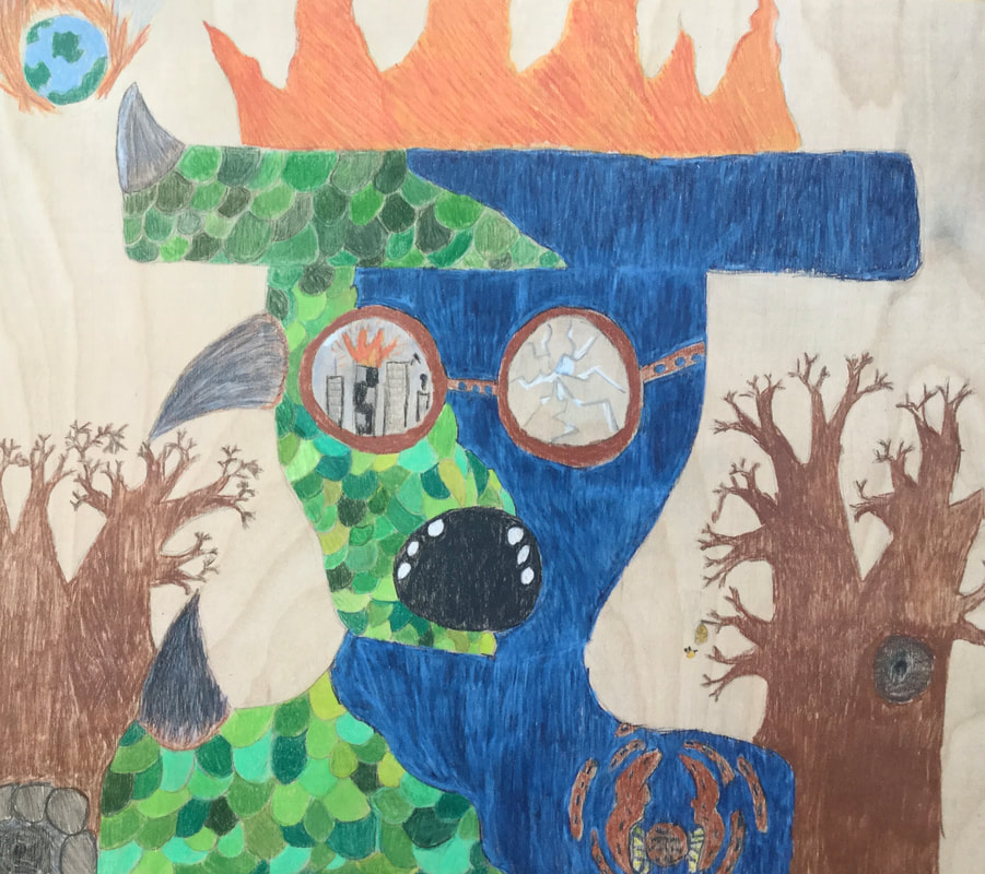
For this piece I took the original design of San Giorgio Maggiore famous piece and changed it up a bit, because the original design is pretty building behind a beautiful sunrise or sunset with the pretty water reflecting off the sun. What I did to change it up and show a different meaning I made the water dirty with pollution, and the building giving off smoke, the reason why I chose to change it in this way was to show how people are treating our environment and I wanted it to relate to climate change. For this piece I used oil pastels, and kleenex to help the pastels blend better, the hardest part along the way when I was creating this was probably blend but I think along the way I learned lots of techniques. I think the most prominent element of art is color and texture, principal of design would most likely be emphasis and the balance of the colors and how they blend. The main idea behind this piece is to show what climate change is doing to the environment and how it’s affecting our ocean and overall pollution, and to show where our climate is going. This piece also helps me feel more inspired to do more about climate change. My goal as an artist is to become more successful with abstract art and to have more patience with designing and thinking of new ideas. I think it turned out mostly how I wanted it to I just struggled making all the colors blend together. I think for this project I could have helped more people out this time but I could definitely change that in the future.
For this piece I took the original design of San Giorgio Maggiore famous piece and changed it up a bit, because the original design is pretty building behind a beautiful sunrise or sunset with the pretty water reflecting off the sun. What I did to change it up and show a different meaning I made the water dirty with pollution, and the building giving off smoke, the reason why I chose to change it in this way was to show how people are treating our environment and I wanted it to relate to climate change. For this piece I used oil pastels, and kleenex to help the pastels blend better, the hardest part along the way when I was creating this was probably blend but I think along the way I learned lots of techniques. I think the most prominent element of art is color and texture, principal of design would most likely be emphasis and the balance of the colors and how they blend. The main idea behind this piece is to show what climate change is doing to the environment and how it’s affecting our ocean and overall pollution, and to show where our climate is going. This piece also helps me feel more inspired to do more about climate change. My goal as an artist is to become more successful with abstract art and to have more patience with designing and thinking of new ideas. I think it turned out mostly how I wanted it to I just struggled making all the colors blend together. I think for this project I could have helped more people out this time but I could definitely change that in the future.

Zero Hydration
For this piece of art I decided make a painting of a hand reaching for a water bottle. The reason I did this was to show that Michigan can be very dry and dehydrated because it's always cold and then hot, and meaning behind this was to show a hand reaching for water and moisture and the water dripping away from the hand. I think the most prominent element of art is movement and value, and the most prominent principal of design is scale and balance.
For this piece of art I used paint as my main material, along the way I learned certain techniques to make the bottle look 3-D I had to blend a lot of different shades of white and gray to make highlights like a real water bottle would have. The most difficult part was making the proportions and size of the water bottle similar to the hand, I also add different red colors of paint to look like blood to really show how dehydration can affect the body. The main idea behind this piece was to show dehydrated dry hands affects me and to show how it can hurt your body, because for me I have struggled with dry cracked bloody hands. And I felt like including what I go through into my artwork and to show a message. I felt like to understand this painting though you have to know the background of the story.
I think that my main goals is to show the meaning and message through my future paintings in the future and to make it clearer to understand. But overall their were a few things that I wish I had taken more time on like the hand and having more patience with it and not feeling as rushed, but yes overall it turned out great. But I definitely learned more ways of blending with paint and how to work with 3-D shapes, and values.
Tess

Masterwork:
For my masterwork, I did Temple Gardens by Paul Klee 1920. It is a very geometric piece, with lots of warm colors and a few cool colors. It is split up into three panels. The most prominent element of art is shape, and the most prominent principle of design would probably be rhythm. To make this piece, I used acrylic paint on two pieces of wood. The painting was too big to fit on one piece of wood, so I had to get two pieces and cut them up so they would fit. I did have some trouble with this because I couldn’t see where the lines were supposed to line up or if the colors were correct. The two panels were also different kinds of wood, so sometimes the paint would apply differently to the surface. So I did have to work with the different types of wood and making sure it matched up, but besides that making this piece was relatively painless. Paul Klee was inspired by Cubism of Pablo Picasso, as well as the idea of making optical illusions and basic shapes. When I see this piece it gives off a feeling of energy and light, mainly based off of the warm colors. Overall, I’m really happy with how this piece turned out. This piece helped me meet some of my goals by helping me learn about color, shape, and being precise. I really enjoyed recreating this piece.
For my masterwork, I did Temple Gardens by Paul Klee 1920. It is a very geometric piece, with lots of warm colors and a few cool colors. It is split up into three panels. The most prominent element of art is shape, and the most prominent principle of design would probably be rhythm. To make this piece, I used acrylic paint on two pieces of wood. The painting was too big to fit on one piece of wood, so I had to get two pieces and cut them up so they would fit. I did have some trouble with this because I couldn’t see where the lines were supposed to line up or if the colors were correct. The two panels were also different kinds of wood, so sometimes the paint would apply differently to the surface. So I did have to work with the different types of wood and making sure it matched up, but besides that making this piece was relatively painless. Paul Klee was inspired by Cubism of Pablo Picasso, as well as the idea of making optical illusions and basic shapes. When I see this piece it gives off a feeling of energy and light, mainly based off of the warm colors. Overall, I’m really happy with how this piece turned out. This piece helped me meet some of my goals by helping me learn about color, shape, and being precise. I really enjoyed recreating this piece.

Independent:
My independent was based off of a picture that I took when I went on a trip. It is of a forest-like area with a fountain in the middle. It has lots of dots on it and is mainly green. The most prominent principle of design is repetition and the most prominent element of art is texture.
Making this piece, I used a small piece of wood and oil pastels. In the beginning, I used a certain brand of oil pastels, but the more I used them the more I realized that they were really hard to use and I wouldn’t really be able to use them for the whole piece, so I switched the brand of pastels. Although they ended up working better, sometimes you could tell they were different colors. I had to work through the blending and mixing of colors because it was a different sort of texture and style. My inspiration, as I said, was based off of a picture that I took. I didn’t really want people to feel any specific feeling, besides just seeing a landscape and other art. I tried to portray a certain calming sense throughout the piece, so I used similar colors throughout the whole piece. This piece had a lot of ups and downs for me, partly because of the fact that I’m pretty hard on myself when it comes to my art. I always want to do better, and I think that definitely applies to this piece. I definitely could have done better, but I’m glad I did this piece because I learned a lot from it.
Devi

For my masterwork, I did a combination of two pieces to make it a bit more challenging. I was originally thinking to just remake a painting called “Small Worlds IV” by Wassily Kandinsky, but then decided to use the colors and blending techniques of another painting called “San Giorgio Maggiore at Dusk” by Claude Monet. The most prominent Elements of Art in the piece I made are definitely line and color. My piece has lots of color, and lots of different lines and shapes. It’s a very abstract piece, with lots going on. The most prominent Principles of Design in the piece are emphasis and proportion. I decided this piece would look best in colored pencil. I learned how to blend the colored pencils along the way, because I didn’t know how to do that before. There’s a lot of places in the piece that has a lot of blending. In the end, I had extra space on the sides of the piece, so I decided to extend it and add gold polka dots around it. The surface I used in my masterwork was wood. When Kandinsky was creating Small Worlds IV, he was focused on making the piece unique, and unlike other works you would see. I love looking at the piece, because it’s very interesting to look at each shape that goes into it. I’m glad I decided to combine two pieces, because it gave me a chance to challenge myself more. When I was creating this, I got better at proportion and blending colored pencils. I overall like the piece, and how it turned out.
Independent:
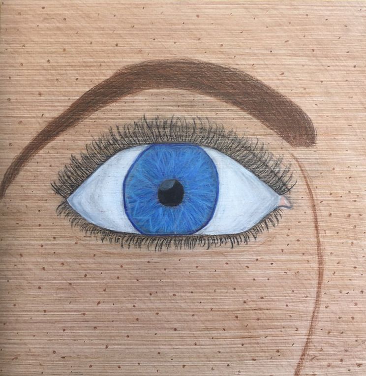
For my independent, I wanted to practice doing realistic art, so I decided to do a close-up blue eye. It was pretty hard because I’m not used to doing realism. The most prominent Elements of Art in my piece, are value and texture, and the most prominent Principles of Design are probably contrast and balance. Instead of only focusing on the eye, I decided to add an eyebrow, nose, and some freckles. There wasn’t enough space on the canvas to have the whole nose on the piece, but I still drew the curve on it. I decided to work with colored pencil in this piece, to practice blending more. The hardest part to make in this piece were the eyelashes, because I wasn’t sure how to make them look very realistic. I added a little bit of gray to the sides of the eye to make it look more round, and it helped a lot. I came up with the idea to make this my independent because I wanted to do something with blue in it and something to practice realism, so I eventually decided on an eye. One of my goals as an artist is to get better at realism, so this piece helped me try that. This piece pretty much turned out as I thought. The only thing I’d like to work on more in the future is drawing eyelashes.
For my independent, I wanted to practice doing realistic art, so I decided to do a close-up blue eye. It was pretty hard because I’m not used to doing realism. The most prominent Elements of Art in my piece, are value and texture, and the most prominent Principles of Design are probably contrast and balance. Instead of only focusing on the eye, I decided to add an eyebrow, nose, and some freckles. There wasn’t enough space on the canvas to have the whole nose on the piece, but I still drew the curve on it. I decided to work with colored pencil in this piece, to practice blending more. The hardest part to make in this piece were the eyelashes, because I wasn’t sure how to make them look very realistic. I added a little bit of gray to the sides of the eye to make it look more round, and it helped a lot. I came up with the idea to make this my independent because I wanted to do something with blue in it and something to practice realism, so I eventually decided on an eye. One of my goals as an artist is to get better at realism, so this piece helped me try that. This piece pretty much turned out as I thought. The only thing I’d like to work on more in the future is drawing eyelashes.
Claire L
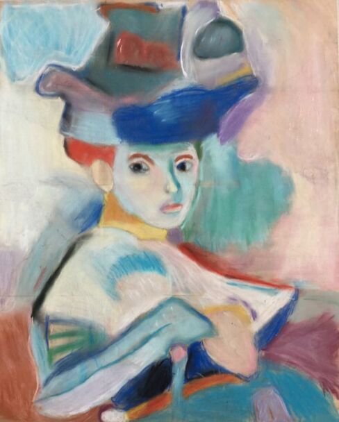
For my masterwork I did Woman with a Hat. The artwork was painted it 1905 by Henri Matisse. The painting is of a brightly colored woman with a huge hat. The painting is filled with a variety of colors, such as blue, yellow, purple, green, and more. In the Woman With a Hat, Matisse used oil paints and he painted on a canvas. When I recreated his piece I used chalk pastels. I used a tissue to blend all the unique colors together. I also tried to go through a couple times with the chalk pastels to get a good rich color. Woman With a Hat was painted as a main focus to the modern art statement of the twentieth century. An art critic said artwork like this looked like it was made by “wild beasts” and the French term, Fauve, was soon associated with this style of painting. This was Matisse’s first painting to have crazier colors and simpler brush strokes and it was quite unusual for his time. I really liked this painting because of its amazing colors and its variety of shapes. This painting really helped me learn how to use chalk pastels and how to blend and use colors to my advantage. I wish I spent more time on making my grid really exact, but other then that I’m proud of my recreation.
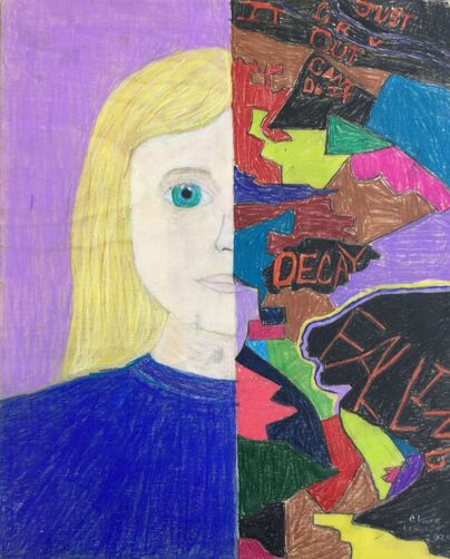
For my independent I drew on a piece of wood and I used Prismacolor pencils. On one side of the board I drew half of a girls face. The girl has blond hair, blue eyes, and a plain blue shirt. On the other side I drew shapes with darker and more stressful colors, and I wrote phrases like “cry it out”, “falling”, and other things like that. I tried to use contrast throughout the two sides of the artwork, and I tried to use a lot of shape in the girls face and the other side. I drew this because I feel really strongly about mental health, and mental health awareness. I drew a stereotypically “perfect” girl. I want more people to know that even though some people seem that they are fine and happy you don’t know what’s going on with their mental health. A lot of people put on a face to hide what they are actually feeling. By making this I hope I can teach people a little bit more about what some kinds of mental health looks like. I really learned how to persevere by doing this piece, a lot of time I struggled making a good skin color using colored pencils. It was hard for me to use colored pencils for more of a realistic look, but I learned to use the colored pencils to get a strong color.
Nakoa
|
|
Sorrel
Master Work
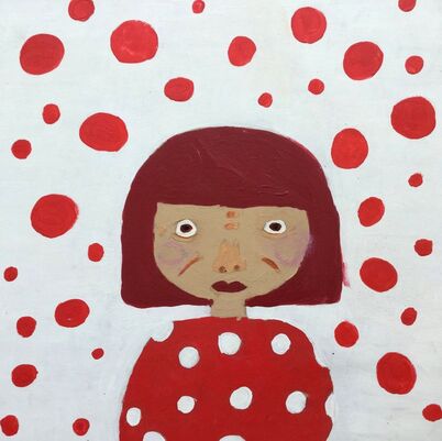
The most prominent design is repetition and rhythm. The background is white with red dots, the most important element of art is the color. There is no official title because it is something I did, a portrait of Yayoi Kusama, and the background was one of her most popular paintings red dots and a white background. The red and white background was [inspired by her work] made in 2011, and I painted the portrait in December. The materials I used where paint and a pencil to sketch out the portrait. The problem solving that went into it was trying to make a face that didn't look really cartoony or bad. I learned how to draw eyes better. She got her inspiration from her hallucinations and from her OCD she reportedly suffered as a child, in which the entirety of her surrounding space was covered with repeating patterns. I feel happy and calm when I look at the art it makes me feel calm inside, I think the pattern repeating makes it easy to look at. Some of my goals are to get better at drawing people it helped me get closer to it because it made me draw a person and try to make it look good and realistic.
The most prominent design is repetition and rhythm. The background is white with red dots, the most important element of art is the color. There is no official title because it is something I did, a portrait of Yayoi Kusama, and the background was one of her most popular paintings red dots and a white background. The red and white background was [inspired by her work] made in 2011, and I painted the portrait in December. The materials I used where paint and a pencil to sketch out the portrait. The problem solving that went into it was trying to make a face that didn't look really cartoony or bad. I learned how to draw eyes better. She got her inspiration from her hallucinations and from her OCD she reportedly suffered as a child, in which the entirety of her surrounding space was covered with repeating patterns. I feel happy and calm when I look at the art it makes me feel calm inside, I think the pattern repeating makes it easy to look at. Some of my goals are to get better at drawing people it helped me get closer to it because it made me draw a person and try to make it look good and realistic.
Independent Work
|
|
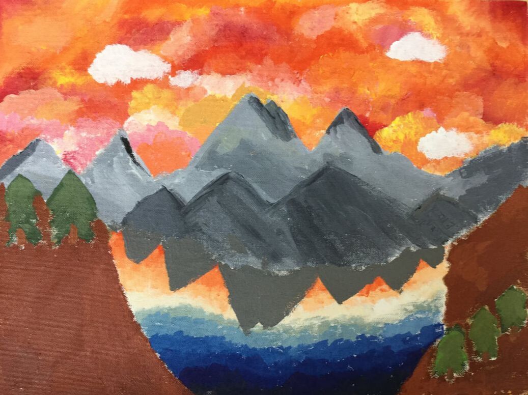
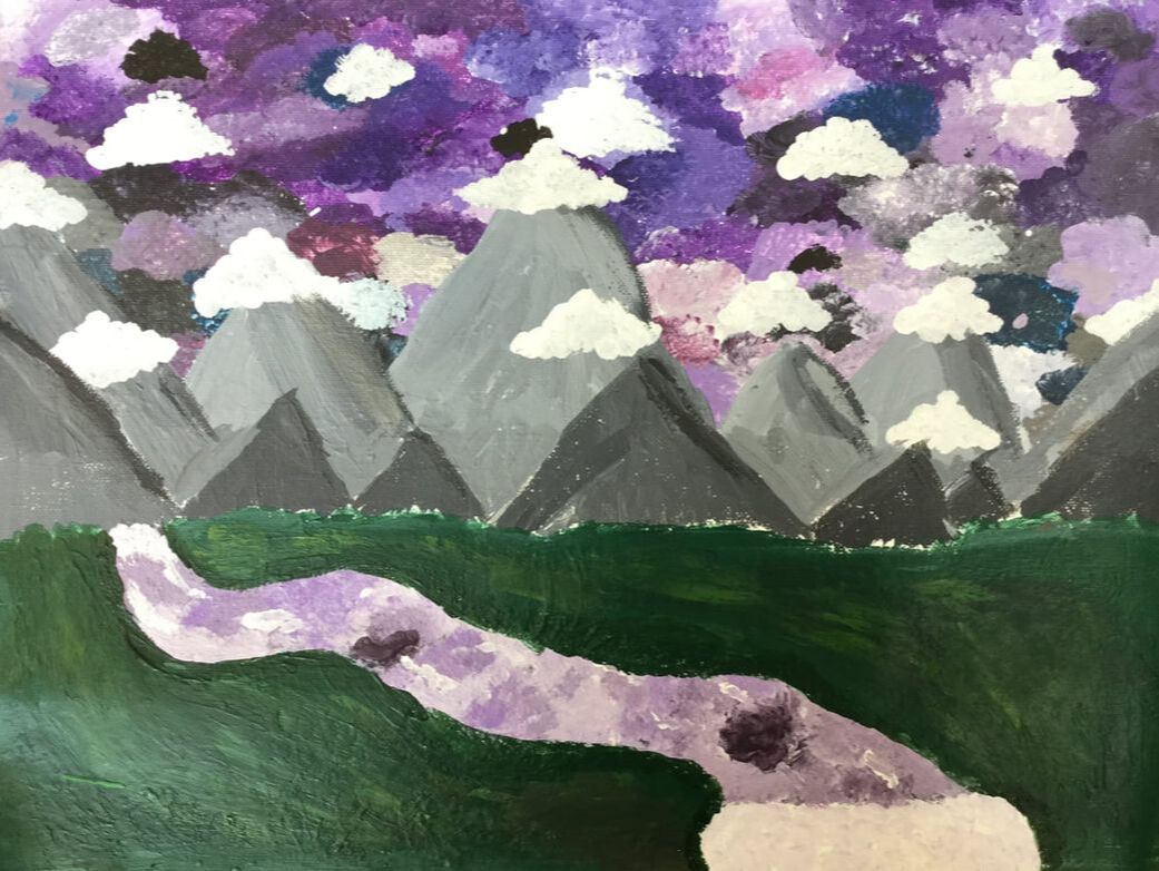
I did two pieces they are both landscape pieces one of them has a river and a cloudy sky and lots of mountains and the river is going through a field of green grass. And the second one has trees a cloudy sky, mountains and in the center there is a pond that reflects the sky so it fades from dark blue to bright orange. The most prominent design is variety and rhythm and movement, the most prominent element is the colors of the skies, both skies were painted with bright colors one of them has a purple sky and the other one has an orange sky. The title of my pieces are The Two Skies. It was started on Dec 20th and was finished on Jan 15th 2020. It is a landscape painting. The materials I used were paint and a pencil to sketch my work. I don’t know if this would be considered a technique but instead of just brushing with the paint brush I used the tip to [add texture]. It was hard to make the mountains not look like the center of the piece because I wanted the river and the sky to be the main thing you see. I learned more on how to make clouds and rivers look more real. I was inspired by the mountains I saw in Switzerland and from the sky. I mainly just wanted to get better at painting clouds and landscapes. I hope people feel calm when they look at my pieces. There isn’t really a message I’m trying to tell people but if I had to think of one it would be “look around more” I tried a bit to communicate it with the nature. Some of my goals where to get better at clouds and blending, I also really wanted to get better at rivers and landscape paintings. It helped me learn more on how to blend and how to make the clouds look nice but not too fake. The first piece turned out way different than how I thought it would be but the second one turned out just as good I thought it would. It made me want to paint more landscapes and get better at different types of landscapes.
Owen

My independent piece looks like a field with trees and the sun is in the upper right corner. The most prominent element of art is color and the most prominent principle of design is rhythm.
For my masterwork, I did an interpretation of Basquiat’s “Untitled.” It looks like an abstract painting of a bird skull on a very colorful background. I tried to stick with the color palette of the original artwork. The most prominent elements of art are shape and color and some prominent principles of design are contrast and emphasis
One of the techniques I used to create my independent project is blending with my fingers. Some challenges I faced with creating this art were using oil pastels which I had never worked with before.
One of the techniques I used to create my masterwork was using different sized brushes. Some of the challenges of creating this artwork were trying to keep it the same style as the original but still making it my own.
I was inspired by nature and the outdoors. I hope viewers walk away with a feeling of peace.

Basquiat had many different inspirations. He was inspired by the style of Picasso and Leonardo Di Vinci’s anatomy drawings, but he was also inspired by many different types of music like rock, hip hop, and even classical, and he was also inspired by his personal feelings and emotion. I think he hoped that people would walk away from his artwork knowing what he was feeling at the time.
Some of my goals as an artist are to at least try a lot of different materials, tools, and styles. I think both of these pieces helped me with that because I have never worked with oil pastels before, and I have never done something really expressive and abstract before.
Some of my goals as an artist are to at least try a lot of different materials, tools, and styles. I think both of these pieces helped me with that because I have never worked with oil pastels before, and I have never done something really expressive and abstract before.
Samantha
|
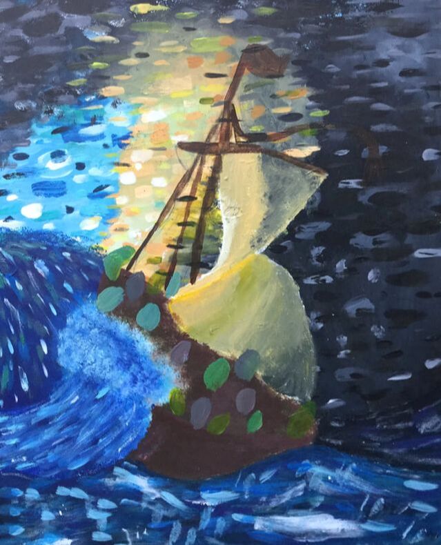
The first painting that I made was “The Storm on the Sea of Galilee” but I didn't do it I the traditional way. It looks like a painting of a boat on the ocean during a major storm, but it has lots of abstract features, and it is closer to a “Starry Night” style. It involves a lot of lines, and some repetition. For this piece, I used acrylic paint and wood. First I blended the colors, to make sure that the background was completely full. After that, I went through and I put lines over that to give texture. It depicts Jesus calming the sea, after a big storm. I am not super happy with this piece, but I think that it looks good, for how little time I had to work on it. Also I think that the design and execution went well.
|
|
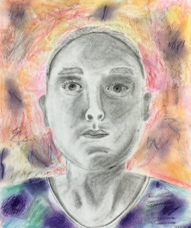
For my independent, I made a self portrait. When you see it you will see a black and white person, with bright colors all around her. I made this piece using charcoal, and chalk pastels. I found inspiration from the Adele album cover “21” . I am a fan of some of Adele's music, but I saw the album cover, and was inspired. I think that the creation of this piece worked perfectly, and I am happy with it. The only thing I would change about it, is that I would not have put color in the background, my original plan did not involve any color, but Deb suggested it, and I figured it was worth a try, because it might be too much charcoal if there wasn't anything else.
|
|
John

Storm on the Sea of Galilee:
Storm on the Sea of Galilee is a picture of a wave crashing over a boat. With this piece I tried to incorporate movement. The original piece was made by Rembrandt in 1633. The original was made with oil paints, but I made mine with Prisma colored pencils. I learned a lot about using colored pencils, specifically blending and the fact that you can’t erase colored pencils. When Rembrandt painted this he got his idea from Jesus calming a storm on the Sea of Galilee. He made the painting very ominous (the storm) with a glow coming from someone on the boat (Jesus). When you look at the piece you almost see the wave building and hitting the boat and the panic of the people on board. I feel like I did a pretty good job on this. I wish I had made the clouds different because you can't really tell that they’re clouds.
Storm on the Sea of Galilee is a picture of a wave crashing over a boat. With this piece I tried to incorporate movement. The original piece was made by Rembrandt in 1633. The original was made with oil paints, but I made mine with Prisma colored pencils. I learned a lot about using colored pencils, specifically blending and the fact that you can’t erase colored pencils. When Rembrandt painted this he got his idea from Jesus calming a storm on the Sea of Galilee. He made the painting very ominous (the storm) with a glow coming from someone on the boat (Jesus). When you look at the piece you almost see the wave building and hitting the boat and the panic of the people on board. I feel like I did a pretty good job on this. I wish I had made the clouds different because you can't really tell that they’re clouds.

Independent / Inside the Lines:
My independent is a picture of a bucket pouring paint onto a color by number sheet. I tried to incorporate variety, harmony, and shape. It’s not really supposed to mean something deeper, it’s just a picture of a bucket and paint. It was made on January 19th 2020. I used acrylic paint and a pencil to create this piece. It doesn’t really have meaning or anything that I want viewers to take away. This didn’t turn out how I wanted it to, I wanted it to look like the paint bucket was pouring them on the canvas perfectly into shape, but it turned out to look not like that.
My independent is a picture of a bucket pouring paint onto a color by number sheet. I tried to incorporate variety, harmony, and shape. It’s not really supposed to mean something deeper, it’s just a picture of a bucket and paint. It was made on January 19th 2020. I used acrylic paint and a pencil to create this piece. It doesn’t really have meaning or anything that I want viewers to take away. This didn’t turn out how I wanted it to, I wanted it to look like the paint bucket was pouring them on the canvas perfectly into shape, but it turned out to look not like that.
Ellie

Tuttomondo
My masterwork is Keith Herring’s Tuttomondo. It has many different people shaped to fit in with one another. I would say the most used and most prominent Element of Art is space and shape. For space, each object relies on another one. The problem with creating this piece was that Keith started with one person and made all of the other ones using his knowledge of space and shape. He used his instincts. So I had to copy his shapes while putting them in the same space, so they all fit together. That way it was harder for me to find places to put them all. The big idea behind this piece, at least for me, is the equality behind all of the people. They are all VERY different, but they fit together perfectly.
I am proud of how I was flexible with how it came out and what it looked like. One of my goals as an artist is to learn how to do non-realistic art. I am very good at realistic art, but I would like to work on more abstract art this year. And this piece has helped me through figuring out how abstract art works and what elements make abstract art. This piece turned out fairly close to what I imagined, but it had little details that weren’t exactly the same. Like the colors, and I added two new characters so it would fit better. I used marker, paint, and pencil in this piece.

Stressed Out
This piece is one that I made by myself, with the exception of looking at two face sketches (123rf bowie15 and Painting Valley.) It expresses many emotions, including anger, stress, and sadness. There were many materials used for this piece- pencil, pen, sharpie, wood, wire, paint, and charcoal. The 3-D materials were used for the “exploding” effect. So it looks like her head is both exploding and taking in lots of negative things.
I created this in the mindset that it would be crazy. It turned out slightly different than I expected. I thought the main emotion would be anger, but I think it ended up being stress and sadness. More of a pitiful piece than an angry one. But I think it still has the conclusive effect that I was going for.
Another goal that inspired this piece was my goal to be able to express emotion from a piece. And I think that this piece probably exceeded that expectation.
Fauti
Trey
Grace
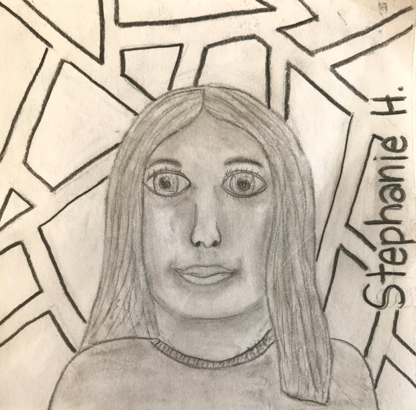
|
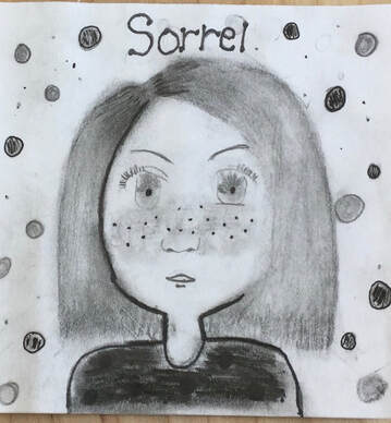
|
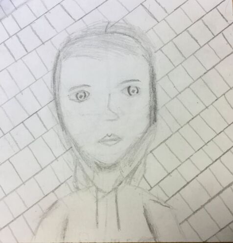
|
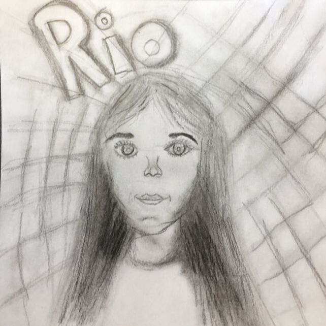
|
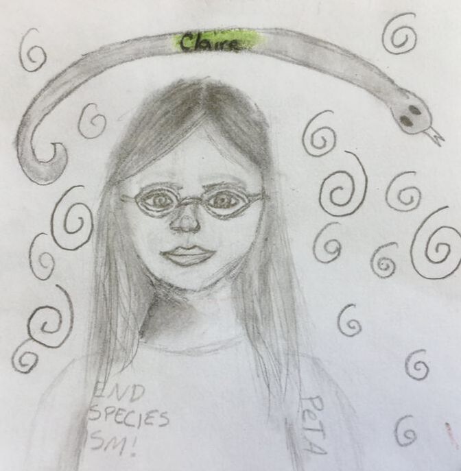
|
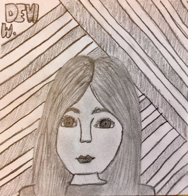
|
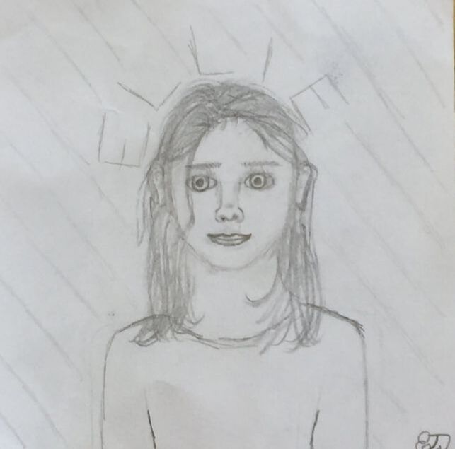
|
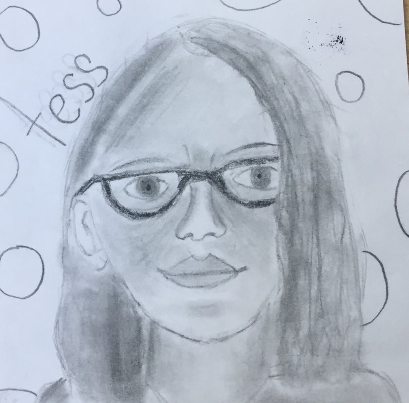
|
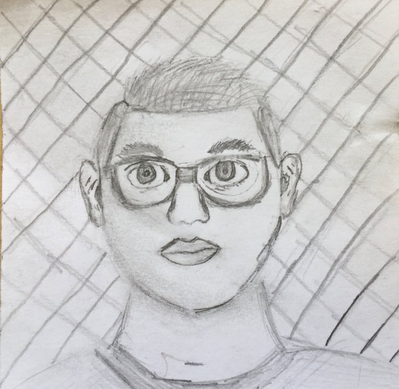
|
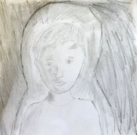
|
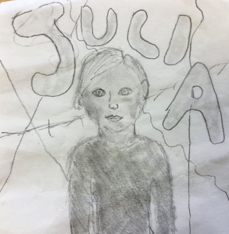
|

|
