Sheridan
A lot has happened for me this quarter in art. I have taken on a very large Masterwork, which hindered me from doing anything overly extravagant in my Independent, but I still managed to get them both done. I used some techniques in my Independent I learned from painting my masterwork. I think that I have gotten a lot better at painting this quarter from both of my pieces. I have learned how to make a straight line of paint, how to draw a pretty good circle, and how to paint inside the lines.
|
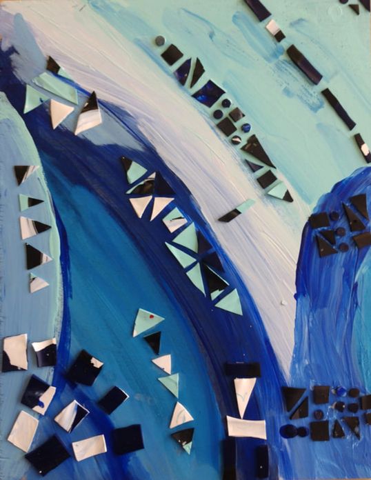
Masterwork
My masterwork piece is a recreation of Benedetta Cappa Marinetti’s Synthesis of Radio Communications. It is a monochromatic blue piece with abstract shapes. It is a very large piece, being 2 by 3 feet. The original was a mural that is part of a series. I started it by using the grid method and sketching the general shapes onto the canvas. I also had to whitewash the canvas beforehand. After this was completed, I started painting using acrylic paint. I believe that when Benedetta created this piece, she was trying to show a visual representation of radio communications, as shown in the title, and I tried to replicate that as well. Doing this piece helped me discover just how long it takes to paint such a big canvas, and to choose the right colors carefully because the differences between colors are so subtle. This piece also helped me see if I like using canvas, because it is the first time I have done so. My independent piece is a collage on wood. In the background there are a few black lines running in different directions. Glued on top are pieces of paper with abstract watercolor work from last quarter cut into organic shapes, and the shape of a treble clef along with a quarter rest. To make the background, I dipped a straight edge into black paint and pressed it onto the paper. For the wider parts and “globs” of paint, I scraped the flat of the edge onto the wood. I also added white acrylic paint afterwards for highlights. |
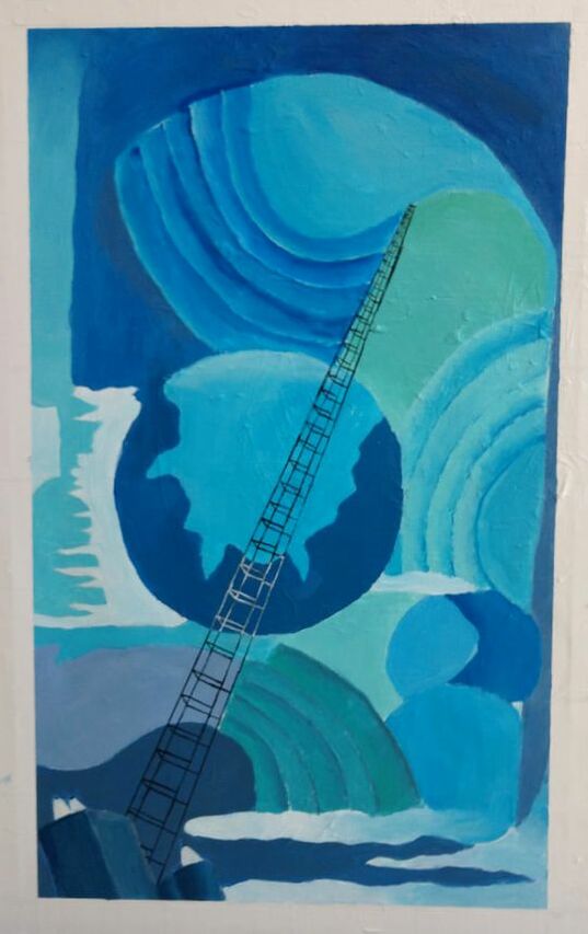
Original credit to Benedetta Cappa Marinetti, 1933-1934
|
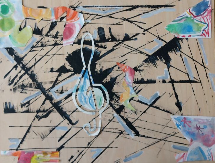
My first inspiration for this idea was when I was working on my Masterwork, and had to use that same technique described earlier to make a long straight line. I had a piece of paper on the side that I was using for practice. It ended up looking so cool I wanted to replicate it on wood for my independent. I used the leftover water color pieces on top and made some more because I needed brighter colors. Quickly I had the idea of modeling my piece after music. I thought of this because the black lines remind me of a staff, the bright colors, organic shapes of the notes, and the slightly bewildering piece overall as the mayhem of playing in a full orchestra.
This piece really helped me go outside my box and be openly creative, because with it I could basically do whatever I wanted to. It was interesting doing the collage because that is not usually the kind of art I do. I really like how this piece turned out although it is a little more confusing visually than I hoped it would be.
Next quarter, if I take art again, which I would like to do, I want to experiment more with techniques and materials, so I would try to pick a still ambitious but less time consuming masterwork so that I can focus more on an Independent. Some things I might want to experiment with are realistic drawing of people, animals and inanimate objects, collages, and using colored pencil.
Stephanie
This is my second quarter of art this year. I think I have improved in some areas but could still do better in others. Through this writing you will be able to notice what I have improved on, what I have learned, and just over all what I have enjoyed.
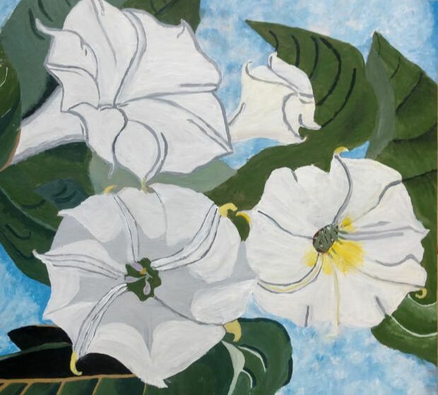 Original credit to Georgia O'Keeffe, 1936
Masterwork
The piece of artwork I recreated for my masterwork is called “Jimson Weed.” It is a piece made by Georgia O’Keeffe, but I decided to recreate it. I painted it on a piece of wood with acrylic paints.
The main element that is most obvious in my recreation of this piece is texture. You can tell that on the background, which is the sky, that there is a lot of rough texture going on. I used a small, firm paintbrush to make it look this way. I noticed after painting the sky that my piece had quite a bit more texture than the original painting, but I personally like how it adds its own unique touch to my painting. One of the main techniques I used was to when painting the petals on the flower to frequently dip my paint brush into a cup of water so it makes the painted petals look smooth and not have as much rough texture to it. The reason I choose to recreate this piece was because I have always admired Georgia O'Keeffe's artwork and how she just is inspired by nature and just paints the weather or the flowers she see as she’s taking a walk. I was looking through a book I have of her stuff and I really enjoyed this piece and I thought this was the perfect opportunity to recreate it. This is just one of those pieces that brings me joy when I see it, like when I look at the artwork and feel like I'm out in nature looking at a flower planted in a garden. I had never replicated anything by this artist before or ever even painted flowers before. So this was a good experience for me to be able to paint something realistic and out in nature. After painting this I have wanted to try to recreate more pieces by her. After doing this I have been more inspired to paint things found in nature.
|
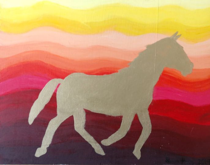
Independent
This piece that I created does not exact have a name, but the basic idea of it is a sunset with a horse silhouette. The basic sunset colors are red, orange, yellow, and maroon. After quite a bit of debating I choose to paint the horse silhouette gold instead of black. This piece was painted on wood with acrylic paints. The reason I choose to paint it on wood is because of after painting multiple pieces on wood and only one piece on a canvas I have realized I like painting on wood a lot more than painting on canvas. |
Joe
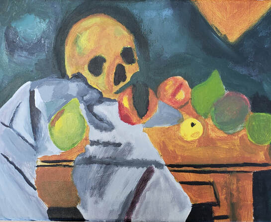 Original credit to Paul Cezanne, 1898
Masterwork
My masterwork art piece is a recreation of Paul Cézanne’s Still Life With Skull. The piece contains a cloth, skull and fruits on a table. The piece has a very dark background and a contrasting bright white in the foreground with medium tints in the middle. The piece draws your eyes from the bright cloth to the skull in the central area of the piece using line and contrast of value. I know that the piece came out of Cézanne’s love for still life paintings. I think that he enjoyed the challenge of making realistic paintings because that’s what he did in his later life. I think that he liked to paint a lot of fruit (especially pears.) I chose this piece because when I was looking for a piece to recreate his still life paintings really drew me in. I enjoy still life paintings for the challenge of it, I also feel calmed when I paint still lives. My recreation is made with acrylic on canvas. I used a dark green of different tints and shades to create the background. I used a bright white to create the cloth in the piece and then made it look more realistic by mixing in grays and other colors. My piece was made on a relatively large canvas allowing me to get finer details done with my level of painting skills. The cloth in the piece ended up looking smoother and less like it was folded and flowing down the table. My goals for the piece were to better my painting skills and familiarize myself with famous artists. During my creation of this piece I have bettered my skills in painting and sketching. I have also familiarized myself with Paul Cézanne and his works. I think the piece ended up looking about how I imagined it would be with small variations. I think it strayed a bit from the original and I like how it has transformed through my recreation. I have discovered an art style that I am fond of and I think it will affect my future pieces.
My masterwork art piece is a recreation of Paul Cézanne’s Still Life With Skull. The piece contains a cloth, skull and fruits on a table. The piece has a very dark background and a contrasting bright white in the foreground with medium tints in the middle. The piece draws your eyes from the bright cloth to the skull in the central area of the piece using line and contrast of value. I know that the piece came out of Cézanne’s love for still life paintings. I think that he enjoyed the challenge of making realistic paintings because that’s what he did in his later life. I think that he liked to paint a lot of fruit (especially pears.) I chose this piece because when I was looking for a piece to recreate his still life paintings really drew me in. I enjoy still life paintings for the challenge of it, I also feel calmed when I paint still lives. My recreation is made with acrylic on canvas. I used a dark green of different tints and shades to create the background. I used a bright white to create the cloth in the piece and then made it look more realistic by mixing in grays and other colors. My piece was made on a relatively large canvas allowing me to get finer details done with my level of painting skills. The cloth in the piece ended up looking smoother and less like it was folded and flowing down the table. My goals for the piece were to better my painting skills and familiarize myself with famous artists. During my creation of this piece I have bettered my skills in painting and sketching. I have also familiarized myself with Paul Cézanne and his works. I think the piece ended up looking about how I imagined it would be with small variations. I think it strayed a bit from the original and I like how it has transformed through my recreation. I have discovered an art style that I am fond of and I think it will affect my future pieces.
|
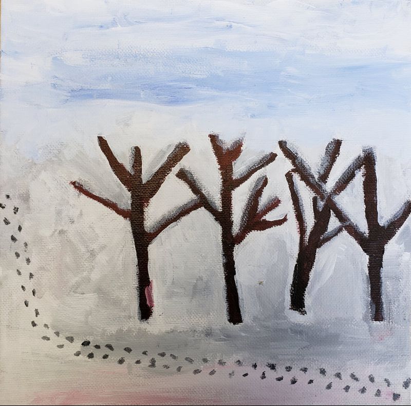
Independents
My independent piece is an Impressionistic style landscape, it is made on a piece of canvas on cardboard with acrylic paint. The piece is a winter landscape with lots of snow and some trees. It has a blended blue and white sky and footsteps going through the snow. I have been interested in doing a landscape in a simple, Impressionism style. I wanted to make the piece slightly differently but I think it came out pretty good looking. I hope that In the future when I have a larger canvas and more paint I can make another painting to how I imagined my independent would turn out. |
|
|
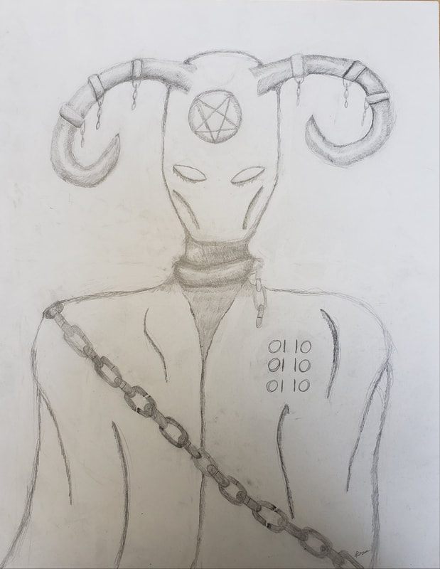
This piece [on the left] was inspired by the classic depictions of the devil. While drawing I also took inspiration from a species from the tv show Dr. Who. The drawing was made with pencil on a large sheet of paper. I was really happy with the result, especially the shading of the horns. The piece has a deeper meaning hidden in it, notice the breaks in the chains along its cloak.
|
Sophie
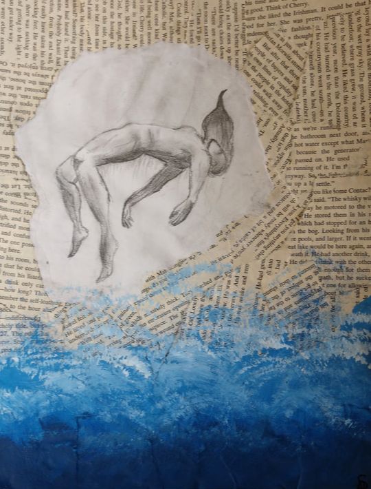
My artwork is on cardboard. I collaged newspaper bits all over to cover each inch of the piece. It’s about just an 8 by 11 normal sized paper (but cardboard material). It has a person right in the middle, falling into the water at the bottom. I cut a piece of cardboard to make it smaller then started to rip parts of the newspaper so they were all different sizes. Then I took some normal craft glue and collaged the bits on to the cardboard. I sketched out a model of someone falling on just a normal piece of white paper and cut it out, then I glued that right in to the middle of the piece. After it all dried I searched up some Bob Ross tutorials and took inspiration from his techniques for acrylic paint and made an ocean of different blues and greens. Someone who inspired it was obviously Bob Ross as I explained for the water part. I’m not totally sure on the big idea so I’ve had some trouble thinking it up but here is what I have so far: The big idea I thought could be like she’s sort of drowning in her emotions if you will. Mostly because she is surrounded in news paper which obviously has lots of words. Then the ocean is like her sort of being overwhelmed by it all. So at first I started with another piece that just really I didn’t find a lot of interest in and just wasn’t fun for me so I wanted to do something that I liked and was actively interested in. with this piece I think I achieved that. That’s all I really wanted. I mean also I wanted other people to feel it and be interested in the concept and the actual drawing. I am pretty happy with this piece I guess. Not really sure what to say except that I spent time and work on this and I’m pretty happy how it turned out. I had a lot of fun this quarter in art and seeing everyones projects come along.
Trey
When I started art for the second time I thought it would be easier but some things were harder than before. For example, the masterpiece was much harder than it was before.
|
Masterwork
My masterwork piece was Red Interior Blue Table Still Life by Henri Matisse. It looks like a room with some apples on a blue table with a picture on the wall and an open window. I used the grid technique by making a grid in a canvas then on paper so I could fill in square by square then paint it. It caught my eyes because of the bright colors and it looked like something I could do. My biggest goal is to be good at the doodles that look cool simple and easy but without the practice they are very hard and this piece didn’t help as I was painting, not doodling. While doing this piece I learned that when things look easy they can be hard. The piece was like what I expected, not too good, not too bad. Independent
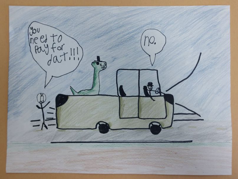
My independent piece is a doodle of a person in a truck with a dinosaur and it is called “Dino Driving”. I made my artwork by pencil, then I traced the pencil with a sharpie then added color with colored pencil. I’m not sure where my inspiration came from but I like to doodle so I did that then drew some more. I didn’t want for there to be a message in it i just drew it. In the picture a person with a dinosaur is driving a truck with someone chasing behind them screaming at them that they need to pay for the truck. There is no message unless you want there to be one, in which case, you make the message. My biggest goal is to be good at the doodles that look cool, simple, and easy, but without the practice they are very hard. This piece helped mostly with shading more than anything else so it didn’t help too much except for my shading skills. My piece didn’t turn out like I thought it would, such as the truck. I don't think it will change too many of my future art pieces except for the ones that have shading in. |
Phi
Masterwork
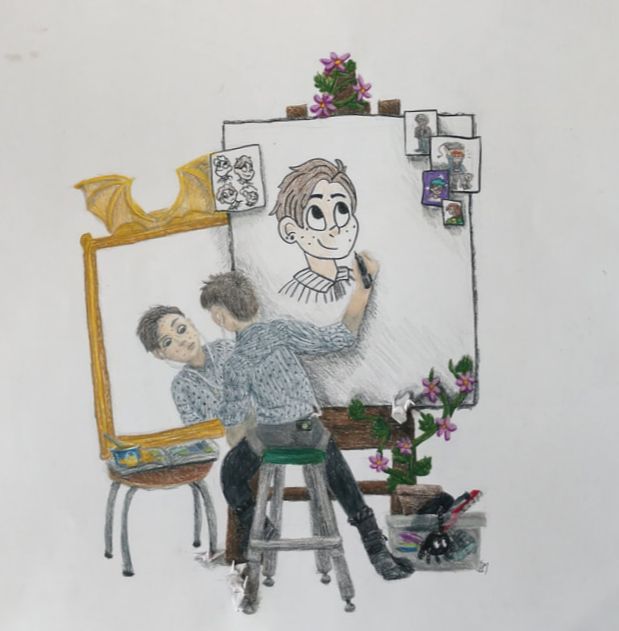
I have drawn a recreation of Norman Rockwell’s triple self portrait. So that it was actually a self portrait, I drew myself instead of Norman Rockwell and replaced some of the objects in the original painting with other ones. When you look at my drawing, you see me, sitting on a green stool, in front of a canvas I’m drawing on, and looking into a mirror. There is a plant growing up the side of the canvas. If you look closely you can see that it also has paper cranes glued onto it. I can be seen three times in the piece, sitting in front of the canvas, in the mirror, and being drawn on the canvas. (I’m actually in the drawing seven times because in the sketch, on the piece of paper, in the upper left corner of the canvas, I am drawn four times).
I drew it with colored pencils. I think the hair was the most fun to draw because I was able to give it texture by just drawing a bunch of lines. The plastic bin in the lower right was very complicated because I first had to draw the objects in the bin and then go over it with grey colored pencil. The bin was hard to draw because it was hard to make it look smooth. I incorporated light into this piece in a weird way (mostly because I kept forgetting how shadows worked) somehow I think the light is coming from the spot behind the mirror and the canvas. The person in the mirror is drawn lighter than the person outside and it was mostly done that way because I was trying to create shadows but I think it’s also a nice way to make the people look like two separate things because they contrast more with each other.
Norman Rockwell painted his triple self portrait because, when asked to draw himself, he wanted to come up with a creative and unique way to express who he was. The best thing about the triple self portrait is that it explains more about yourself than just what you look like. It also shows different objects in the room that you like, your drawing style, and your creative process. I wanted to recreate the triple self portrait because I really like drawing myself (I don’t know why probably because drawing my own expressions are easier) and I thought that this would be a cool way to fully express myself within one drawing.
When I was drawing my triple self portrait I changed a lot of things from the original painting. Norman Rockwell had a bucket in which he kept his paint supplies and he painted it next to his foot. So, I painted my bin of markers and other art supplies next to my foot. On the mirror, instead of the eagle, I drew bat wings because, in my opinion, bats are a lot better than eagles. In the original painting, Norman Rockwell painted a glass of soda because he liked to drink it while he painted. I often eat mac ‘n cheese while I am drawing. This usually isn’t a very good idea because mac and cheese is a really messy food, so I drew the bowl of mac and cheese spilling onto the book that I replaced by a comic book. The helmet at the top of the canvas was the hardest thing to find a replacement for because I don’t wear hats. I eventually settled on drawing a plant. I like plants a lot more than hats. Norman Rockwell often looked at other artist’s paintings while he worked, in order to find inspiration. I don’t do this, but I did decide to recreate the self portraits of artists that I admire anyway. I don’t want to draw the chairs in the original piece because I haven’t ever sat in them in real life. I replaced the stool with a chair from the art room at school and the table holding the mirror with a chair from my house. When I drew my phone in my pocket so that I could listen to music I wasn’t trying to replace anything. But when I looked closer at the original painting, I realized that Norman Rockwell has a rag in the same pocket in which I drew my phone. This was probably the most satisfying thing that had ever happened to me because if I had just done that I would have thought it was really clever, but I did it absentmindedly. Norman Rockwell has paintbrushes thrown all across the floor in his painting. I wanted to incorporate my love for making paper cranes, so I used them instead.
My goal when drawing this was pretty much just to draw a triple self portrait...it seemed like something that would be challenging for me and it was. I learned that it’s important to use a lot darker values of colors when shading in things, especially the face. I had struggled with making things dark enough in the past and I feel satisfied with the fact that when you step farther away from my drawing, you can still see the shadows on the face.
I expected drawing this to be a learning experience (I didn’t really expect it to look that good) and it was. I don’t use colored pencils very often, or draw realistically. I know I can, I just don’t do it very often because it takes longer. I like the way it turned out. I didn’t expect it to be any better than it is right now. It’s just really satisfying to see it all on the page and complete.
Independent
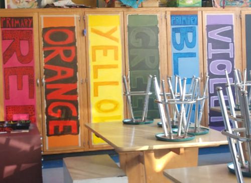
I painted the cabinets in the art room. There are ten of them, four of which are black, and the other six used to be a light rainbow. They used to have small letters made out of masking tape on them to indicate which ones where primary colors and which ones where secondary colors. After a while, I got really sick of the uneven masking tape letters, so I decided it would be a good idea to paint ‘primary’ and ‘secondary’ onto the cabinet doors. They are still completely the colors of the rainbow because I used different tints and shades of the colors on each door to paint the letters. Each door said the name of their color in large letters, facing sideways to fit on the rectangular cabinets. Above the color name, in smaller letters it says whether the color is primary or secondary, and below the color name it says whether the color is warm or cool. I painted designs in the letters of the primary colors and outlined the letters of the secondary colors.
I used acrylic paint to paint the cabinet doors and, honestly, it was really hard to make it look like not a total mess. I probably could have planned everything a bit more before I actually painted. I didn’t have enough time to paint details on the secondary colors so I just went with a simple outline. The lack of time I had probably had something to do with the fact that I am still learning how to mix the right amount of black paint into colors to make them darker so all of the shades of the colors (especially the orange, red, green, and violet) looked to dark. When I tried to paint over the dark shades with lighter colors I had to apply multiple coats in order for it to look like a solid color which was very time consuming. Because I didn’t have a lot of time, I accidentally ended up making the edges of the letters not as neat as I wanted them to be so I had to paint over the orange and green doors again. Luckily, Deb decided to be really nice to me and painted the orange and purple doors to look less dark over a very long line of snow days and a weekend that we had.
My goal when I started painting the cabinets was to make a less masking-tape-like way for the kids in the art room to learn about primary and secondary colors. I think I probably accomplished that… or I just made it worse because now kids will have to turn their heads ninety degrees in order to read it. It definitely took longer than I thought it would and it does not look as perfect as I imagined it, but I think it did turn out okay.
Gillian
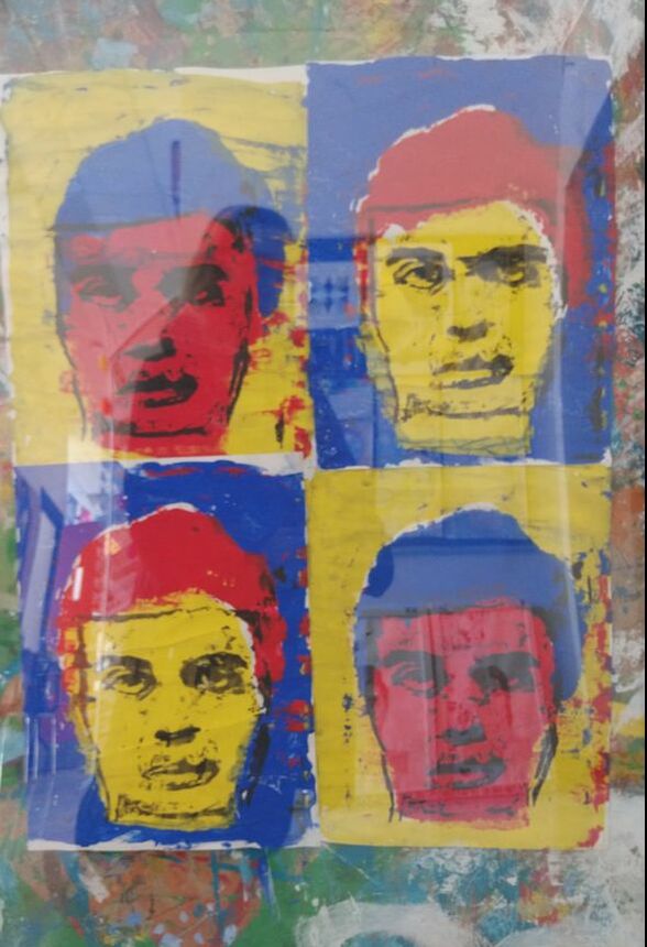
My artwork is an adaptation of Warhol’s Marilyn series. The subject instead of Marilyn Monroe is a headshot of David Byrne, the lead singer of Talking Heads, looking indifferent, sad, worried or confused. He is reproduced four times, the colors are all primary, plus black, and vary in position. The picture is backed up in its frame by a randomly splattered, primarily green piece of cardboard. The title is “4 Davids.” The most obvious principles of design featured are contrast and pattern. The elements of art featured are shape, color, value, and form. My artwork was made using tempera paint, a squeegee, and four silkscreens. I used silk screens to print out the face identically on all four papers. I took a photo of David Byrne and set it on a light box. I set a screen over the photograph and blocked out everything that wasn’t a background with modge podge, then took another screen, and blocked out everything that wasn’t skin, etc. When you’ve made all four screens, you take your paper and put your screen down on it, and then use your squeegee to push the paint through. You line up the screens on top of each other, and eventually you have your picture. My artwork was inspired by Andy Warhol and David Byrne. Of course, it’s inspired by Warhol since it’s an adaptation of his work. Warhol chose the silkscreen process because it made it possible to mass-produce his art. He did this because he wanted to his emotions and personality to be separate from his work, he wanted the art to basically be made by a machine. When Warhol was a child, he developed a nerve disease that rendered him bedridden. During that time, he would draw pictures with his mother, listen to celebrity news and radio programs, and watch popular films. He got the idea to use pop culture in his art after he decided abstract expressionism got cliched. Warhol said about his art: “I just paint things I always thought were beautiful, things you use everyday and never think about.” Warhol also produced and made the artwork for the Velvet Underground and Nico album. I chose David Byrne as my subject because he’s always looking really tense and wooden, and that’s important to express, in my opinion. I used primary colors to try and make the work seem basic and simple. I don’t think about art goals much. I want to enjoy making art, and I want to be proud of the things I make. I want my work to mean things that are of importance to me. David Byrne represents things that mean a lot to me, so that checks out. I’m proud enough of the final version, but I wish it looked a bit more clean, like the Marilyns. I learned how to use silkscreens, and how to solve whatever problems show up in working, like when I was using just about the most defective squeegee possible. It didn’t turn out exactly how I wanted because I was planning on the picture being huge with tons of little faces, but it’s no problem that it turned out the way it did. I think I’ll work more with silkscreens, since it was nice to be able to replicate the picture, and figuring out what I was supposed to do was fun in a way.
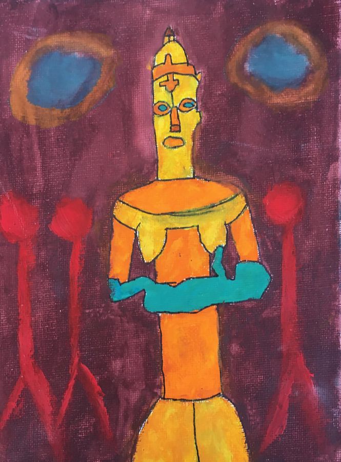
My artwork is a painting of an orange, yellow, and teal color-blocked African statue. She covers a vertical strip of the canvas. The background is a muddy red and purple color. Red stick figures with no arms stand to the side of the sculpture. The statue’s eyes are magnified and hang in the air to the side of the sculpture’s head. The title is “After African Art.” My artwork is made out of gouache paints and pen. I used a grid transfer to try and copy the picture of the statue as accurately as possible. I drew out the figure and then outlined it with a thick pen. Then, I painted in everything else. I was inspired by an African statue I saw at the Ann Arbor art museum. The information card read that the figure was considered “terrifying to humans, but beautiful to the spirit world.” I’d say that in my painting, the figure represents how “differences” are perceived. The dark, moody background represents feeling dissatisfied by having these differences. The red figures represent how most people seem in the eyes of the statue. The eyes of the sculpture floating in the air reinforce the perceived world. You can fill in the blanks however you want from that. When I started the work, that was just about what I wanted to say in my art. Now, a few weeks later, I think I need to say something different. I’m not thinking like the person who came up with that concept anymore. My goals for this piece were to: have it mean something important, look harmonious in a way, and to practice more art in general. I met these goals with ease. At the moment, goals in my art aren’t mattering much to me. I’d just like to be proud of my work. I had never worked with gouache paints before this picture was made. I’d say that I’m now fairly competent with the medium, they were pretty easy to get the hang of. I kind of learned to make all the symbolism in the picture count for something, everything is there for a purpose. The final version is just about exactly what I imagined. I had about the idea for what I wanted it to look since I saw the statue. I think I might make more colorful artworks in the future, and maybe use more color-blocking.
Ivy P.
Masterwork
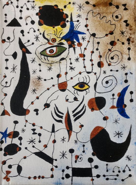
The piece that I decided to recreate this quarter was called Ciphers and Constellations by Joan Miro. This piece includes many thin and small lines all over and has many geometric elements to it. Joan Miro created this piece in 1941, and it is one of his 23 pieces of art that he created in his constellations series. The hardest part about recreating his piece was getting all of the very thin lines all over. To do this I used a very small paint brush and used a very light hand while handling it. When Joan Miro had his first art exhibit he was criticized and ridiculed by art critics and the public yet he still went on with his work and did not let that stop him from creating the art he wanted to. While Joan Miro was primarily known for his paintings, he also worked on many sculptures. Miro is often referred to as one of the pioneers of surrealism art. My goals as an artist when I came into art this quarter were to finish my masterwork with enough time to do an independent piece, and I did end up finishing this masterwork in time. Some things that I learned during this quarter are keeping control of my brush as I was painting, also I learned how to do the background on this piece with a dry brush and tapping it wherever I wanted the paint. I think that I did a pretty good job recreating this piece. I really enjoyed studying some of Joan Miro’s others artworks. I think that in the end my recreation came out how I wanted it too if not better than how I thought it would.
The piece that I decided to recreate this quarter was called Ciphers and Constellations by Joan Miro. This piece includes many thin and small lines all over and has many geometric elements to it. Joan Miro created this piece in 1941, and it is one of his 23 pieces of art that he created in his constellations series. The hardest part about recreating his piece was getting all of the very thin lines all over. To do this I used a very small paint brush and used a very light hand while handling it. When Joan Miro had his first art exhibit he was criticized and ridiculed by art critics and the public yet he still went on with his work and did not let that stop him from creating the art he wanted to. While Joan Miro was primarily known for his paintings, he also worked on many sculptures. Miro is often referred to as one of the pioneers of surrealism art. My goals as an artist when I came into art this quarter were to finish my masterwork with enough time to do an independent piece, and I did end up finishing this masterwork in time. Some things that I learned during this quarter are keeping control of my brush as I was painting, also I learned how to do the background on this piece with a dry brush and tapping it wherever I wanted the paint. I think that I did a pretty good job recreating this piece. I really enjoyed studying some of Joan Miro’s others artworks. I think that in the end my recreation came out how I wanted it too if not better than how I thought it would.
Independent
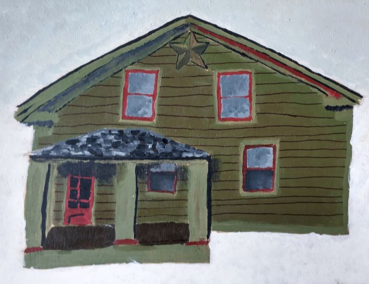
For my independent piece this quarter I decided to do a painting of my house. One of the reasons I chose to paint my house is that I really enjoy drawing and creating buildings because my grandpa was an architect in Detroit and I have been inspired by some of his works. To create this I used acrylic paint on a piece of wood. I first did a sketch on a piece of paper and then used a sheet of carbon transferring paper to transfer my sketch. It was my first time using anything like that and I would definitely use it again. This piece was somewhat inspired by my sister also because she once created a design of our house that was very simplistic and I thought it would be interesting to try and create the front of our house for myself. One of my goals when painting was to make it look realistic and I think that I accomplished that. I think that overall I did a pretty good job on painting this piece. My favorite part is the windows because of how I shaded it I think that they came out looking good.
For my independent piece this quarter I decided to do a painting of my house. One of the reasons I chose to paint my house is that I really enjoy drawing and creating buildings because my grandpa was an architect in Detroit and I have been inspired by some of his works. To create this I used acrylic paint on a piece of wood. I first did a sketch on a piece of paper and then used a sheet of carbon transferring paper to transfer my sketch. It was my first time using anything like that and I would definitely use it again. This piece was somewhat inspired by my sister also because she once created a design of our house that was very simplistic and I thought it would be interesting to try and create the front of our house for myself. One of my goals when painting was to make it look realistic and I think that I accomplished that. I think that overall I did a pretty good job on painting this piece. My favorite part is the windows because of how I shaded it I think that they came out looking good.
Elliot
A Portrait of a Man and His Thoughts & A Picturesque Tour of Passing Fancies
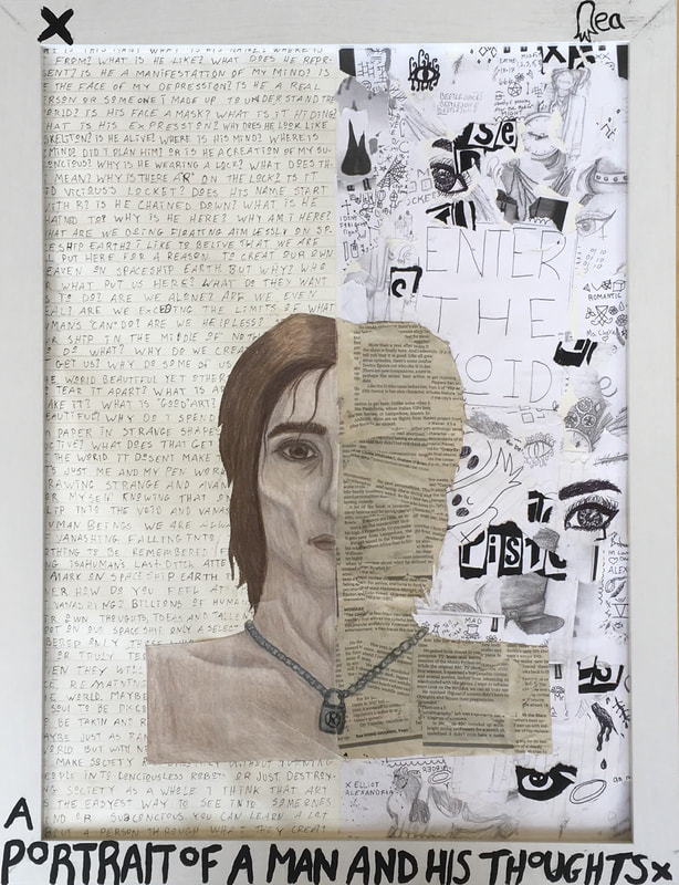
For my independent project this quarter I made two coordinating pieces. They are inspired by my thoughts and my mind. They both have a colored pencil drawing of a man front and center with writing and collage in the back. The writing is my thoughts and philosophies and the collages are made of older drawing of mine. These are some of the first piece I have made that I titled, one is a name inspired by Emerson Barrett’s “Portrait of a Faceless Man and the Vase of Flowers for his Deceased Lover,” the other is a lyric from A Fever You Can’t Sweat Out, the first Panic! at the Disco album.
To make these pieces I started with a big sheet of watercolor paper and split it in half. I used watercolor paper because it was the nicest big paper we had. One side was for the writing and one side for the college. I first tried drawing the face directly on the watercolor paper but the paper is textured and the colored pencils looked uneven and bumpy so I decided to use a separate piece of smooth paper and collaged them on. When drawing the faces, I let my mind do whatever it wanted. The first face looked like Johnny Depp for a while and the second still looks a little bit like Brendon Urie, but they were not based on any specific person or facial structure. They were entirely constructed by my subconscious as representations of my mind. I only drew one side of the face and on the other side I covered the silhouette of the head with newspaper. On the left side of the background I wrote down thoughts and rants about art and the world with a 1.0 Coptic fine liner. Half way through the second one it ran out of ink so I had to use a 0.5 pen. I have noticed that these Copic ink pens are kind of cheaply made (even though they cost a lot) and they break and run out of ink quickly. On the right side I ripped up older achromatic (grayscale/black and white) drawings (or photocopies of drawings I didn’t want to destroy) and glued them on in no particular pattern. I tried to avoid logos and recognizable images but some logos (Siouxsie and the Banshees and Sex Pistols) and some older “portraits” I drew (Palaye Royale, Kurt Cobain) showed up. I added a big piece of paper with plainly written words near the center of each collage. One says “enter the void” (which is a refrence to Emerson Barrett) and the other says “live your own frickin’ life” which is something I struggle to remember to do. Eyes seem to show up a lot in this collage. For some reason I love drawing eyes and I think you can show a lot of emotion in one single eye. Also eyes are some of the hardest things to draw so you can see a lot of progress in eye drawings. I got two whiteish frames at Michaels and painted the titles and my signature on them with black acrylic paint mixed with glue. This was not my best idea, straight acrylic paint does not stick to a smooth, varnished frame and adding glue honestly makes it worse. I will probably seal the paint with a spray sealant in the future so it does not completely peel off.
To make these pieces I started with a big sheet of watercolor paper and split it in half. I used watercolor paper because it was the nicest big paper we had. One side was for the writing and one side for the college. I first tried drawing the face directly on the watercolor paper but the paper is textured and the colored pencils looked uneven and bumpy so I decided to use a separate piece of smooth paper and collaged them on. When drawing the faces, I let my mind do whatever it wanted. The first face looked like Johnny Depp for a while and the second still looks a little bit like Brendon Urie, but they were not based on any specific person or facial structure. They were entirely constructed by my subconscious as representations of my mind. I only drew one side of the face and on the other side I covered the silhouette of the head with newspaper. On the left side of the background I wrote down thoughts and rants about art and the world with a 1.0 Coptic fine liner. Half way through the second one it ran out of ink so I had to use a 0.5 pen. I have noticed that these Copic ink pens are kind of cheaply made (even though they cost a lot) and they break and run out of ink quickly. On the right side I ripped up older achromatic (grayscale/black and white) drawings (or photocopies of drawings I didn’t want to destroy) and glued them on in no particular pattern. I tried to avoid logos and recognizable images but some logos (Siouxsie and the Banshees and Sex Pistols) and some older “portraits” I drew (Palaye Royale, Kurt Cobain) showed up. I added a big piece of paper with plainly written words near the center of each collage. One says “enter the void” (which is a refrence to Emerson Barrett) and the other says “live your own frickin’ life” which is something I struggle to remember to do. Eyes seem to show up a lot in this collage. For some reason I love drawing eyes and I think you can show a lot of emotion in one single eye. Also eyes are some of the hardest things to draw so you can see a lot of progress in eye drawings. I got two whiteish frames at Michaels and painted the titles and my signature on them with black acrylic paint mixed with glue. This was not my best idea, straight acrylic paint does not stick to a smooth, varnished frame and adding glue honestly makes it worse. I will probably seal the paint with a spray sealant in the future so it does not completely peel off.
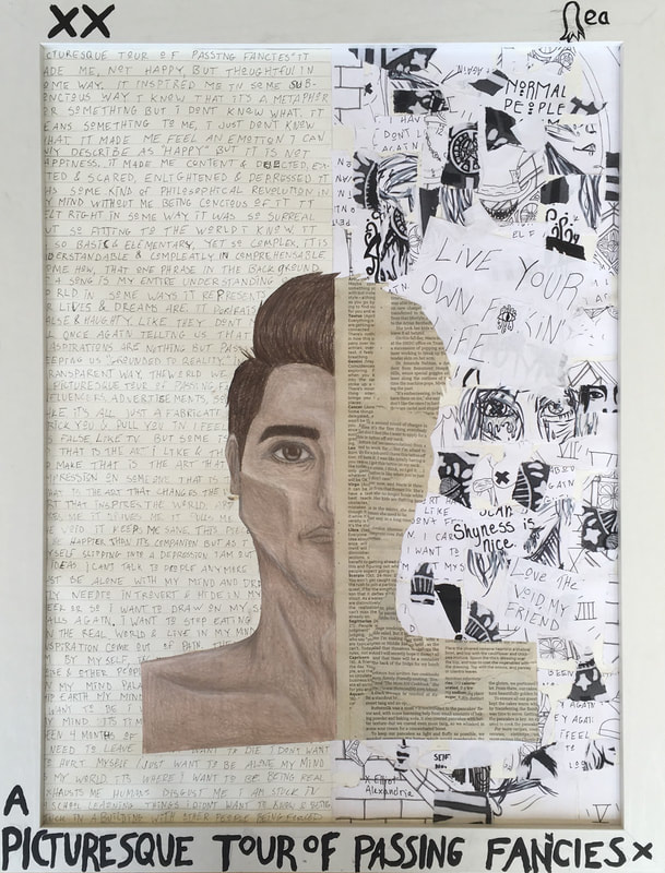
I’m still not entirely sure what the thought process behind these was. They just happened. These are a look inside my mind, the idea just came out of my subconscious. Portrait of a Man and His Thoughts is, in a way, a manifestation of my depression. The man in the picture is slightly skeletal and looks unkempt and dirty. His hair is long and messy and he looks dejected and done with the world. He also is wearing a chain necklace with an “R” lock on it. This is the same necklace that Remington Leith and Sid Vicious, two people I look up to, wore and I wear a necklace similar to it. The writing in the background is not meant to be read, it’s just for the aesthetic but the content of it is mainly about art and life here on our spaceship Earth. It would honestly be quite dull and depressing if one did read it. My mind goes down a rabbit hole when I'm in a certain art mood and it is somewhat nice to have that level of concentration but my thoughts do get pretty bleak. While drawing this one I was listening to 80s punk music such as the Sex Pistols and Siouxsie and the Banshees. I also listened to a lot of Morrissey and Palaye Royale, whose music contributed to the depressing and slightly philosophical mood. A Picturesque Tour of Passing Fancies is more or less the same as the Portrait of a Man, minus the locket. It’s just a guy, facing forward, with half his face covered and a busy background. This one was meant to be more uplifting and positive, kind of like the alter-ego of the depressed man, but it did not really turn out that way. I was mentally not in the best place when I made this and that is definitely reflected in the final product. I believe that, to some extent, good art comes out of pain, and a lot of the writing on this piece is about that. My ranting also gets more political and less oriented to the art world, but to the world as a whole. For the frames I painted the title, my signature, and one or two X’s. When I make a set of pieces I like to number them with X’s. When I put them in the frames I left out the plexiglass so there is no barrier between the art and and the world. I don’t believe that art should be under glass or behind bars. I don’t like how art museums have glorified guards and you aren’t allowed to be close to the art. Art is not made to be coveted and hidden. Art is for the whole world to see. I know not putting glass in my art won’t change the world but it feels right to me.
I really don’t have specific art goals. I like to just go with wherever my mind takes me when I draw. Art is my escape and I don’t like to force myself to create something specific. I make art to make me content and express my personal thoughts and philosophies, not to meet goals. However, I do like learning how to use different media and I was interested in learning how to use nice colored pencils. I had not really drawn with colored pencils since I was nine or ten and I had never used Prismacolors which are basically the best. I really don’t know how I feel about them. I am used to ink and digital art and colored pencils feel a little waxy and complicated. I’m not completely happy with the results but I do think I understand them a bit better and I will use them in the future. Another thing I wanted to work on was drawing more realistically. I guess I just rarely draw human faces so I wanted some more practice with that. I was actually quite happy how they looked with just a pencil outline. I feel a like I mostly stayed in my comfort zone though, that annoys me a little. I drew the faces head-on which is one of the easiest angles to draw from. In addition to that, I only drew half the face. Getting two sides of a face even and lined up is very hard, so I kind of dodged a bullet there.
Honestly, I don’t know if I like these or not. They look cool, but not amazing. I want my art to inspire people and make an impression on them and this is just not doing it. The background looks too busy and chaotic which, I suppose, is part of the desired aesthetic but it’s almost too much. The paint doesn't stick to the frame properly. The colored pencil is splotchy and not fully blended even though I went over it multiple times. I just don’t know how I feel. I don’t know if I was unmotivated or I worked too quickly or what, but it’s just not right. I did have some fun making them, though, and I learned a few things about new mediums and facial structure but I don’t feel like I created something on the level I want.
Sophia
In this class we make at least two pieces. One is a master work where we recreate a famous art piece. The other pieces that we make are where you make your own art. I was fortunate enough to have time to make three pieces in total! This is a little bit about each of the pieces I made.
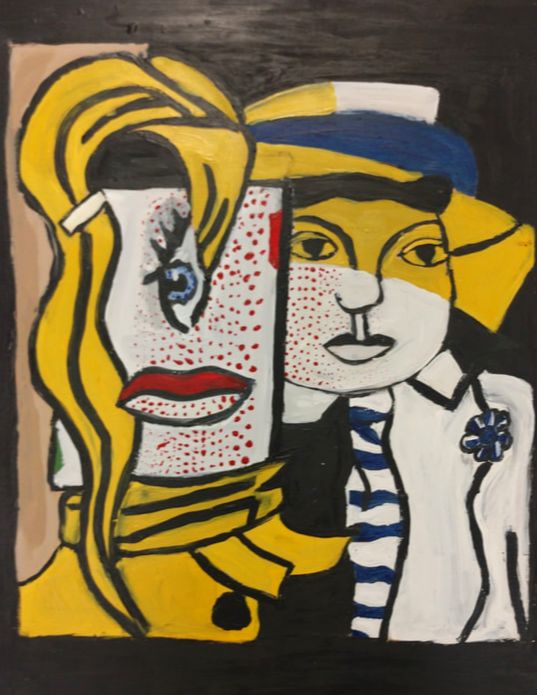
Master Work (Stepping Out, By: Roy Lichtenstein)
Stepping out is an abstracted art piece made in 1978 and is a form of pop art. On the right side there is a man that is looking away from the woman. The woman doesn't look like a regular woman, her eye is really big and vertical.Her lips are also really big and horizontal. The woman doesn't really have a head, but the eye and the mouth are on a rectangle. This piece has a lot of blue and yellow in it. I think the subject matter is definitely the shapes and colors in this piece. I’m not sure why he made this piece, but I do know that Roy Lichtenstein was a pop artist, so he based his art work on what was popular at the time. I think that the two most important elements in this piece are the shapes and the lines. When I was working, I noticed that there was a variation in the lines. I noticed some were straight, some were curved, and some were diagonal. I also noticed how much my painting skills and techniques have developed since last quarter. I recreated this piece on a piece wood. I used the graphing skill by dividing the canvas and printed copy into squares so I could be more precise. After I was finished with that, I started with the woman's hair and then the big rectangle. When I was done with that I worked on the bottom part of the piece, and then worked on the man. The last thing I drew were the lips and the eye. When I started painting I painted all the white parts first and then did the black. After I was done with that, I painted the other colors. I painted it this way so before I added the color I wanted to see the light and dark parts of the piece. To recreate this piece I used wood, pencil, paint, a yardstick, an eraser, and time. I was inspired to recreate this piece because I have never made an abstracted piece before. Also, the first time I saw it I felt connected to the piece in some way. I feel like this art piece might express a time in someones life where things feel turned upside down or when someone is showing people who they really are. I tried to show a bold aspect in this recreation. My goals for this piece was to master my painting skills and to not rush through my piece or put myself down about it. I think I completed my goals while doing this piece. I know this because when I looked at my piece and something did not look right, I tried to ask myself how can I make this piece look better instead of telling myself that the piece does not look good. I also think that I mastered my paint skills because I learned a lot from last quarter so it helped me in this quarter a lot.
From doing this piece I learned how to do the graphing technique, to not stress out over my art, and that less paint on the paint brush means more control. I think the final piece looks a lot better than I thought it would be. I honestly think it looks great, so yay! I think by doing this piece it will help me on future abstract pieces and with help me with lines and colors.
Here are some facts that I learned while I was doing this piece……
-Roy Lichtenstein was a pop artist in the 1960s.
-He was born in 1923 and died at age 73.
-He spent at least ten hours a day in his studio working on art.
I had a lot of fun recreating this piece!
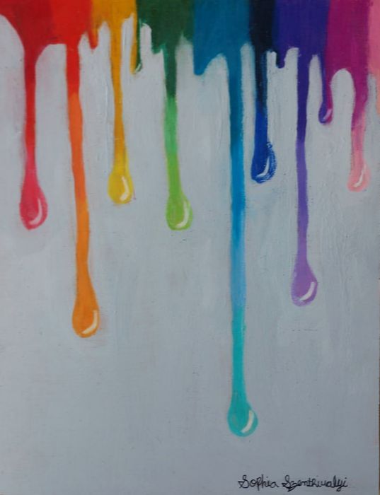
Independent Piece #1 (Dripping Emotions)
Dripping Emotions is a piece I created. It is made on a piece of wood and has drawings of dripping paint on it. I used the colors of the rainbow for the colors of the paint drops. Each drop is a color in the rainbow dark to light. I used a blender made out of paper to blend the colors together. After I was done with the paint drops, the piece did not feel like it was done, so I painted the background a light gray. I feel like this touch makes the colors pop out more.
I used colored pencils, pencils, erasers, wood, paint, and a blender to make this piece. I feel like this piece represents emotions people feel, and how some feelings last longer or shorter than others. I also feel like the light grey adds the other idea that all you have to do is add color to something to make it great. Definitely the most powerful element in this piece is the color. When I was making this I tried to make the colors bold and bright. I also think another important element in this piece is shadow. I tried to show this with a white mark at the end of the paint drop. I was inspired to make this piece because sometimes I am confused on how I feel about different things so I thought it would be a good idea to show that in art. I was also inspired to make this piece because I have a lot of confidence and I think the colors in this art shows that. I think anyone could see something different in this piece but to me it would look like emotions. I feel like someone could connect to this piece if they are going through a hard time and are feeling a lot of different emotions. My goals for this piece were to work with colored pencils and blending them, because I have never really worked with colored pencils before. I also really wanted to try working on wood because I have also never used wood before. I really like the feel and look of wood. I think I accomplished my goals on this piece, I feel way more comfortable with colored pencils now. While working on this piece I learned how to use colored pencils and blend colored pencils together with a blending tool. I also discovered a new surface to work on which is wood. I think this piece turned out exactly how I originally pictured it, though I was not picturing the gray background, but I’m glad I added that. I feel like I really connected to this piece when I was working on it. I think connecting with the piece I am working on will really help me with my art in the future.
I think this was one of my favorite pieces I have made and I am very happy by the way it turned out!
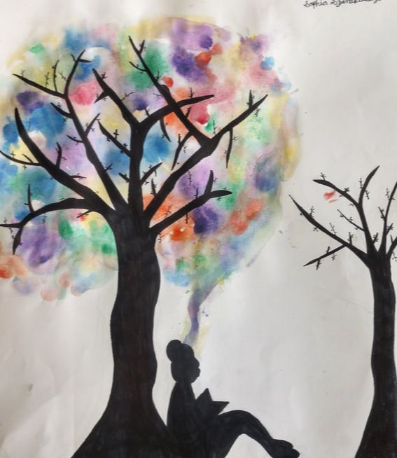
Independent Piece #2 (Under the Tree)
Under the tree is a piece that shows the beauty of imagination. I made this piece on watercolor paper. I started by drawing an outline of the big and small trees, and the silhouette of the girl reading. I then did the watercolor around the big tree. I was originally going to paint the silhouette of the trees with black watercolor paint, but I used sharpie instead. I am glad I used sharpie because it helped outline the small details better. For this piece I used watercolor paper, pencil, easer, sharpie, and watercolor.
This is a piece of a girl reading a book under a tree. As she is reading she sees the tree in a totally different propesive. Instead on regular colored leaves she sees all different colors of leaves. I made a line with watercolor from her head to the tree so people will be more likely to see the ides of the piece. Across from the girl, there is another tree. This tree is just black, because there is no imagination in it. I think the most obvious elements in this piece is he color and contrast. I was inspired to create this piece because I feel like most people play video games or are on screens instead of reading and using you imagination. So I thought I should remind people that imagination is such a great thing. My goal for this piece was to learn how to use watercolor. I think that for the most part I completed my goal. I feel like I am definitely better with watercolor, but there is still more I could learn about watercolor. In this piece I learned a little about how to use watercolor and I learned how to draw trees and silhouettes. I think this piece turned out way better than the way I pictured it, I really like the way it came out!
I had a lot of fun in this quarter and I learned a lot of techniques that I can definitely use in the future. I learned how to use colored pencil, how to use watercolor, how to use paint in more efficient ways, and so much more! Deb is a great teacher and has taught me a lot about art, I am glad I was in her class no once but twice. I think this quarter was a success and I can’t wait for next!
Evan
|
My artwork only has four or five colors but has more dimension than most paintings, 3D. Shapes of dried acrylic paint were glued onto the blue and black background. People often ask me how I came up with this idea. The truth is I don’t know, I just started cutting some dried old paint and I was like “hey, this would look cool on a background.”
This piece was made on a wood plank with acrylic paint background. The textures were made from slices of dried acrylic paint. The piece only has about four colors but multiple different shapes and patterns. My piece meant to have a calming effect on the observer with mellow tones streaking slowly across the wood. Blue is often called a sad color but in my opinion it is more of a calm and relaxing color. |
|
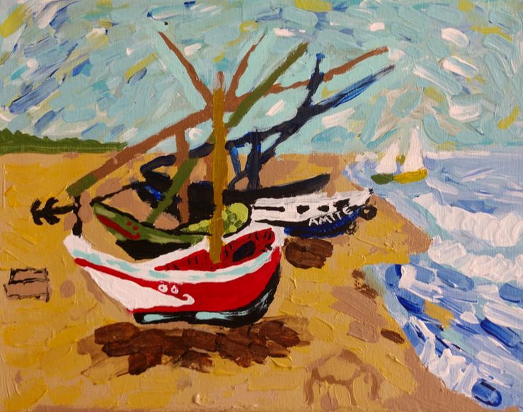
My masterwork painting was The Fishing Boats by Vincent Van Gogh in 1888.
I thought I did quite a good job on this particular work. I thought I stayed very similar to the original. The hardest part was getting the shades and colors right especially the sand.
I made my masterwork on canvas with acrylic paints. I had to texture some parts that stand out more than others. The blending of the sea and the sky was difficult at first because they have similar colors and the fine details were challenging with a soft tip brush. The masts ended up not quite as I would like but acceptable.
Naomi
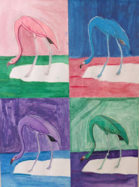
My first piece is my masterwork recreation of the American flamingo by James Audubon. My take on the piece was to make four flamingos, each a different color. I choose pink, the original, and purple, green, and blue. This artist had a passion for birds and he showed it in his art. I choose this piece because I love animals as well and I thought it might be a fun challenge. I did really show my emotions making it, too; frustration, enjoyment, relaxation and satisfaction. I hope to create animals in my artwork like James. I definitely had goals I reached with this piece. I worked on my muscle memory and using the window to trace my draft on to my final surface. I learned how to blend Prismacolor pencils, how to use watercolor, and how to make tracing easier as I mentioned earlier. I think my piece came how I hoped it would, but there are some things I could do to make it better. Definitely in the future I’ll work on muscle memory when creating animals to make them look more realistic. Overall I enjoyed my piece.
My first independent piece is a series of drawings made out of words. What you do is draw something than over your drawing and around (if you want) with ink like sharpie fine point you write words any words. Most of my out of words that resembled my feelings and each drawing has words that go with it. When I made my first one, it was done and I accidently
dripped watercolor on it but it turned out to be a happy accident. These pieces I probably enjoyed making the most.
dripped watercolor on it but it turned out to be a happy accident. These pieces I probably enjoyed making the most.
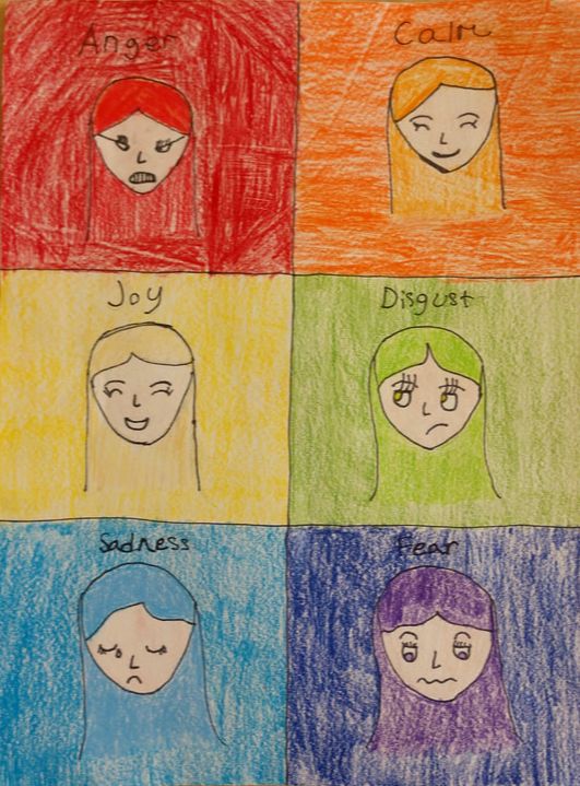
My second independent was inspired by Phi’s independent piece from last quarter of their emotions and I took a different approach. I drew six stylized faces and had each on a color of the rainbow that represented an emotion I have. These, of course, are not all my emotions but some I express frequently. What I used to make my piece, I used pencil then outlined it with fine point sharpie then colored it in with Prismacolor pencils. This piece for me was probably the easiest but the second most fun. I did mess up a little bit and it made me aggravated but I still enjoyed making it. Of course I’m learning as I go. I am very proud of all my pieces.
Katherine
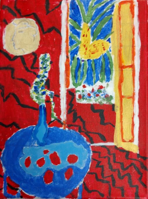
My masterwork is based on Paris Through the Window by Marc Chagall.
Marc Chagall was famous for these quotes:
Marc Chagall was famous for these quotes:
“If I create from the heart, nearly everything works, if from the head, almost nothing.”,
“Only love interests me, and I am only in contact with things that revolve around love”,
“In our life there is a single color,
as on an artist’s palette, which provides the meaning of life and art.
It is the color of love.”
“Only love interests me, and I am only in contact with things that revolve around love”,
“In our life there is a single color,
as on an artist’s palette, which provides the meaning of life and art.
It is the color of love.”
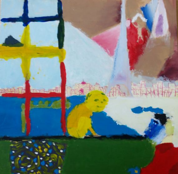
My artwork is a very colorful piece. The cat is the first thing that grabs my attention because its head is the only circular object in the piece, the next thing that I see is the line on the counter top, I follow it until I see the blue man, the lines lead my eye up the Eiffel Tower and I see the big brown sky and am lead to the rainbow window, which brings me back to the cat. I made my artwork using techniques that Deb taught me. I learned that if I spread the paint to and fro very slightly I am able to get a good blend so it looks really nice. I used acrylic paint and I worked on the wood canvas. I didn't know this but you're not able to revive the acrylic paint with water so that's something I learned.
The big idea in my artwork was so I could show that I'm not the worst at making art. But I did make my own spin on it, just because it didn't turn out like I planned, but I like my painting even more now. I feel like I would come to art and work on it when I was happy or sad or any other emotions and that's really nice to have that for me. My goals for my artwork were to make my art better and to get people to like it. This was the first time that I've painted on a canvas and I wanted to make it really special. I wanted to reach those goals, and I feel like I did better, because I'm happy with it, my peers are happy with it, and Deb seems happy with it - so that means I accomplished my goals.
In conclusion, I learned a lot about my artwork and I learned different techniques on how to paint, how different colors work well together, and I learned about aesthetics. This isn't what I imagined it would look like, but it's way better, because I put my own spin on it. I feel like this will make my artwork better because I'm going to feel more comfortable with it and I tapped into my creative thoughts and that certainly helps.
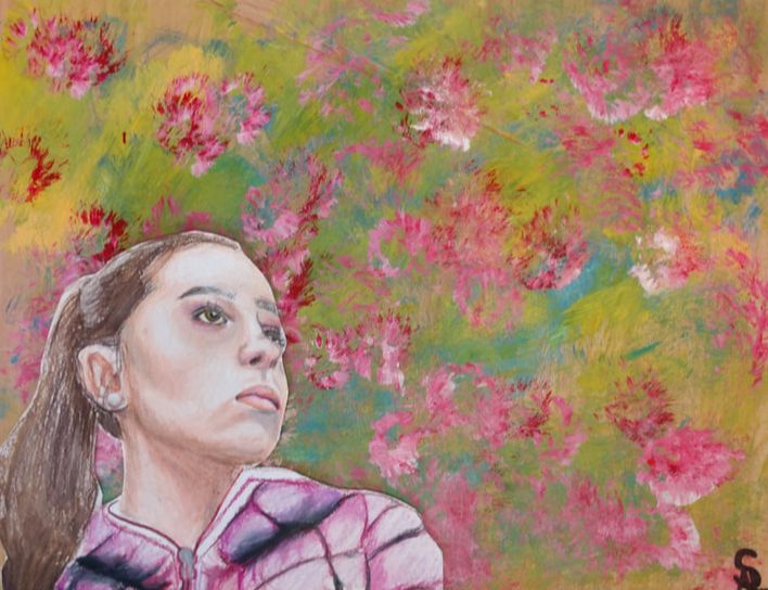
Independent Concept
My independent piece is a piece that I haven't finished this quarter. I planned it to be a very good piece of artwork, though since it is not finished I am going to be taking art again so I can finish it the next quarter I take art. next time I'll be picking a different and easier Masterwork so I can have more time on my more difficult independent. I will do it next time I take art so I'm very excited to get started.
My artwork will look like one girl doing several sports. The thing that I hope will grab my attention is in the middle if the painting, it will say “go” after that I will hope to see all the different sports that the girl is playing, I want the aesthetics to bring the person to look all around it. It will be a mural in the gym, so when you play sports you can look at it and think “I can do this.”
In conclusion, I have found that all my planning took time away from actually DOING it, the next quarter I will take will be focusing on the independent. I have learned a lot from art this quarter and think I am a better artist.
The big idea in my artwork was so I could show that I'm not the worst at making art. But I did make my own spin on it, just because it didn't turn out like I planned, but I like my painting even more now. I feel like I would come to art and work on it when I was happy or sad or any other emotions and that's really nice to have that for me. My goals for my artwork were to make my art better and to get people to like it. This was the first time that I've painted on a canvas and I wanted to make it really special. I wanted to reach those goals, and I feel like I did better, because I'm happy with it, my peers are happy with it, and Deb seems happy with it - so that means I accomplished my goals.
In conclusion, I learned a lot about my artwork and I learned different techniques on how to paint, how different colors work well together, and I learned about aesthetics. This isn't what I imagined it would look like, but it's way better, because I put my own spin on it. I feel like this will make my artwork better because I'm going to feel more comfortable with it and I tapped into my creative thoughts and that certainly helps.
Independent Concept
My independent piece is a piece that I haven't finished this quarter. I planned it to be a very good piece of artwork, though since it is not finished I am going to be taking art again so I can finish it the next quarter I take art. next time I'll be picking a different and easier Masterwork so I can have more time on my more difficult independent. I will do it next time I take art so I'm very excited to get started.
My artwork will look like one girl doing several sports. The thing that I hope will grab my attention is in the middle if the painting, it will say “go” after that I will hope to see all the different sports that the girl is playing, I want the aesthetics to bring the person to look all around it. It will be a mural in the gym, so when you play sports you can look at it and think “I can do this.”
In conclusion, I have found that all my planning took time away from actually DOING it, the next quarter I will take will be focusing on the independent. I have learned a lot from art this quarter and think I am a better artist.
Natalie
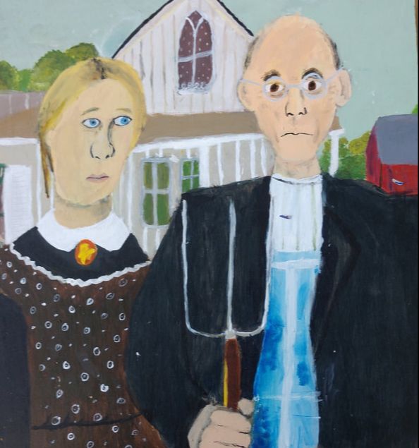
Rachel
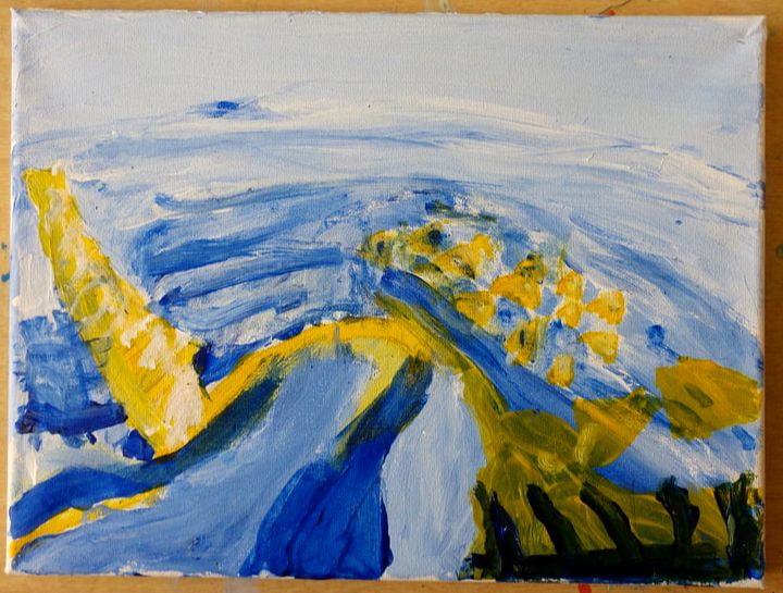
Ivy
This quarter, I’ve done a mural inspired by Kelsey Montague. It was the first large project I’ve done in quite a while, making it full of errors and kinks. The mural is of two butterfly wings, with designs covering the interior. I tried to add a lot of elements to the patterns on the inside, but the thin lines I made with the pencil were hard to recreate with the thicker paintbrush. I think that the white and black color scheme helped with contrast, and the idea behind it. On the right wing, I tried playing with lots of curving lines, and a slight nature theme. However, in contrast to the right, on the left I used more jagged line art, with a civilized feel to it. I wanted to show the difference between the flowing plant life to the stark contrast of the city. I definitely accomplished that goal of contrast, along with just enjoying the art piece. The mess of detail is kind of cohesive in a way, which I thoroughly enjoy.
