Julia
Tess
Masterwork:
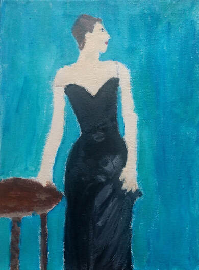
For my masterwork piece, I recreated Portrait of Madame X, by John Singer Sargent in 1884. The piece was originally seven feet tall, and just shows a woman with a simple black dress on. I would say the most prominent elements of art are color and space, and the most prominent principles of design are space and proportion. It was first made on a canvas with oil paint, and I made mine on canvas with acrylic paint. The original piece has a basic black and brown background, but I changed the background. I was originally trying to mimic the background of Vincent Van Gogh’s Self Portrait. I had some trouble recreating that, so I changed it a little bit so the colors were more vibrant and blended together. This was my first attempt at trying a realism piece, so I learned a lot throughout this working on it. Sargent’s inspiration for this piece was the fact that this model was someone countless painters wanted to paint. Although this model refused to pose for any other painters, she accepted for Sergeant because of his wealth and status. That’s why the painting is titled Portrait of Madame X, because the model wanted to remain anonymous. I have multiple different goals as an artist, but I would say the main one is shooting for painting and drawing realistically. Recreating this piece definitely helped me get closer to this goal, because this is definitely realism painting. Although the painting didn’t turn out exactly the same as the original, I think having the courage to try this piece when I thought I couldn’t and following it through helped me grow significantly as an artist.
For my masterwork piece, I recreated Portrait of Madame X, by John Singer Sargent in 1884. The piece was originally seven feet tall, and just shows a woman with a simple black dress on. I would say the most prominent elements of art are color and space, and the most prominent principles of design are space and proportion. It was first made on a canvas with oil paint, and I made mine on canvas with acrylic paint. The original piece has a basic black and brown background, but I changed the background. I was originally trying to mimic the background of Vincent Van Gogh’s Self Portrait. I had some trouble recreating that, so I changed it a little bit so the colors were more vibrant and blended together. This was my first attempt at trying a realism piece, so I learned a lot throughout this working on it. Sargent’s inspiration for this piece was the fact that this model was someone countless painters wanted to paint. Although this model refused to pose for any other painters, she accepted for Sergeant because of his wealth and status. That’s why the painting is titled Portrait of Madame X, because the model wanted to remain anonymous. I have multiple different goals as an artist, but I would say the main one is shooting for painting and drawing realistically. Recreating this piece definitely helped me get closer to this goal, because this is definitely realism painting. Although the painting didn’t turn out exactly the same as the original, I think having the courage to try this piece when I thought I couldn’t and following it through helped me grow significantly as an artist.
Independent:
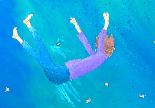
This is a piece showing a girl falling down among stars. It has a marbleized background with blue tones. The most prominent elements of art are space and shape, and the most prominent principles of design are emphasis and movement. To create this piece, I first started out by sketching the stars and the girl in the middle. After that, I taped over the stars and the girl so I could make the paint pour. To make the paint pour, I mixed together water, glue, and paint. I did that for four different colors, and after that I poured all of them over the top, and I’m really happy with how it turned out. The hardest part of this whole piece was taking the tape off at the end, because the layer of paint over the top was really thick. I had to get an x-acto knife to scrape it all off, but the paint still got under. This was also my first time using colored pencils, so that wasn’t always the easiest. I didn’t have an exact inspiration for this piece, but I wanted to create something that was actively moving. I don’t have a specific feeling I hope people take away from it, but I want it to be something that stands out among other pieces. I think this piece helped me come closer to my artistic goals because I learned new techniques that I haven’t tried before. This was a fun piece to create, and even though I did struggle a few times along the way I’m overall really happy with how it turned out.
This is a piece showing a girl falling down among stars. It has a marbleized background with blue tones. The most prominent elements of art are space and shape, and the most prominent principles of design are emphasis and movement. To create this piece, I first started out by sketching the stars and the girl in the middle. After that, I taped over the stars and the girl so I could make the paint pour. To make the paint pour, I mixed together water, glue, and paint. I did that for four different colors, and after that I poured all of them over the top, and I’m really happy with how it turned out. The hardest part of this whole piece was taking the tape off at the end, because the layer of paint over the top was really thick. I had to get an x-acto knife to scrape it all off, but the paint still got under. This was also my first time using colored pencils, so that wasn’t always the easiest. I didn’t have an exact inspiration for this piece, but I wanted to create something that was actively moving. I don’t have a specific feeling I hope people take away from it, but I want it to be something that stands out among other pieces. I think this piece helped me come closer to my artistic goals because I learned new techniques that I haven’t tried before. This was a fun piece to create, and even though I did struggle a few times along the way I’m overall really happy with how it turned out.
Cecelia
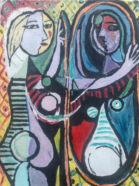
For my masterwork piece, I recreated Girl Before A Mirror by Pablo Picasso. It was made in 1932.
The painting depicts a girl looking into a mirror. Her reflection is darker and it looks more deformed, while the girl looks bright. Most famous Picasso pieces are made of cubic shapes, but this one is made of curvy shapes that give the piece a sense of movement. In my opinion, the most prominent elements of art are shape, line and color. These three words are a great description of the painting. I think the most prominent principles of design are contrast, movement and harmony. The contrast is a big factor in the two sides of the girl, herself and her reflection. The colors, movement, and the shapes bring the whole piece together.
The medium I used was acrylic paints on canvas. I have never used both those materials at the same time, so the challenges were new to me. The paint felt dry on the rough canvas, so I got used to using water with my paints to help it spread easier. Painting the piece itself was more challenging than I thought it would be. In all honesty, I chose this painting because I thought it looked fairly simple and I could get it done quick. But I learned that the unique shapes and colors are hard to recreate. It took me longer than I expected, but I really enjoyed making it.
This piece was originally made using oil paints on canvas.
Picasso’s big idea behind this masterpiece was based on his paramour, Marie-Thérèse Walter. She was his favorite model during the 1930s and appears in some of his other famous pieces as well. Girl Before A Mirror plays with the way that the world views Marie-Thérèse and the way that she views herself.
I had never successfully painted a Picasso piece before, so my big goal for this painting was to get it done and have it look good. I accomplished my goal, although my piece is not identical to the original, which was expected. I really enjoyed painting a surrealism piece with curvy and colorful shapes. It was rewarding to finish and I’m proud of how it turned out.
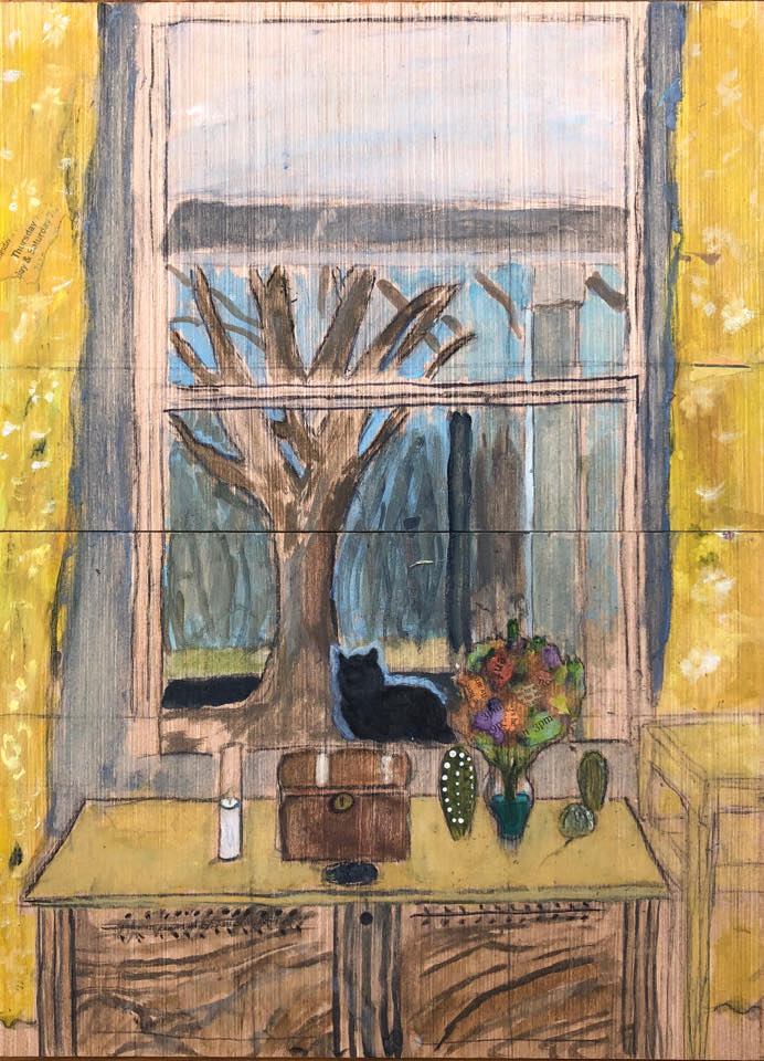
My independent piece is called There’s a Cat in the Window. I painted my living-room window with yellow curtains, a wooden trunk, a vase of flowers, a tree outside, a blue sky, and a black cat sitting on the other side of the glass. I wanted to paint this scene because I always thought the colors were neat and I knew it would be a challenge to paint something realistic.
The main elements of art are space, texture, and color. Space was a very hard concept to paint for me. I had to draw my window and give the perspective that the tree was further away than the trunk and the flowers were in front of the glass, while the cat was behind. It took me a while to get it right, but after staring at the scene while I painted, I got the gist of how it works. Texture was important in painting the tree and the sky, and color was important because I wasn’t sure if they would work together or if they would clash.
The most prominent principles of design are harmony and proportion. I wanted to make sure that everything in the piece came together and it wasn’t too busy or crowded. The proportion concept was similar to space; I had trouble getting it right, but after looking at my subject long enough, I learned how to draw it.
I used wood, pencil and watercolor paints to create this piece. I found that the materials worked well together and I may have found my new favorite medium.
My inspiration for this artwork was my cat and the way she always sits in the window when it’s cold outside and she wants to come back in. The name of the piece is what I say when I see her sitting there, a cue for someone to open the door. I thought it would be fun to paint something I could physically see in front of me rather than having to imagine what it should look like. I didn’t have a message in mind when I painted this, but I guess I wanted to paint something that was familiar to me. It was nice to paint something that I see everyday and notice the small details in the flowers, or the way the branches curve. Things that I hadn’t noticed before.
My goal for this piece was to gain more understanding of how to paint realistically. Working on this did help me do that and I feel a little more confident in painting trees.
Sophia
 Inspired by Repair the World, by Kehinde Wiley, and
Portrait of Madame X, by John Singer Sargent.
Inspired by Repair the World, by Kehinde Wiley, and
Portrait of Madame X, by John Singer Sargent.
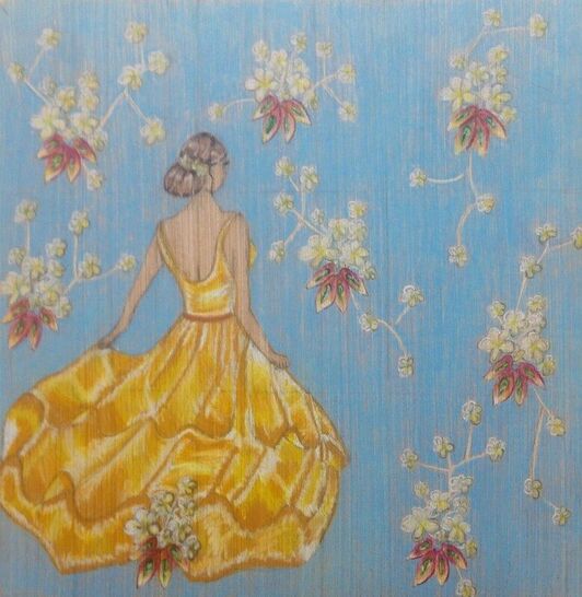
Picture Imperfection
For my masterwork piece, I decided to do an interpretation of two famous pieces, but add my own twist to each one. I chose Repair the World by Kehnide Wiley because I liked the delicate background and I chose Portrait of Madame X, by John Singer Sargent, because I liked the traditional women in a dress. You can see, when you look at my piece that I incorporated the flowery background from Kehinde Wiley’s piece but instead of the white tones for the flowers and the pink and greens for the leaves, I decided to add yellow into the flowers and make the leaves with more variety of colors. For John Singer Sargent’s piece you can see that I have a lady in a dress, but I decided to change the dress, and have the lady looking to the corner of the piece. I did this to make the piece more mysterious.
I decided to interpret the pieces this way because when you first look at the piece everything seems perfect, there is a girl in a beautiful dress, with a beautiful background, but then you notice she is looking off in the corner and everything might not be as perfect as it seems. I also left the skin as wood so it leaves a feeling of being seen through. I feel like there is a lot of this in the world, for instance red carpets everything seems so perfect but how perfect is it really. I would say the subject matter is to look deeper in what seems to be a perfect situation.
I think the most prominent elements of art in the piece are color, texture, and unity. I think unity is the stronger element of art in this piece because you can see that everything ties each other in. The green accents of the flowers draw the leaves in, the yellow on the dress draws the flowers in, and the hair of the girl draws the belt in, so in the end there is a sense of unity in the piece. I think the most prominent principles of design are harmony and pattern. In the piece there is the pattern of the flowers and leaves. While creating this piece, I used wood, Prismacolor colored pencils, pencil, and a reference.
While working on this piece, the main thing I learned is how to make ruffles on the dress. I used multiple references to figure out the formula of dark and light in the dress to make the texture look like ruffles in a dress. Both Repair the World and Portrait of Madame X were made with paint, which is a different material than I used. Kehinde Wiley got his inspiration for his pieces when he looked at old artwork with all white people and he wants to incorporate black people in the pieces with the same traditional backgrounds. I think the message he tries to convey is that black people are just as important as white and it is important to acknowledge it. When I see the piece I see Kehinde Wiley making a statement, which is what I like to do in my pieces, too.
My goal as an artist is to master realism. This piece helped me accomplish this with the girl in the tree. I learned how to make the dress look real as well as the person. This piece turned out better than I pictured. This piece will be influenced by future pieces by continuing practicing realism.
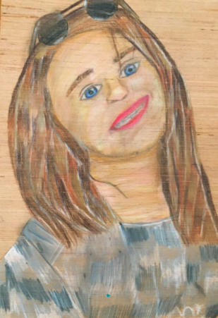
Blue Eyed Girl, by Sophia
I created this piece with wood, Prismacolor colored pencils, graphite paper, pencil, and an eraser. While working on this piece, I ran into the worldwide issue of coronavirus. As I just began working on this piece, school was cancelled, so I had to work on my piece at home. I used references to create this piece, and I learned to manage my time. I also learned how to use a grid, and do a graphite press, which is where you draw your piece on a piece of paper and then you transfer it onto the wood with the graphite paper.
I got my inspiration for this piece because I am working on realism in art and I wanted to do a traditional self-portrait to further my understanding. The message I want the viewers to take away from this piece is that simplicity is sometimes that best thing.
I conveyed this message by doing no background, and using basic colors in the piece. My piece is done on a wood surface with me in the middle smiling with my head up at an angle. I think the most prominent elements of art are balance, value, and texture. I think the most prominent principles of design are harmony and contrast.
My goals as an artist is to master realism. I think this piece helped me with that goal because I learned how to draw realistic lips and a nose. I also practiced hair, eyes, skin and clothing more. I think this piece turned way better than I expected, especially with the coronavirus. This piece is definitely going to influence my future artwork because my ultimate goal is realism.
Claire L
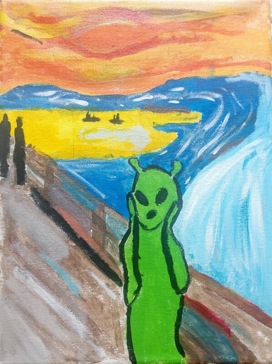
For my Masterwork I painted The Scream. The scream was painted in 1983. It is of a screaming man with his hands on his face. This man is on a bridge with a bright red sky behind him. There is so much color in this piece, the sky is full of bright reds, oranges, and yellows. There is movement in this piece, the lines are wavy which just makes your eyes follow through the whole painting.
When I was painting The Scream, I decided to instead of painting the guy screaming I painted an alien. I struggled sketching it out on the canvas and making sure everything was in the right places. It was my first time this year using canvas so it took me a little bit to get used to painting on such a bouncy surface. I used acrylic paint, and the hardest part for me was figuring out how to get more of the little details.
The artist of this piece is named Edvard Munch, he got the idea for this painting when he was on a walk and he saw this “blood red” sky. He recalled that he felt an "infinite scream passing through nature.” Munch’s sister was also at a lunatic asylum during this, making Munch feel overwhelmed. I made the man into an alien because I was thinking about how out of place you can feel some times and just like you are from another planet.
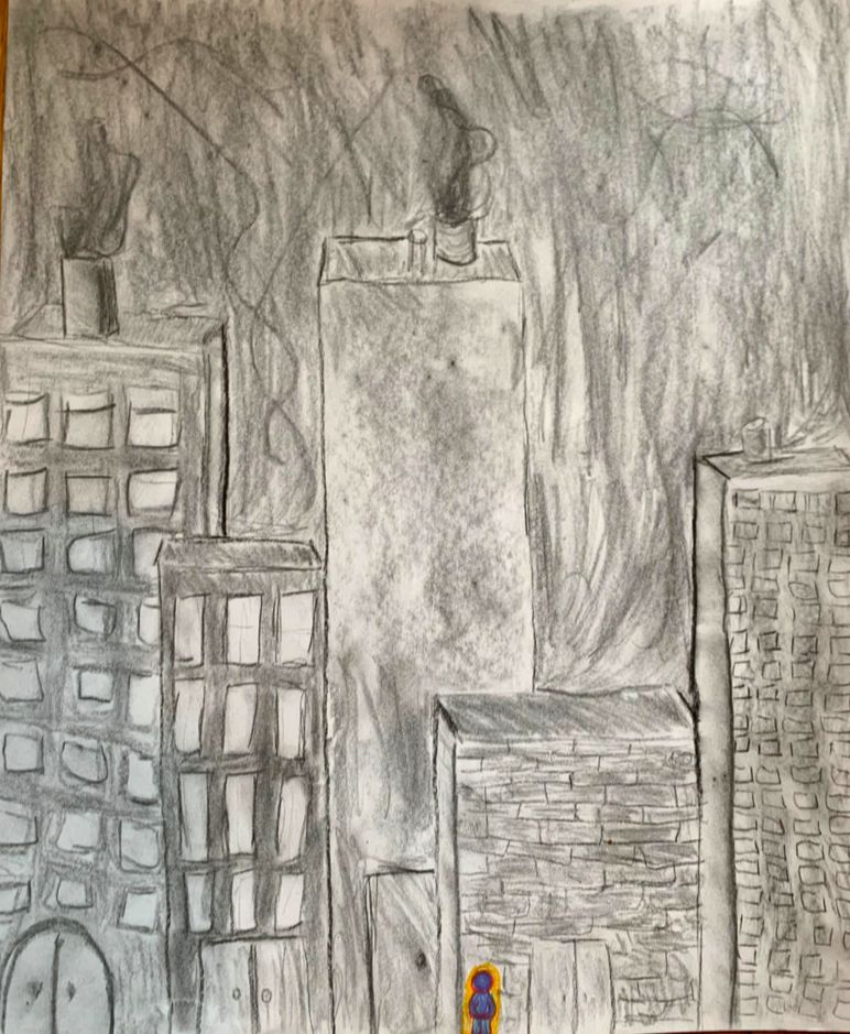
My Independent piece is called Joy. It’s of a bunch of very plain buildings. The buildings are all just black and white. Then there's this one little person at the very bottom of the page that is full of color. In my piece I tried to have a lot of form, I tried to make the buildings look more 3D. I tried to make the buildings as proportionate as I could to the person. And I also tried to bring in lots of emphasis on the person, using lots of color.
I used charcoal for the buildings and prisma colored pencils for the little person. I spent a lot of time trying to figure out how to make the building look really 3D and try to make shadows with the charcoal.
The big meaning in my piece is that there can be so much overall darkness in the world and right now with everything that’s going on. We all have to remember those little moments of brightness and embrace them. The little person is just a little bit of color but it is able to brighten up the whole drawing. With this piece I just want people to remember to be positive, and those little things are the things that make people's days.
Overall these two pieces have just taught me to keep going, and most of the time your artwork isn’t going to be exactly what you thought it would be, but to just play off of your mistakes and make them into happy accidents. My goals as an artist is just to work my hardest and make art that I’m proud of.
Devi
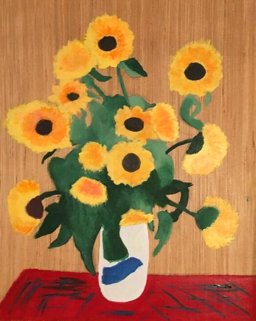
Masterwork: “Bouquet Of Sunflowers”
For my masterwork, I decided to do a recreation of a piece called “Bouquet of Sunflowers.” The original piece was created by Claude Monet in 1881. I think the most prominent elements of art in this piece are value and color, and the most prominent principles of design are movement and harmony. For this masterwork, I worked with a wood canvas and paint. I thought the piece would look better in paint rather than colored pencil or oil pastel, so that's what I went with. This piece was one of the harder ones I’ve tried to recreate because there’s lots of detail in it, but I like how it turned out. When I was making this piece, I learned how to blend dark and light paints together. I had to blend a lot in this piece, because the flowers are yellow and orange, and the leaves have dark green and light green together. When Monet made Bouquet Of Sunflowers, he was inspired by the Japanese woodblock prints that interested him and the Impressionists of his time. When I look at the painting, I love looking at all the little details, and how everything comes together.
One of my goals as an artist this year is to get better at realism, and this piece really helped me work on that. Another goal this helped me with is working on larger canvases. I usually want to work with smaller, but this time I worked on a bigger canvas. Overall I like my recreation of the piece, especially the blending of all the paints.
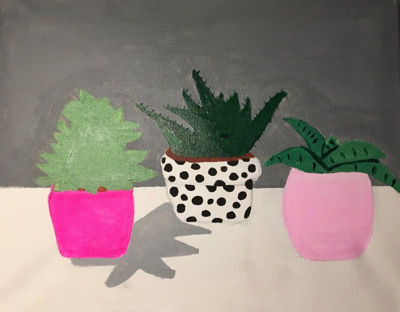
Independent: “Succulents”
For my independent, I decided to do a still-life painting of the succulents on my desk. I think the most prominent elements of art in this piece are texture and color, and the most prominent principles of design are contrast and balance. For this piece, I used paint and a white canvas, and worked on it all from home. In this piece, there are three succulents with different colored pots, and a gray background. I really liked the idea of doing a still-life of succulents because I’ve always loved the way they looked, and knew it would be really fun to paint. The challenging part of this painting was trying to get the texture of the plants to look right. Before I came up with ideas for my independent piece, I knew I wanted to do something that looks simple, but is still interesting to look at. This piece pretty much turned out how I imagined, but in the future I’d still like to work on texture, and painting shadows. As I said before, this year I would like to get better at realism, and this piece also helped me with that.
For my independent, I decided to do a still-life painting of the succulents on my desk. I think the most prominent elements of art in this piece are texture and color, and the most prominent principles of design are contrast and balance. For this piece, I used paint and a white canvas, and worked on it all from home. In this piece, there are three succulents with different colored pots, and a gray background. I really liked the idea of doing a still-life of succulents because I’ve always loved the way they looked, and knew it would be really fun to paint. The challenging part of this painting was trying to get the texture of the plants to look right. Before I came up with ideas for my independent piece, I knew I wanted to do something that looks simple, but is still interesting to look at. This piece pretty much turned out how I imagined, but in the future I’d still like to work on texture, and painting shadows. As I said before, this year I would like to get better at realism, and this piece also helped me with that.
Rio
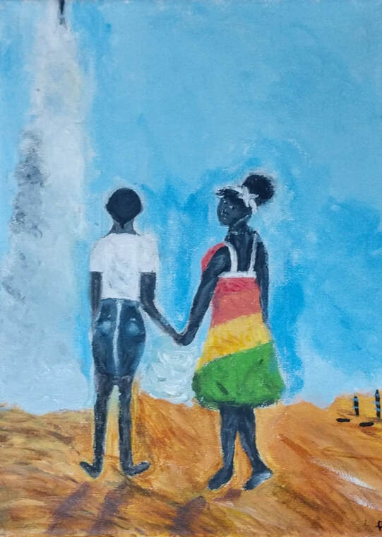
My masterwork was inspired by Amy Sherald which is called Planes, rockets and the space between, which was made in 2018 with oil paints on canvas. I think some of the most prominent elements of art are shape, texture, and value. I think that the most prominent principal of design is contrast, in the lights and darks of the painting, and the way the darker skin contrasts with the blue sky. Movement is also a big one in the way the girl is holding her hand looking sideways. My work was created with acrylic paint on canvas. I definitely struggled with getting the proportions of the body to look correct, which was why the grid was so helpful for this piece. I learned more about creating people and focusing on the small details, to really make it look great. I felt like my art style didn’t really differ from the original piece. I feel like the big idea behind this is to show power, and when I look at the painting it makes me happy because I think of women empowerment. I also like how she changed the skin tones a little bit to make it match the contrast in a better way.
My independent piece
In a way I feel I was inspired by my master work because my independent is of a girl standing on a rock looking at the sunset next to mountains, which I called My Feet Are On The Rock. I think the most prominent elements of art in my piece are texture and shape. The most prominent principal of design is most definitely movement and proportion/scale.
My independent was created with Prismacolor colored pencils on wood. The hardest part so far was making the body of the girl and the shades of the rock. I definitely learned lots of blending techniques along the way, it was definitely a difficult process, but a great challenge. The main idea behind this piece is to show power which was a reason why it’s similar to my master work. Definitely inspired by Amy Sherald her reasoning and style. I tried to communicate love and power. I feel great while looking at it, it’s sad that I couldn’t finish…
My goals all around are to keep doing art my whole life, and to always find time to do so. I also would like to challenge myself with more realistic ideas! It helped me meet goals in terms of taking my time and not being stressed or rushed.
Stephanie
Masterwork
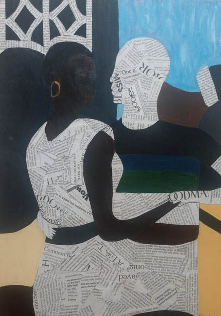
This piece was my interpretation of the piece ‘I Refuse to be Invisible’ created by Njideka Akunyili Crosby in 2010. She created the piece with Ink, charcoal, acrylic, and transfers on paper. I used acrylic paint on wood to create my piece. I also used cut up pieces of newspaper to fill in the spaces on the original piece where she used a photo transfer technique, so half of the painting is acrylic paint and the other half is newspaper. The most prominent elements of art in my piece are shape and color. The diamond shapes in the background made partially with newspaper pieces and with black acrylic paint are very prominent and help the people stand out. The most prominent principle of design in my piece is mainly balance, with how and where I placed the newspaper throughout the piece. There is also a lot of contrast between the black and white newspaper and the other parts with color.
To create this piece I started by sketching out the main shapes I had seen in Crosby’s piece. Once I had everything sketched out I started painting everything in the background. Most of the paint in the background, I painted a solid color and tried not to make it too textured except for the blue behind the man’s head. The main challenge throughout doing the painting in this piece was painting the woman’s face. It was hard to try and create the highlights with her face. It took me a long time to mix the brown paint to try and get the paint matched up with her skin tone, too. I learned a lot about shadows and highlights on faces and how when trying to do highlights, the paint drys a lot darken then when you first put it on. Once I finished the painting, I cut up pieces of newspaper that was only text (no pictures). I then used Elmer’s glue and painted it on each piece of newspaper then put it down on the wood in spots wherein Crosby’s piece she used a photo transfer technique.
Crosby was born in Nigeria, she is a visual artist currently working in LA, California. Her art is inspired by the “cultural terrain” connecting her adopted home which is in America and her native home in Nigeria. She made collage and photo transfer-based paintings. Her art shows the difficulties in connecting these two worlds. “It just seems so relevant, that feeling of… invisibility that happens when you move here, and that happened to me when I moved here. That’s why I think representation is so important, that feeling of: Do you exist if you don’t see yourself? … On one hand, I refuse to be invisible - meaning I don’t want to not exist due to the lack of representation.” This was a quote from Crosby expressing her big idea behind this piece.
I really enjoyed creating this piece because I was able to work at some of my goals of more realistic art within working on painting the woman’s face but also was able to make it a little more abstract with the collaging with the newspaper. This piece turned out better than I thought it would. I really like how it turned out and inspired me to look more of Crosby’s art. I really enjoyed creating this piece and want to create more pieces like this.
Independent
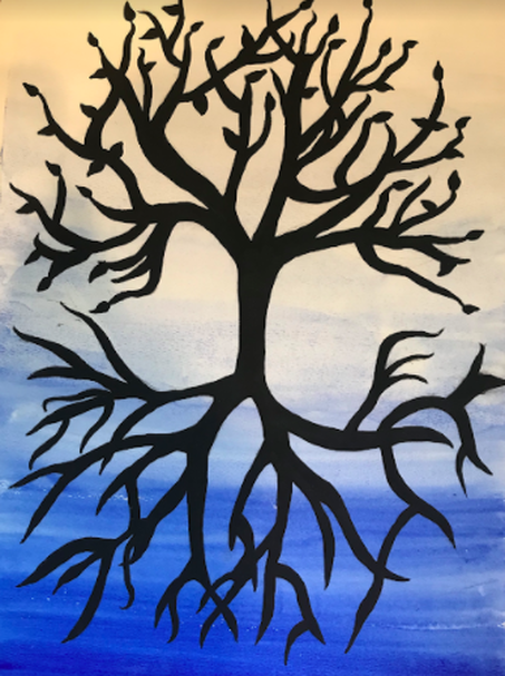
I named this piece “Solstice” because when I was first finished with this piece and held it up to look at it, the first words that popped into my head were winter, a new beginning, winter solstice. I made this piece on watercolor paper with black acrylic paint and watercolors. It’s a blue graded watercolor wash background, with a black tree silhouette that shows light and dark, life and death. It’s a semi-symmetrical tree that’s flipped so it’s on the top and bottom of the page. The background fades from light at the top of the page to dark to the bottom. The top of the tree has small leaves and the bottom of the tree with the dark blue background has no leaves. The most prominent elements of art in my piece are value and line. The background has a lot of value with the blue watercolor being a graded wash and I used a lot of different varies of line widths and lengths in the tree. The most prominent principle of design in my piece is balance throughout my piece. I tied to make the tree semi-symmetrical and flipped, so it’s very similar on the top and bottom of the page.
I started by sketching the tree on a big piece of watercolor paper. When I was done sketching, I did about 8 practice washes with the watercolor to try to find the technique that worked best for me. When I was done practicing, I did the background on my actual piece, starting with little water so it was very dark and dipping my brush into the water each time to eventually fade the blue into white. After I was able to let the watercolor fully dry, I used black acrylic paint and a very small pointy paintbrush to make the tree branches. One thing I learned, this being my first time using watercolors in this way, is that once you finish putting all the color down, don’t go back to parts you already did and try and fix them because it will just make it get worse.
It took me a long time to try and find an idea for my independent piece. One thing I knew I wanted to learn more about was watercolor. I got the idea to do a tree because I have done a lot of pieces with acrylic paint, so I wanted to try something a little more challenging. I’ve never really been able to draw or paint trees, so I decided that’s what I wanted to do. I chose to do the black silhouette of the tree because I thought it would stand out a lot against the watercolor background. When I first came up with the idea of the flipped tree and the graded background, I wanted to try and make the tree represent light and dark or life and death like I said before. But after finishing the piece the feeling I got and what I hope my viewers take away from this piece is of a winter solstice. The leaves on the top being the last few leaves left on the tree from fall and the blue being the first fresh coat of snow covering the ground.
I think this piece helped me grow as an artist and learn a whole new set of skills and techniques. I learned a little bit about watercolor, which is a medium I’ve always wanted to try but never really have until now. I had a picture of what I wanted this piece to look like in my head when I first started and tried my best to get this piece to that point. When it was finished, it didn’t exactly express what I was hoping it would. I really liked how it turned out and am very proud of this being for my first time using watercolors. After doing this piece I definitely want to work more with watercolors because it was a lot of fun!
John
Son of Can
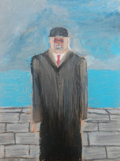
My masterwork is based on the Son of Man painting by Rene Magritte, but instead of an apple, I used the Campbell's soup can by Andy Warhol. My picture is of a man in a black trenchcoat and a bowler hat, standing in front of a lake, with a can of Campbell’s soup levitating in front of his face. It’s supposed to represent juxtaposition(two things that wouldn’t normally be together, but are together) of something plain and normal (a man by a pier), and something unexpected in that context (can of soup). The most prominent element of art in this piece is value, as shown in the man’s coat. The most prominent principle in my art is emphasis, as shown in the man as a whole. For this piece I used oil pastels, my goal for this piece was to try and get good at using oil pastels to try blend colors, which I felt pretty good at by the time I was done. The original used paints instead of oil pastels. The artist's idea for the son of man was to show that everything we see is hiding another thing, and you might want to see what's behind it but sometimes you can't. The Idea behind Campbell's soup can is that art doesn’t need to be something big or impressive, and it can just be a can of soup. Overall I'm pretty happy with the outcome of this piece.
My masterwork is based on the Son of Man painting by Rene Magritte, but instead of an apple, I used the Campbell's soup can by Andy Warhol. My picture is of a man in a black trenchcoat and a bowler hat, standing in front of a lake, with a can of Campbell’s soup levitating in front of his face. It’s supposed to represent juxtaposition(two things that wouldn’t normally be together, but are together) of something plain and normal (a man by a pier), and something unexpected in that context (can of soup). The most prominent element of art in this piece is value, as shown in the man’s coat. The most prominent principle in my art is emphasis, as shown in the man as a whole. For this piece I used oil pastels, my goal for this piece was to try and get good at using oil pastels to try blend colors, which I felt pretty good at by the time I was done. The original used paints instead of oil pastels. The artist's idea for the son of man was to show that everything we see is hiding another thing, and you might want to see what's behind it but sometimes you can't. The Idea behind Campbell's soup can is that art doesn’t need to be something big or impressive, and it can just be a can of soup. Overall I'm pretty happy with the outcome of this piece.
Dinosaur?
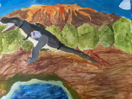
For my independent piece, I did a picture of a toy T-rex standing in front of a volcano and bushes, and a pond in front of the dinosaur. For this piece I tried to incorporate texture by making the volcano look bumpy and rough, and making the bushes look leafy. For this piece I tried to incorporate proportion, I did this by making the dinosaur look like it was bigger than most of the other stuff in the piece except for the volcano, which was only a little bigger because it looked like it was further away. For this piece, I used acrylic paint. I used two techniques to do this piece, I used dry brushing to make the bushes look like they were actual bushes, and for the volcano, I painted in different directions to make it look 3D. During this piece, I learned how to blend paint. I got my idea from a toy dinosaur in the room. My goal at the beginning of this piece was to do still life and learn how to blend paints. I am proud of the overall outcome of this, the one thing I would change is the fact that there is a lot of empty space.
For my independent piece, I did a picture of a toy T-rex standing in front of a volcano and bushes, and a pond in front of the dinosaur. For this piece I tried to incorporate texture by making the volcano look bumpy and rough, and making the bushes look leafy. For this piece I tried to incorporate proportion, I did this by making the dinosaur look like it was bigger than most of the other stuff in the piece except for the volcano, which was only a little bigger because it looked like it was further away. For this piece, I used acrylic paint. I used two techniques to do this piece, I used dry brushing to make the bushes look like they were actual bushes, and for the volcano, I painted in different directions to make it look 3D. During this piece, I learned how to blend paint. I got my idea from a toy dinosaur in the room. My goal at the beginning of this piece was to do still life and learn how to blend paints. I am proud of the overall outcome of this, the one thing I would change is the fact that there is a lot of empty space.
Fauti
Ellie
Masterwork- Based off of Oriental Poppies and The Bigger Interior
My masterwork was a piece inspired by the painting Oriental Poppies, by Georgia O’Keeffe. It was made in 1928. My piece has two poppies as the focal point of the piece, with geometrical shapes surrounding it. Some of them are digging into the surface of the flowers, or reflecting onto it. The contrast between the poppies and the shapes is mainly the change in lines. Poppies are more natural, while geometrical shapes are forced and angled. And obviously shape, the type of shape. Geometrical and organic. There is also contrast between color. The flower has a palette of oranges and pinks, while the shapes are neon colors, inspired by the piece The Bigger Interior with Blue Terrace and Garden, by David Hockney. The Bigger Interior was created in 2017.
For making this piece, I mainly used Prismacolor colored pencils. I was originally going to use paints for the shapes and pencils for the flowers, or vice versa. I kind of wish I used paint for the shapes, because it was hard to make them all one color and blend them because they were supposed to look solid. I learned a lot about how to use Prismacolor pencils. Like how to blend, how to shade, etc. before this piece I hadn’t ever used Prismacolor.
Georgia O’Keeffe said that her inspiration behind drawing just flowers is that us humans are always busy, running around, doing things, that we never have the chance to just admire/look at flowers. She said that if you study them, they’re actually beautiful things. By drawing them, she hoped that people would make a bigger effort towards paying attention to them. When I look at her piece, I feel like I’m looking at perfection. The way she painted parts, blended, it looks so realistic and peaceful.
I have worked a lot on making pieces look realistic, but since I have never used Prismacolors, this was a good exercise. One of my goals as an artist is to work on being patient with myself, and this piece definitely helped me with that. It didn’t exactly turn out as I imagined, like I mentioned my shapes were more blotchy and less solid. But overall, I like my piece.
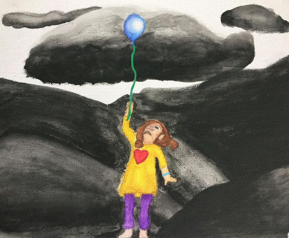
Independent- Powerful Significance
My independent is a painting of a black and white hill landscape background with a small young girl in the center, holding a balloon. She and her balloon are in color, so that’s why it’s called Powerful Significance. It uses a lot of value and space, because of the 3D landscape and the difference between color and not-color. It also includes tons of contrast, obviously, because of the significance between the girl and the background.
I actually started drawing it with watercolor pencils, which I thought were just normal pencils. But since this piece was on canvas, it was very blotchy and didn’t get in every space. So I took a paint brush and went over every pencil line to blend and blur it. I used this process throughout the painting. I learned a lot about how to use watercolor pencils and how to find a good process to stick to.
I knew immediately I wanted to do something about contrast, and to draw a human. I love drawing realistically, but for me it’s a push to draw people, so I wanted to challenge myself. The inspiration behind the little girl was that children are the most significant key detail in life. They bring a lot of joy, but nobody seems to care or notice them. I thought that bringing them out looking happy and being in color would be a neat way to express that. I originally thought about having a b&w background with slashes (not real ones,) going through her and those slash marks would be in color. This idea, thought sounded more dark than I wanted it to be. So I added a balloon. This piece, also, isn’t inspired by the balloon piece by Banksy at all, though. I just decided to add a balloon to symbolize joy in a kid’s life.
This piece turned out, actually better than I imagined. I thought there was a possibility that the little girl would look somewhat like an angel, with all the color. Luckily, that didn’t happen. One of my goals as an artist is to stay positive through making art, which is hard sometimes if I’m not satisfied with its appearance. This piece really helped me realize that I can do more than what I thought. I am really proud of it!
Photo used under Creative Commons from frankieleon
