Luca
Masterwork
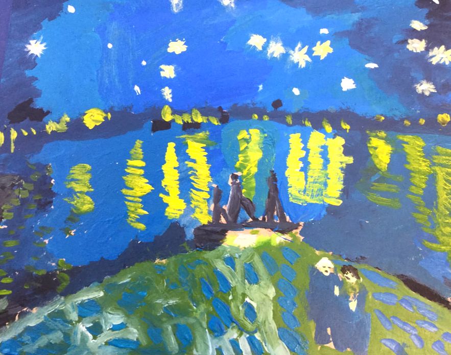
My masterwork piece that I recreated is Starry Night over the Rhone by Vincent Van Gogh. Van Gogh only sold one of his paintings when he was alive. He had a mental illness for 37 years before he committed suicide. Van Gogh created about 2,100 artworks including 860 oil paintings. It looks like a night with a sky full of stars that is on top of a a blue lake with a city next to it. I first drew on wood where the lake and the other things would be and then I started with background and finished with the areas with more detail. I wanted to do this piece because I really liked how it looked and I liked the colors and I have liked Van Gogh’s other art pieces. My goal was to try to make it look a bit like the original and to get the colors right. I thought I reached my goal and that it looked a it like the original. I learned that I am okay at art and that I have some fun doing it. I thought I would do a lot worse but in the end, I did okay.
My masterwork piece that I recreated is Starry Night over the Rhone by Vincent Van Gogh. Van Gogh only sold one of his paintings when he was alive. He had a mental illness for 37 years before he committed suicide. Van Gogh created about 2,100 artworks including 860 oil paintings. It looks like a night with a sky full of stars that is on top of a a blue lake with a city next to it. I first drew on wood where the lake and the other things would be and then I started with background and finished with the areas with more detail. I wanted to do this piece because I really liked how it looked and I liked the colors and I have liked Van Gogh’s other art pieces. My goal was to try to make it look a bit like the original and to get the colors right. I thought I reached my goal and that it looked a it like the original. I learned that I am okay at art and that I have some fun doing it. I thought I would do a lot worse but in the end, I did okay.
|
Independent
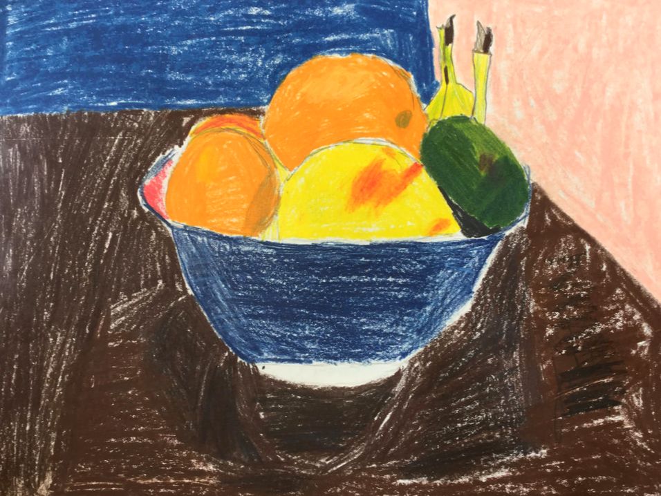
My Independent piece looks like a bowl of fruit on a brown table. In the background there are two walls. I first took a picture of a bowl with fruit in it and then I sketched it with a pencil and then I colored it in with colored pencil. I wanted to do this because I have seen drawings of this and I wanted to try to do it. My goals was to make the drawing look realistic with colored pencils and I think I reached my goals. I think I did pretty well and I learned how to blend colors with colored pencils. I can use this in my future if I want to blend colors to make the colors look more realistic. |
|
Owen
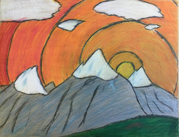
My Independent project looks like a landscape with the sun shining through some mountains. Some elements most visible in my art are color, line and shape. My artwork is colored pencil on a wood. I made my art by first looking at pictures of real mountains and then sketching an outline on the wood. After that I colored in the outlines. I did a lot of blending with the colored pencils to try and smooth out the lines. Again, my goal as an artist is to learn about and use a lot of different art tools, mediums, and techniques. This project helped me get closer to that goal because I have never used the Prismacolors or used wood as a surface and I had never really blended colored pencils before. This piece will definitely influence other artworks because I will try to use other materials for a surface not just paper in other artworks. I learned that Prismacolor colored pencils blend very well.
|
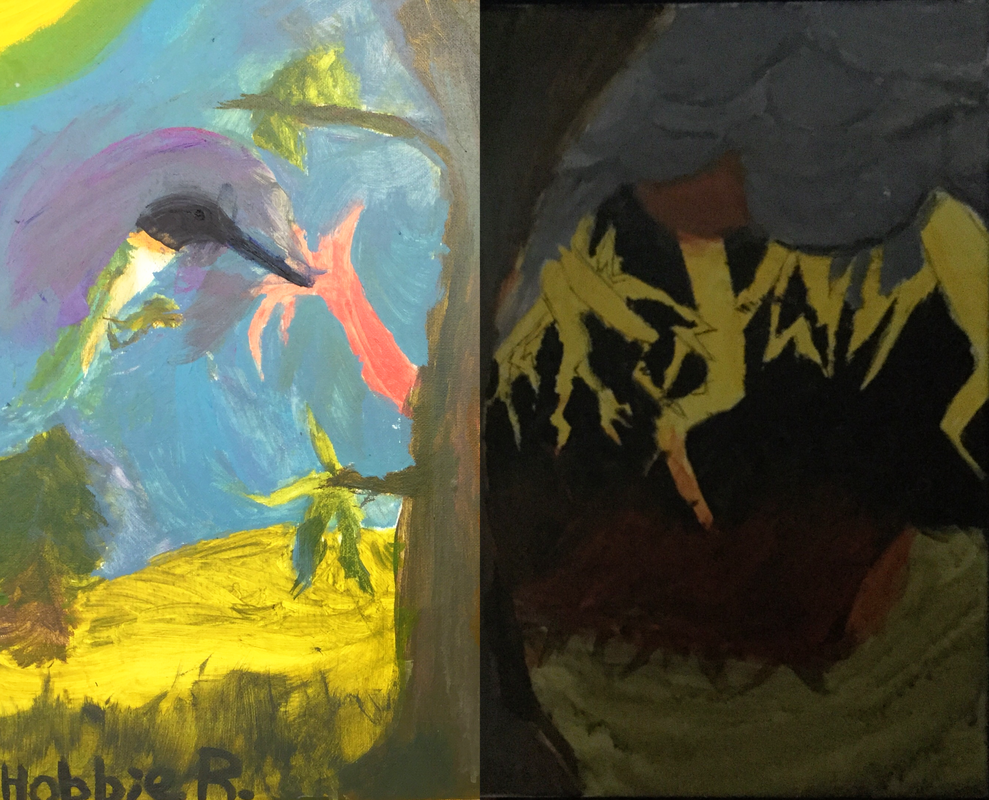
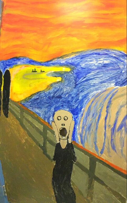
For my masterwork, Hobbie and I did a mural of the scream. Our artwork looks like a person on a bridge screaming and holding their face. Some of the elements most visible in my masterwork are the shapes, the colors, and the sense of space. We created our art by first sketching with the grid technique then I painting using the guidelines we had just sketched. I did a lot of dry brushing with smaller brushes to make the individual brush strokes stand out like Edvard Munch did. Some of the things that inspired Edvard Munch to create the scream was his sister being put into a mental asylum for having a mental condition that Edvard also had. I think Edvard tried to show a lot of anxiety and stress in his painting because he was stressed about his sister. My goals as an artist are to learn about and use a lot of different art tools and mediums. I feel like this class really helped with that because I had never used acrylic paint and I had never painted a mural before. The final piece is mostly what I imagined but I wish I could have spent more time on getting the colors more like the original. |
Elizabeth
Masterwork: Christina’s World
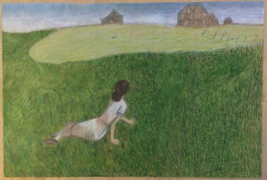
For my masterwork, I recreated Christina’s World by Andrew Wyeth. I started working on this in the First Quarter, but only ended up finishing about half of it. I spent a lot of time working on Christina and the grass that surrounds the whole piece. I used colored pencil on wood and used a lot of different techniques. For the skyline, I blended the colored pencil to create an ombré, whereas for the grass I had to use many strokes to create the detail and texture I was going for. In my piece, it looks like Christina is reaching to get back to her home. I tried to express that through my piece. I really tried to get better at texture and color through this piece- I think I reached some of my goals and also got better at shading. I think that this really challenged me, but still turned out how I thought it would.
For my masterwork, I recreated Christina’s World by Andrew Wyeth. I started working on this in the First Quarter, but only ended up finishing about half of it. I spent a lot of time working on Christina and the grass that surrounds the whole piece. I used colored pencil on wood and used a lot of different techniques. For the skyline, I blended the colored pencil to create an ombré, whereas for the grass I had to use many strokes to create the detail and texture I was going for. In my piece, it looks like Christina is reaching to get back to her home. I tried to express that through my piece. I really tried to get better at texture and color through this piece- I think I reached some of my goals and also got better at shading. I think that this really challenged me, but still turned out how I thought it would.
|
Independent Piece
I had seen a lot of my inspiration for my masterwork online and wanted to do something involving layering and color. I strayed a little bit away from my original idea, but many elements I wanted to use, like the color palette and shape, are still there. I used watercolor paper and watercolor paint to make this piece. I wanted the colors to blend more, but instead added lines to separate them with black acrylic paint. I think I wanted to make this piece to try something new that I had never done before. I’m a little disappointed about how it turned out because I wish I had tried to do a couple of things differently. Overall, I think it ended up okay, just not exactly how I wanted it. |
Ivy
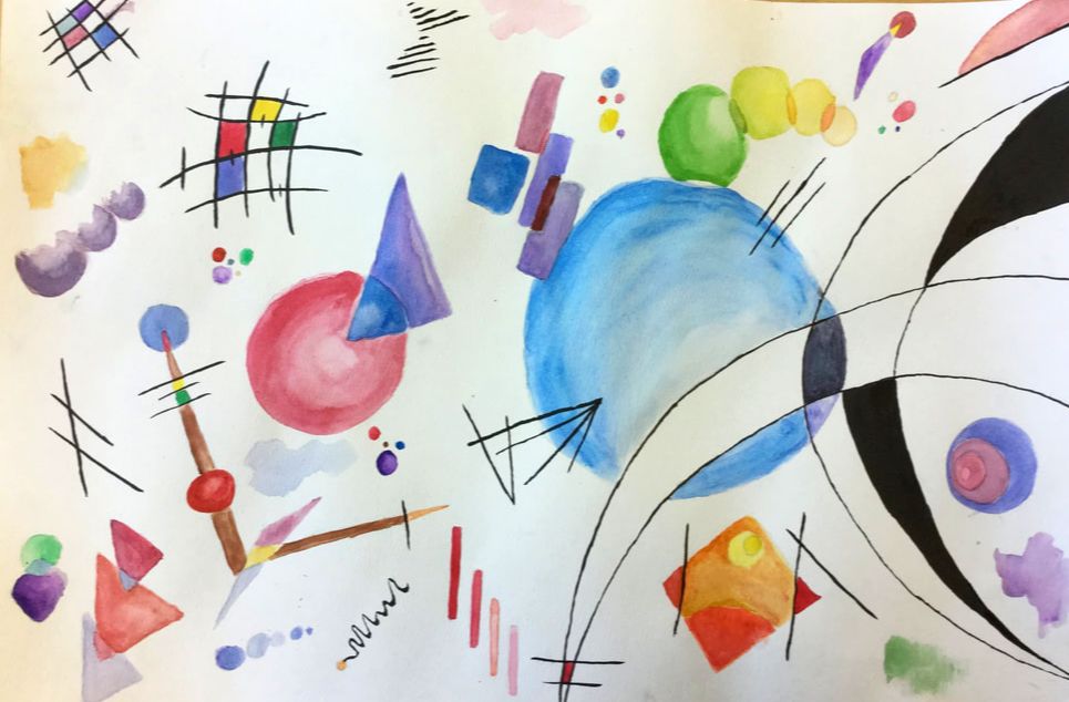
For my first piece this quarter I created a watercolor painting inspired by the artist Wassily Kandinsky. I wanted to use watercolors because I had never created a piece like this using them. I was inspired by Wassily Kandinsky’s watercolor pieces, but he also often used other materials like gouache, and oil paints. While I was painting I liked finding new techniques to use with the watercolors, like the wet on wet method and others. I was drawn to Wassily Kandinsky's work because of the lines, colors and different shapes that he uses in his work. My goals for this piece were to become more familiar and confident using watercolors, creating colors, and gradients. I think that I accomplished these goals and that my piece came out good. In the end I really like the way this piece came out, I liked working with watercolors, and want to use them more in the future. Wassily Kandinsky is often known as one of the pioneers of abstract art. He also taught at the Bauhaus school of art and architecture in Germany from 1922-33
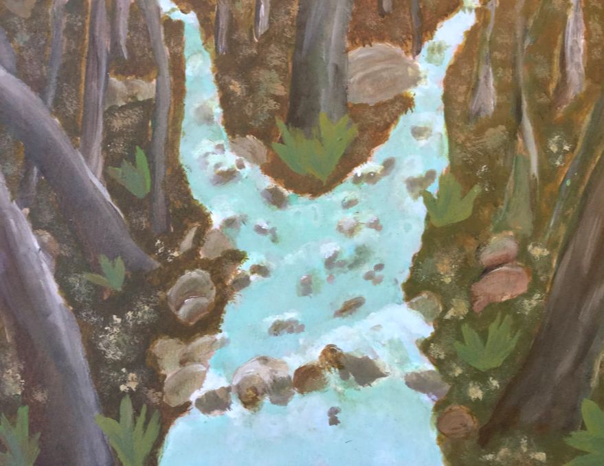
For my second piece this quarter I painted a forest landscape with a river running through. I used acrylic paint and added some water to dilute the paint to help it flow easier and look more translucent. While creating this piece I used many brown, red, orange, and greens to make the right colors and highlights throughout the piece. With this piece I wanted to make a landscape and a river because I had never done anything like that before, and I wanted to work on making things look realistic. I think that I did a good job on the highlights especially on the trees I also like the way that the river turned out. I really enjoyed working on a landscape and parts of nature.
Gillian
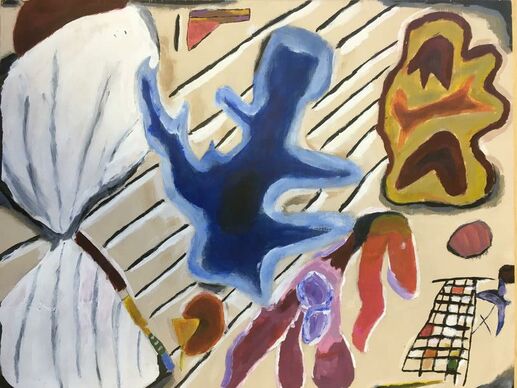
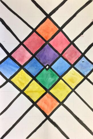
My artwork is a variety of abstract shapes scattered about a cream piece of wood. The title is “Composition One.” The most noticeable elements of art featured are color, shape and line. The most noticeable principles of art are balance, rhythm, harmony, and movement. The focal point of my artwork is a red and yellow shape in the top corner.
My picture is acrylic on wood. First, I painted on the background, and then I drew on the shapes I had decided on earlier with pencil. I assigned colors to them as I went. I used firm brushes for accuracy and carved out messy shapes with white and cream on a detail brush.
My artwork is a painting attempted to be done in the style of Wassily Kandinsky. I learned that Kandinsky got the inspiration for his abstract masterpieces by listening to symphonies play. His shapes are visual music. While drafting my piece, I listened to two songs: Rock Lobster, by the B-52’s, and The Great Curve, by Talking Heads. I tried to get the feelings of the music to transfer into my piece by thwacking the shapes around the canvas and choosing colors by whim. I tried to show some kind of disarray and unnatural-ness, in some kind of purely natural way. I think, for the full effect, I should have used wilder colors, and packed the thing even more full with shapes.
I think I met a few of my goals by creating something purely abstract. My skill was helped along by forcing me to use no recognizable images, only shapes and color, to get the point of my piece conveyed.
Kandinsky was first inspired to make his art at a classical music concert. He said that he saw all kind of colors and shapes in his head while listening. He was also inspired by the use of color in Monet’s Haystacks series. He was said to be the first abstract painter.
The final outcome is exactly what I imagined for for my work, since I planned out what I wanted to do. I’m going to work more in a purely abstract manner. I think it’s a very bold and challenging way to approach making pictures.
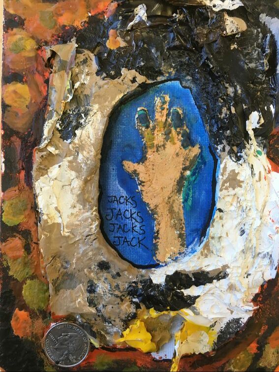
My piece is called “Wormhole Into the Fourth Dimension.” The main subject and focal point is the hand in the middle of the painting, surrounded by a large slab of dried and layered neutral paints. The edges of the picture are encaustic layers in warm colors. The elements of art most noticeable in my work are texture, shape, and space. The principles of art most noticeable are balance, emphasis, and harmony.
My picture was done with many mediums. The first thing I did was hot glue a circular slab of dried paint to my canvas. Then, I glued on a quarter. After all of this gluing, I got a hot plate and some crayon slivers. I melted the crayons on the plate and used the puddles of wax like real paint, blending them together on the plate. I brushed on layers of wax all around the edges of the picture. I built up an interesting bumpy texture after a while. I also used this encaustic method in the center of the piece, painting on a hand. I then used watercolors to fill in the rest of the center and a pen to write the words I liked in that same space.
My work was inspired by people. My grandmother and I are very similar people in more than a few ways. I imagined some kind of science fiction scenario where I could travel through a wormhole and see all of time. I would like to see her at my current age to sympathize with her, understand her and all other people better. I painted on a conjoined hand, marked as a shared hand by a condition we have in common. This is shown as the blue fingers. I chose a hand instead of say, a face, because it’s interesting how much someone’s hands and wrists can tell you about the person. I wrote the word “jacks” over a few times under the hand as a nod to my grandmother’s favorite childhood game. This is all in the center to represent the contents of a wormhole. The circle of paint is the wormhole itself, and the edges of the work are the chaotic, wonton cavities of space. The quarter that was glued on was the first quarter I was given for a quarter collection I started and never finished when I was a little kid. My grandmother gave it to me when I was starting, and I still have it.
I have a few goals in art. Firstly, I want to inspire, interest and and touch in some kind of way any person who might look at my pictures. Secondly, I want to try new things each time I create a work. Thirdly, I want to be proud and happy while making my art. I reached the latter two of these goals, as far as I know. I had a great time experimenting with encausting. I had a great time working with textures.
I learned how to work with the encaustic technique. The final piece is close to what I was thinking about. I had one idea to add patterns and embroidery thread to my piece, but that fell through as the art took shape. I think encausting is wonderfully fun and I would like to do it again.
Bridgette
|
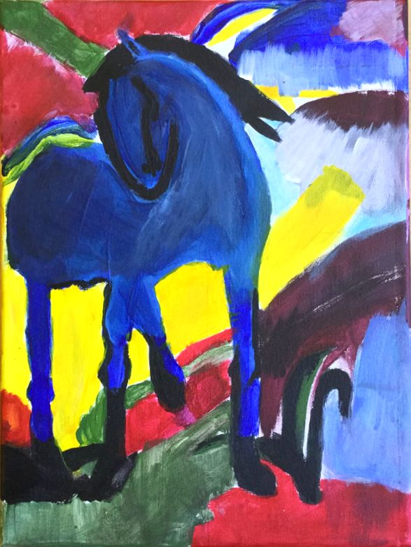
The Large Blue Horse
Large Blue Horse is by Franz Marc, a German artist that did painting and printmaking. He was part of a group called Der Blaue Reiter or the Blue Riders. Franz Marc was famous for painting animals. Some of his other pieces include Fuchs (Fox) 1911, Der Turm der blauen Pferde (Tower of Blue Horses) 1913. I am pretty proud of my recreation of the piece. One thing I struggled with while making the piece was getting the colors correct. It was difficult to get some of the paint to match the colors that Franz Marc had painted. One of the things that I like about this piece is how it looks. I like horses and the color blue, so I decided that I would like to paint the piece. Independent
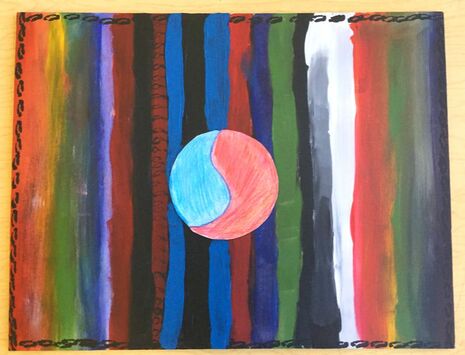
I didn’t start with an idea for this painting, I just grabbed a paint brush and some paint and started working. One of the goals that I made for myself while making this piece was not to wet the brush. The only thing I did was wipe the brush on a paper towel. Each of the lines represent me or my family. The red in the painting represents fire, the orange represents my brother, the yellow also represents my brother, green is nature, blue is my dad, and purple is my sister and my mom. The red and black is Toothless, the blue and black is Stitch, and then back to the rainbow. The Yin and Yang in the middle is half blue half red, this represents water and fire. |
Natalie
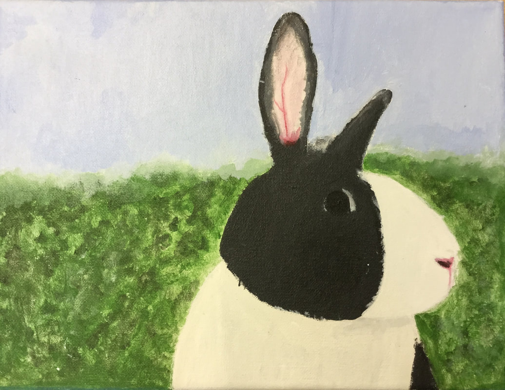
I did a painting of my very wonderful and cute bunny, Norman. It didn't take to long because I did a very simple sketch and didn’t add too much detail to the painting even though I tried to. I painted on canvas and only used four colors red, black, green, and white. I tried different techniques for each part of it. Some techniques definitely worked better than others, but it still turned out okay. I didn't have any goals working on this piece but I have never used canvas before and I just wanted to try something new. I wasn't able to figure out how to paint correct texture for the fur so it isn't as realistic as I hoped it would be but it worked out eventually. The big idea of my painting was not inspired by anything, I just wanted to try and learn new things. Overall in pretty proud of it.
Jack
|
|
Wyatt
|
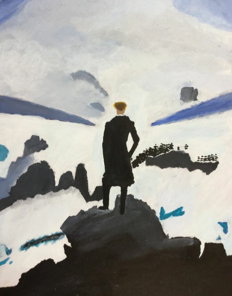
My piece is the Wanderer Above the Sea of Fog. I painted it on a wooden background. I used lots of mixing in it to get the right coloring for the background. I used three main colors, white, black, blue, and many other colors that came from the mixing of those colors. This piece is by Caspar David Friedrich. I feel that I got much better at the general use of paint and especially mixing for the sky and the background of the painting. I enjoyed painting this piece, I hope to paint other paintings by Caspar David Friedrich someday.
|
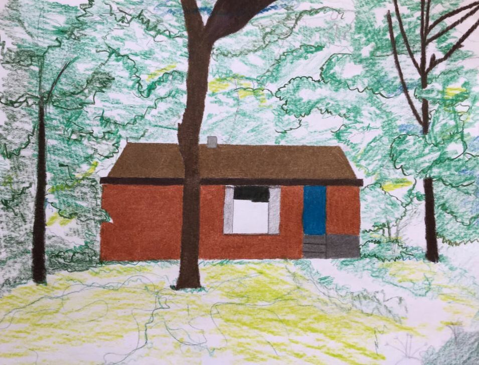
My piece is a drawing of my home in the summer. I drew this on a piece of construction paper. I used a style of making the main focus point of the picture detailed but the things around not as detailed. I used different shades of brown and green and a small amount of blue for the front door. I took a picture off of Google Earth of my house. I got much better at using colored pencils for shading and the mixture of detail and a more abstract loose style. This picture shows our house being surrounded by trees, plants, and wildlife.
Joe
Sophie
Independent
This piece I did for my Independent project. It is a picture of a surprised girl with big eyes and yellow background, then with little lighter yellow dots. To create this piece I first took a scrap piece of paper and sketched out the main idea of what I wanted to do, then I took the canvas and transferred that idea with a pencil. Then I mixed all of the skin tones I needed to create it and started with the all of the dark shadows, then went in with the highlights. I then made the eyebrows and lips with smaller brushes. For the eyes, I used a mix of acrylic paint and a thin black sharpie marker. I only used the marker for the eyelashes, then used the paint for the rest of the eyes. The hair was a little more frustrating to do but once I added in all of the shadings, especially on the bangs, it looked way better. The hands were also something that was hard for me honestly, after a while, I just decided it would be better to leave them plainer. One of my goals for this piece was just to make the face looking like it was expressing emotion as best as I could. Overall I like this piece but I think if I had more time I could make it better, especially the hands. Doing this helped me learn a lot more about facial expressions because in other things I've done the faces have been less expressive.
Masterwork (sort of)
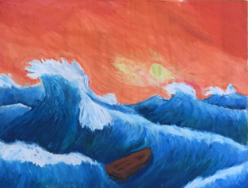
For my masterwork, I was inspired by this artist from Instagram. I can't remember the name so I'm very sorry about that. This is of a boat on a lake with trees in the back and the reflection just looked so beautiful, that’s why I wanted to experiment with that. I used watercolor for this piece and it was actually my first-time seriously trying watercolors, it was actually so much harder than I thought it would be controlling the paint and all. First I sketched it on the paper and started doing the boat first, and then did the trees and such. For the lake part, I used the method of putting the water on the page first and then letting the color spread throughout the page. Overall it was very fun to experiment with watercolors.
This piece I did for my Independent project. It is a picture of a surprised girl with big eyes and yellow background, then with little lighter yellow dots. To create this piece I first took a scrap piece of paper and sketched out the main idea of what I wanted to do, then I took the canvas and transferred that idea with a pencil. Then I mixed all of the skin tones I needed to create it and started with the all of the dark shadows, then went in with the highlights. I then made the eyebrows and lips with smaller brushes. For the eyes, I used a mix of acrylic paint and a thin black sharpie marker. I only used the marker for the eyelashes, then used the paint for the rest of the eyes. The hair was a little more frustrating to do but once I added in all of the shadings, especially on the bangs, it looked way better. The hands were also something that was hard for me honestly, after a while, I just decided it would be better to leave them plainer. One of my goals for this piece was just to make the face looking like it was expressing emotion as best as I could. Overall I like this piece but I think if I had more time I could make it better, especially the hands. Doing this helped me learn a lot more about facial expressions because in other things I've done the faces have been less expressive.
Masterwork (sort of)
For my masterwork, I was inspired by this artist from Instagram. I can't remember the name so I'm very sorry about that. This is of a boat on a lake with trees in the back and the reflection just looked so beautiful, that’s why I wanted to experiment with that. I used watercolor for this piece and it was actually my first-time seriously trying watercolors, it was actually so much harder than I thought it would be controlling the paint and all. First I sketched it on the paper and started doing the boat first, and then did the trees and such. For the lake part, I used the method of putting the water on the page first and then letting the color spread throughout the page. Overall it was very fun to experiment with watercolors.
Phi
For my individual art project this quarter I made a collaged self portrait over a background that looks a bit like Ancient Greek architecture. In the background, there are brightly colored shapes flying through the sky and around the pillars that contrast with the less saturated colors in the background.
I made the background out of a combination of a lot of materials. The floor and ceiling are made out of cut up magazines, the sky is painted with a combination of acrylic paint and watercolors, and the pillars are white acrylic paint with colored pencil over them to add value. I think the hardest part was trying to make the shadows look right on the pillars because I wanted it to come from behind and I haven’t practiced drawing backlit things as much as things with other shadows. I also had a bit of trouble painting the clouds in the sky. At first I had covered the place where the pillars were going to be in masking tape and then colored the sky and clouds over it. This didn’t work as well as I had planned because the masking tape stuck to the paper I was using a bit more than it would to other paper and it ended up tearing up some of the paint near the smaller pillars. The fact that I used some watercolors mixed with acrylic paint also proved as a problem because the watercolor seeped under the tape a bit. When I painted the pillars, the brush I used was a bit too big and went out of the space I was trying to paint. I ended up having to paint over the sky again once the pillars were done. I had to paint the pillars two times before I went over them with colored pencil because they were dark grey the first time instead of white (I still am terrible at judging how much black paint I should mix into lighter colors) the self portrait part of the piece is made out of bits of magazine just like the floor and ceiling. I made the colored shapes by taking a picture of my painting and drawing them on my iPad. I then printed them out and glued them onto where they were supposed to go.
I had the idea to make this piece because a few people in the art class with me were recreating things or making things inspired by by the artist Kandinsky. Kandinsky saw colors when he listened to music and he painted the colors that he saw. I also see colors when I listen to music so I thought it would be cool to incorporate how I see my favorite songs into my art. It ended up being a bit annoying though because I had to listen to all of the songs over and over many times in order to draw all of the different parts of it.
I think I’m going to try to paint more clouds in the future and learn how to make them look more like clouds. I also might work on painting things less sloppily and make the lines straighter. Next time I do something like this I’ll attempt to work on it more in my free time instead of saving everything for the last minute.
I made another collage this quarter before I made this one and I think it helped me collage parts of this one better. I don’t know if this exactly turned out the way I wanted to, but I think my plan at what I was doing changed so much over the course of it that I didn’t exactly have an overall goal for what I wanted it to look like. It didn’t turn out exactly how I would have liked it to but I’m still really happy with it.
Evan
|
|
Hobbie
|
|
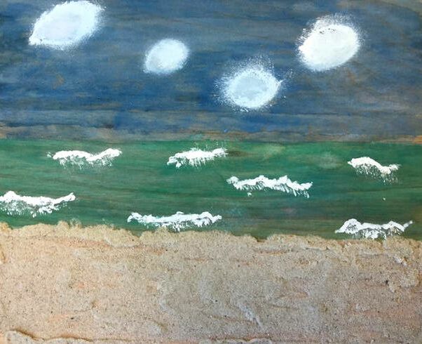
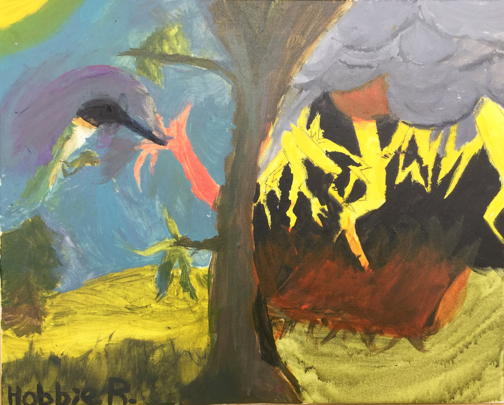
When you look at this artwork you see the concept of balance! I created it in my brain, then made it with paint. The big idea is balance. My 1 and only 1 goal for this peace is to be expressive. I like my artwork, yet with more time I could have added more.